Search It with Bing
Bing is the new Microsoft search experience and it’s live now for Canada! I’ve been using it for a while internally as Kumo. There’s already very lively conversation on Twitter about Bing. Some people like it after giving it a try and see the improvements we are making in search experience. Others are very skeptical about the new brand. I have to say I wasn’t sure about the name Bing at first, but then I got to know the reasoning behind, it suddenly made a lot of sense.
Why called Bing?
Bing is the ringing of a bell that signals the “aha” moment when a search leads to an answer. It’s the “sound of found” – short and simple, which functions well as a URL. In China, we added two Chinese characters to the name “必应 Bing.” The Chinese character 必应 is pronounced “bee-ying” and its meaning is derived from the last two characters of a Chinese proverb “有求必应,” which means - Ask and you shall find – very fitting :-).
Why new search UX?
As a UX designer, I used to think search experience should be as simple as possible because you want users spend less time on your search page but more time on the destination pages, there’s not much innovation space in search UX. However, Bing changed my opinion. There’s so much more we can innovate to help users in the “Search, Find, Decide” workflow cycle. Here are some examples:
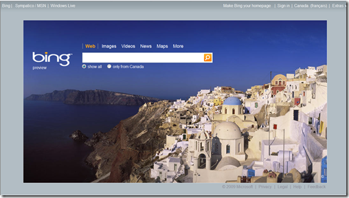
1. Many people set their browser homepage to be a search page (e.g. google.com) because the most frequent task they do when opening a browser is to search. Why not make the homepage experience more pleasant and dynamic by showing a different background picture everyday?
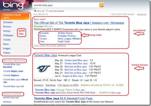
2. The search result page layout - think about this page as the hub for everything related to a particular search query. In this case, the common user activities when search for “Toronto blue jays” should be present on this page. For example, a user may want to see when is the next game or go to the blue jays ticket page. The goal is that users shouldn’t need to conduct another related search query to find what they need.
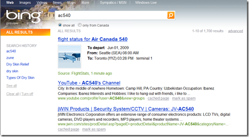
3. Instead of searching for Air Canada and then searching for the flight number on the Air Canada website, finding a flight status by searching it directly on Bing. Help users to find the information they need with the least amount of search.
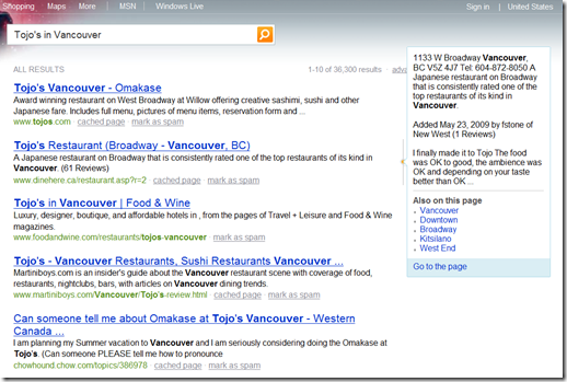
4. Help users make better decision after searching by providing contextual reviews. In the example below, I searched for a Sushi restaurant in Vancouver and was able to preview the exact location and customer reviews of the restaurant.
5. Search within Search -this feature is not yet available in Canada, but I hope soon. Most people go to Amazon.com to search for things to buy. Why not make this easier by letting users to search directly on the search result page? 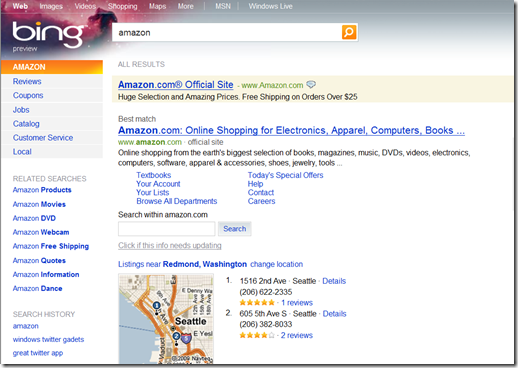
Now I think sky is the limit for search experience. There’s plenty of room for innovation around how we can connect search with other related user activities such as decision making, how we can support search experience based on people’s preference and intension, and how we can make search a connected experience on web, desktop, and devices.
Search it with Bing and let me know what you think. Let’s improve our search experience together.
Other suggested readings for Bing:
- How Microsoft's Bing came to be
- Behind Stories of Bing at DiscoverBing.com: there’s a video on Designing the UX of Bing
- An Inside Look at Bing by Canadian MVP Miguel Carrasco
- WATCH: Steve Ballmer Unveils 'Bing' Microsoft's New Search Engine
Technorati Tags: Bing,Search User Experience
Comments
- Anonymous
June 01, 2009
PingBack from http://asp-net-hosting.simplynetdev.com/search-it-with-bing/
