Note
Access to this page requires authorization. You can try signing in or changing directories.
Access to this page requires authorization. You can try changing directories.
One of the new features we plan to add to the next version of story creator is to add caption text support for each photo. This includes related settings such as text font and color. Adding font support isn't too difficult. But color is another story.
It is easy enough to provide a static list to allow users select some pre-defined colors. But the experience may not be very good. Windows Phone supports 32 bit colors (2^32). Why limit the user experience to about 10 colors? This may be fine for certain scenarios, such as use a color to categorize a task. But for our application, a richer user experience is desired. So we decided to create a custom color picker that is similar to the one you find in Expression Studio. In Expression Studio, you have a nice color picker. Below is Expression Web's color picker (the software I use to write this blog post):

What we want to create is a simplified version. It allows the user to use finger (or mouse in case of a mouse capable Windows 8 device) to pick a color, but it doesn't show the detailed information such as HSB values. I first created a prototype before integrating it to the real application.

In the above screenshot, the top control is a custom control, the color picker. The bottom color list is for comparison, to show what you will get if you simply want to allow users to select from a known color list.
You can download the prototype from https://bluestar.blob.core.windows.net/prototypes/WPColorPicker.zip. Once again, note this is a prototype, not a released sample.
I think it will be fun to blog about the experience in developing this prototype. So here it goes. This article only talks about the Windows Phone version. We may talk about Windows 8 version in the future.
The second part of this article is about HLS color model. This is what I learned by creating the prototype, and perhaps not too many of you are familiar with it. But the first part of this blog post is about how to create UserControl and custom control for Windows Phone. This information may be redundant with a lot of existing information on the web. If you haven't created UserControl and custom control, you may find it useful. If you're already familiar, simply skip the next section.
UserControl and Custom Control
Many people who have worked with Windows Mobile like to create system components. But this is not supported in Windows Phone. Only Microsoft and device OEMs are allowed to create system components. Fortunately, today in order to create reusable components, you do not actually need to make them system components. You can create web services (recommended to use REST as it is supported on almost all devices), class libraries, control libraries (actually also class library), and so on. In this article, we will compare UserControl and custom control.
From functionality point of view, UserControl is usually used within a particular application. You use UserControl to divide a large page into several small pieces. Together they compose the application. UserControl can also be reusable. But that's not the main functionality of UserControl.
Custom control, on the other hand, are created to be reused. In fact, all system provided controls, except for UserControl, are custom controls. When you create your own custom control, it behaves just like a built-in control, such as Button. They can be reused by other applications, as long as they reference your assembly. Custom control also supports style and control template, so you can customize its appearance in your application if you like.
From development point of view, creating a UserControl is very easy. I think most of you have already done that. Visual Studio provides an item template for this task.

After creating a UserControl with this item template, you will get a XAML file and a code behind file. Then you develop the UserControl in the same way as your main page. In our prototype, we have a UserControl named ColorListUserControl, in the WPColorPickerTest project. It provides a simple color list to pick a known color.
Creating custom control is a bit more complex, and currently Visual Studio doesn't provide an item template. A custom control's rendering is controlled by its control template, and you can modify its style and control template so different instances of the same custom control may render differently. So custom control does not have a specific XAML file and code behind. It only has a class. Some controls (such as our color picker) may rely on certain UI elements in order to work properly. In this case, you can use GetTemplateChild method to obtain named elements in control template.
To create a custom control, first you need a class. This class must inherited Control or a sub class of Control (except for UserControl). Then create a folder named "Themes" under the root folder of your project. Under the Themes folder, create a file named "Generic.xaml". Note the names are important. You must use "Themes" and "Generic.xaml". Generic.xaml does not contain code behind. Its root element is a ResourceDictionary. Here you can define a default style (without a key), which can be applied to all instances of this control.
<ResourceDictionary
xmlns="https://schemas.microsoft.com/winfx/2006/xaml/presentation"
xmlns:x="https://schemas.microsoft.com/winfx/2006/xaml"
xmlns:WPColorPicker="clr-namespace:WPColorPicker">
< Style TargetType="WPColorPicker:ColorPicker">
<Style.Setters>
<Setter Property="Template">
<Setter.Value>
<ControlTemplate TargetType="WPColorPicker:ColorPicker">
</ControlTemplate>
</Setter.Value>
</Setter>
</Style.Setters>
< /Style>
</ResourceDictionary>
You can modify the style and template in whatever way you want. Just note this is merely a default style. The developer that uses this control may provide his/her own style and template, which makes the control look completely different from what you may expect. This is the same as you can modify a Button, to make it look like a gun whose grip rotates when the button is clicked.
To use the default style, you need to set the DefaultStyleKey in your control class's constructor. To get named elements from the default template, you can use GetTemplateChild. Usually you do this inside the OnApplyTemplate method. Do not assume the element definitely exists, as the template can be changed. If an element is critical for your control but it does not exist, you may want to throw an exception.
public class ColorPicker : Control
{
private Rectangle _saturationRectangle;
public ColorPicker()
{
this.DefaultStyleKey = typeof(ColorPicker);
}
public override void OnApplyTemplate()
{
base.OnApplyTemplate();
this._saturationRectangle = this.GetTemplateChild("saturationRectangle") as Rectangle;
if (this._saturationRectangle == null)
{
throw new ArgumentNullException("saturationRectangle");
}
}
}
Now you can add whatever code you like to implement the control. For example, use code to add event handlers for certain UI elements (you cannot use XAML to add event handlers).
In our prototype, the WPColorPicker is a class library which implements a custom control that looks similar to Expression Studio's color picker.
To use UserControl and custom control in your main page, you need to define an xml namespace.
xmlns:WPColorPicker="clr-namespace:WPColorPicker;assembly=WPColorPicker"
Then to use it:
<WPColorPicker:ColorPicker x:Name="colorPicker"/>
RGB and HSB
Now comes the fun part. To create the color picker, you need to know something about RGB and HSB. Actually before creating the color picker, I didn't even know the name of HSB. I just wonder how Expression Studio works. So I asked around. I got the answer from some guys in Expression Blend team (Thanks!). Essentially, the standard solution to build a color picker is based on the HSB color model (also called HSV). You can learn about HSB onWikipedia. Here I'll briefly describe this concept (maybe not very precisely).
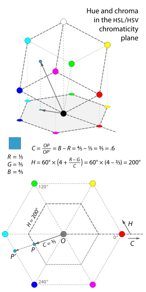
We all know RGB. You can actually position RGB colors on a cube, whose 8 vertexes represent black, red, magenta, blue, green, yellow, white, and aqua. Rotate the cube for 45 degrees, and project it to the horizontal plane. The result is a hexagon. All colors in the RGB color space are projected onto the hexagon. We define a coordinate system, where the black vertex of the cube (center of the hexagon) is 0,0,0. Each color can thus be defined using a 3 dimensional vector in the cube (or 2 dimensional vector on the projected hexagon). You can refer to this Wikipedia image for more information. I'm not sure if license permits me to copy the image here.
For a particular color, we define C (Chroma) as the proportion of the distance from the origin to the edge of the hexagon. That is, OP/OP' in the above Wikipedia image. It is also the difference between the largest and smallest values of R, G, and B. If you want a proof why the two definitions are identical, refer to the Wikipedia article.
We define H (Hue) as the angle between the horizontal line and the line connecting the projected point and center point, ranging from 0 to 360 degrees.
We define V (Value, also called Brightness and thus B) as the maximum value of R, G, and B. As you can see from the above Wikipedia image, the smaller the value is (and thus the RGB values), the blacker the color will be. When value is 0, the color will be completely black (as the vector is 0,0,0).
Finally, we define S (Saturation) as C/V. The smaller the saturation, the whiter the color will be.
You may have already heard of those concepts if you've played with old colour TVs when you were a child. Together, Hue, Saturation, and Brightness are called HSB. We can see in most cases HSB has a one to one relationship with RGB. But if S is 0, the color is always white (whatever H and B is). If B is 0, the color is always black (whatever S and B is). The corresponding color vector in this case is a vertical line which is perpendicular with the horizontal plane.
If you know HSB value, you can also compute the corresponding RGB value. For example, since S=C/V, then C=V*S. After you know the chroma, you can continue to calculate RGB. You can find the detailed formula here and here.
Implement the formula
Before we create the actual control, we need to implement the above formula to convert between RGB and HSB. The first thing we did is to write a simple console application. At this stage, we simply focus on implementing the formula, without thinking too much of code optimization, such as validating parameters.
     class Program
    {
        static void Main(string[] args)
        {
            TestToRGB(new HSB() { H = 60, S = 1, B = 1 });

            // Desired if H is no longer 45 when converted back. S = 0 means the color is white independent from H.
            TestToRGB(new HSB() { H = 45, S = 0, B = 1 });
            TestToRGB(new HSB() { H = 81, S = 0.74, B = 0.57 });
            TestToRGB(new HSB() { H = 35, S = 0.36, B = 0.38 });
            TestToRGB(new HSB() { H = 183, S = 0.18, B = 0.81 });
            TestToRGB(new HSB() { H = 294, S = 0.64, B = 0.27 });

            // Desired if H is no longer 45 when converted back. B = 0 means the color is black independent from H.
            TestToRGB(new HSB() { H = 165, S = 1, B = 0 });

            TestToHSB(new RGB() { R = 1, G = 0.14, B = 1 });
            TestToHSB(new RGB() { R = 0.51, G = 0.35, B = 0.28 });
            TestToHSB(new RGB() { R = 0.54, G = 0.39, B = 0.76 });
            TestToHSB(new RGB() { R = 0, G = 0.25, B = 0.12 });
            TestToHSB(new RGB() { R = 1, G = 0.78, B = 0.24 });
            TestToHSB(new RGB() { R = 0.97, G = 0.45, B = 0.62 });

            Console.ReadKey();
        }

        private static void TestToRGB(HSB hsb)
        {
            Console.WriteLine("Converting:");
            Console.WriteLine("H: " + hsb.H);
            Console.WriteLine("S: " + hsb.S);
            Console.WriteLine("B: " + hsb.B);
            RGB rgb = ConvertToRGB(hsb);
            Console.WriteLine("Result:");
            Console.WriteLine("R: " + rgb.R);
            Console.WriteLine("G: " + rgb.G);
            Console.WriteLine("B: " + rgb.B);
            HSB hsb2 = ConvertToHSB(rgb);
            Console.WriteLine("Converting back:");
            Console.WriteLine("H: " + hsb2.H);
            Console.WriteLine("S: " + hsb2.S);
            Console.WriteLine("B: " + hsb2.B);
            Console.WriteLine("Done.\r\n");
        }

        private static void TestToHSB(RGB rgb)
        {
            Console.WriteLine("Converting:");
            Console.WriteLine("R: " + rgb.R);
            Console.WriteLine("G: " + rgb.G);
            Console.WriteLine("B: " + rgb.B);
            HSB hsb = ConvertToHSB(rgb);
            Console.WriteLine("Result:");
            Console.WriteLine("H: " + hsb.H);
            Console.WriteLine("S: " + hsb.S);
            Console.WriteLine("B: " + hsb.B);
            RGB rgb2 = ConvertToRGB(hsb);
            Console.WriteLine("Converting back:");
            Console.WriteLine("H: " + rgb2.R);
            Console.WriteLine("S: " + rgb2.G);
            Console.WriteLine("B: " + rgb2.B);
            Console.WriteLine("Done.\r\n");
        }

        private static RGB ConvertToRGB(HSB hsb)
        {
            double chroma = hsb.S * hsb.B;
            double hue2 = hsb.H / 60;
            double x = chroma * (1 - Math.Abs(hue2 % 2 - 1));
            double r1 = 0d;
            double g1 = 0d;
            double b1 = 0d;
            if (hue2 >= 0 && hue2 < 1)
            {
                r1 = chroma;
                g1 = x;
            }
            else if (hue2 >= 1 && hue2 < 2)
            {
                r1 = x;
                g1 = chroma;
            }
            else if (hue2 >= 2 && hue2 < 3)
            {
                g1 = chroma;
                b1 = x;
            }
            else if (hue2 >= 3 && hue2 < 4)
            {
                g1 = x;
                b1 = chroma;
            }
            else if (hue2 >= 4 && hue2 < 5)
            {
                r1 = x;
                b1 = chroma;
            }
            else if (hue2 >= 5 && hue2 <= 6)
            {
                r1 = chroma;
                b1 = x;
            }
            double m = hsb.B - chroma;
            return new RGB()
            {
                R = r1 + m,
                G = g1 + m,
                B = b1 + m
            };
        }

        private static HSB ConvertToHSB(RGB rgb)
        {
            double r = rgb.R;
            double g = rgb.G;
            double b = rgb.B;

            double max = Max(r, g, b);
            double min = Min(r, g, b);
            double chroma = max - min;
            double hue2 = 0d;
            if (chroma != 0)
            {
                if (max == r)
                {
                    hue2 = (g - b) / chroma;
                }
                else if (max == g)
                {
                    hue2 = (b - r) / chroma + 2;
                }
                else
                {
                    hue2 = (r - g) / chroma + 4;
                }
            }
            double hue = hue2 * 60;
            if (hue < 0)
            {
                hue += 360;
            }
            double brightness = max;
            double saturation = 0;
            if (chroma != 0)
            {
                saturation = chroma / brightness;
            }
            return new HSB()
            {
                H = hue,
                S = saturation,
                B = brightness
            };
        }

        private static double Max(double d1, double d2, double d3)
        {
            if (d1 > d2)
            {
                return Math.Max(d1, d3);
            }
            return Math.Max(d2, d3);
        }

        private static double Min(double d1, double d2, double d3)
        {
            if (d1 < d2)
            {
                return Math.Min(d1, d3);
            }
            return Math.Min(d2, d3);
        }
    }

    public struct RGB
    {
        public double R;
        public double G;
        public double B;
    }

    public struct HSB
    {
        public double H;
        public double S;
        public double B;
    }
If you run the above code, you'll see as long as neither S nor B is 0, after HSB is converted to RGB and then converted back to HSB, the value doesn't change. But if either S or B is 0, the converted back value may be different.
Implement the control
Now we can port the console application's code to Windows Phone. Most of the code can be reused. Of course, in production environment, in addition to simply implementing the algorithm, you must optimize your code, such as validating all parameters, to make sure they're valid (for example, both S and B must stay between 0 and 1, and H must stay between 0 and 360).
I've tried to do some code optimization in the prototype so I can integrate it into our real application more easily. But note the attachment of this article is still a prototype. If you want to use it in your application, please double check to make sure it doesn't have any bugs, security issues, and performance is optimized.
The code of this custom control is quite long, so I won't paste it here. Below are several points of interest:
Use design patterns
We recommend you to use design patterns whenever it fits. For example, a commonly used design pattern in Windows Phone is MVVM. In the prototype, the ColorPickerViewModel class serves as a view model. It provides data for view, and encapsulates implementation logic, such as the above formula. The control class itself is ColorPicker, which acts as a view. Usually you don't put any implementation logic in a view. But a view may contain presentation logic.
One advantage of MVVM is when you change the presentation, you can be confident the implementation logic will remain intact. In addition, if you're not creating custom controls, very often the view also includes XAML. In XAML you can use data binding to bind certain properties on elements directly to properties in the view model, and as long as you implement INotifyPropertiesChange, you don't need to write any code to modify the presentation when a property's value changes. You can learn more about MVVM here.
Validate parameters and properties
As pointed out above, in production code, it is very important to validate parameters and properties, as long as you don't control them. For example, hue must stay between 0 and 360:
public double Hue
{
get { return this._hue; }
set
{
if (value < 0 || value > 360)
{
throw new ArgumentOutOfRangeException("value");
}
if (value != this._hue)
{
this._hue = value;
this.ConvertToRGB();
this.NotifyPropertyChanged("Hue");
}
}
}
If you don't perform the validation, you may introduce bugs. There is an exception. If you're writing a private method, you don't have to validate the parameters, as you have full control over the method, and if the parameters come from public properties, you can perform validation on the properties.
Similarly, you may need to check for overflow if certain calculation in your implementation may cause it.
Use style instead of inline properties
If you're an HTML developer, you probably know the best practice is to use CSS instead of inline properties. The same principle applies to XAML. In XAML, try to use style whenever possible, especially if the property only controls presentation. It may make sense to use inline properties for behavior properties, though, as it makes the logic clearer by reading XAML without looking into a separate style file.
You can use Expression Blend to extract styles from a control that you've applied inline properties. Of course you can also create styles manually.
Make interactable elements bigger
Do not forget there's no mouse on Windows Phone. You can only use your finger. Even on Windows 8, it is highly recommended to design your UI for touch experience. This is commonly forgot (at least for me) when testing using the emulator, which supports mouse. Usually a finger is not so precise as a mouse. So it is recommended to make all interactable elements bigger than you may expect. Compare our prototype with Expression Studio's color picker, you'll note our ellipse and thumb are bigger.
Similarly, it is not easy to input text. So you should only require the user to type text when it is definitely necessary. Thus we make the caption text feature as optional. If the user doesn't want to give a caption to a photo, then fine. The emulator already does a good job to annoy you by not supporting physical keyboard. Some of you may find it annoying, but remember this is the experience you get on a real phone. If you feel annoyed, same does the user if you require too much text input.