Navigation in OneNote 2013
This post was authored by Olya Veselova, Senior PM Lead on OneNote
Organizing and finding content is an important part of your note taking experience, and we've spent a lot of time this release thinking about how to improve navigation in OneNote 2013. We've also been working on making OneNote better for touch based devices, which have an entirely different set of constraints. It's also important for the UI to scale well for casual and power users - we wanted to make it easy to get around your content whether you have a single notebook or dozens of them.
As David touched upon in his earlier post, we now have two modes in OneNote:
- Normal View, an updated version of the layout from 2010 designed for mouse and keyboard use
- Full Page View, a completely new style of navigation designed specifically for touch
Normal View
Normal View is an updated version of the OneNote layout you've always known - pages are on the right side, sections are on top and a list of notebooks on the left.
Notebook Dropdown
In OneNote 2010 the notebooks were shown collapsed in a bar along the left side of the screen , and we realized that there were some shortcomings to that approach: sideways text was harder to read, and the visual layout didn't make the relationship between notebooks and sections entirely clear. It also wasn't very obvious which notebook was current and the UI didn't scale very well when you had many notebooks.
The dropdown in Normal View will be the default view for most mouse and keyboard users, and the name of the current notebook is displayed prominently next to your sections, so you're never in doubt about which notebook you're in. To navigate to another notebook, you click on the notebook name which brings up the dropdown. The layout also scales well - if you add several notebooks, the icons will be shrunk so that you'll almost never have to scroll.
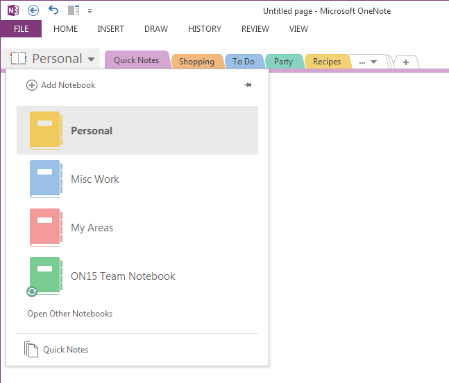
If you have only one notebook, we don't take up the extra space on the side of your screen - this view is good to use if you spend a good amount of time in each of your notebooks, rather than constantly switching between notebooks. It is also best suited for notebooks of medium size - without section groups or too many sections - such that your most used sections can fit across the top.
Notebook Pane
Now, if you're more the power user type and you like to switch between your notebooks frequently, fret not - we've updated the old Notebook pane view from OneNote 2010. You can get to this view by clicking on the pin button in the notebook dropdown (pictured below)
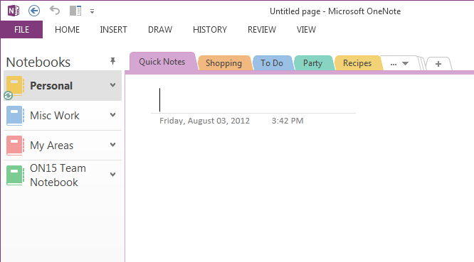
When you turn on the notebook pane, we display a list of all your open notebooks and highlight the notebook you're looking at. The pane takes up less space, and wraps your notebook names if they are too long. This view is great for large notebooks with many section groups and sections.
If you have several sections in your notebook, the bar on top can get filled quite easily and then you have to click twice to get to your section. To make this simpler, the notebook pane also displays a vertical list of sections so that you can get anywhere with a single click.
Full Page View
Full Page View is our minimalist, touch friendly mode that you can get to by clicking on the button in the top right corner of any page. Full page view gets rid of both the ribbon and our navigational chrome, and keeps you content in focus.
As you can see the layout is very clean, keeping your content front and center while removing all but the most necessary UI elements. The extra whitespace is really useful for working with wide tables or taking notes next to inserted documents. It's great for a tablet when you're writing with a stylus, and you won't accidentally go to a different page when your rest your palms on the screen. In fact, if you rotate your tablet to portrait mode, OneNote goes into Full Page View to provide a better experience.
Notebook Dropdown
In this mode, you tap the notebook name in the top right corner to bring down your notebook dropdown. If you're using a slate, this button will be within easy reach of your thumb so that you can jump between pages easily.
To make our navigation more touch friendly, we brought notebooks, sections and pages into a single 3 column layout. You can tap on a notebook, section or page to preview it instantly in the background and then tap on the page to dismiss the dropdown. You can also double click or tap or navigate instantly to a particular page,
You can right click any item in here for context menus and drag and drop to reorganize. There's also a shortcut to the search box, and if you're using a mouse, you can take advantage of our new floating page button to insert a new page exactly where you want it:
Editing Notes in Full Page View
You probably also noticed that the ribbon is hidden by default in full page view in addition to our navigation. Users can still edit and interact with content through the context menus, which can be brought up by :
- Right clicking with a mouse
- Selecting and tapping with touch
The layout changes depending on whether you're using touch (pictured above) or a mouse and keyboard. Of course, You can always bring back the ribbon temporary by clicking the '…' bar at the top of the screen or you can pin the ribbon to have it always appear.
If you have feedback on any of the changes we've made to navigation in OneNote 2013, please let us know in the comments below.
Olya Veselova
Senior PM Lead, OneNote
Comments
Anonymous
August 08, 2012
Please keep the keyboard shortcuts as much as possible. For instance I use very often the shift key when clicking on a netbook so that I can choose to go directly to the section I want, instead of the "active" one. And I would also want to better navigate around TAGS, there is too much clutter in that pane. I want as many tags as possible to be shown on the screen, not to keep scrolling and scrolling. Thank you.Anonymous
August 10, 2012
Could we have on first screen the same menu as on screen four. Touch menu is fantastic on Tablet, for keyboard use too. There is plenty of space and when somebody have lots of section it helps faster choosing what you want.Anonymous
August 11, 2012
I love all the changes you've made, especially the full page view and Notebook Dropdown, which I am using all the time on my tablet. But the "..." at the top does not work most of the time with my Stylus and it's vertically to small to be able to hit it with my fingers. Right-clicking on a selection with the Stylus also does not work at all. I also find automatic selection of text with your fingers rather annoying. Why would I want to select text with my fingers? That is almost never the case. The selection circles are too small anyway even if I wanted to (they should be much bigger). The default finger mode should always be panning unless I explicitly choose another mode. The icon for panning is already a hand, so fingers should pan. I second Kamil on the Notebook Dropdown in Normal View. It is so incredibly good that it should also be the primary navigation method for the mouse and keyboard. This would also make the UI more consistent because there would be only one navigation method.Anonymous
August 13, 2012
Thanks for the feedback Daniel, Kamil and HK, I've passed it along to the rest of the team.Anonymous
September 02, 2012
- Invent a "Favorites", like all browsers have, that would allow you to organize your own list of pages (or even bookmarked portion of a page) into quick pick menu.
- Keyboard short cuts and right click (context menus)
- REALLY WANT - Calendaring integration with Outlook (online) rather that the desktop only + other calendaring options within the program.
Anonymous
September 05, 2012
The comment has been removedAnonymous
September 15, 2012
<a href='http://www.ankaofis.net'><strong>Ofis Mobilyaları</strong></a>Anonymous
September 27, 2012
Great job on the new UI. I've been using it the last few months and especially love the full screen mode. Everything is out of the way but still within quick reach.Anonymous
October 09, 2012
any plans for a hierarchy with more levels? Notebook/sections/pages just isn't enough. Why not have some arbitrary nesting level? This would add a tremendous amount of flexibility.Anonymous
November 02, 2012
@Travis: You can use section groups to create an extra level of hierarchy for large notebooks. Just right click on any existing section, and you should see an option for creating a new section groupAnonymous
November 13, 2012
I used OneNote 2010 extensively, and one of the things I've become accustomed to is leaving OneNote in Full Page View while writing & editing Notes. In this view, the menu bar is still available, though the ribbon is hidden (and I can pin it to visible when I want). Nowadays every time I enter Full Page View using F11 or the button I put on my Quick Access toolbar, it also puts me into Full Screen View. That's an extra click, then, to show my menu bar and disable Full Screen View. I love Full Screen View for side-notes, but not for the majority of my note-making. Is there a way to enter Full Page View without entering Full Screen View as well? There should be. Thanks.Anonymous
December 02, 2012
Is there a keyboard shortcut to display Notebook Dropdown? Once I enter Full Screen mode, the only way to bring up Notebook Dropdown seems to be to click on the current notebook name in the upper right corner of the screen.Anonymous
December 02, 2012
@Ilya - Yes there is a way to pull it down just hit Ctrl-G for the navigation or Ctrl-E to open search and you can navigate to pages just by searching. Both of these work in standard view as well.Anonymous
December 02, 2012
Yes, Ctrl+G from full-screen mode was the keyboard shortcut I was looking for. Thanks, Daniel!Anonymous
December 03, 2012
Is there a way to configure size of an indent in OneNote 2013 (or, equivalently, the number of whitespace characters in one tab character)? I see that it currently is set to 4 whitespace characters, and would like to be able to set it to 2 (or even 1).Anonymous
December 03, 2012
@Ilya thanks for the suggestion but currently there is no way to customize the size of the indent.Anonymous
December 06, 2012
The comment has been removedAnonymous
December 07, 2012
Are there keyboard shortcuts to close, selectively, Research, Spelling and Thesaurus tabs? Having shortcuts to bring the tabs is helpful, but it appears the only way to close them is to reach the mouse.Anonymous
December 10, 2012
Is there in Normal View way to call Notebook Dropdown as in Full Page View mode (like Shift+Right Click on Notebook in OneNote 2010) ?Anonymous
December 10, 2012
Oh, I found the way to call it: In Normal View press F11 then Ctrl+G - I got what I want. It's too longAnonymous
December 15, 2012
Please add a feature to make the OneNote remember the last view settings in Full screen mode. Or please make a sticky option somewhere. Everytime I go in Full screen, i have to press "..." and then "Show Tabs and Commands". It's becoming tiresome. And also, please add an option to tell OneNote that I NEVER want to send my printouts to multiple pages.Anonymous
January 03, 2013
Is there a way to open One Note in full page view. Thank you.Anonymous
January 11, 2013
I DETEST the notebook drop-down and how it replaced my hierarchical view in the left pane. I organize my notebooks with many nested section groups and sections, and the tabs along the top are confusing and useless for navigating any of my notebooks. Yes, after an hour of searching where my notebook/navigation pane went, I finally figured out how to pin the drop-down view so it looks something like the 2010-style. This was so frustrating and infuriating that I almost uninstalled OneNote 2013 and re-installed the 2010 version. The section groupings along the top are still taking up space on my display. How do I unpin that so I never have to look at it again?Anonymous
January 30, 2013
Absolutely agreeing with Patrick above. I made heavy use of the section grouping, as I had a ton of groups in my notebook. In OneNote 2010 they all appeared on the left in a logical hierarchy. Now they're all at the top with a "..." to access additional section groups. This makes no sense. The only way to go around this is to use Full Page View's Notebook Dropdown. Why is this not available in the Normal view's Notebook Pane? Why have two completely different usage paradigms in one app? Can someone let me know what I can do other than downgrade to 2010?Anonymous
January 30, 2013
NEVERMIND! I FOUND THE GOLDEN TICKET. I didn't see the "Pin" icon which basically does what I wanted it to do. VOILA. Sorry for the angry message above. Thanks, NathanAnonymous
January 31, 2013
I have always been looking for a way to automatically generate a table of contents (TOC) similar to what can be done in MS Word. I find this very useful because it provides me a one-glance view of my key headings and to quickly go to any content (e.g. "sub-topic 5 of topic 3 of section 7 of chapter 4") - with one click of the mouse. Is there anyway to auto-generate such TOC with OneNote (especially as easy to update as MS Word's "update TOC" feature)? The most ideal case would be to be able to do this from "all notebooks" all the way down to however many levels of headings one need to use.Anonymous
May 09, 2013
I second Eduard's comment above (and the many other comments on the Office forums): OneNote 2013 really should remember whether one has selected the "Show Tabs and Commands" setting in Full Page View mode! I pretty much always want the ribbon displayed, as I switch between pens a lot. At the moment, when I am in full page mode, then leave full page mode to view another page, then re-enter full page mode, the ribbon disappears and I have to tell the program again that I want it to be there. At the very least it could be a program option whether to have it remembered or not. Or two separate functions: Full Page View vs Full Screen View or something like this. I currently have both OneNote 2010 and 2013 installed, and I find myself having to use 2010 because of this issue. Please if someone with the appropriate knowledge could fix this or find a work-around, so that I can enjoy the other benefits of OneNote 2013!Anonymous
July 02, 2013
How about including being able to insert 'bookmarks' anywhere on any page that can be linked to using the 'Link' facility?Anonymous
July 26, 2013
I would like to show revise my notebooks to show at the top, laterally instead of the side. Can I do this?Anonymous
September 23, 2013
is there a reason why I would not be able to see the drop down button in normal view? I have several tabs that only can be seen on the left column. at the same time I have many sections that Do show the drop down menu/button so I know that it is "somewhat" working on my system thanks for any help you might be able to send my wayAnonymous
October 17, 2013
The comment has been removedAnonymous
March 03, 2014
I am struggling with navigation. I want to use the docked mode, which is identical to the 'full page' mode, but also tells other applications not to flow over the window when maximized. I say identical, but in fact there is a difference- in docked mode the navigation button is removed for some reason! Why is it assumed that you would never need to switch notes, and have other windows not flow over your notes at the same time? The keyboard shortcut ctr-alt-G pulls up the same menu; this is a good start, but I really want a button I can add to the quick access toolbar (or use the same floating button that exists in full page mode) to access the navigation pane, but there doesn't seem to be one. The 'navigation' sub-menu that does exist only provides access to previous and next page, and search. Please give us a button to navigate in docked mode!Anonymous
March 04, 2014
I can't find it and it's surely one of the most used and most needed navigation tools. Please advise.Anonymous
March 14, 2014
I am really frustrated to lose the Navigation Bar on the left. My eyes track down much more comfortably than across the top. It was easy to see and select anything I had and you could hide the bar if you needed the space. Navigation in the new version is terrible and non-intuitive. I would just like a great big REVERT button, but must use this because it is on our corporate image. GRRR, really frustrated!Anonymous
April 03, 2014
When I first saw the Full Page View, I didn't realize it was a different view of Onenote - I thought that the page had popped out into a separate window. It would be nice if it was a separate window and you could have more than one page in it's own window at the same time and be able to move them around the screen. I guess you could attempt that effect by opening more instances of OneNote. But that's a little more complicated.Anonymous
April 09, 2014
Is there a way to customize the OneNote Navigation pane. I simply want to make the font a little bigger.Anonymous
May 14, 2014
Is there a way to get the vertical scroll bar to appear all the time on a new page...I use OneNote for presentation and when I need more space to write I have trouble getting the scroll bar. I need it even though I'm not at the bottom of the page. ThanksAnonymous
July 15, 2014
The comment has been removedAnonymous
July 30, 2014
Please introduce the Navigation Pane as it appears in Word that allows us to see our headings on the left side of the page. I rely heavily on those headings to keep track of items I'm working on and I would use OneNote to store all of my notes in one place but for the absence of a navigation pane. If is a way to make the navigation pane appear on the left side of the page in OneNote I have not been able to find it either in the ribbon, the help menu or online. Thank youAnonymous
August 04, 2014
Thanks for the Notebook Pinning tip! I was literally ready to move to Evernote today because I loved the OneNote 2010 Notebook browse view and find the new tab view much less productive. Please keep this left sidebar browse view for Notebooks prominent and updated. I would also like to see it available on the OneNote for Mac client and the iPad Client.Anonymous
August 11, 2014
Just bought OneNote 2013 and hate the primitive drop down menu to go from book to book. 2010 is much, much better with the left side pane displaying book sections. When you have to switch from pages in one notebook to another constantly, 2013 is a nightmare. 2010 has half the number of keystrokes and twice the functionality.Anonymous
August 11, 2014
I went through the pinning procedure to get the books and sections column. It's actually worse than nothing because it puts it on the right side, next to the similar pages column, confusing the eye so you have to constantly check which column you are seeing! It should be on the left by itself. Is there a way to uninstall 2013 and replace it with 2010 for no charge?Anonymous
August 11, 2014
Hello, I think there is a bug in the way the View->Normal View and Full Page View buttons work - all of the buttons behave as a toggle, same as pressing F11. For example, if you are already in Normal view, pressing it again goes to full page, even though it should DO NOTHING. I'm trying to automate (using keyboard shortcuts and SendKeys) OneNote for multiple monitors where I want it full page view on secondary, and normal on main, but this is impossible since they all behave like a toggle, and the states of the windows depend largely on how it was closed last time. I shouldn't have to resort to COM programming if these buttons behaved properly. Please fix, Thanks!Anonymous
August 31, 2014
The comment has been removedAnonymous
September 18, 2014
Hi, I cannot access my Ribbon when using one note... it's just not there, is there any thing i can do to gain access to it? thanksAnonymous
October 10, 2014
The new fullscreen mode is really not "great for a tablet when you're writing with a stylus." If you want to change pens, add white space, or any number of things, you have to go through a cumbersome sequence of clicks to get to the hidden ribbon -- and when you're done, the ribbon is hidden again; when you want to e.g. change the pen back, you have to go through the whole thing again. Yes, the ribbon can be pinned with the "Show Tabs and Commands," icon, but after various unrelated events, OneNote forgets this setting and rehides the ribbon, no matter what you told it to do. So, it's just not true that, "if you rotate your tablet to portrait mode, OneNote goes into Full Page View to provide a better experience." It's a worse experience. So please, MS, fix this usability error and remember the "Show Tabs and Commands" setting.Anonymous
October 13, 2014
I'm so frustrated! OneNote opened in Full Page View, which I hate, and I can't figure out how to get back to Normal view. I have no menu or Ribbon. Really not impressed. I use OneNote 2010 all the time and love it, but now have a new laptop with Office 2013 and so far this is almost unusable.Anonymous
November 12, 2014
Very disappointed with 2013. Just installed it. Obvious the developers have massive screens - why else would they get rid of the sideways notebook names? Why could you not make it optional. Currently it takes too much space on the screen, but if you hide it, it's too many click to switch to different notebook.Anonymous
December 17, 2014
I am truing to create multiple notebooks in one note from one template please tell me how to do this ThanksAnonymous
January 23, 2015
Thank you very much for this post. I've been a avid oneNote user since 2006 and have purchased two upgrades since then -- there is just nothing that competes. Okay, Evernote has come a long way but I still prefer oneNote and not just because I have 8-9 years of notes in it. Although it is awesome that it is now FREE, I was pretty disappointed in the new look-and-feel with 2013. In particular losing the tree view of my Notebooks on the left as I do make used of "Section Groups". I did not realize until reading this that clicking the pin icon would bring that feature back for me :)Anonymous
February 04, 2015
I have a new MS Surface Pro 3 which came with Onenote. It's the new version which has no menue bar at the top as is traditional. I absolutely HATE it. Is there any way to get the menue bar back to the top???? No Power User but not completely dumb either, Don In Pearland, TexasAnonymous
March 15, 2015
Please allow the user to determine what is shown in the full screen mode. Many hundreds of users feel that the "Show Tabs" when selected should be persistent in full screen across app restarts. This right now requires 3 extra clicks. Please fix this oversight.Anonymous
April 06, 2015
When creating a note in the field on a mobile device, is the GPS info tagged in the note, and retrievable later on other devices using the account?Anonymous
April 09, 2015
After I upgraded, I cannot find a way to put Section into list view as before. I have to click Dropdown arrow, scroll down, and click the section I want to switch to. Since I have lots of Sections, and I switch back and forth a lot, this new look actually cause more clicks. Is there any ways I can show Section list on the left, as older version?Anonymous
April 23, 2015
Thank you for explaining how to display notebooks and folders on the left side as in OneNote 2010 - that is a lifesaver.Anonymous
April 28, 2015
Will Microsoft ever has the "Notebook View Layout" in either word or One Note like what is available for Mac users? It's boggling to me the view was/has not been created for actually PC owners who chose MicrosoftAnonymous
May 12, 2015
I've been a long-time user of One Note 2010 (and previously). The full page view in One Note 2013 is exactly what I need for thinking and writing - less clutter, more space. I'm buying One Note 2013 right away. Navigation features between notes have always been a strength in One Note, and look to be improved in One Note 2013, from what I can tell here. The one navigation feature that I really need is within a given note page - being able to see the structure and jump around on the basis of headings and also on the basis of what has been emphasized in the writing (e.g., bold or underlined or italic text). That is really helpful when you are developing anything longer than one printed page. Ideally, One Note should be able to scan down a page looking for user-selected features such as bold or italic or underlined text (as well as various levels of headings) and then put those items up in a menu so you can see the larger structure and jump around. I once wrote all these features into a programmable word processor which I used for a long time until it was no longer practical to run it in today's systems. I miss these features and would love to have them in One Note.Anonymous
June 27, 2015
WHY did you waste so much screen space with ginormous icons on the ribbon. And the tabs on the sides? I've got my resolution cranked up, so the text is small, but the amount of vertical space they take up is appalling. Shrink those puppies down, so more than 1/3 my screen is actual workspace. And don't tell me just to hide them...I want to use them. The ribbon does not need to be 2" tall on my 13" screen.Anonymous
July 14, 2015
This article assume you are a One Note developer and is muck to try to decipher.Anonymous
July 19, 2015
I'm glad I read this because I thought OneNote was broken when I couldn't see all sections. I like it MUCH better the old way - I have lots of sections.Anonymous
July 23, 2015
The comment has been removedAnonymous
August 03, 2015
Thank you for keeping the ability to show numerous notebooks on the side instead of relying on the new drop-down approach!Anonymous
August 22, 2015
you took an intuitive product and messed it up. You are killing meAnonymous
September 21, 2015
I want to rest my palm on the tablet when writing, but one note makes marks where my palm is. Is there a way to prevent this with some sort of palm recognition? Not currently in my version of one note.Anonymous
October 05, 2015
Is there a particular reason why your name keeps showing up in certain notebooks in my page versions? It makes it look like you're creeping on my work.Anonymous
November 15, 2015
The loss of the navigation bar on the left is quite extreme. With very large projects in play, this has caused a bit of a slowdown on navigation.Anonymous
November 23, 2015
How do we turn off the tabs on the top? Using the navigation pane on the left side of the screen, and that is proving sufficient.Anonymous
November 27, 2015
In full screen mode there is a user interface element in the upper left of the screen used to navigate the notebook. I really dislike that I cannot hide it. I only want to see a blank page with my notes on it. I know where the tab is if I want to access the ui. Please allow me to hide it. Minimal ui means zero ui.Anonymous
December 21, 2015
OneNote is still too much focused on touch devices. When I am on a PC with a accurate pointing device I do NOT need spaces around certain fields. I have about 45 notebooks open. The scrolling in the Notebooks pane is just too much. Why can't I chose to display smaller Icons? (Why need the icons at all? See tabs in Excel!) Also the colour options: Come on: The few colours you offer for colouring the notebooks are partially very similar and not very outstanding. I want to be able to use bolt colours as well: Bright green, red, yellow etc. Not these very, VERY boring pastel colours... At least, if you insist on these boring default colours, let me chose my own colours!Anonymous
February 24, 2016
Is there currently an optional setting to display your current open notebooks in alpha order on the Navigation pane?