Note
Access to this page requires authorization. You can try signing in or changing directories.
Access to this page requires authorization. You can try changing directories.
We’ve booted the machine, displayed stuff on the screen, launched programs, so next up we’re going to look at a pretty complex topic that sort of gets to the core role of the graphical user interface—managing windows. Dave Matthews is program manager on the core user experience team who will provide some of the data and insights that are going into engineering Windows 7. --Steven
The namesake of the Windows product line is the simple “window” – the UI concept that keeps related pieces information and controls organized on screen. We’ll use this post to share some of the background thinking and “pm philosophy” behind planning an update to this well established UI feature.
The basic idea of using windows to organize UI isn’t new – it dates back (so I hear) to the first experiments with graphical user interfaces at Stanford over 40 years ago. It’s still used after all this time because it’s a useful way to present content, and people like having control over how their screen space is used. The “moveable windows” feature isn’t absolutely needed in an operating system – most cell phones and media center type devices just show one page of UI at a time – but it’s useful when multi-tasking or working with more than one app at a time. Windows 2.0 was the first Windows release that allowed moveable overlapping windows (in Window 1.0 they were only able to be tiled, not overlapping. This “tiled v. overlapping” debate had famous proponents on each side—on one side was Bill Gates and on the other side was Charles Simonyi). In addition, Windows also has the unique notion of "the multiple document interface” or MDI, which allows one frame window to itself organized multiple windows within it. This is somewhat of a precursor to the tabbed interfaces prevalent in web browsers.
As a side note, one of the earlier debates that accompanied the “tiled v. overlapping” conversations in the early Windows project was over having one menu bar at the top of the screen or a copy of the menu bar for each window (or document or application). Early on this was a big debate because there was such limited screen resolution (VGA, 640x480) that the redundancy of the menu bar was a real-estate problem. In today’s large scale monitors this redundancy is more of an asset as getting to the UI elements with a mouse or just visually identifying elements requires much less movement. Go figure!

From Windows 2.0 to Vista.

An area I’ve been focusing on is in the “window management” part of the system – specifically the features involved in moving and arranging windows on screen (these are different than the window switching controls like the taskbar and alt-tab, but closely related). In general, people expect windows to be moveable, resizable, maximizable, minimizable, closeable; and expect them to be freely arranged and overlapping, with the currently used window sitting on top. These transformations and the supporting tools (caption buttons, resize bars, etc) make up the basic capabilities that let people arrange and organize their workspace to their liking.
In order to improve on a feature area like this we look closely at the current system - what have we got, and what works? This means looking at the way it’s being used in the marketplace by ISVs, and the way it’s used and understood by customers.

Caption buttons give a simple way to minimize, maximize, and close. Resizable windows can be adjusted from any of their 4 edges.
Data on Real-World Usage
As pointed out in the previous Taskbar post, on average people will have up to 6 – 9 windows open during a session. But from looking at customer data, we find that most time is spent with only one or two windows actually visible on screen at any given time. It’s common to switch around between the various open windows, but for the most part only a few are visible at once.
Windows Feedback Panel data

As part of our planning, we looked at how people spend their time and energy in moving and sizing their windows. This lets us understand what’s working well in the current system, and what could be improved.
For example, we know that maximize is a widely used feature because it optimizes the work space for one window, while still being easy to switch to others. Users respond to that concept and understand it. Since most of the time users just focus on one window, this ends up being very commonly used. We know that for many applications people ask for every single pixel (for example spreadsheets where a few pixels gain a whole extra row of column) and thus the beyond maximize features for “full screen” become common, even for everyday productivity.
An issue we've heard (as recently as the comments on the taskbar post!) with maximize in Vista is that the customized glass color isn’t very visible, because the windows and taskbar become dark when a window is maximized. (In Vista you can customize the glass window color – and in 29% of sessions a custom color has been set). The darker look was used to help make it clear that the window is in the special maximized state. This was important because if you don’t notice that a window is maximized and then try to move it, nothing will happen - and that can be frustrating or confusing. For Windows 7 we’re looking at a different approach so that the customized color can be shown even when a window is maximized.

Interestingly, people don’t always maximize their windows even when they’re only using one window at a time. We believe one important reason is that it’s often more comfortable to read a text document when the window is not too wide. The idea of maximizing is less useful on a wide monitor when it makes the sentences in an email run 20+ inches across the screen; 4 or 5 inches tends to be a more pleasant way to read text. This is important because large desktop monitors are becoming more common, and wide-aspect monitors are gaining popularity even on laptops. Since Windows doesn’t have a maximize mode designed for reading like this, people end up manually resizing their windows to make them as tall as possible, but only somewhat wide. This is one of the areas where a common task like reading a document involves excessive fiddling with window sizes, because the system wasn’t optimized for that scenario on current hardwarwe.

Resolution data suggests wide aspect-ratio monitors will become the norm.

Being able to see two windows side by side is also a fairly common need. There are a variety of reasons why someone may need to do this – comparing documents, referring from one document into another, copying from one document or folder into another, etc. It takes a number of mouse movements to set up two windows side by side – positioning and adjusting the two windows until they are sized to roughly half the screen. We often see this with two applications, such as comparing a document in a word processor with the same document in a portable reader format.
Users with multiple monitors get a general increase in task efficiency because that setup is optimized for the case of using more than one window at once. For example, it’s easy to maximize a window on each of the monitors in order to efficiently use the screen space. In a Microsoft Research study on multi-tasking, it was found that participants who had multiple monitors were able to switch windows more often by directly clicking on a window rather than using the taskbar, implying that the window they want to switch to was already visible. And interestingly, the total number of switches between windows was lower. In terms of task efficiency, the best click is an avoided click.
MSR research report

Single monitor machines are more common than multi-mon machines, but the window managing features aren’t optimized for viewing multiple windows at once on one monitor. The taskbar does has context menu options for cascade, stack, or side-by-side, but we don't believe they're well understood or widely used, so most people end up manually resizing and moving their windows whenever they want to view two windows side by side.
An interesting multiple window scenario occurs when one of the windows is actually the desktop. The desktop is still commonly used as a storage folder for important or recent files, and we believe people fairly often need to drag and drop between the desktop and an explorer window, email, or document. The “Show Desktop” feature gives quick access to the desktop, but also hides the window you're trying to use. This means you either have to find and switch back to the original window, or avoid the Show Desktop feature and minimize everything manually. It’s very interesting to see scenarios like this where the people end up spending a lot of time or effort managing windows in order complete a simple task. This kind of experience comes across in our telemetry when we see complex sequences repeated. It takes further work to see if these are common errors or if people are trying to accomplish a multi-step task.
Evolving the design
To find successful designs for the window management system, we explore a number of directions to see which will best help people be productive. From extremes of multi-tasking to focusing on a single item, we look for solutions that scale but that are still optimized for the most common usage. We look at existing approaches such as virtual desktops which can help when using a large number of different windows (especially when they are clustered into related sets), or docking palettes that help efficiently arrange space (as seen in advanced applications such as Visual Studio). And we look at novel solutions tailored to the scenarios we're trying to enable.
We also have to think about the variety of applications that the system needs to support. SDI apps (single document interface) rely heavily on the operating system to provide window management features, while MDI apps (multiple document interface) provide some of the window management controls for themselves (tabbed UI is an increasingly popular approach to MDI applications). And some applications provide their own window sizing and caption controls in order to get a custom appearance or behavior. Each of these approaches is valuable, and the different application styles need to be taken into account in making any changes to the system.
For Window 7 our goal is to reduce the number of clicks and precise movements needed to perform common activities. Based on data and feedback we've gotten from customers, a number of scenarios have been called out as important considerations for the design. As with all the designs we’re talking about—it is important to bring forward the common usage scenarios, make clear decisions on the most widely used usage patterns, address new and “unarticulated needs”, and to also be sure to maintain our philosophy of “in control”. Some of the scenarios that are rising to the top include:
- Can efficiently view two windows at once, with a minimal amount of set up.
- Simple to view a document at full height and a comfortable reading width.
- Quick and easy to view a window on the desktop.
- The most common actions should require the least effort - quicker to maximize or restore windows with minimal mouse precision required.
- Keyboard shortcuts to replace mouse motions whenever possible for advanced users.
- Useful, predictable, and efficient window options for a range of displays: from small laptops to 30” or larger screens; with single or multiple monitors.
- Easy to use different input methods: mouse, keyboard, trackpad, pen, or touch screens.
- Customized window glass color visible even when maximized.
- Overall - customers feel in control, and that the system makes it faster and easier to get things done.
This last point is important because the feeling of responsiveness and control is a key test for whether the design matches the way people really work. We put designs and mockups in the usability lab to watch how people respond, and once we see people smiling and succeeding easily at their task we know we are on the right track. The ultimate success in a design such as this is when it feels so natural that it becomes a muscle memory. This is when people can get the feeling that they’ve mastered a familiar tool, and that the computer is behaving as it should.
This is some of the background on how we think about window management and doing evolutionary design in a very basic piece of UI. We can’t wait to hear feedback and reactions, especially once folks start getting their hands on Windows 7 builds.
- Dave
Comments
Anonymous
October 01, 2008
The comment has been removedAnonymous
October 01, 2008
@magicalclick I dislike when that one happens! Rather than add another button or space to click, I do the same thing in one click with a "power user" trick which is when you see the small window open don't close it until you first open up another copy of the application with the "normal" window size. Then close the small one and then the normal one. Of course this is a pain and close to impossible for anyone to find, but likely a better solution than adding a fourth UI affordance on the title bar. --stevenAnonymous
October 01, 2008
Thanks steven, I agree. But I am yet to think of a better solution. >_< I hope someone in your team pop some magic out of their brains.Anonymous
October 01, 2008
One thing I'm concerned about though is that if the title bar is glass and transparent, won't that be rather distracting, and possibly hard to see if you have a black background? In Vista, since it was always a solid color, you always would know what sort of situation you would get in. However, with Glass / Aero enabled, I can definitely see things getting distracting while working, especially if you have a DreamScene desktop with a video playing in the top of the title bar. How are you guys planning to work around these issues?Anonymous
October 01, 2008
Linux has Compiz(Fusion). What would be cool was if Window Desktop Manager api's allowed for that kind of flexibility.Anonymous
October 01, 2008
A very simple feature that I think would be extremely useful is the ability to have windows snap to the edges of the screen similar to the way it is done in the linux Gnome GUI. I frequently find myself trying to position a non-full screen window against the edge of the screen and it's not easy to do without some kind of snapping mechanism.Anonymous
October 01, 2008
Arranging windows in a split-window fashion is actually quite easy: While pressing CTRL select multiple windows in the taskbar. Then right-click them and select one of the tiling options...Anonymous
October 01, 2008
Hey kvalbiff Listen me You see compiz today?? See longhorn in 2003 4015lab6 http://www.youtube.com/watch?v=X0idaN0MY1U&feature=related Compiz copy Windows !Anonymous
October 01, 2008
Why not add an option to "fix window size" as a right click on the application window... bar, for lack of a better term? One more to Restore, Move, Minimize, Maximise, and Close wouldn't hurt, and it would solve the issue without real visual clutter.Anonymous
October 01, 2008
In addition to Mysterlee's comments, how about being able to double-click the border of a window which causes that side of the window to snap to the edge of the screen?Anonymous
October 01, 2008
@d_e I know you can tile windows, however there's no way to just snap a window to the edge of the screen by dragging it there without having to tile them. @Colemeister I agree, that would be very useful.Anonymous
October 01, 2008
The comment has been removedAnonymous
October 01, 2008
A very useful feature would be the ability to split the deskotop into separate portions, especially on larger screens. For example, I might want to maximize my Messenger window to a small part on the right hand side of the desktop and still have the ability to maximize other windows into the remaing space. Non-maximized windows would be able to float across both (all) parts of the desktop. --AAnonymous
October 02, 2008
The comment has been removedAnonymous
October 02, 2008
The comment has been removedAnonymous
October 02, 2008
I'd agree with the standardized Always On Top feature, plus a snap-to grid that makes for quick window placement/tiling without requiring the user to align the window edges manually. A good example for snapped tiling would be Visual Studio, the IDE shows the drop locations as overlay icons, so the user doesnt have to get the edges in the right place by nudging the mouse carefully. Can we also have multiple desktop support built-in, as has been standard on Linux distributions for years? I know that there are additional programs that can do it, but making it a Windows standard means you can rely on it being available on someone's PC.Anonymous
October 02, 2008
I think the best option would be, if there will be an option (or not option but rather function) to adjust windows sizes to their content. I have seen this function on Mac. For example, when you are using Safari and click green button, Safari window adjust its size to webpage. Other application do it also. I miss this function on Windows, especially with IE and Windows Media player, because when I play videos in WMP I want to fit WMP windows to video size.Anonymous
October 02, 2008
I really don't see why so many people want comiz(fusion) in windows. On my Q6600 machine, with 4Gb RAM, and a geforce 8800GTS, Compiz struggles at 1920x1200 resolution with even the most modest of transparency enabled. Aero, however, flies along. If you people just want Aero to be as modifiable as compiz, well then yeah, that would be pretty cool I guess, but we'd probably have to put up with linux diehards moaning that windows copied linux forevermore >-(Anonymous
October 02, 2008
Aengeln, that is a great idea about segregating the desktop into portions.Anonymous
October 02, 2008
The comment has been removedAnonymous
October 02, 2008
The comment has been removedAnonymous
October 02, 2008
The comment has been removedAnonymous
October 02, 2008
Changes to the UI are probably one of the most important areas when users move to a newer OS. And although changes are necessary, they’re not always beneficial to all users. So, in my opinion, if you do change the UI, you need to ensure that users can still do things the way they used to in windows XP (not using vista as an example because there were some changes that didn’t meet this criteria). I’ll just give a few examples, even though it may not pertain to your team, but it is part of the UI. You took away the ability to right click on my network places and select properties to open network connections. You took away the ability to right click the network tray icon and get the status. Now, you may think nobody uses these, but there was no reason to remove them because they didn’t actually hurt anything if they were accidently selected. Also, changing the time takes more mouse clicks in Vista than in XP. You also need to ensure that performing these operations takes no more mouse clicks than in the new UI versus windows XP. all of the examples I mention take more clicks. XP Vista Network Connections 2 3 Status 2 5 Change Time 2 3 And you may argue that either not everybody uses these options or that they’re not used that often. But that’s no excuse for making the operation harder to access than it was before. It takes 9 clicks to turn off the details, preview and navigation panes. Why can’t I turn them off in the same UI instead of the menu system closing as soon as I deselect one of them and then have to traversing the entire menu system again? In folder/details view, I know a lot of people don’t like the fact that the all columns are selected instead of just the file name. when single mouse click is enabled, and you move from one window to another and try to set focus in the window, a file or folder opens. In XP, you could click anything but the file name to get focus. Now I have to increase the width of the folder to have white space, with no columns, and use that as the selectable area. Which leads to my next point. In XP, opening a folder would show the folder size in the status bar. In vista in take extra keystrokes because the user must first select all of the files to see this value. Operations should not be made harder or obsolete when creating a new OS. But these are just my opinions.Anonymous
October 02, 2008
The comment has been removedAnonymous
October 02, 2008
@moflaherty : I see what your are talking about, but it looked like users were uninterested. I can imagine easily things like gadgets on the desktop behind icons, but I thinks people don't like to mix functionalities with their favorite wallpaper. If I am wrong or away from your subject, I am sorry about this, English isn't my main language. Anyway, it's still an idea for a programmable UI. ;-)Anonymous
October 02, 2008
In Vista, it's too hard to tell which window is active. Try this: tile two or more windows on a monitor. Now try to determine which window is active. On my PC, the title bar of the active window is slightly darker, but the difference is so subtle that I can't use it. Instead I have to look at the close (X) icons on each window until I find the one which has a red background. Now try this: tile two or more windows on monitor 1, and maximize a window on monitor 2. Now try to determine which window is active. A quick glance would suggest that it is the window with the black title bar. Not necessarily. Again, it's the one with the red background behind the close icon. Previous versions of windows had this right. I hope Windows 7 gets it right.Anonymous
October 02, 2008
Hope this post gets through: As you wrote, scenarios like watching 2 documents side by side or switching between the desktop and an application can be really difficult. All those functions don't seem to work properly and really need a rework. I would really like to see tabs in main apps like Windows Explorer (at least optional) because when I have opened 6 folders I always get lost in translation with the grouped task in the taskbar while dragging and dropping. I also would suggest tabs for all multiple document applications (like Word, Excel, ...) to navigate easier. Another nice addition would be a window instant search in Flip or in an Expose equivalent to easily switch to another window through keyboard input. That would be really useful because mostly I know the name of the window or app I want to switch to but I can't see it immediately. Besides, switching tabs in tabbed applications should be like Flip with nice Thumbnails of the contents to find the wanted tab easier.Anonymous
October 02, 2008
@simmans, I like your first idea - I can see this being useful, but I disagree with your second one. IMO programmers should not be able to change window decorations, and by this I mean the window borders (frame), titlebar and window controls (minimize, maximise, close). This is something that should be the same for ALL applications so that novice users at least have consistency in how they manage windows even if programmers create wierd and wonderful UIs within their application's client area. This is one thing I really hate about Office. They took the titlebar that novice users are familiar and changed it in order to add their Jewel, Quick Access icons and a centre-aligned title when the thing novice users value above all else is consistency in the user interface. In fact Office is a prime example of how not to build a UI - I've configured how I want my windows to look but the Office developers decided to ignore this and make it a 'nice' light blue instead.Anonymous
October 02, 2008
I recommend that the Win7 team just steal ideas from OSX and Compiz Fusion. They both offer similar functionality to each other (so it would be hard to figure out which one you stole from - in most cases) and more importantly, they both offer functionality that Windows either currently lacks or has hidden. Both have a neat function that allows users to quickly tile all open windows in a graphically nice way and both have multiple desktops which I find very useful. Don't be shy, the entire software industry is built upon the theft of ideas, you'd just be upholding tradition! So just steal their ideas, tweak them if you must, and ship Win 7 as soon as you can. I can't wait to see the new GUI!!Anonymous
October 02, 2008
I would use the tile windows feature obtained by right-clicking the taskbar except that, as magicalclick implies, the window sometimes saves the new size. I understood that you could SHIFT-click the close button to save a window's size -- why doesn't this become the default method for saving so that it's not done by accident. Also, the option to ALT-click windows on the taskbar that you wish to select and tile is a bit obscure -- it would never have occurred to me I think!Anonymous
October 02, 2008
You said "This last point is important" in reference to "customers feel in control..." This touches on one of my pet peeves, which I also consider to be a security bug: focus theft, specifically keyboard focus theft. At any point in time, any window on my system could decide to take keyboard focus from the application that I have chosen to be using, such as this web browser. This often happens when an application has an alert or asks for authorization. It pops up a dialog, but if I happen to be hitting the spacebar when it does so, which is very common when typing, the dialog is instantly dismissed. I have even had dialogs that were dismissed by keyboard input before the WM_PAINT handler could complete. In such cases, I can have no idea what actions I have just authorized and sometimes I cannot even determine which application alerted me. I do not feel in control. Ted Howard ps. In case you care about this too, I entered bugs for this which were resolved as By Design. Search for my name or 'tedhow' in IE's PS path.Anonymous
October 02, 2008
I understand, but my main idea it's to be able to have more possibilities. I take your example about the new Office UI. I agree that imposing a new UI is a bad idea, but if we can at least return with the old UI, people could be more happy. That's same about inactive windows. He don't like the UI of Windows Vista, then he change it and return to the Windows XP one (if possible). If we have more possibilities, more people will be happy. That's why I speak about "programmable" things because everyone could create alternatives of everything that is already implanted. Sorry again for my English.Anonymous
October 02, 2008
adeling - The SHIFT-click close button to save window position idea is a myth. Window placement is generally remembered by the app, not by Windows.Anonymous
October 02, 2008
TedHoward - In general, applications are not allowed to set the foreground window unless the thread setting it is part of the already active application, or has been given that ability by the active application using AllowSetForegroundWindow. There may be bugs, and there may be some complicated ways around this system (like injecting code into the active window's UI thread), but Windows has in the last few versions tried to stop this behavior. One problem is that if you take away this ability completely, there are some applications (like half of Stardock's apps) that simply aren't possible. I don't understand how you consider focus-stealing to be a "security" bug. If some app wanted to know what you were typing it doesn't have to be the focused application in order to do that...Anonymous
October 02, 2008
I find myself frequently with several overlapping explorer windows and wish to drag an object from one window onto another window that is being covered by other windows. I remember seeing a GUI demo where an item from a window was dragged out of the window and hovered over a corner of that window. The window corner 'peeled' back so that the item can be dropped onto a second window located under the previous one. Another GUI behaviour could be a way for the item or another window to 'nudge' a window out of the way so you can access the second window underneath while in the middle of a 'drag' movement.Anonymous
October 02, 2008
mark: that would be too cool for windows to do.Anonymous
October 02, 2008
I hate when I launch an application or start a process like compile a project, and meantime i use another program like a web browser and when the first apllication is complete, the system has not detected that switch to the browser and show the window at top, hiding the form I was seeing. As well it take too many clicks to send a maximized window to another monitor ( change to normal size, drag to the other monitor and maximize again). Thanks.Anonymous
October 02, 2008
@mark_ms Like Firefox 3 + Live Writer ?Anonymous
October 02, 2008
Please make sure everything you do works with dual or 3 monitors and include features to easily arrange across multiple monitors, move windows between monitors, have various system message and boxes appear on the monitor where the current window is, support different size monitors in dual mode (I leave my tablet in 1Kx1400 mode on the left and my LCD in 1600x1k), etc. Microsoft has been pretty awful in its support for dual monitor environments.Anonymous
October 02, 2008
It would be useful that when I´m dragging an object I could to open a list or thumbnail of the windows ( maybe a right- click )to select what window use to drop the object.Anonymous
October 02, 2008
Mark, if you've ever used Visual Studio 2008, you'll notice that when you drag a window to another window it shows a translucent window target and you can then choose which window to drop onto. This would be a great addition to the explorer option you're talking about with activation using drag right click opening a radial window with translucent target windows.Anonymous
October 02, 2008
Antonio, that was weird. Look at our post times. LOLAnonymous
October 02, 2008
Just a thought regarding my suggestion for having windows snap to the edges of the screen. They should also snap to each other so that they can be easily positioned next to each other as well as when resizing them they should snap to the size of the window next to them. I also agree with above posts on a standardised always on top button on every window, that would be very useful.Anonymous
October 02, 2008
What about multiple monitor support a little like we use Synergy? Each monitor is like an independent system and one monitor don't affect the other one. If you don't know Synergy, it's a freeware that share keyboard, mouse and clipboard between 2 or more computer. More computer there is, more screen there is, further the Windows experience it is. And Synergy is compatible with Mac and Linux too. I know, that's not a multiple monitor support but it's a root of solution, of idea to resolve the multiple monitor support problem.Anonymous
October 02, 2008
The comment has been removedAnonymous
October 02, 2008
One thing that I've always wanted is sticky windows. If your moving a window it should loosely 'stick' to other windows already around, and screen edges. Also when expanding windows, dragging a window down should stick when it gets to the bottom of the window next to it. Winamp has done this wonderfully well for ages. Another option would be a 'sticky' grid, optional of course (maybe by two button dragging, or a key).Anonymous
October 02, 2008
A lot of commenters seem to be asking for features for Windows 7. I think the Windows 7 planning was completed a long long time ago. Vista shipped at the end of 2006. What do you think they have been doing during all of 2007 and most of 2008 ? It seems unrealistic to assume that in October of 2008, the Windows 7 team is saying "What features should Windows 7 have ? I don't know, let's look at the comments on our blog, maybe we'll get some ideas."Anonymous
October 02, 2008
I would love to see something like Mac OS's Springloaded folders. Drag something over a folder and hover, it pops up, drag over to the next folder, drop it.Anonymous
October 02, 2008
Something I would love to see integrated into Windows is the Virtual Desktop concept from Linux. Even in a multi-monitor environment it has it's uses, and in a single monitor environment it's invaluable. The Virtual Desktop Manager that's part of powertoys is a start, but it's no where near as seemless and well organised as that under Linux (understandable as it's trying to shoehorn a feature in, instead of being integrated in the UI itself)Anonymous
October 02, 2008
Great article! One of the things you mention is my major beef with Excel 2007: MDI/SDI interfaces. In Excel 2007, if you open up two spreadsheets, the taskbar displays two instances of Excel. However, they are open in the same window, maximised. In order to copy data between them, one must un-maximise their MDI instance and arrange/compare as necessary. It would be MUCH nicer if the two taskbar instances reflected two separate, ACTUAL windows of Excel, allowing me to move, resize, visually compare, copy & paste as necessary. To me, it would be a much more natural process.Anonymous
October 02, 2008
There is some really good stuff here! Some more stuff:
- Windows needs an Exposé-like feature. I want to see all of my windows at once.
- Window isolation mode. Let me isolate a window or several windows without minimizing or maximizing so I can drown out the distractions. Example: Isolator (http://willmore.eu/software/isolator/)
- Related/group windows. Think IE8's tab groups.
Anonymous
October 02, 2008
Yes we expect windows to be resizeable etc... Are we going to see the command prompt window follow suite?Anonymous
October 02, 2008
I agree with Ted Howard but I would like to go further. I often start a long-running process, whether installing updates, opening a web site that can take over a minute to come up, or whatever. At the time I start the process, the relevant window has the focus. Then while I'm waiting I deliberately switch to a new window. Maybe it's Visual Studio, maybe it's Word so I can update some notes, or maybe it's IE so I can read a news article. It's a time saving technique so I can accomplish something instead of just staring at the screen while my original activity finishes. My problem is that when the background process is done or gets an error, it pops up into the foreground and steals focus. If I'm reading a news article or writing a paragraph, I'm in the middle of a thought and I do NOT want a window to pop up on its own initiative and cover what I was doing. And if I'm typing it's even worse - my typing goes to the wrong window. I do want to know when the background process is done, so flashing the taskbar icon (which you also do sometimes) seems like a fine way to let me know that another window is ready for attention without stealing focus. Some web sites are particularly bad - IE will pop to the front and steal focus even though the site isn't completely loaded - some will pop to the front falsely 3 or 4 times and I have to re-select the window I'm really using each time. What a pain. And as others have pointed out, if the window that pops up unexpectedly is "updates have been installed - do you want to restart now?" then something I'm typing into Word can initiate a restart of Windows without my permission which can cause lost work and is completely unacceptable. There are a few warnings like "your battery is discharged - shut down immediately or you will lose your work" that I could accept popping up, but otherwise a window should NEVER steal focus. I deliberately opened the window I wish to work with, and Windows should respect my choice! I think this happened rarely if at all in Win95, and it's been getting worse every Windows release ever since. It's time for you guys to address this once and for all. I agree with some of the other comments like it takes a lot more clicks to open Network Connections than it did in XP, but having my working window frequently vanish under others is my pet peeve each and every day!Anonymous
October 02, 2008
The comment has been removedAnonymous
October 02, 2008
What about retractile title bar (Mask Automatically)? We can save space on windows.Anonymous
October 02, 2008
The comment has been removedAnonymous
October 02, 2008
I would like to see more APIs for developers to leverage the power of the window manager.Anonymous
October 02, 2008
The comment has been removedAnonymous
October 02, 2008
The comment has been removedAnonymous
October 02, 2008
More thoughts on the TopMost and FixedSize requests. This is something I think will be really useful on many occasions, but it is not as easy as it sound. For example, Window Explore has array of Window Size on different path. Some app didn't implement Window Size, so it will always opens up in the same size. And there is a management issue. Certainly I would require a management software to tell me what app/window has been set with such property. This is not only make Windows bloated with optional features. But will introduce many usage problems when casual users have no idea what happens. Like "omg, why is it always open IE in small 10x10 size. I already resize it and close it." Certainly such feature has to be off by default. It has to be a module installed by user request. Then, the argument arise. How much time should MS spend on this project when only few people have the knowledge to use it? All in all, I still want the feature. Make it an ultimate extra? I would love to help out too.Anonymous
October 02, 2008
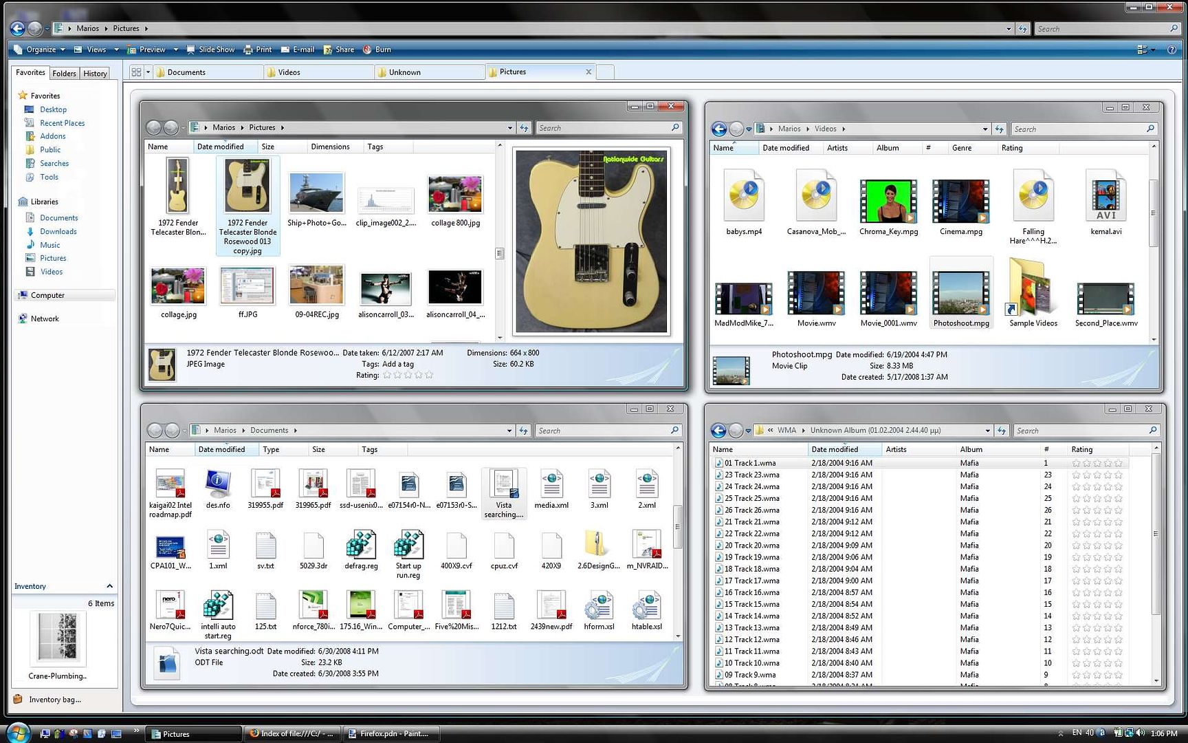
Windows Explorer using tabs ... A next Windows Explorer using tabs is a nice idea (one window fits all). Here is an example of a tabed Windows Explorer concept. The inventory is a place where we drop files and programs to create links, and the multi windows icon button releases or bounds the sub folders to the tabs.Anonymous
October 02, 2008
http://i237.photobucket.com/albums/ff89/mariosalice/WinExplorer.jpgAnonymous
October 02, 2008
For those of you who want a window switcher more like expose, that shows all your windows at once, you might want to try out Switcher: http://insentient.net/ It will show you all your windows, with live content. It also provides incremental filtering/searching of the windows based on their titles. It has many customization options too. It's really much better than Flip3d.Anonymous
October 02, 2008
I hate the way XP/Vista thinks I wish to rearrange my files when dragging from one window to another (copying or moving). If I have the Auto Arrange option on, icon repositioning should not be allowed.Anonymous
October 03, 2008
I just recently experienced an issue with window management that I think might be interesting for the team: I was on a forum typing a response to a post. This required me to do some calculations, so I opened up the calculator and made the first calculation. However when I clicked the maximized browser window to type in the result of my calculation the calculator of course disappeared behind it. When I wanted to do the second calculation I had to reactivate the calculator via the taskbar. After several calculations this became pretty annoying. A solution for this problem would be a checkable option in the right-click menu of a window to "stay on top". A more advanced version of this could divide the desktop into several overlapping layers. If a window exists on a layer higher then that of another window, it will stay above the other window no matter what the activated window is. I can see numerous situations in which this could be useful during multi-tasking.Anonymous
October 03, 2008
one word - expose. copy it.Anonymous
October 03, 2008
The comment has been removedAnonymous
October 03, 2008
@Domenico - I couldnt care less what longhorn did or did not do. Vista don't :) LCars - "I would like to see more APIs for developers to leverage the power of the window manager." Excactly. I want to be able to replicate compiz fusion in windows. My Desktop, My Way. If a linuxdude then wants to complain about it, he would have to do it to me and not ms.Anonymous
October 03, 2008
The comment has been removedAnonymous
October 03, 2008
I agree with mariosalice. I think that the tabs on explorer would be very useful. (very important: middle click on a favorite link of the left pane to open a new tab, and drag&drop beetween tabs). But I want also to show you a concept that I made some days ago. http://img523.imageshack.us/my.php?image=7conceptyp0.jpg Very useful for me.Anonymous
October 03, 2008
- My old Mac LC3 (OS v7) had a "fit to contents" button on the window pane. It would be useful for Windows applications that can determine their most economical size. As far as I know, this has never been implemented in a Windows OS.
- A few apps these days have options to display windows "always on top". For example, MS Communicator has this and some other apps as well. I've implemented this in my own applications, and think it would be great as a pushpin icon on the window pane (next to minimize). This would allow any user to make any window persistantly visible (or not).
Anonymous
October 03, 2008
Mark_ms and others have requested a convenient way to drag from a foreground window to another window that may be obscured or minimized. You might be interested in a feature that's been around since the task bar was introduced in Windows 95. While dragging, you can hover the mouse over a task bar button to bring the corresponding window to the foreground.Anonymous
October 03, 2008
@niklas borson: this specifically is not really useful when having grouped tasks in the taskbar - you have to wait until the grouped tasks show up and then you have to find the right one... really annoying... Flicking away Windows with a special gesture would be really helpful! Please give us also a window always on top function built into the context menu of a window. Also transparency settings for a window would be useful in many cases. As I said before - give use power users some useful choice that should not bother any novice user. @quillaja: Switcher is really nice (especially the search feature) but its lacking performance and is not that mature. Additionally I dont think I should need extra programs to comfortably switch between windows. Although I use Ultra Mon for getting a second taskbar. It also has handy buttons to span a window on different screens and to move a window instantly from one screen to another while scaling the frame to fit different screen sizes. This should also be in Windows directly, if you ask me...Anonymous
October 03, 2008
Niklas (and Mark_ms and others): There's also drag, Alt+Tab to other window, then drop. You can also do this with Ctrl+Tab in MDI apps and tabbed dialogs to get to a particular child window or tab. Unfortunately IE7 doesn't allow you to switch tabs using that same shortcut when you have something in mid drag.Anonymous
October 03, 2008
I don't know if anyone mentioned this, but I hope that if you're going to add new items to the standard system menu, that "Close" remain at the bottom of the menu. I and many users I know have developed the habit of right clicking on taskbar buttons and selecting close to close them. Then we run into windows like the console, MMC, or HTML help where other items are positioned below Close. I'd like to see these apps fixed so that close is always at the bottom (why does the MMC need help on the system menu anyways?), and perhaps this could be somehow enforced by Windows for all apps?Anonymous
October 03, 2008
GRiNSER said "this specifically is not really useful when having grouped tasks in the taskbar - you have to wait until the grouped tasks show up and then you have to find the right one... really annoying... Flicking away Windows with a special gesture would be really helpful!" The menu for grouped window show up instantly. The windows can't because then the first menu item you hit would pop open, so there's a delay. Maybe I'm misunderstanding your suggesstion, but with your gesture idea, you'd need to perform this gesture while holding onto an item (or do it as a two step process), and you'd have to root through a pile of windows looking for the one to drop on instead of scanning a nice orderly list like in the current solution. I don't see the advantage. Also, my Alt+Tab suggestion avoids the grouping problem as well.Anonymous
October 03, 2008
Niklas (MS): That's kind of where you guys are not getting it. The UI could be enhanced quite a bit to make it much easier to do things. It's not just about how easy it is but it's also about how smoothly the user transitions between common UI workflows and tasks. This is a bit like explaining the difference between a Ferrari and a Toyota to someone that has never driven a Ferrari though, so I don't know if it will ever happen.Anonymous
October 03, 2008
Please consider providing the following shortcuts for windows 7 - <windows-key>+x to maximize the current window <win>+n to minimize the current window <win>+t to tile the windows currently not minimized <win>+c to cascade the windows currently not minimized and may be <win>+s to save the current window state that will be used to open it the next time it's launched?Anonymous
October 03, 2008
Hello, I think a multi-desktop concept is pretty worth to think about and windows need to adopt it.Anonymous
October 03, 2008
The best way to minimize switching is to put more focus on MDI. The most switching is done to copy and move files around with Windows Explorer. I use QTTabBar (excellent software, you guys could buy them) to turn Explorer into a tabbed interface. I think the Windows team could implement this much better. On another note, the Office team should really consider tabs or some other MDI for their applications.. they're the main reason taskbar grouping was invented. If we didn't have to manage so many Office document windows at a time in the course of work, this post might not have been as necessary. I have one more thing to say about managing windows and the whole issue of focus and being on top: sometimes transparency can really help, if applied correctly.Anonymous
October 03, 2008
@Triple, @aaronsteers, @GRiNSER, @ddahlstrom et al. Windowspace 1.01 adds "Always On Top" to every windows's control menu. It also has snap to grid plus other sizing/movement facilities. I find the keyboard shortcuts to move windows are particularly useful. Works in 2000, XP and Vista. http://www.ntwind.com/software/windowspace.htmlAnonymous
October 03, 2008
The comment has been removedAnonymous
October 03, 2008
I would like to see a feature where you can snap two window together and the copy/move files between. This Ctrl+C, ALT+Tab, CTRL+V is five key presses more than comfortable. In this "dual" mode a Ctrl+C (or F5) would copy the file(s) to the target window. In general you have to reduce the key presses and clicks. Also I would like to see a "mass rename" tool. Try to rename 40000 files with sequential serial numbers and pre-, post-fixes. Also a nice compare and directory synchronization feature would be nice. File aliases too.Anonymous
October 03, 2008
I'd like to see an alterante/advanced version of "show desktop". Instead of minimizing all windows, it would be great if all windows became 90% transparent and inactive (i.e. I can select icons on the desktop through the transparent windows). As soon as I drag a file and I pass over a window, this window should become active so I can drop the file. For me this would be the best solution to the desktop switching problem.Anonymous
October 04, 2008
The comment has been removedAnonymous
October 04, 2008
With respect to using the taskbar, I would have to agree that whenever I use multiple monitors I can't be bothered with the taskbar. In fact, I probably wouldn't mind a single sidebar with all my icons and widgets that would run in the taskbar on one monitor, with a clean look everywhere else.Anonymous
October 04, 2008
Please, please, please, document whatever interface you come up with. It's great to have documentation for all the visual style API's but developers need to know how the controls are composed. This is a great example: http://shellrevealed.com/photos/blog_images/images/4538/original.aspxAnonymous
October 04, 2008
>.> The main comment was not to be deleted... Posting it again. I'm somewhat disappointed when I realized there was nothing about the more advanced caption bar features which have appeared in many other OSes: most notably I was looking for transparency and stay-on-top features. Also, there was nothing about rearranging the caption bu770ns. These are some of the features I would REALLY like to see in Windows 7. Though even if adding them may seem like copying the other OSes, they still are pretty useful features. I know there are third-party applications to achieve these things, but they tend to slow the system down while running in the background. The new caption bu770ns could not be taken into use without first implementing the possibility of rearranging, hiding and displaying caption bu770ns. Some users (for example Linux users) may prefer to have one or more of the three default bu770ns on the left side of the title bar. I'd use this because of I like having the task bar on the top of the screen and therefore all the tray icon pop-ups appear on the top of the caption bu770ns of maximized windows (which I use often) - and I have first to close them. That makes one more, virtually useless click. Also, this feature, as already said, could make it possible to have even more caption bar bu770ns. Of course, you should make it that by default everything looked like the same it looked like in Vista, so you wouldn't scare off the more inexperienced users. Stay-on-top feature could really make it easier to use multiple windows at the same time. You had less trouble thinking which window goes to the top and when. Another thing, especially combined with Stay-on-top is the complete transparency of the whole window. Whether you needed to see a glimpse of a window behind that maximized window or you just wanted to make a window shine through, this feature could be handy. The new aspects you brought on the table (for example just maximizing the window height) could as well really make use of customizable caption bars - just make the common ones visible by default and more advanced ones available through customization. I actually think the worst aspect of Windows is at the moment the level of customization features and the number of power-user tools. Why to allow only Microsoft-made themes? I've patched my uxtheme.dll with VistaGlazz and randomly use a fan-made Metal Luna theme (I tried to find an authentic blue Luna but didn't find) - I think you should really think in a more open way. bu770ns should be possible to be dragged around and reordered anywhere as well as any text field etc. - but in most cases they are not. Also, while Vista was in many ways user-friendlier than XP or earlier systems, it removed or made many good features worse, and I'm going to shortly say my opinion about a few of them. Where is my "Go up one level" button? I know that you can click the name of the previous folder on the navigation bar, but especially with long folder names I have to open the menu which contains the higher-level folders. This is very irritating at times. Why is this defragment program like this? No progress bar, no anything! When it comes to tools like this, people actually WANT to see how long the process has taken and preferably an estimate of how much they still possibly have to wait after they've finished with anything else and are going to shut the computer down as soon as that defragment tool finishes. Why there is no tool to monitor the network activity? I know there is a kind in the MMC but in my opinion that's quite hard to find, and even if you happen to find it, it's still clumsy and in my opinion not very usable. There are dozens of other "incomplete" or missing features I'd find useful as well. You probably can name a few too yourself. Please think a second time and ponder if you could in one way or another add these features into your OS. I've been always using Windows - Win95 was the first one we had, now I have Vista Home Premium - and while I am quite a MS fanboy, I've began using Linux too, though at least now I use it quite seldom. Please let your OS evolve so people like me would not have to leave Windows in the future because of its stalling with old, stub and worn-out feature setups. Any response to this message is appreciated. If there are any grammar errors, they are most probably because of English is not my native language - please do not mind them. Yours, UltimateSephirothAnonymous
October 04, 2008
The comment has been removedAnonymous
October 05, 2008
The comment has been removedAnonymous
October 05, 2008
The comment has been removedAnonymous
October 05, 2008
Hi there. I'm not commenting on the specific post, but since it's UI related I'm using the opportunity to bring attention to a site called Windows Aero Taskforce. It's a very well made site that allows people to post UI annoyances and rate them. Now, a lot of them might not make much sense, some might be to difficult to implemente, nevertheless, I think there are a lot of excellent suggestions for Microsoft to consider for Windows 7. Check it out at: http://www.aerotaskforce.com/Anonymous
October 05, 2008
What I really want to see is, that MDI child windows has also a glass frame. I'm a developer and my app is using MDI windows and on Vista the child windows looking really ugly. There is also a display bug on Vista when child windows are maximized and there is no side panel in the MDI parent window. And please make the non Aero look in Windows 7 nicer. Aero looks really great, but the basic color theme is terrible (e.g. when an old app disables Aero or used in MDI child windows). And my last feedback is regarding toolbars. The toolbar color in Vista (used for example by Firefox's Vista theme by default) is not really nice. The colorful Explorer toolbars are great in Vista, btw! And please don't remove the icons from these toolbars like seen in the Live Wave 3 software tools. I don't want to read each button, I want to look at the symbol.Anonymous
October 05, 2008
The comment has been removedAnonymous
October 05, 2008
The comment has been removedAnonymous
October 05, 2008
Some of the data might be a result of working with the current implementations though rather than the desired way of working. I always found the cascading / tiling options to work the wrong way round mentally: you have to open the windows and then tile them, however mentally you decide to tile something then worry about the windows involved. So it would make sense perhaps to rework around that notion. Also in vista it's possible to select two tasks from the task bar, but when i then decide to show side by side or stack them then my selected tasks are not used but the current open windows. As a power user, another issue i'm constantly fighting with is keeping an overview of / managing more than 10 or so windows. It takes progressively more time than I'd like to find the right button to click on, and the taskbar is only useful when docked to the side in this scenario, otherwise space runs out. Rather than virtual desktops I think windows should be grouped by task and then one should be able to cycle through all windows belonging to one task. Some real time strategy games do a good job of organizing many similar objects. Imagine you are working on an administration task, a programming task and a web research task. It would work so much better if you could switch to the web research task (minimizing and grouping the other tasks) then alternate between several windows in that task, doing work until you're ready to switch back. Hopefully you'll read my suggestions.Anonymous
October 06, 2008
Some really nice features that I enjoyed using in RISCOS OS 3.x and have sorely missed on Windows:
- moving/resizing windows without changing the z-order of windows
- obtaining window focus without changing the window z-order
- right-click on scrollbar to get 2D panning
- right-click on scrollbar arrow to reverse scroll direction Although I imagine these "features" will be right down the list and left to the third party packages. Time for the GUI to be built on WPF?
- Anonymous
October 06, 2008
bpaddock said "I don't understand how you consider focus-stealing to be a "security" bug." I don't understand how someone would not see unintentional dialog confirmations as a security bug. You seem to not believe that it even occurs which completely blows my mind because before I switched to Mac OS X, I experienced it 100's of times a day. Here's a repro:
- Use Windows Live Mail for RSS feed reading
- Click a feed to read it in your browser
- Browser launches, but you want to queue up lots of tabs of RSS-links to read, so you click back immediately to WLMd.
- Oops! IE suddenly appears in front of WLMd, which you just clicked to give it full foreground and focus. At this point, IE is displaying nothing, I don't think it would even have the title bar up implying that this focus theft is before the html is even downloaded.
- Well, that's annoying so you click on WLMd again to give it focus. Moments later, IE steals focus from the application that I'm using again all for one page. So, twice for every single RSS feed item clicked, IE takes focus from the application that I am currently using. Now, go try Mac OS X with Firefox and NetNewWire (NNW). Set the NNW option to open links in the background. Perfection! Firefox doesn't block my use of NNW. Again, any application can do this. Once a week while using Windows Vista, I would accept a prompt or dismiss a dialog inadvertently due to this issue. I have no way of knowing what was happening, not even the application. I could be argued down to this not being a full data-loss bug, but even as a full power-user Windows Vista was not Trustworthy due to these mysteries.
Anonymous
October 06, 2008
Royal theme from Windows XP should be included in Windows 7 as many including me miss it in vista.Anonymous
October 06, 2008
Why not let there be an invisible grid, a lot like Visio, that windows will automatically snap to when resizing them? This would allow you to easily resize windows so they align with each other or the edge of the monitor without having to introduce any new features/functions to existing users. You should be able to disable "Snap To Grid" and fine tune the dimensions of the grid to whatever you desire but I think this would solve most of the problems with resizing, snapping to the edge of the screen, etc.Anonymous
October 06, 2008
Windows should have the Royal theme like the following: http://psycob.deviantart.com/art/Royale-for-Vista-Basic-67469153. To me the Royal theme give me the present feeling that Aero never give me.Anonymous
October 06, 2008
Window Title and Icon should be shown in Windows Explorer which is shown in this image: http://img407.imageshack.us/my.php?image=titleexplorerch4.jpgAnonymous
October 06, 2008
I really really like all the "upgrades" you're taking into consideration to get even better our windows experience. So,i really love the whole Windows Aero look and feel,and as I understood you're going to keep it and even get it better for Windows 7. This is great in my opinion,it's such a great interface. As i've seen in the screens of Windows 7 milestone 3 (i know it's still a milestone and that final version is gonna be a lot better or different),i really like the different touches you gave to Aero Glass,and I also appreciate the fact that windows keep trasparencies if maximised. Another thing i would love to see in Windows 7 is a better animation when opening windows ect. The one in Windows Vista may give a feel of slow,i don't know how to explain,not much responsiveness with the rest of the menus and toolbar (even though it's fast). I'd really love to see Aero improved,even faster. I know that performance is one of the key words for Windows 7,everything is gonna be less-cpu dipendent,more powerful and faster. Keep up the good work Microsoft :) and don't revamp totally Windows' Gui,improve Aero and other elements. Thank you for givin' us the opportunity to suggest you stuff. Bye and can't wait to see Windows 7 (PDC is coming,among other things)Anonymous
October 06, 2008
One thing I've always wanted to see within Windows is the support of user-created visual styles and support of the Windows customization community from Microsoft. Where in Windows XP it was easy enough to place in a modified uxtheme.dll file to allow for custom visual styles to be used, Vista's raised security against modification made it rather frustratingly difficult to do the same. In example of what I mean, here is a promo screen of a visual style I have been using with my instances of Windows XP called Concave VS, done by the talented George Harrison. http://i38.tinypic.com/34g4ilt.jpgAnonymous
October 06, 2008
The comment has been removedAnonymous
October 07, 2008
@raz0rskyl1n3: I suggest that the Win key is the obvious mod key to use for window dragging. Hold Win, click anywhere within a window or a window's decoration, drag to move. Alt is 'traditional' but may interfere with many things. Other than that I concur, this is another useful feature which could be harmlessly (IMO) added to Windows.Anonymous
October 07, 2008
One of a few features, which frustrates me a lot is the free use of setForegroundWindow API... I hate when a window steals a focus, while writing... I have tried the TweakUI from "PowerToys for WindowsXP", but it did not work... Obviously this should be fixed, but I can see a more intelligent solution, where I would define this rule (do not steal focus) on an application bases (or window title). Thanks, PeterAnonymous
October 07, 2008
The comment has been removedAnonymous
October 07, 2008
A simple start menu and task bar for each monitor would be awesome. It would allow you to open up apps for that monitor only and having the task bar on that monitor would allow you to know what is on that monitor. Also would be cool if you could add two mice to the system and lock mouse 1 to monitor one and mouse two to monitor two and so on. Also if you are in a window it would be nice to have a send to monitor button.Anonymous
October 07, 2008
One more thing. If you could right click on a icon and there was a option that would let you choose which monitor to go to would be nice also.Anonymous
October 08, 2008
After surviving the beta's of Vista I have learned one thing. You need choice, not everyone wants the same flavor, Vista is the same flavor, no choice. Ribbons are fine if you like them, many people don't. Again give us a choice, allow more easily customizations to the UI. There are many companies out there who are willing to sell add on products to allow users to customize the UI to suite their needs. Microsoft failed to do this in Vista, they are still failing to do this in the IE 8 beta, If you go over to the blogs of IE8 there is no mention or even discussion on the UI, it is locked in, it is what it is, and that is a mistake. That's my only hope for the UI, allow users a choice, if we want to use an xp style UI so be it that is our choice, if want to use a vista style, or a ribbon, or want tab's in explorer, we should have a choice. Do I believe Microsoft will do this, No I believe it will be the same walls they put up in Vista, and they continue to put up the same wall in the IE 8 beta, It will be this is the way you will do it and you don't have a choice. That is why I like your new advertisement, "Life with out walls" I just would like to see Microsoft walk the talk. If anything your do to many six sigma projects and over annualized the UI. Just leave the UI open enough to allow other companies to give your customers the CHOICE they should have...Anonymous
October 08, 2008
How about this:
- Multiple virtual desktops
- Dragging a window to the edge of your monitor would automatically cause you to scroll to the parallel virtual desktop, allowing you to simulate multiple monitors (sort of) with a single monitor and manage your applications per virtual desktop via drag-n-drop.
- Dedicated task bar for each virtual desktop
- "Snap to Grid" style feature allowing window dimensions to automatically snap to the edge of the monitor and to an invisible grid (similiar to Visio) for easy Window resizing.
Anonymous
October 08, 2008
No one mentioning having to have a Window in focus to interact with it using the mouse wheel? It's not exactly window-management but I like being able to scroll with my mouse wheel on inactive windows, Ubuntu does this and I think it works very well. It makes things like the file tree (in navigation) much more usable.Anonymous
October 09, 2008
Exposé is a good approach, the argument than when the number of windows increase is not valid because the medium user open 6 windows at same time and with this quantity expose works well, very more useful than flip 3DAnonymous
October 11, 2008
Some windows need to be big and some need to be small. Example: a window for the Calculator app never needs to be full screen. It might need re-scaling to be readable, but thats all. Arguably, its better to have them as a gadget in the Sidebar rather than a full-blown app. This applies to lots of utilities and applets or monitoring functions. My biggest problem is working with apps like Excel and Powerpoint. Many times, I want to be working on one document while referring to another. Its almost impossible to do. If you've got multiple Powerpoint windows open at the same time, trying to switch between them is a nightmare. I think the answer has to be with a configurable 'dock'. In this case, you setup how many docking locations you want and their layout, and how many active locations you want and their layout. For instance, 2 tiled vertically or horizontally as active, and the others in a ribbon say on the right side as smaller windows/rectangles, still large enough to view the content of the window but not able to interact with it. To activate or deactivate, either click & drag the smaller window docked to the larger active window (which puts the currently active window in place in the dock) or click the active window and somehow select which smaller window you want. The current tab concept for example in IE forces you to switch from one full screen to another full screen and back again, so you can't see both at the same time. I think users want to control the layout, and its hard to do. I also think users get frustrated with z-order. If you think about a messy desk, the most annoying thing is having to locate your document, which you know is there somewhere, within the z-order. Follow that analogy. Typically, you start at the top and then have to lift and look, re-select the next layer, lift again. Transparency doesn't actually help. Example: the old film based slides you used to use with a projector. Find the one you want in a stack of those transparencies, its impossible. At work, I'll have an enterprise app (possibly multiple windows/sessions) like SAP, a Word or Powerpoint doc, and Excel doc (or several) and my email client open all at the same time. Thats typically a LOT more than 6 windows.Anonymous
October 11, 2008
One feature that would be awesome is alt-tab with intellisense. This means you hit alt tab, start typing FI and then all programs except FIrefox, FIlezilla etc... is automaticly filtered away. Look at quicksilver for OSX and you'll get the idea.Anonymous
October 12, 2008
The comment has been removedAnonymous
October 12, 2008
one more thing, Since your cleaning up the UI in windows 7, please keep in mind not to make it to clean to the point where everything seems washed out. Windows live mail beta is a fine example of a washed out UI. so please take my last comment in to consideration. We need more customazation in explorer, that includes being able to change the color so it wont be all washed out.Anonymous
October 12, 2008
Hi, I liked the article. Just to give you some ideas of my workflow: I often use my fav 2 programs side to side: Left, Firefox, Right Skype, chatting with friends. So, lets just do one step with windows xp: Try, to put Firefox, using 3/4 of the space, and skype 1/4 with at least effort as possible? Thats a hassle! Well, you can click the 2 taskbar buttons with CTRL, and let windows display them side to side. But in most cases, that wont work. Skype is somewhere, FF is somewhere overlapping skype, and so on.. Like me too, I own a 22" with lots of space. Most time, I don't have more than 2 or 3 apps on top. Also a Nice way would be to have a bar between 2 programs, so that you just would have to press on bar to resize two windows. Just imagine the example with FF/Skype, having to touch 2 apps. And the next one: Like you mentioned: Most apps miss a "reading layout". You really dont want to surf with a 22" and 1680x1050 Browsing Window.Anonymous
October 12, 2008
The more photo shots I see of Windows 7 the more I realize, Windows 7 is just Vista warmed over, again no choice, it's Microsoft way or nothing. The Tool bar, ADDRESS BAR, Menu bar, Icon Bar need to all be customizable. Someone anyone explain to me why do won't you allow customizations to the ADDRESS BAR? Microsoft you started this in the beta's of Vista and IE 7 and you will not give in on this! WHY? Why is it forbidden to change the address bar? The address bar is a huge WALL THAT MICROSOFT KEEPS ON PUTTING UP. It's in Vista, it's in IE 7, it's in IE 8, and now it looks as it is the same Windows 7, and again WHY? In closing, I defy anyone from Microsoft to answer WHY THE ADDRESS BAR IS FORBIDDEN TO BE MOVED OR CHANGED? I know in IE 8 you can make the search bar bigger, wow! I want to be able to completely customize the ADDRESS BAR as I could in pre Vista incarnations of Windows, again how is that wrong? Microsoft STOP PUTTING UP WALLS......Anonymous
October 13, 2008
I agree with eghost, but remember this is still in development so things could change. I also want more control over how I use my computer. Microsoft thinks its cool for them to lock everything down and have no customzation whats so ever, if you dont want another vista then change your attatude and listen to us customers microsoft.Anonymous
October 13, 2008
I agree with divinglog. Child windows in MDI applications look so sick (Vista basic theme) when Aero is enabled. Make the child windows use Aero too. Make windows 7 themes use sleeker interface rather than that sick Vista basic themeAnonymous
October 15, 2008
I think I posted a comment about this in the wrong place! When using multiple screens (in extend my desktop across both screens mode) I would like to see a display option to extend the taskbar across all screens. Also with this set up it would be good if the taskbar tabs for programs are on the screen in which they are open (if that makes sense!). ie I have Word open in my left hand screen so the taskbar tab for that is on my left hand screen in the usual place but I also have Outlook open on my right hand screen so the taskbar tab for that one is in the extended taskbar on the right hand screen, rather than in the lefthand screen. I think this would be quite intuative.Anonymous
October 15, 2008
further to my post just above. One major annoyance in Vista for me is the amount of clutter in Windows Explorer ie a lot of screen space is taken up by menus and dead space ie huge icons, wide empty borders. It would be very nice to have a minimal look for a change. If you're working on a laptop say 1280x800 screen (which is fairly standard) you loose a lot of vertical working space very quickly.Anonymous
October 18, 2008
I seriously don't like that way windows lose transparency when maximized. I have resorted to manually maximizing my apps within a margin of 10 pixel from each side so that they don't lose transparency and I also get the shadow around the edges. There should be a policy to enable/disable the currently enforced behavior.Anonymous
October 25, 2008
Just please, Please PUHLEESE remember the reason many (most) end-users are buying Macs today. It looks cool, it feels DIFFERENT, and this implies innovation. Please fols, give us something that feels 2010 and not something that looks like just another version of Windows. Otherwise, prepare to feel the wrath of Apple, Google, IBM, and everyone else looking to replace the tired old desktop. Windows is smart, powerful, and has amazing features ofr the IT Pro and Developer....but this does nothing for the end-user or the father who is looking to buy a new laptop for his son, daughter, mother etc. Please give this market a simple, intuitive, and FAST interface that shows that Microsoft can innovate.Anonymous
October 26, 2008
The comment has been removedAnonymous
November 05, 2008
The comment has been removedAnonymous
November 14, 2008
PLEASE! Make it possible to minimize the windows volume mixer again!Anonymous
December 26, 2008
Hey, i don't like the idea of current window dominating the others. if we have to write something off from another window to word document, for example, i have to resize both of them. what is much easier is that i maximise the word document and type into it. plus, the other window i'm writing off from can have an 'always on top' option in the context menu of title bar alongwith close, maximise etc. it can make our time consumption very less and provide more space for me to write on. also, i don't exactly know if such an option exists in windows, but if it is buried inside somewhere, please make it visible!Anonymous
December 26, 2008
Also, i would like to have control how much we want to maximise our window. we can have an option which shows us how much our window will gain space after we maximise it. And we can change it, make it somewhat more or less according to our needs. it'll enable users to have an area upto which the window will maximise and still have some space around to see, for example, gadgets that one, otherwise, can't see.Anonymous
January 07, 2009
I would like to be able to customize the glass color per application. Besides fun and aesthetics, this would be a great way to distinguish windows.Anonymous
January 19, 2009
I would like to be able to designate a default width for 'maximize' and then have a button to override this that would use the full width of the screen. I would use the 'ultramax' for wide spreadsheets but nothing else.Anonymous
April 27, 2009
I would like to see the right pane of the startmenu drag and dropable so you can customise the order in which the menu items are displayed.Anonymous
August 15, 2009
I always found the cascading / tiling options to work the wrong way round mentally: you have to open the windows and then tile them, however mentally you decide to tile something then worry about the windows involved. So it would make sense perhaps to rework around that notion. Also in vista it's possible to select two tasks from the task bar, but when i then decide to show side by side or stack them then my selected tasks are not used but the current open windows. As a power user, another issue i'm constantly fighting with is keeping an overview of / managing more than 10 or so windows. It takes progressively more time than I'd like to find the right button to click on, and the taskbar is only useful when docked to the side in this scenario, otherwise space runs out. Rather than virtual desktops I think windows should be grouped by task and then one should be able to cycle through all windows belonging to one task. Some real time strategy games do a good job of organizing many similar objects.