Fluent Design on Ribbon-like Pivot
Following up the article on Office Ribbon: Styling the Pivot Control, there were some remaining visual effects that I kept thinking on how to implement to have a more closer experience to the one found on Word Mobile.
The light effect that appeared on nearby tab’s borders while hovering a tab was possible using a technique called Reveal from the Fluent Design System, one of the new features of Windows 10 Fall Creators Update, which is about using light to guide user interaction into target areas of the app.
Some controls have this functionality baked into them but disabled by default as these visual effects are GPU intensive tasks that if used improperly or in too many controls could compromise the performance of your app altogether.
As many visual aspects this is achieved using styles paired with visual state changes. Another technique introduced by Fluent Design is Acrylic which define a new Brush named AcrylicBrush which allows different levels of transparency for app elements within the app and with other apps or objects behind its window.
The visual effects for Reveal combine a set of Brushes for Background, Foreground, and Border applied to the target element.
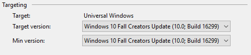
Image 1 Project Target build.
Brushes
To be able to consume this feature we change the target values of the project to Fall Creators Update build in both values for build targets, this will make all the new types available to our code. There are ways to set up the code so that it checks for different build versions so that users in older builds can still run the app without the extra juice, but that is a topic for another post, so bear in mind that for this to work in your machine you need to have the Fall Creators Update and its SDK installed.
We begin defining two AcrylicBrush instances around the colors used in the TitleBar and the PivotHeaderItem. Then we create StaticResource references to replace the values that were already used by the app.
 <AcrylicBrush x:Key="TitleBarAcrylicWindowBrush"
              BackgroundSource="HostBackdrop"
              TintColor="{StaticResource TitleBarBackgroundColor}"
              TintOpacity="0.7"
              FallbackColor="{StaticResource TitleBarBackgroundColor}" />

<StaticResource x:Key="TitleBarBackgroundColorBrush"
                ResourceKey="TitleBarAcrylicWindowBrush" />
 <AcrylicBrush x:Key="PivotHeaderItemAcrylicWindowBrush"
              BackgroundSource="HostBackdrop"
              TintColor="{StaticResource PivotHeaderBackgroundColor}"
              TintOpacity="0.7"
              FallbackColor="{StaticResource PivotHeaderBackgroundColor}" />

<StaticResource x:Key="PivotHeaderBackgroundColorBrush"
                ResourceKey="PivotHeaderItemAcrylicWindowBrush" />
If you read the previous article you might remember that we overrode a series of StaticResource references inside the ThemeDictionary to impact or affect those values inside the styles for Pivot, PivotItem and PivotHeaderItem. Pay closer attention to the later ones, they have combinations of states and actions to support the different VisualStates observed in the control’s behavior. To suit our new needs, we are going to rearchitect those references for PivotHeaderItem which is the area where we will be applying the Reveal effect.
note: I am not paying extra attention and create the corresponding style values for the HighContrast and Light themes as you properly should for a real application, but this will clutter the code a bit and cause us to lose the focus on the concepts that are being pointed out in the articles.
The new changes organize the states and actions into three groups: Background, Foreground, and BorderBrush with the corresponding states of Selected and Unselected. Although the “unselected” is not part of the name for the resources anymore.
You can refer to the source code on GitHub to observe these changes as they represent a big chunk of code to include it in here.
Style Changes
Once all the colors and brushes are in place with the corresponding reference names for StaticResources we proceed to make modification inside the styles defined for the controls. Most of the changes were to the style for PivotHeaderItem, but a few improvements were given to the other styles as well that are worth mentioning. For the Pivot style, the Background property of the elements named LeftHeaderPresenter and RightHeaderPresenter is now pointing to a ThemeResource instead of a StaticResource, although the result is visually the same. Why this change? It is better for styles to have dependencies on values defined at a Theme-level, so they can adapt properly making the apps theme-aware. Another changed is around the ItemsPresenter named PivotItemPresenter, this element has been wrapped in a Grid, so we can apply the properties of Background, BorderBrush and BortherThickness to the whole row. And the same values were removed from the root Grid on the PivotItem’s style ControlTemplate.
 <Grid Grid.Row="1" Grid.ColumnSpan="3"
      Background="{ThemeResource PivotItemBackgroundColorBrush}"
      BorderBrush="LightGray"
      BorderThickness="0,0,0,1">
  <ItemsPresenter x:Name="PivotItemPresenter">
    <ItemsPresenter.RenderTransform>
      <TransformGroup>
        <TranslateTransform x:Name="ItemsPresenterTranslateTransform" />
        <CompositeTransform x:Name="ItemsPresenterCompositeTransform" />
      </TransformGroup>
    </ItemsPresenter.RenderTransform>
  </ItemsPresenter>
</Grid>
In the PivotHeaderItem style the changes made were on three areas as shown in the following code fragments, first to the Style setter properties some were modified, and others added.
 <Setter Property="Background" Value="{ThemeResource PivotHeaderItemBackground}" />
<Setter Property="Foreground" Value="{ThemeResource PivotHeaderItemForeground}" />
<Setter Property="BorderBrush" Value="{ThemeResource PivotHeaderItemBorderBrush}" />
<Setter Property="BorderThickness" Value="{StaticResource PivotHeaderItemBorderThickness}" />
<Setter Property="Padding" Value="{ThemeResource PivotHeaderItemMargin}" />
<Setter Property="UseSystemFocusVisuals" Value="True" />
<Setter Property="Height" Value="32" />
Then some additional properties set on the Grid root for the ControlTemplate.
 <Grid x:Name="Grid"
      Background="{TemplateBinding Background}"
      Padding="{TemplateBinding Padding}"
      BorderBrush="{TemplateBinding BorderBrush}"
      BorderThickness="{TemplateBinding BorderThickness}"
      CornerRadius="{ThemeResource PivotHeaderItemCornerRadius}"
      Control.IsTemplateFocusTarget="True">
And as the core for the Reveal effect, the changes happened inside the VisualState elements for most of states in the controls behavior. As this code change is too big to post in here, I present one of them to illustrate the changes while the others are significantly similar with its corresponding resource value reference.
 <VisualState x:Name="UnselectedPointerOver">
  <VisualState.Setters>
    <Setter Target="Grid.(RevealBrush.State)" Value="PointerOver" />
    <Setter Target="Grid.Background"
            Value="{ThemeResource PivotHeaderItemBackgroundPointerOver}" />
    <Setter Target="Grid.BorderBrush"
            Value="{ThemeResource PivotHeaderItemBorderBrushPointerOver}" />
    <Setter Target="ContentPresenter.Foreground"
            Value="{ThemeResource PivotHeaderItemForegroundPointerOver}" />
  </VisualState.Setters>
</VisualState>
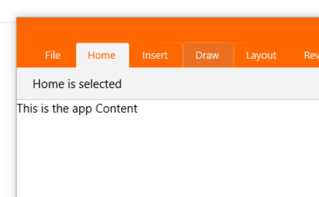
Image 2 Final result.
With these changes the goal of applying Fluent Design to the app is completed. Remember to review the complete project source code on GitHub as some small details were not mentioned in this post. And in case things don’t work as expected let me know in the comments.