Back means back. Not forwards, not sideways, but back
Windows Phone Mango introduces a lot of great new features for developers: alarms & reminders, pinned secondary tiles, deep-linked toasts, and AppConnect to name just a few. One thing that Mango hasn’t changed, however, is the overall navigation structure of Windows Phone’s “Metro” design and the purpose of the hardware back button. I’ve previously blogged about the concept of places and the tyranny of exit buttons, but with the changes in Mango I wanted to provide a refresher and also update with some new guidance for the new scenarios.
You may find this post quite repetitive. That is deliberate; I really want to illustrate the fundamental concepts on the phone, to show the patterns already established by the built-in experiences, and to drive home the need for consistency in marketplace applications in order to maintain a high degree of user satisfaction.
The most critical point to remember is that “back means back” – it is used throughout the phone to do one of two things:
- Dismiss transient UI such as alert dialogs, popup menus, pick lists, driving directions, and the SIP
- Return to the previous page (place)
(The astute reader might note that a long-press of the back button is also used to bring up the task switching UI, which is a variation on returning to a previous place. It's also used in games to bring up a 'pause' menu, but games are always the exception that prove the rule).
The back button is never used to move forwards to a new page.
The back button is never used to substantially change the content of the current page.
This principle has not changed in Mango. It has not changed with alarms & reminders. It has not changed with secondary tiles or deep-linked toasts. It has not changed with AppConnect. It has not changed at all.
Follow our lead
Let’s look at some examples of built-in phone features and how they relate to the new Mango APIs.
Reminders
If you have an appointment in the built-in Windows Phone calendar and it is set to show a reminder, the phone will popup a reminder at the appropriate time. Tapping on the text of the reminder takes you into that appointment, as you would expect. From that appointment, hitting the Back button takes you back to whatever you were doing before.
It does not take you to the calendar view. It takes you back to what you were doing.
Reminders from marketplace applications should behave exactly the same way. Tapping on the text of the reminder should deep-link into the application to show detailed information, and the Back key should always exit the application and return the user to what they were doing.
Secondary Tiles
Many of the built-in applications allow you to pin secondary tiles. The People hub lets you pin individual people or groups; Zune lets you pin albums, playlists, and artists; maps lets you pin locations; and so on. When you tap on the pinned item, it takes you directly to the contact, album, location, etc. and when you hit the Back button you return to the Start menu.
It does not take you to the main hub or application. It takes you back to the Start menu.
Pinned secondary tiles for marketplace applications should behave exactly the same way. Tapping on a tile should deep-link directly into the content that the user pinned, and the Back key should always exit the application and return to Start.
Toasts
The built-in messaging application shows toasts when you receive an IM or SMS. Tapping on the toast takes you to the appropriate conversation where you can read and optionally reply. From the conversation, hitting the Back button takes you back to whatever you were doing before.
It does not take you to the all-conversations list. It takes you back to what you were doing.
Toasts for marketplace applications - whether they come from Push notifications or from background agents – should behave exactly the same way. Tapping on a toast should deep-link directly to the appropriate application context, and the Back key should always exit the application and return to what the user was previously doing.
App-to-app links
There’s no direct analog of AppConnect for built-in experiences, but there are cases where one application will link to another, such as when you receive an e-mail with an attached Office document or picture – opening the attachment launches the associated application to display the content. From that application, hitting the Back button takes you back to the original application (in this example, e-mail).
It does not take you to the Office hub or the Pictures hub. It takes you back to what you were doing
AppConnect-enabled applications should behave the same way. If the user searches for a movie in Bing and taps on one of the AppConnect results, that application should show content specific to the movie (show times, reviews, streaming options, etc.). Hitting the back key from that page should exit the application and return to the Bing results.
Allowing further exploration
The previous section discussed how the built-in experiences deal with the back button to enable users to quickly “glance and go” at information and then easily and consistently return to their previous activity with the Back button. But what if the user doesn’t want to return to their previous activity? What if they want to stay within the application and continue exploring or using other features?
Using the built-in experiences again as an example, if you pin a group to Start, after tapping on it you can take additional actions such as viewing an individual person’s profile, sending them an e-mail, browsing their pictures, and so on. No matter what other activities you perform, the sequence of pages the user sees as they hit the Back key is predictable and eventually lands them back at the Start menu without any surprises.
Marketplace applications can do exactly the same thing. If you deep-link into an item from any of the extension points mentioned above, it is fine for you to allow further actions to be taken from that point on. But these further explorations must be forward navigations, never backwards. You can use UI affordances such as hyperlinks, buttons, thumbnail images, or other entry points that the user will naturally perceive as forward navigations deeper into the application. And then when they are done and they want to return to what they were doing, they can use the Back button.
As noted above, none of the built-in applications provide a way to get from a deep-linked item back to its “container” hub or application. If you pin a group to Start and tap on it, Back takes you to Start, not to the People hub. In fact, there’s no way to navigate from a pinned group to the all-people list, even via forward navigation. All the actions you can take within the pinned group are scoped to the context of that particular group. The same is true of pinned Zune content (albums, artists, etc.) but pinned map locations are a little different since once you are viewing the map you are free to perform additional searches (note, however, that Back will always take you to the initial pinned location).
Simplifying applications and their navigation structure is a design pattern that we recommend all applications follow, regardless of their high-level design. Keeping the application structure simple and scoping down the actions the user can take avoids confusion and having the user go off “into the weeds.” Nevertheless, sometimes users really do want to move from a single deep-linked item to the full application experience. An example might be a shopping application where the user has both the main application tile and a “wish list” tile pinned to the Start menu. Tapping the main tile launches the application into its normal browse / search UX, but tapping on the wish list tile lands them directly at their wish list. From here, the user can quickly see the items on their wish list, dive into product details to review customer ratings and price comparisons, and perhaps delete items that are no longer desired. All this can be done using the techniques described above to facilitate seamless, consistent, in-and-out behaviour for the wish list. Tapping the tile launches the wish list, and hitting Back returns to Start. Tapping the tile and drilling into an item shows its details, hitting Back once returns you to the entire list, and hitting Back again returns you to Start.
But in this scenario there are some more complicated things the user might want to do though:
- Purchase the items in their wish-list by going through a checkout procedure
- Add new items to their wish list by browsing / searching the catalog
- Engage in free-form discovery, purchase a one-off item, create a new type of list, or perform other actions not directly related to the wish-list
Completing a task
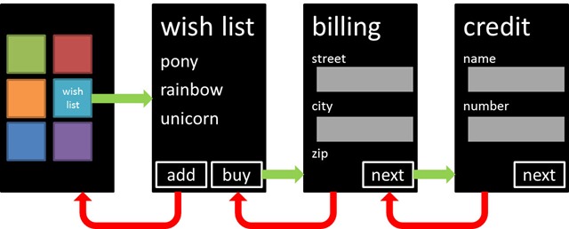
In the first case, the actions are still well-scoped to the original item that was pinned to Start. There might be an AppBar button, for example, that allows the user to purchase the items. The purchase experience may require several steps (especially if the user doesn’t already have a credit card or billing address on-file) and each of those steps might be implemented as a page in your application. While the user is performing the checkout operation, it makes sense for the Back button to return to the previous step. For example, if the user went from the wish list page to the billing address page to the credit card page, pressing Back would return them to the billing address page, then the wish list, then to Start.
Once the user has completed the entire transaction, it doesn’t make sense for the Back key to traverse the (now stale) sub-steps of the purchasing flow - they can’t change their address or credit card number, for example - so those ‘orphaned’ pages can be removed from the back stack. So if the user is presented with the confirmation page, pressing the Back button would return them to the (now empty) wish list, ready for them to add more items or return to Start by hitting Back again.
Constrained exploration related to a task
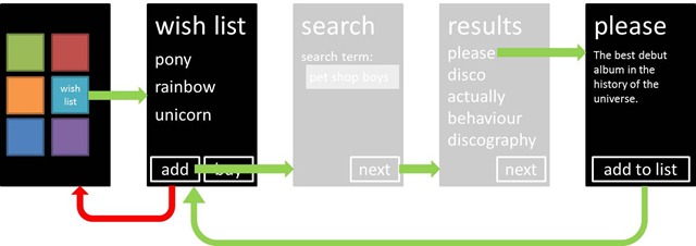
In the second case, where the user wants to add more things to their wish list, there are a couple of options you might take. The first is very similar to the above approach; instead of the billing / credit / done sequence, you might have a search / results / details sequence, where once the user reaches the details page and hits “add to wishlist” the application automatically navigates back to the (now longer) wishlist, clearing all the items in the process. In this case, Back would exit the application:
Another solution would be the same search / results / details sequence, but after the user hits “add to wishlist” the app merely shows a confirmation that the item has been added, leaving the user to return to the search results or search pane for further exploration:
Either of these approaches should be OK, since it is clear to the user that they have either completed a task (in the first case, similar to the purchase flow) or are still free to explore (in the second case). What’s important is that you don’t allow the user to go off “into the weeds” in such an experience so that they forget where they came from. For example, in the details page of the item above there are no options to find related items or to purchase it directly; the activity is well-scoped to just adding things to the list. (If this page was implemented using the same details page that was used for every-day browsing, you would dynamically remove these elements when in the context of the add-to-wishlist sequence). A concrete example here with a built-in experience is the photo viewer. If you launch the Photos hub and open up an image, the AppBar menu contains all sorts of commands to share, delete, save to favourites, and so on. But if you open a file attachment from an e-mail, there are only two options available to you: save and set as wallpaper. The user is prevented from getting too far off-track from their original task of reading e-mail.
Unconstrained exploration
In the third case, the user decides (for whatever reason) that they want to break out of the context for which they launched the application and just start using your application as if they had launched it from the primary tile. As noted above, none of the built-in applications provide such a feature, so you should think long and hard about whether it really makes sense for your application or whether it would do more harm than good. If you think it will be a common case that the user wants to transition from a deep-linked item (secondary tile, incoming toast, etc.) to an unrelated portion of the application, consider the possibility that you’re exposing the wrong types of things as deep links. Just because the feature is there, doesn’t mean you have to use it.
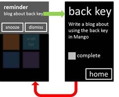
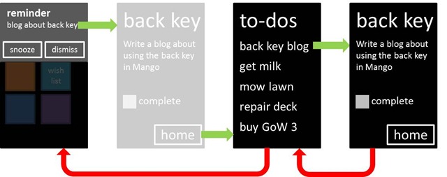
Nevertheless, there will be legitimate cases where the user wants to go from a deep-linked item into the broader context of the application. I gave one example of this in my Multitasking talk at MIX 11, where I demonstrated a simple “to-do” application that allows the user to remind themselves of things they need to do. In this instance, it is not unreasonable to expect that once the user is reminded to complete task A, they might want to see what tasks B, C, and D are in order to appropriately plan their execution. Note that the rules above about the behaviour of Back still apply. If the user taps on the reminder and sees the detailed page for the to-do item, pressing Back will exit the application and return them to what they were doing.
But if they want to see what other items are still left to do, the application provides them with an additional “home” command that essentially re-sets the application by navigating them to the home view and clearing the back stack.
In this case, pressing Back exits the application rather than taking them back to the original deep-linked item, which is indeed an exception to the rule that “back always goes back” but it is a very specific one for which we can add a third case:
- If the user explicitly navigates “home” (using some clear and obvious UI affordance) then the back stack is cleared and Back immediately exits the application
Do what’s right for the user
All of this guidance really boils down to one simple thing, which is letting the user interact with your application in a manner that is most natural for them. To a lesser degree, it’s about respecting your users and trusting them to make the right decisions as they navigate your application and the phone in general. If they popped in to the app to quickly check up on something, the most obvious and consistent mechanism for them to get out again is to hit Back. If they want to drill in deeper, the most obvious and consistent mechanism for them to do that is through forward navigation.
Windows Phone has a different overall user experience than iOS or Android or Symbian or BlackBerry (or any other OS for that matter). The way a user interacts with your application on another platform may not translate well to how they would interact with your application on Windows Phone. And whilst it might seem logical to say “users who move from other OSes to Windows Phone will be confused if apps work differently”, remember that the vast majority of smart phone purchases in the future will come not from people switching from one OS to another, but from people who have never owned a smartphone before and, in many cases, have never owned a PC before either. These are your future customers and they have no pre-conceived notions of how apps “should” or “should not” work; they will simply notice which apps do or do not work well on the phone they choose to buy. In other words, familiarity with the behaviour of other smartphone OSes is not a good excuse for building poor Windows Phone experiences.
Some implementation tips
Guidance itself isn’t worth much when you’re in the trenches pounding out code, so how about some examples? Luckily for me, I’ve already published code that is applicable to this scenarios before, and our documentation already covers these topics with conceptual articles and samples. Yay for not having to write more sample code! :-)
In particular, the aforementioned alarms and reminders post includes code to conditionally display a “home” button on a deep-linked page and how to clear the backstack such that the Back key works as the user would expect. This technique works for reminders, deep-linked toasts, and secondary tiles. There is also a complete “how-to” article on MSDN that explains this topic in detail, and the new Mango backstack APIs should be able to replace any use of the old non-linear navigation service in existing Windows Phone applications.
Another earlier post on redirecting your first navigation might be helpful for cases where your application is launched with a set of parameters, such as from AppConnect. By adding a UriMapper to your application and pattern-matching on the types of parameters that will be sent, you can bypass any interstitial screens and navigate directly to the right content in your application. There’s a full sample project included in the documentation page for AppConnect that shows exactly how to do this.


