Note
Access to this page requires authorization. You can try signing in or changing directories.
Access to this page requires authorization. You can try changing directories.
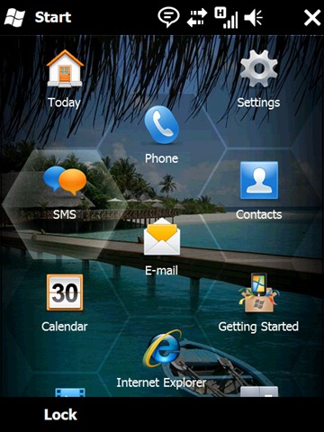
A pretty nice looking UI from the Windows Mobile team – I know this has been circulating on the web for a while but I wanted to draw attention to the icons – in particular Getting Started and Calendar. They’re a departure from the typical icons we’d see from Microsoft where we borrow from the big daddy OS (Windows). Whilst some retain their familiarity such as IE, I like the fact that we’re finally letting our UX people do their job un-encumbered by the Windows style guide.
What do you think? Like it?
Comments
Anonymous
February 16, 2009
The getting started icon is nice, but I hope it leads to more than the fairly sorry attempt at a getting started app in WinMo Pro 6.1. ;-( I haven't heard anything about the developers story yet - is there anything new for 6.5 or do we have to wait for 7 for that? WinMo development (I'm mainly thinking .net CF) is sadly lacking nowadays - no Linq, Wcf, Silverlight/wpf. Silverlight in particular has been promised since Mix 07, then Mix08 and the recent PDC declared that a ctp would be available in jan this year. I haven't seen anything yet though, and surely it is once the developers can go to town on the UX that we will get the range of cool apps that the competition is providing.Anonymous
February 16, 2009
I hate to be the one who brings up Apple, but I guess somebody has to. Getting Started looks awfully similar to the iPhone SDK icon. http://developer.apple.com/iphone/program/images/download_iphonesdk.png Today... almost identical to Home on OSX. Not because its a house. But the visual style, colour scheme etc. http://blog.tice.de/a_icons/icons/Extra%20Home.png Phone / Contacts.... similar to those on the iPhone. I know there aren't many ways to depict this kind of stuff but there's no need to be that close. Settings...a gear! Though these are designer nitpicks of mine (you guys do this a LOT!) and dont really mean much - in general I like the 6.5 announcements.Anonymous
February 16, 2009
I like it, the lock screen in particular, something simple but useful. I'm glad Ballmer promised better developer tools for WinMo, I assume that'll be part of the WinMo7 push, it's what MS does better than almost anybody else so I can't wait.Anonymous
February 17, 2009
re: Icons. It is a bit ironic b/c the messages seem to indicate a push to enhance Windows in the brand - "Windows Phones" was used quite a bit yesterday in the press. This would seem to indicate that aligning the icons would be a better move. What really needs to happen is Win, WinMo, and other teams need to get together and design relavent, cross platform design guidelines....but, I suspect, that would be a very difficult task.Anonymous
February 17, 2009
The comment has been removed

