Evolve or die!
If there is one thing certain in web design it’s this: change your interface and your user’s will temporarily hate you.
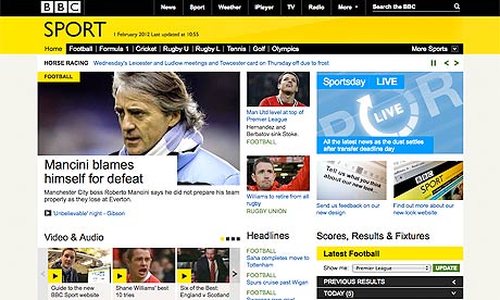
Facebook, Google+ and the BBC Sports website are just three site’s which have dramatically changed their visual design recently – and faced the wrath of their user base as a consequence. All you need to do is hit Twitter as soon as a major players tweaks the front-end to see the stream of vitriol emerge from the masses.
Whilst this type of discussion will have marketing and brand executives quaking in their boots I would argue that change, if considered and well researched, is worth the risk.
Websites and designs are meant to evolve to reflect both changing user requirements and technology developments. Of course, there is a right way and a wrong way to go about this. I am here to tell you how you can update your front end with confidence and pride.
Figure 1: BBC Sport old design
Figure 2: BBC Sport new design
Figure 3: BBC Sport new design Twitter backlash
Rule number 1: Base the change on an actual requirement
Don’t change design for design’s sake.
Endless rounds of interface updates are the stuff of nightmares for your loyal users. If you are implementing an update think about where the requirement has originated. If it’s an anecdotal piece of feedback from the Chairman’s son, it’s time to question the value of following it through.
At this point it’s a good idea to some general research with your audience. Collate all the feedback comments and see if this reveals any insights with regards to actual requirements, and if a change has originated from a business need, look to see if this is going to conflict with what your users have told you. A little bit of legwork could prove invaluable in either red-flagging a senseless change or supporting an innovation.
Rule number 2: Before you go live, do some user testing
User testing is often that part in the project that is squeezed out due to time pressures. This is absolute stupidity/madness.
Why take the risk and launch something without actually knowing if people are going to use it? All you need to do is haul in a minimum of 5 representative users and take them through a task-based test. Can they still achieve the goals the interface is designed to facilitate? Are their any obvious barriers to completion that we have time to change before go-live?
It will take a day or two of project time but will be worth it.
Rule number 3: Prepare for the haters
Know this, as soon as the change goes live the haters will emerge. You can’t please everyone.
All you need to do is listen to the feedback – the constructive parts of it anyway – and see if you can learn something from the negative comments. Try and engage with these users and find out if perhaps there are fundamental elements missing that would help improve their experience.
Rule number 4: Change is good
If change is based on a real requirement and has been properly researched and tested, it’s absolutely a good thing.
Sometimes organisations think that because their product works well and has a degree of market strength, they can avoid thinking about paying for design updates. To some extent you can but complacency will get you in the end.
Innovation rests at the core of the technology industry and if businesses want to maintain a comfortable position, in front of competitors, then it’s time to think about how you can stay ahead of the curve.
Comments
Anonymous
April 16, 2012
Good info. Thanks :)Anonymous
April 19, 2012
nonsense. maybe for microsoft it's a design change for design's sake because you never desinged anything good in your entire history. changing design to more clear and concise is always a good move basing your "stats" on some 10-20 tweets about how bad the change is - it's just ridiculous there will always be users that don't like changes, it's not for them to decide how anything should be designed. they will die eventually and stop complaining - why should evolving of UX stop because of them?Anonymous
April 21, 2012
Max, I agree with your main points and that's the purpose of the article. In that you have to update and evolve when online to improve and enhance do it with purpose. However there will always be people who will not like what you do regardless of how improved the new design is but they should not stop you from moving forwards. UX doesn't stop evolving because of the few who complain but they evolve as users.


