Note
Access to this page requires authorization. You can try signing in or changing directories.
Access to this page requires authorization. You can try changing directories.
This post describes some considerations around the design of calendar-related UI, such that the UI is efficiently accessible to everyone – regardless of how they interact with their device.
Introduction
A few weeks ago I was very pleased to have the opportunity to co-present at a DigiGirlz event at work. I got to talk about some things that UI designers might consider when building UI that's accessible to everyone, and chose a calendar control as an example. Preparing for this event was particularly interesting to me, as I got to reflect on how the accessibility of a modern calendar control compares with that of a control that was designed many years ago, when accessibility wasn't as much a part of the design process as it is today.
There were some aspects of the older calendar control which seemed great. I could fully interact with it through only the use of the keyboard. I could use the arrow keys to move around the days shown in a month, and press Enter to select a date. I could use Home or End to move to the first or last day of the month, and I could use Page Up or Page Down to move to the next or previous month. I loved all that, as for me, one of the signs of quality UI is that it's really efficient to use with the keyboard.
Another thing that the control tried to do was respect colors from the active high contrast theme. When a high contrast theme was active, it presented its background, text and other UI using a mix of related colors from the high contrast theme. In fact when I first saw this, I thought it had no issues at all when a high contrast theme was active. But what I'd failed to notice was that while almost all the UI had very high contrast, the headers of the day columns, (saying "Sun", "Mon", "Tue" etc,) had dark blue text on a black background. That means the text is practically invisible for many customers, and why I didn't even notice it at a first glance.
On a side note, this point does remind me of how careful we need to be when testing UI when a high contrast theme is active. A couple of years ago I reviewed some UI when the High Contrast Black theme was active, and said I thought it was fine. I learned later that there was a button being presented whose text, border and background were all black. (The button's text and border had been hard-coded to black, and so when the high contrast theme's black background color was applied, the whole thing vanished.) So there was a severe accessibility bug here, which I didn't notice. When testing for high contrast support, it's important to know what the UI looks like when a high contrast theme is not active.
Anyway, some thought had clearly been put into the accessibility of the calendar control. But there were two things that I chose to spotlight at the event around the accessibility of the UI.
The first relates to an issue where an important part of the UI is clearly inaccessible, and no-one can dispute it. The control has an edit field, which can be typed in, and which gets updated when a date is selected elsewhere in the control's UI. The rest of the UI is a dropdown beneath the edit control which presents a grid of days in the month. If a customer using the Narrator screen reader moves into the edit field, Narrator will announce the date shown in the field. As the customer arrows through that date, Narrator only echoes what key was pressed. Similarly, if the customer moves Narrator through the days in the dropdown UI, again, only the key press gets echoed. The information shown in the UI where Narrator is, is not announced. However, this is not an issue with Narrator. Rather, none of the information that the customer needs is being exposed through the UI Automation (UIA) API. So this is a fundamental accessibility blocker, and a customer using Narrator cannot use the control.
The second issue I spotlighted was of a different nature. It was one where it could be said that there's no accessibility issue as such, but we should ask ourselves, how easy is the UI to use? The issue relates to the size of the UI. Each day shown on the month dropdown was around 62x30 pixels. That may not sound small, but if the screen has a resolution of (say) 3000x2000, the day UI really is pretty small. This means that for some customers, it's going to be some effort to interact with the visuals, and maybe they'll have to move towards the screen as they use it. Similarly, on a touch device, customers really have to pay attention if they're going to tap the day they want to tap. And if the customer finds it a challenge, or impossible, to keep their hand still while doing this, it's going to be really frustrating to interact with the control through touch.
This second type of issue can lead to all sorts of debate when designing products. One might say that the UI is fully accessible with regard to its size, and doesn't need to be changed. But one might also say that why would you want to ship features that are technically accessible, but frustrating to use? If we don't ship features that are accessible to everyone, and efficient and pleasant for everyone to use, then we've failed our customers.
The modern calendar control
So after demo'ing the older control, I demo'd the modern control, and asked the audience what's the first thing they notice about it. Their response: "It's bigger". And indeed it is. The days shown in the month are around 80x80 pixels. So they're much easier to see, and much easier to tap on. All in all, the UI just feels more friendly.
Note: When considering issues around accessibility or usability, I do feel it's worth considering what might have led to the issue existing. If we don't consider that, then it's more likely that future UI will also have related issues. In the case of the small UI in the older control, I expect part of what led to the issue is that at the time the control was designed, screen resolutions were generally lower than they are today, and touch input was much less common. As such, the issues probably wouldn't have seemed so interesting as they seem on today's devices.
In addition to the modern control's visuals being bigger, if I point the Inspect SDK tool to the control, I find all sorts of interesting data being exposed through the UIA API. For example, the screenshot below shows the Inspect SDK tool reporting the UIA data being exposed by the UI element representing the 8th day of the month. Inspect shows that that element supports the UIA GridItem pattern, and through that, a screen reader can know that the day is on the 1st row and 5th column. (The row and column indices are zero-based.) Also through that pattern, a screen reader can determine that the element which is the container for the day element has a localized control type of "calendar". In addition, the day element supports the UIA TableItem pattern, and through that, a screen reader can know the column header is "Friday", and the row header is "September 2017".
What all this means is that when a customer using a screen reader encounters that day element, (which only visually shows the number eight,) they can learn that they've encountered the 8th of September, and that day is a Friday. And they didn't have to move anywhere else in the control in order to learn that. It certainly seems that when this modern control was designed, the team put a lot of thought into providing an efficient experience for their customers who use screen readers.
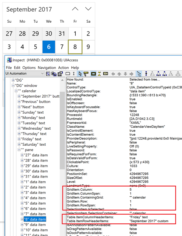
Figure 1: The Inspect SDK tool reporting the UIA representation of a day shown in the calendar control.
So what happens when I start customizing the UI?
These days, many platform teams put a ton of thought into accessibility, and aim to build controls that are efficient for everyone to use. So by default, it's a good idea to not customize the UI of controls hosted by your app. In many cases the control will be keyboard accessible, programmatically accessible, and respect whatever theme colors have been configured by your customer.
There are a couple of reasons why devs decide to customize the experience at their hosted controls. One reason is that they need to extend the feature in order to provide functionality that the customer needs. Another reason is that it seems cool for the dev to put their own stamp on the experience.
To focus on that second reason first. When experimenting with the control, I decided that it would look nice if the day elements were blue. I like blue, because it reminds me of the sea. So I decided that the control should show cyan text on a dark blue background. In some respects, this had the desired effect, in that the days in the current month now reminded me of the sea. But what I hadn't expected was that the color of the column header text was now cyan on a white background, and practically invisible. In addition, the current day's visuals had not changed, and so was now more similar to all other days in the month. This meant my customer's attention wouldn't be drawn towards it as readily as it was before. And I also need to consider whether my custom colors will be shown when a high contrast theme is active, which will not be what my customer wants.
Important: It turns out I'd broken the accessibility of the control in more ways than I originally realized. Once I started interacting with the control, the states of the visuals change, to account for things like selection state and mouse hover. In one state the text became black on dark blue, and so practically invisible. This was an important reminder of how whenever custom colors are used, care must be taken to analyze the results in all possible states of the UI, (including when light-on-dark and dark-on-light high contrast themes are active).
So customizing the control's visuals simply because I think that's a cool thing to do, is not helpful to my customers. My customers are familiar with the experience at this type of control, so why would I want to introduce a new experience that they have to become familiar with? The sea is cool. Breaking the accessibility of a control is not.
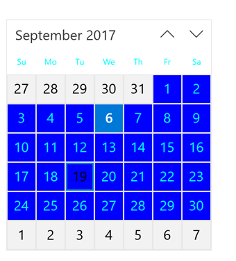
Figure 2: Unexpected and inaccessible visuals shown in the calendar control after some inappropriate customization of the colors used.
Extending the functionality of the control
Now, sometimes you choose to customize the experience at a control because by doing so, you'll provide functionality that's really helpful to your customers. And helping your customers is cool.
Note: For this exercise, I'm intentionally ignoring whatever support the control provides for customizing the experience at the control. This is absolutely what I would not do were this shipping UI. For shipping UI, I'd leverage whatever support is provided by the platform. But here, I want to present my own custom experience in order to discuss related consideration points.
So say I want to provide a way for my customer to mark some days as "Available", and some as "Unavailable". In order to do this, I added two buttons next to the control. One showed a "Thumbs up" symbol, and the other, a "Thumbs down". But this raises an interesting question – how do I know those symbols are good to use everywhere around the world? I want to deliver a great customer experience globally, and I wouldn't dare use a symbol that I didn't know was appropriate. Perhaps some symbol that seems ok to me wouldn't as effectively convey the meaning of the button in some regions, or worse, could have a negative connotation. So I'd always consult with people more experienced with global matters than myself, when showing symbols like this in my app.
When I asked the audience what they might consider for symbols instead, one person suggested emojis. And that was an interesting point. If there are emojis commonly used around the world to indicate that a date is available or unavailable, why not use those?
One additional point here that's extremely important relates to the screen reader experience at my new buttons. While many UI frameworks will repurpose the visual text shown on a button to be the UIA Name property of the button, a button showing no text will typically have no accessible name by default. This means a screen reader cannot announce the meaning of the button, and so may make my feature unusable to many of my customers. As such, I need to add concise, helpful, and unambiguous accessible names to the buttons. One suggestion from the audience around the accessible names was "Mark as available" and "Mark as unavailable". I actually preferred those names to the ones I'd planned to add to the app, as my original choice of "Show as available" and "Show as unavailable" seemed less of a match for the true purpose of the buttons.

Figure 3: The Inspect SDK tool reporting the UIA Name properties of the two buttons in the demo app.
Important: Going back to the point about delivering a great global experience, clearly I won't be doing that by hard-coding the accessible names of the buttons in English. Instead the names need to be as localized as any text shown visually on a button.
Ok, so now having buttons to mark the days as available or unavailable, I need to have the calendar control react to the buttons being invoked. (Note that because I'm using regular button controls here, they can be invoked through any of mouse, touch, keyboard and programmatically through UIA, by default.) My first attempt to have the control react to a day being marked as available or unavailable was to change the background color of the affected days in the control. The background of an available day becomes green, and the background of an unavailable day becomes pink.
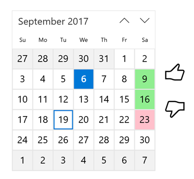
Figure 4: The calendar control showing available days marked as available or unavailable with backgrounds of green and pink respectively.
So I then asked the audience for their thoughts on what I'd done. The answer came back really quickly – this is going to be a problem for customers who are color blind. Color blindness is very common, and if you're shipping a product, then you have customers with some level of color blindness. To convey important information through use of color only, leads to an experience which is in some cases difficult to use, and in some cases impossible to use. And so it's something you'd never do. Clearly I had to rethink my approach here.
But I don't want to remove my use of colors completely. Some of my customers will be able to differentiate between the green and pink just fine at a glance, and I still want to deliver an efficient experience for them. I don't want to start removing useful aspects of the experience because it can't be leveraged by some of my customers. Rather I want to build up a single experience which is great for all my customers, regardless of the ways in which they find it most useful. So I explored how I might do this, by shading the upper left corner of the day in green for days that are available, and shading the lower right corner in pink for days that are unavailable. I also updated the buttons to show similar shading, in order to convey the connection between each button and the affected days in the calendar.
This means it's clear which days are available and unavailable, for my customers for whom the colors are indistinguishable, and also for my customers who do leverage the colors' meaning. For both sets of customers, the experience is efficient.

Figure 5: The calendar control showing days marked as available or unavailable with an upper left corner of green or lower right corner of pink respectively.
The screenshot below shows the new design after having been processed by a color blindness simulator tool. For the particular type of color blindness I'd selected at the tool, the colors shown in the screenshot for the red and green visuals are practically identical, and yet the visuals clearly indicate which days are available and which are unavailable.

Figure 6: The calendar UI having been processed by a color blindness simulator tool.
But hold on a moment. I've updated the control such that it shows visuals which convey important information to my customers. What about my customers who don't consume the visuals at all? I've got to stop thinking about my app "showing" data, and start thinking about it "conveying" data. All my customers need to efficiently leverage the important information, regardless of how they interact with their device. This means my customers who are using screen readers need to access the information being conveyed.
In order to achieve that, I set the UIA HelpText property on the day element to be either "Available" or "Unavailable". A screen reader can access this information, and include it in the announcement made to the customer however it feels is most helpful. As a test, I just marked Saturday the 16th as available in my demo app, and the following is the announcement that Narrator makes when it encounters that day:
16, non-selected, Column Header Saturday, Available, non-selected,
So Narrator is announcing the day as being available, and that's exactly what my customers need.

Figure 7: The Inspect SDK tool reporting the HelpText property of a day in the calendar control as being the string "Available".
What about high contrast?
The above exploration was all I had time for in the DigiGirlz event, but while I was preparing for the event, I did do some additional experimenting with high contrast themes. When a high contrast theme is active, my customer needs the colors shown to be those defined in the high contrast theme. So hard-coding important UI in red or green as I'd done above, is not helpful.
This is where my experiments started to get pretty hacky, and it could well be that the control does provide a fine way of expressing custom information in the UI which can respect colors from the high contrast theme without much effort on the app dev's part. But in my case, I wondered if I could follow a pattern I'd noticed in the Mail app on my Windows 10 phone. In the Mail app, when the High Contrast setting is not on, a custom color is used in a mail item's subject to indicate whether the mail's been read or not. But when the High Contrast setting is on, that text is shown in the same high contrast color as all the other text in the item. And while this means it's very high contrast, it no longer lets me know whether I've read the mail. So how can the app provide an efficient way for the customer to know whether an item's been read or not?
Well, any item that's not been read gets a solid bar shown down the left side of the item, in the high contrast color for text. (As it happens, a similar bar appears with the default theme too, but I'd not really paid attention to it before, because I'd use the subject line text color as the indicator for whether an item's been read.) The screenshot below shows a number of items in the Mail app on my Windows 10 phone, when the High Contrast setting is on. The unread items have a bar shown down the left-hand side of the item.
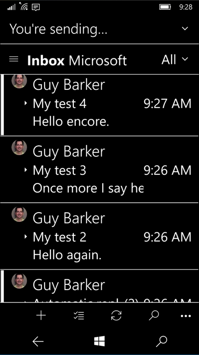
Figure 8: The Mail app on a Windows 10 phone, with the High Contrast settings turned on.
So I wondered - could I do a similar thing in my demo app? This is where my experiments got really hacky. Instead of drawing rectangles of a high contrast color, I messed around with the day visuals' margin and padding, until I appeared to get some of the results I was after. Having said that, I didn't like my results, as it wasn't clear at a glance as to which day was associated with the bar that I'd apparently created. Was the bar at the bottom of a particular day, or the top of the day below it? Still, it was a fun experiment, and got me thinking how a real app might choose to do this. The screenshot below shows the demo app running with a high contrast theme active, and with a solid bar across the top of a day to indicate that the day is available, and a solid bar along the bottom of the day to indicate that the day is unavailable. The buttons by the control also shows the bars, so that the customer can associate the button with the results shown on the control.

Figure 9: The demo app running with a high contrast theme active, and showing high contrast bars on the days that have been marked as available or unavailable.
Summary
Co-presenting at the DigiGirlz event gave me a chance to consider some design topics relating to making a calendar control accessible and efficient for everyone to use. It also gave me an opportunity to reflect on how designs have become more accessible over the years. It was interesting for me to explore how a customer might efficiently leverage all the control's functionality, regardless of how they interact with their device. For example, whether they consume information through all or some of the colors shown in the app, or through high contrast colors, or through audio rather than visuals. Or whether they use touch or the keyboard to input at their device.
Most interesting for me was to get the audience members' thoughts on the accessibility of the UI, as this has given me a wider perspective on the topic, and that's always helpful. It really was great for me to hear such energy around making technology accessible to everyone, from these future software designers and developers.
Guy