What can I do to make my Windows 8 WinJS.UI.ListView app as accessible as possible?
I recently spent five years working in the Windows Accessibility team, working on most of the accessibility-related features in Windows. This included the UI Automation API, Narrator, Magnifier and the On-Screen Keyboard. A few months ago I started working in a Windows Apps team, and so was very interested in studying accessibility from the App developer’s perspective. In order to learn more about this, I examined a new app that I created from the HTML/Javascript Grid App Template. My goal was to understand exactly how WinJS.UI.ListView UI is accessible by default, and what additional steps a developer can do to make the UI even more accessible. At the end of this blog, I’ve listed a summary of my findings.
Programmatic Access
Many assistive technology products will want to access and interact with your UI. For example, a screen
reader will speak the details of your UI to users who have visual impairments, and magnifiers will follow keyboard focus around the screen. Your UI is made accessible through the UI Automation (UIA) API available in Windows. The WinJS framework builds up a hierarchical tree of elements representing the UI on the screen, and that tree is accessed by UIA client apps.
So having created my new app from the HTML Grid App template, I pointed the Inspect SDK tool to it, and examined the results reported by Inspect. These results are shown in Figure 1.
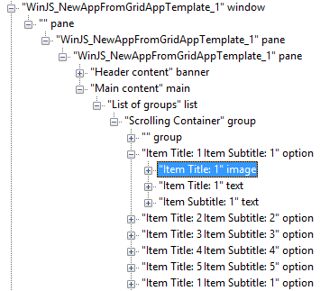
Figure 1: Inspect reporting the UIA tree for an app based on the Grid App template.
A number of things caught my attention when I did this, and I could see that there was already a lot of support for accessibility built into the WinJS.UI.ListView control. Great! But I was particularly interested in whether there was additional action I could take myself to further enhance the accessibility of the UI in some way.
The follow topics were some of the things I considered.
1. Should I try to name the unnamed “pane” element high up in the tree?
In general, the user really doesn’t want to encounter elements that don’t have accessible names. For example, a button without a name means that the user won’t know what’s going to happen if they click it. Similarly an app with multiple lists which don’t have names can make the experience very challenging for a screen reader user. (Sometimes container elements that are only used for layout purposes appear in the tree, and while it’s preferable for them to have names, it’s not such a problem when they don’t given that the user will usually not interact with them.)
It turns out that that the unnamed pane shown by Inspect is not a part of the UI defined in the HTML that describes the UI in the pages that got generated when I created my app. So this is not something I can easily control myself. As such I’ll leave the unnamed pane as it is, and when the user encounters it, they’ll ignore it and move on to the more interesting elements.
By the way, there are a bunch of other pane elements shown high up in the UIA tree, with names of “WinJS_NewAppFromGridAppTemplate_1”. These names all came from the name I supplied for the new app when I created it form the template. So your pane elements there will have whatever name you gave.
2. Should I set the accessible names of other elements that are defined in my HTML files?
The answer here is a resounding Yes! This is one of the most important things you should do as part of delivering the most accessible app possible. The template used to create the app has already populated many elements with names, such as “List of groups” for the list shown on the first page when I run the app. But you’ll want to change this to best describe your list. So for example, say I was presenting a list of houses for sale. The accessible name on the list is set through the use of the aria-label attribute in the groupedItems.html file, and so by replacing the default text of “List of groups” with “Houses for sale”, my customers who user screen readers can know what the list refers to.
However, to do that would only be useful to my customers who speak English. Given that I want a worldwide customer base, I want to present a localized accessible name for the list. I wouldn’t present English text visually to my Spanish speaking customers, so why would I present English text audibly? So, when setting the aria-label attribute here, I want to use a localized string. I can do this by replacing the default aria-label attribute with the following in the HTML, (where “stringGreeting” is the id of some localized string).
data-win-res="{attributes: {'aria-label' : 'stringGreeting'}}"
Of course, this means you need to update your app to include the localized string. I just did this with my new app with the steps below. (You’ll want to do this regardless of accessibility, to make it easy to localize you app for worldwide distribution.)
- Add a new “Resources File (.resjson)” item to my project.
- Create a “strings\en-us” folder in my project and move the new resjson file into there.
- Near the top of the “ready” function in my page’s js file, add a call to WinJS.Resources.ProcessAll().
- Edit the new file to contain the localized string I want to show. For example:
"stringGreeting" : "Welcome to Houses For Sale!"
Similarly I’ll want to replace all the other fixed strings that are set through aria-label in the VS solution, with localized strings. I can then point the Inspect SDK tool at my UI and verify that no elements defined on my pages have missing accessible names.
So with the above few steps, I have an app which is ready for worldwide distribution regardless of whether my customers will consume the text visually or through a screen reader.
But hold on – what’s that unnamed group element shown in the Inspect results? The results show an unnamed group element as the first and last child elements of another group with the name “Scrolling Container”. It turns out that all these group elements are created by WinJS when I use the ListView and their names are not under my control. As such, they’re not something I should spend time on changing.
3. The order of the list items and group headers in the UIA tree does not match their order shown on the screen.
Figure 2 shows the UIA tree for the last set of descendant elements beneath the list. It shows a number of list items, followed by elements representing the group headers shown in the list. So this raises the question, does this mean that when a user moves through the list via a screen reader which relies on the UIA tree, the user will be taken to all the items, and then to all the group headers? This seems less helpful than moving to a group header, then to all the items in the group (in order), then onto the next group header.
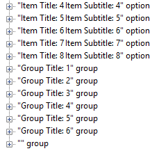
Figure 2: Descendants of the list element in the UIA tree.
This more preferable navigation order is supported, thanks to the WinJS.UI.ListView’s use of the UIA FlowsTo and FlowsFrom properties. These properties allow an element to specify which element logically precedes it and which follows it in the UI, when those elements aren’t adjacent in the UIA tree. So there’s nothing I need to do here to enable a useful navigation path through my items and group headers.
By the way, you may wonder why the Inspect SDK tool reports an ARIA role of “option” for the list items. (The ARIA specification includes a role of “listitem” after all.) This is because the ARIA “listitem” role doesn’t support a selected state, whereas the WinJS.UI.ListView makes it very easy to enable single- or multi-selection of items. The ARIA “option” role does support selection, so that’s the role the list gives to its items. The end result is that when UIA exposes data on this element, the element has an ARIA role and localized control type sting of “option”, and a UIA Control Type of UIA_ListItemControlType.
4. Do the elements in my UI have unique identifiers?
Sometimes assistive technology apps such as screen readers want a unique identifier to search for a particular element in your UI. Automated test frameworks certainly want to do this. So how do you give your element such an identifier? In many cases, if you set an id on your div, that id will be exposed through UIA as the UIA AutomationId property for the element. For example, if I add some id to the list in my new app, say id=”listHouses”, then I can see the AutomationId set by using the Inspect tool, as shown in Figure3.
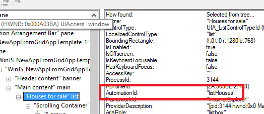
Figure 3: Inspect reporting the AutomationId for the list in my new app.
Note that setting the id of divs contained within WinJS.UI.ListView items does not result in the UIA AutomationId being set. So if you want to set some id on the divs contained within the list items for automation test purposes, you’d want to set some custom attribute on the div, and have your automated test framework examine the DOM.
So that wraps up what struck me as I looked at the UIA tree associated with my new WinJS.UI.ListView app. A great UIA element hierarchy, (along with very helpful properties being set on those elements), is critical to allowing a screen reader to provide a fully functional and efficient experience to your customers. While there are a number of screen readers available for Windows, I then wanted to explore the experience provided by one in particular; the in-box screen reader – Narrator!
Narrator
As I’ve just said, having your app present a great representation of its UI through UIA is essential if a screen reader is to describe the UI to your customers. The Narrator screen reader only uses UIA to access your app’s UI, and so if some data’s not exposed through UIA, Narrator can’t present it. But verifying a great UIA representation alone doesn’t necessarily mean your customers are going to get the best screen reader experience they can. So in addition to verifying the UIA representation, it’s really helpful to your customers to consider the resulting screen reader experience.
For example, say your customer wants to navigate through the items in your list to find a particular item. As they move between items, they’ll not want to find that they have to listen to a lot of text that’s the same for a bunch of nearby items, before they hear the text that differentiates the new item from the previous. That’ll be a really slow and frustrating experience. Instead, they want to hear something immediately that lets them know whether they’ve found an item of interest. By default WinJS will build up an accessible name for a list item based on the text elements contained within the item. So take a look at that accessible name with the Inspect tool and consider whether the user’s going to hear the most valuable text almost immediately or not. And to really get an appreciation for the user experience, turn on Narrator, turn off your monitor, and arrow around your list. Remember that this is not only about building an app that’s technically accessible, but providing a fully functional and efficient experience.
Another important consideration is around images shown in the list items. In my new app, the list items include an “img” tag, and also set the alternate text for the images to some bound strings. So it’s great that the template reminds app devs to consider alternate text here. (As with the aria-label mentioned earlier, the alternate text that finally gets supplied to the user needs to be localized.) But say for some reason, you wanted to set the background-image attribute of some div to present an image, rather than using the img tag. (Sometimes it can be more straightforward to get a particular cropping and scaling that you want for an image though the styling of the background-image.) So you add your div, and set its background-image attribute accordingly through its css.
background-image: url(house.jpg);
If you then point the Inspect SDK tool to your new div, no element shows up in the UIA tree for the new div. As such Narrator is unaware of the image, and cannot make your customer aware of it. While it’s important not to distract the screen reader user with information which is not generally useful to them, I prefer to make the presence of the useful image discoverable to the user if they choose to explore the UI in detail. As such I want to make sure some UIA element associated with the image-related div exists in the UIA tree. This is straightforward by adding the following to the javascript associated with the UI:
myBackgroundImageDiv.setAttribute("role", "img");
myBackgroundImageDiv.setAttribute("aria-label", WinJS.Resources.getString("stringImageDescription").value);
Once I’ve added a localized image description, Inspect will then show that a UIA element exists for the image-related div, and it has the useful alternate text.
Controlling the list item
Programmatic accessibility isn’t only about exposing details of what you’re showing on the screen. It’s also essential that your customers can use a screen reader to control that UI too. For example, your customer needs to be able to invoke or select an item. This is enabled by default, thanks to the WinJS.UI.ListView supporting specific UIA patterns. (A UIA pattern is used to describe the behavior of UI.) Because the list item supports the Invoke pattern, the Narrator user can invoke it. And because the list item supports the SelectionItem pattern the Narrator user can select and deselect it.
Navigation
The Narrator user can use touch gestures or keyboard shortcuts to move to the next or previous UI element, so thanks to WinJS.UI.ListView’s use of UIA’s FlowsTo and FlowsFrom properties, the Narrator user can navigate between list items. By default the navigation will not include the individual elements within a list item, but the user can navigate through these contained elements if they choose to. They would do this with a keyboard by using the CapsLock+RightArrow shortcut. (Note that if the item contains an image div, then this could be included in the navigation by changing Narrator’s cursor movement mode setting to “Advanced” first.)
There’s some interesting background on Narrator’s touch gestures at Using your feedback to make Narrator work better with touch.
Using your app with the keyboard
Many of your customers will want to access the full functionality of your app through use of the keyboard alone. There are a whole host of reasons for wanting to do that, ranging from some users simply finding it most efficient to only use the keyboard, to users who have severe mobility impairments and interact with their device through a head switch or foot switch. (Your customers who use a switch device will interact with your app with an on-screen keyboard rather than a physical keyboard.)
The great point here is that the list items in the WinJS.UI.ListView supports keyboard access by default. Your customers can use the tab key to move focus into the list, and then use the arrow keys to move between items once the list has focus. Use of the Page Up/Down and Home/End keys allow for faster navigation through the list. If you want an item in the list to have focus when the app starts, be sure to set focus to the list when you create it. When a list item first gets added to the list, focus will move to that list item.
If you’ve modified the list from the HTML Grid App template such that it supports selection, a press of the Spacebar will select or deselect the focused list item. A new app created from the template also contains an invoke event handler which gets called when a list item has focus and you press the Enter key.
All of the above keyboard action can be taken either at a physical keyboard or an on-screen keyboard. Figure 4 shows the Windows OSK docked beneath my new app. The OSK is scanning the keys to allow the user to navigate through the list of items by only using a switch device.
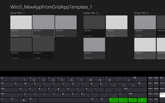
Figure 4: Interacting with the app by using the OSK in scan mode.
Group headers
An important point that I discovered while working with my new app with the keyboard is that WinJS.UI.ListView doesn’t have built-in support for interacting with group headers via the keyboard. As I tabbed around in my app I found that keyboard focus didn’t go to the group headers, even though I could invoke the header with a mouse click. The reason why focus didn’t go to the headers is because the template used for the list has a “tab-index” property of -1. (This meant the group headers should not be included in the tab order.) So as a test I removed that, and sure enough keyboard focus navigation included the group headers. But having done that, if I moved focus to a group header and pressed the Enter key, the UI reacted as though focus was really on the most recently focused list item. So to avoid confusion, I added the “tab-index” of -1 back in.
But it’s essential that your customers who only use a keyboard can access all the functionality in your app. If a group header can be invoked with the mouse, you must allow it to be invoked through the keyboard. This requires the page’s javascript to take action to enable this, and it turns out my newly created app already has an example of just how this can be done. If I set focus to a particular list item, and then press Ctrl+Alt+g, this invokes the group header associated with the selected list item. I can see how this is done by looking at the keydown event handler that automatically got created in my app’s groupedItems.js file.
So the end result is that while the WinJS.UI.ListView doesn’t have built-in support for invoking the group headers with the keyboard, with the additional javascript that automatically gets created in your app, your customers can invoke the headers just fine. And that’s good news – because it’s critical that all your functionality can be leveraged using only the keyboard.
High Contrast
Your sighted customers need to be able to read all the text that you show, and that means there needs to be a useful contrast between the text and its background. (My keyboard at home shows the Function Key text in dark blue on a black background, and it’s really irritating spending time scrutinizing which key’s which.) So make sure that when using the default Windows theme, your text stands out clearly against the background.
Now some of you customers will have selected a high contrast theme to make it practical for them to read text on the screen, and so your text needs to respect those high contrast colours in order to be useable. So I selected a high contrast colour theme, and took a look at the results in my new app. (In order to experiment with different themes, I select these by right clicking on the classic desktop, selecting Personalize, and then picking one of the High Contrast themes. I always at least try out High Contrast Black and High Contrast White.) You don’t have to restart a WinJS app after changing the theme, as the app automatically gets updated to reflect the new system colours. Having changed the theme, I found that the items in my list got updated just fine. The background of the list items was the newly active window background colour and the text was the newly activate window text colour.
Given that everything worked just great, it’s tempting to leave high contrast now, and move onto the next topic. But this is where you can stop to consider if there's anything you can do beyond checking that the minimum expectations around high contrast have been met, and elevate the experience to something more useful in practice. For example, when I run my new app with the High Contrast Black theme active I find that the items have no borders showing, which means if my items only contained text, it would be a challenge for some of my customers with low vision to quickly determine where one item ends and the next begins. So once the default text shown in Figure 5 has been replaced with all your actual text, it might be less efficient to use your app than your customers would like.

Figure 5: High contrast list items with no clear delineator between items.
So you might consider changing the styling of the items when a high contrast theme is active, to make each item stand out more. For example, all it takes is to add the following styling to the new app’s css for the .item-overlay, in order to get the borders shown in Figure 6. And another great thing here is that the colour of the border will automatically be set to the colour appropriate for the currently active high contrast theme.
border-style: solid;
border-width: 4px;

Figure 6: High contrast list items with a clear border around each item.
Images
While the following isn’t specific to images presented in lists, given that many lists do show images, I thought it was worth mentioning it here.
Another important question you’ll want to ask yourself relates to background images. As you turn your app from the one created fresh from a template into the one that exactly meets the need of your business, you may have chosen to present some images through styling as background images, rather than with “img” tags. By default WinJS will hide background images set through styles when a high contrast theme is active. This default WinJS action is helpful, because if background images continued to appear behind text, that would interfere with the goal of making text clearer by maximizing the contrast between text and its background.
But there may be times when you feel that your image might be of use to some of your customers when a high contrast theme is active, and you still want it to appear. All you need to do then is to set the following css to override the default behavior, and to have the background image appear.
-ms-high-contrast-adjust: none;
If having done that, the image appears behind text when a high contrasts theme is active, you’ll want to move or size it as necessary to make sure it can’t appear behind text.
Also, your app may ship with some fixed images which aren’t easy for some of your customers who use high contrast themes to make out. So for any fixed image you ship, you’ll want to ship a white-on-black version and black-on-white version which can be presented when a particular high contrast theme is active. The following css shows how you can do this.
@media screen and (-ms-high-contrast)
{
.mypage #houseImage {
-ms-high-contrast-adjust: none;
background: url(/images/houseimage.contrast-black.png);
}
}
@media screen and (-ms-high-contrast:black-on-white)
{
.mypage #houseImage {
background: url(/images/houseimage. contrast-white.png);
}
}
In fact, given that above I’ve used the WinJS image file naming convention for high contrast, I don’t even need to specify the files in the css there. Rather I can leave it to WinJS to select the appropriate file based on the active high contrast theme, and I only retain the css to say that I don’t want background images to be hidden by default.
@media screen and (-ms-high-contrast)
{
.mypage #houseImage {
-ms-high-contrast-adjust: none;
}
}
Having said that, when I tried this, I found that the image displayed was appropriate only for the theme that was active when I started up my app. So if I changed the active theme I had to restart my app. If the file name was specifically included in the css, (as shown earlier), then the image presented would change in my running app as the active theme changed.
Conveying information through colour alone
Many of your customers will be colour blind, and so it’s really important that information isn’t conveyed only through use of colour. The classic example of this is a shape which indicates that all is well by being green, and all is not well by being exactly the same shape, but red. That’s not going to help your customers who find it a challenge to differentiate red and green.
So I took a look at my new app, and found that no information was conveyed through use of colour alone. As such, I didn’t need to add additional text, (either in the form of text that appears next to images or shapes, or as tooltips.)
Conveying information through audio alone
If your app presents some information through audio and no matching visuals change, then your deaf customers may miss out on something very important, such as an alarm. (Depending on how you output the audio, the system may help to get visuals shown.) My new app outputs no audio at all, so this isn’t a concern for me here.
Make everything bigger
Now this Windows Ease of Access setting is another great feature for many customers. On devices with a resolution that supports the setting, everything in your app can be made bigger on the screen. While this helps a lot of people with low vision, (and many people who don’t consider themselves to have a disability – but just find it more efficient to work with things that are bigger,) you don’t need to do anything specific to an accessibility setting for your app to support this. Rather, you just need to support all the resolutions that Windows Store apps should support. When your customers turn on the “Make everything on the screen bigger” setting, your app will just be presented at a particular resolution.
Given that new apps created from the HTML Grid Template support the required resolutions, I didn’t need to change anything in my app related to this setting.
Note that an HTML app does need to be restarted after the user has changed the state of the “Make everything on the screen bigger” setting. (If the app is not restarted, then the UI will not be sized correctly after the setting has been changed.)
Respecting system settings
There are a few additional system settings which you can leverage, and doing so can help you to provide a great user experience to some customers, where otherwise the app might be unusable. For example, respecting the duration for which notifications are to appear on the screen. Some of your customers need a certain amount of time in order to digest the contents of notifications that appear, and so if the notifications only appear for a few seconds, they might as well have not appeared at all.
My new app presents no notifications, and so I won’t check this system setting. In fact I won’t be changing the app to leverage any other systems settings either.
Summary
So having considered all the above, what did I actually change in my new app to make the list as accessible as possible? There were only a few things:
- Set a useful localized accessible name on the list. I did this by using the “aria-label” attribute. The Inspect SDK tool is invaluable for checking the UIA properties in your UI, and you can use it to make sure all of the UI that you add to your app exposes a localized accessible name.
- I gave some divs unique ids in order to expose useful UIA AutomationId properties which can be accessed by automated tests.
- Show a border around my list items when a high contrast theme is active, to make sure the items really stand out.
- Include high contrast versions of my shipping images, such that when the High Contrast Black and High Contrast White themes are active, the images are as clear as possible to all my customers.
Other things I considered while doing carrying out these investigations included:
- Can the Narrator user quickly determine whether a list item’s of interest when they navigate to it?
- Should a list item get focus when the app starts?
- If I use the background-image style on a div, what’s the best experience for the user when they’re using a high contrast theme? (Certainly I don’t want an image to appear behind text when a high contrast theme is active.)
There are lots of interesting topics when considering how you can make your app as accessible as possible, and so reach the most customers. The above investigation relates to a list shown in a new app based on the HTML Grid App template, but many of the things mentioned relate to UI in general.
So try out your cool new Windows 8 apps using only the keyboard, in high contrast and with Narrator. It’s fascinating to consider how you can enhance your app to make it really efficient for all your customers to leverage its full functionality, regardless of how they interact with it!