Visual Studio .NET
Building Windows Forms Controls and Components with Rich Design-Time Features
Michael Weinhardt and Chris Sells
Code download available at:Design-TimeControls.exe(286 KB)
This article assumes you're familiar with Visual Studio .NET and C#
Level of Difficulty123
SUMMARY
Visual Studio .NET provides support for designing rich features into your controls and components, allowing you to set properties, set form placement, inherit from base classes, and much more. So how does Visual Studio .NET do all this? What does the Windows Forms designer do? What's the difference between a control and a component? How does Visual Studio integrate your controls so that they can access features of the .NET Framework?
In this article, the authors answer these common questions by building a clock control and taking the reader along for the ride. In building the control, hosts and containers are illustrated, the property browser is explained, debugging is discussed, and a general overview of the design-time infrastructure is presented.
Contents
Design-time Architecture
Hosts and Containers
Sites
Testing a Component
Customizing the Toolbox
Debugging
Components versus Controls
Design Mode
Attributes
Property Browser
Code Serialization
Batch Initialization
Extender Controls
Where Are We?
When building a Windows® Forms application, you create forms, add components and controls, consume events, and write custom code. All of this is done with the intention of responding to user demands at run time. Likewise, at design time, components and controls themselves have to respond to developer demands. Towards that end, the Microsoft® .NET Framework includes rich design-time support, offering a bevy of interfaces, base classes, and attributes to increase the flexibility and usability of your controls and components, from simple form placement and property settings to full UI editing support.
This article offers an introduction into the world of design-time functionality in the .NET Framework. We'll cover the basics of the design-time architecture and some of the simpler things you can do to influence how your components and controls interact with it. We'll walk through building and testing a clock control to demonstrate the various design-time features and services. In a future companion article, we'll delve into some more complicated features. The goal of this series is to provide an overview of the .NET Framework's extensive design-time support and infrastructure. For in-depth coverage of specific features, take a look at Shawn Burke's articles on MSDN® Online.
Design-time Architecture
Design mode is activated the moment a form is opened for editing. It can involve activities like resizing, setting the border style, changing the caption, and adding controls and components, which also enter design mode the moment they are dragged onto either the visual or nonvisual design surface. The nonvisual area, or component tray, hosts components. A component is a Framework class that supports the design-time experience but doesn't draw its own UI in a container-specified region. Components implement the System.ComponentModel.IComponent interface, typically by deriving from the SystemComponent.Model.Component base class. Controls, on the other hand, do draw themselves and are therefore shown in the visual area. All controls ultimately derive from the System.Windows.Forms.Control class, which in turn derives from the Component base class. In other words, a control is really a component with a UI. Both act nearly identically at design time in terms of their integration with the design host. Figure 1 shows a form in design mode acting as a design host for a number of components and controls.
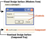
Figure 1** Form in Design Mode **
While both components and controls ultimately derive from the Component base class, that's not what distinguishes a component from any other class. Instead, what makes the Component class fit into the design-time architecture is its implementation of the IComponent interface. IComponent allows components to integrate with the design-time host, providing them with design-time services.
Hosts and Containers
In Visual Studio® .NET, the Windows Forms Designer is responsible for providing design-time services during Windows Forms development, including a form's UI and code views. The responsibility of managing integration between design-time objects and the designer is handled by an internal implementation of System.ComponentModel.Design.IDesignerHost. The designer host stores IComponent references to all design-time objects on the current form as well as the form itself, which is also a component. This collection of components is available from the IDesignerHost interface through the Container property of type System.ComponentModel.IContainer:
interface IContainer: IDisposable {
    ComponentCollection Components {
        get;
    }
    void Add(IComponent component);
    void Add(IComponent component, string name);
    void Remove(IComponent component);
}
This implementation of IContainer allows the designer host to establish a relationship that helps it manage each of the components placed on the form.
Sites
At design time, contained components can access the designer host, as well as each other, through their container. This two-way relationship is shown in Figure 2. You can also see that the fundamental relationship between the designer host and its components is established with an implementation of the System.ComponentModel.ISite interface:
interface ISite: IServiceProvider {
    IComponent Component {
        get;
    }
    IContainer Container {
        get;
    }
    bool DesignMode {
        get;
    }
    string Name {
        get;
        set;
    }
}
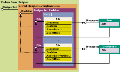
Figure 2** Designer Component Architecture **
Internally, a container stores an array of sites. When each component is added to the container, the designer host creates a new site, connecting the component to its design-time container and vice versa, by caching the ISite interface in the IComponent.Site property implementation.
interface IComponent: IDisposable {
    ISite Site {
        get;
        set;
    }
    event EventHandler Disposed;
}
The Component base class implements IComponent and caches the site's interface in a property. It also provides a helper property to go directly to the component's container without having to go through the site first:
class Component: MarshalByRefObject,
IComponent,
IDisposable {
    public IContainer Container {
        get;
    }
    public ISite Site {
        virtual get;
        virtual set;
    }
}
The Component base class provides a component with access to both the container and the site directly. A component can also access the Visual Studio .NET designer host by requesting the IDesignerHost interface from the container:
IDesignerHost designerHost = this.Container as IDesignerHost;
In Visual Studio .NET, the designer has its own implementation of the IDesignerHost interface, but to fit into other designer hosts, it's best for a component to rely only on the interface and not any specific implementation.
Testing a Component
Here's the skeleton of our basic digital/analog clock control sample, including an Alarm property and a SoundTheAlarm event:
class ClockControl: Control {
    public ClockControl() {
        ...
    }
    public DateTime Alarm {
        get {
            ...
        }
        set {
            ...
        }
    }
    public event onSoundTheAlarm SoundTheAlarm;
    •••
}
Figure 3 shows the clock control in action.
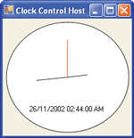
Figure 3** Clock Control **
Testing a component at design time requires a little more attention since you're likely to be testing in the same environment that you're developing in, namely Visual Studio .NET. Things you might test include adding it to the Toolbox, dragging it onto a form, configuring properties, consuming events, and execution. The simplest way to support all of this is to create a host Windows Application project, adding it to the same solution as your control project (see Figure 4).
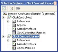
Figure 4** Create a Host **
Customizing the Toolbox
If your component is a User Control (and therefore derives from System.Windows.Forms.UserControl), you'll find that it automatically appears in the Toolbox under the Windows Forms tab after a successful build. For other components, you'll need to add them to the Toolbox manually. First, right-click the Toolbox and select Customize Toolbox. Then select the .NET Framework Components tab. Click the Browse button, navigate to the location of your control's assembly file, and click the Open button. Then click OK.
Once the component is firmly entrenched on the Toolbox, you can indulge in an Alan Cooper-inspired drag-and-drop orgy, spreading your components into Windows Forms projects far and wide.
Debugging
In a standard Windows Forms application, debugging is a matter of setting a breakpoint in some of your component's code and running the test application, relying on Visual Studio .NET to break at the right moment. Debugging design-time components requires a similar approach in that the DLL is going to need a hosting EXE to debug against. What makes testing design-time functionality a bit different is that you need a design-time host to debug against, and the favorite one is Visual Studio .NET itself. This means that you'll be using one instance of Visual Studio .NET with your component's project loaded to debug another instance of Visual Studio .NET with an instance of the component itself loaded. While this may seem somewhat confusing, it's remarkably easy to set up:
- Open the component to debug into one instance of Visual Studio .NET.
- Set a second instance of Visual Studio .NET as your debug application by going to Project | Properties | Configuration Properties | Debugging. Set Debug Mode to Program. Set Start Application to Devenv.exe path\devenv.exe. Then set Command Line Arguments to Test Solution Path\TestSolution.sln.
- Select Set as StartUp Project on your component project.
- Set a breakpoint in the component.
- Use Debug | Start (or F5) to begin debugging.
At this point, a second instance of Visual Studio .NET starts up with another solution (don't attempt to load the solution for the component you're testing into the second instance of Visual Studio .NET) and you can debug at will.
Components versus Controls
Although components and controls are similar as far as their design-time interaction is concerned, they are not identical. The most obvious difference is how they are drawn on the design surface. One not-so-obvious divergence is what happens when you drag one onto the design surface. When dropping a control, a design-time instance is created to support various design-time features, including the generation of initialization code to set the properties of the control (see Figure 5).
Figure 5 Designer-managed InitializeComponent
class ClockControlHostForm: Form {
    ClockControlLibrary.ClockControl clockControl1;
    •••
    void InitializeComponent() {
        this.clockControl1 = new ClockControlLibrary.ClockControl();
        •••
        // clockControl1
        this.clockControl1.Alarm =
          new System.DateTime(2002, 11, 26, 3, 39, 42, 967);
        this.clockControl1.Location = new System.Drawing.Point(18, 16);
        this.clockControl1.Name = "clockControl1";
        this.clockControl1.Size = new System.Drawing.Size(256, 238);
        this.clockControl1.TabIndex = 0;
        this.clockControl1.Text = "clockControl1";
        •••
    }
    •••
}
InitializeComponent is a designer-managed area of your form code to which the designer serializes relevant initialization code for the controls and components hosted on the form. The designer uses InitializeComponent to remember control state across form loads at design time and to initialize controls for run-time execution. The designer does not generate the same code for every type of object that can be dragged onto a form. In particular, components that aren't also controls get all of the same code for creation and initialization as controls do, but they also get some extra code that notifies them when their container goes away. Controls don't need this extra code because they already get the Closed event, which is an equivalent notification for most purposes. A component can let the designer know that it would like to be notified when its container goes away by implementing a public constructor that takes a single argument of type IContainer, as shown in this snippet:
class ClockComponent: Component {
    public ClockComponent(IContainer container) {
        // Add object to container's list so that
        // we get notified when the container goes away
        container.Add(this);
    }
    •••
}
Notice that the constructor uses the container to add itself as a container component. In the presence of this constructor, the designer will generate code that uses this constructor, passing it a container for the component to add itself to. For example, if our clock sample were a component instead of a control, once it were dragged onto a design surface, the initialization code would call the special constructor:
class ClockComponentHostForm: Form {
    ClockComponent clockComponent1;
    IContainer components;
    •••
    void InitializeComponent() {
        this.components = new System.ComponentModel.Container();
        this.clockComponent1 = new ClockComponent(this.components);
        •••
    }
    •••
}
By default, the generated code for anything with a design surface will notify each component in the container as part of the Dispose method implementation:
class ClockComponentHostForm: Form {
    •••
    protected override void Dispose(bool disposing) {
        if (disposing) {
            if (components != null) {
                // Call each component's Dispose method
                components.Dispose();
            }
        }
        base.Dispose(disposing);
    }
}
A component that has added itself to the container can catch the notification that is being disposed by overriding the Component base class's Dispose method:
class ClockComponent: Component {
    •••
    protected override void Dispose(bool disposing) {
        // Dispose of resources
        •••
        // Let base class have a chance
        base.Dispose(disposing);
    }
}
This service of the designer allows all types of components to be immediately notified when the container goes away, although this happens differently depending on whether the component is actually a component or a control.
Design Mode
As soon as the basic clock control is hosted at design time, it's clear that it is a bit overzealous in keeping time:
void timer_Tick(object sender, EventArgs e) {
  this.Refresh();
  •••
}
The code contained in this timer event implements run-time functionality that shouldn't be executed at design time. To avoid executing such code, a control can check whether it's currently in design-time or run-time mode with Component.DesignMode, as shown here:
void timer_Tick(object sender, EventArgs e) {
    if (this.DesignMode) return;
    this.Refresh();
    •••
}
Note that the DesignMode property shouldn't be checked from within the constructor, or any code called by the constructor. Since the constructor is called prior to the component being assigned to a site, and it's the site that determines whether a component is in design mode or not, an object can't know whether it's in design mode until after the constructor has finished executing.
Attributes
Design-time functionality is available to controls in one of two ways: programmatically or declaratively. DesignMode is an example of the programmatic approach. One side effect of using a programmatic approach is that your component implementation takes on design-time responsibilities, resulting in a blend of design-time and run-time code. On the other hand, a declarative approach relies on attributes to request design-time functionality implemented somewhere else, most often in the designer host itself. As an example attribute, consider the default Toolbox icon for a component, which you can see in Figure 6.
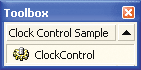
Figure 6** Old Icon **
Using System.Drawing. ToolboxBitmapAttribute, you can give your component a professional look by specifying a more appropriate image. The first thing to do is add a 16 × 16 pixel, 16-color icon or bitmap to your project and set its Build Action to Embedded Resource. Then, to associate it with your component, add the ToolboxBitmapAttribute:
[ ToolboxBitmapAttribute(typeof(ClockControl), "images.ClockControl.ico") ]
class ClockControl : Control { ... }
The parameters to this attribute specify the use of an icon resource located in the "images" project subfolder.
You'll find that the Toolbox image doesn't change if you add or change ToolboxBitmapAttribute after the component has been added to the Toolbox. However, if your implementation is just a component (and not a control), its icon is updated in the component tray. You can only assume that the Toolbox is not under the direct management of the Windows Forms designer, unlike the component tray. To refresh the Toolbox, remove and then re-add the component to the Toolbox. The result will be something like Figure 7.
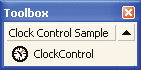
Figure 7** New Icon **
You can achieve the same result without using ToolboxBitmapAttribute by placing a 16 × 16 pixel, 16-color bitmap into the same project folder as the control and giving it the same name as the control class. This is a special case shortcut for the ToolboxBitmapAttribute only, so don't expect to find similar shortcuts for other design-time attributes.
Property Browser
Aside from code serialization, another interesting thing the designer does with your component is make it accessible through the property browser. The designer uses reflection with the design-time control instance to discover its public properties. It then calls the get accessor on each property to find the current value, rendering the property names and associated values in the property browser. Figure 8 shows how the property browser looks for the basic clock control.
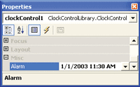
Figure 8** Clock Properties **
The System.ComponentModel namespace provides a comprehensive set of attributes (see Figure 9) to help your control modify its appearance in the property browser. By default, public read and read/write properties are displayed in the property browser under the "Misc" category, such as the Alarm property which is highlighted in Figure 10.
Figure 9 Design-time Property Browser Attributes
| Attribute | Description |
|---|---|
| Browsable | Determines whether the property is visible in the property browser |
| Category | Tells the property browser in which group to include this property |
| Description | Provides text for the property browser displays in its description bar |
| DesignOnly | Specifies that the design-time value of this property is serialized to the form's resource file, and is typically used on design-time-only properties |
| MergableProperty | Allows this property to be combined with properties from other objects when more than one are selected and edited |
| ParenthesizePropertyName | Specifies whether this property should be surrounded by parentheses in the property browser |
| ReadOnly | Specifies that this property cannot be edited in the property browser |
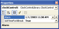
Figure 10** Alarm Property **
If a property is intended for run time only, it can be hidden from the property browser by including the BrowsableAttribute with the property, like this:
[ BrowsableAttribute(false) ]
public bool IsItTimeForABreak { get { ... } set { ... } }
With IsItTimeForABreak out of the design-time picture, only the custom Alarm property remains. However, it's currently listed under the property browser's Misc category and lacks a description. We can improve the situation by applying both the CategoryAttribute and the DescriptionAttribute, like so:
[ CategoryAttribute("Behavior"), DescriptionAttribute("Alarm for late risers") ]
public DateTime Alarm { get { ... } set { ... } }
After adding these attributes and rebuilding, you'll notice that the Alarm property has relocated to the desired category in the property browser, and the description appears on the description bar when you select the property (both shown in Figure 11). You can actually use the CategoryAttribute to create new categories, but only do so if the existing categories don't describe the property; otherwise, you'll confuse users who are looking for your properties.
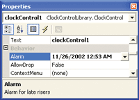
Figure 11** New Category **
In Figure 11, you might have noticed that some property values are bold and some are not. Bold values are those that differ from the property's default value, as specified by the DefaultValueAttribute shown here:
[CategoryAttribute("Appearance"),
  DescriptionAttribute("Determines whether digital time is shown"),
  DefaultValueAttribute(true)]
  public bool ShowDigitalTime {
    get {
        ...
    }
    set {
        ...
    }
}
Using DefaultValueAttribute also allows you to reset a property to its default value via the property browser, which is available from the property's context.
The Reset option is disabled if the current property value is the default. Non-default properties are rendered in bold to provide a visual cue that they've been changed.
Like properties, a class can also have default values, most notably events and properties. By adorning a class with the DefaultEventAttribute, the designer will automatically hook up this event for you when the control is double-clicked:
[ DefaultEventAttribute("SoundTheAlarm") ]
class ClockControl : Control { ... }
Likewise, adorning the class with the DefaultPropertyAttribute will cause the property browser to highlight the property by default:
[ DefaultPropertyAttribute("ShowDigitalTime") ]
class ClockControl : Control { ... }
Code Serialization
Unlike the DefaultEventAttribute and DefaultPropertyAttribute, the DefaultValueAttribute serves a dual purpose. Not only does it affect a property's appearance in the property browser, but it also influences what code the designer serializes to InitializeComponent. Those with a default value are only included if the property's value is different than the default. The primary rule of thumb is that your initial property values should match the value set by the DefaultValueAttribute.
DesignerSerializationVisibilityAttribute is another attribute that affects the code serialization process. Its constructor takes a value from the DesignerSerializationVisibility enumeration. The default, Visible, causes a property's value to be set in InitializeComponent if its value is not the same as that of the default (as we've seen). If you'd prefer that no code is generated to initialize a property, no matter what the value, use Hidden:
[CategoryAttribute("Appearance"),
  DescriptionAttribute("Determines whether digital time is shown"),
  DefaultValueAttribute(true),
  DesignerSerializationVisibilityAttribute(DesignerSerializationVisibility.Hidden)]
  public bool ShowDigitalTime {
    get {
        ...
    }
    set {
        ...
    }
}
You should use Hidden in conjunction with the Browsable attribute set to false for run-time-only properties.
Batch Initialization
You might have noticed that the code that does eventually get serialized to InitializeComponent is laid out as an alphanumerically ordered sequence of property sets, grouped by object. Order isn't important until your component or control exposes range-dependent properties, such as Min/Max or Start/Stop pairs. The clock control also has two dependent properties, PrimaryAlarm and the BackupAlarm (we decided to split the Alarm property into two for extra-sleepy people).
Internally, the clock control instance initializes the two properties 10 minutes apart, starting from the current date/time:
DateTime _primaryAlarm = DateTime.Now;
DateTime _backupAlarm = DateTime.Now.AddMinutes(10);
Both properties should check to ensure the values are valid, as shown in Figure 12. Figure 13 shows the resulting code when these properties are serialized to InitializeComponent. At design time, the property browser would show an error dialog if you enter an invalid property into the property browser. That's OK, because it lets the developer know the relationship between the two properties. However, even if the developer sets them appropriately, we still have a problem at runtime. The problem is that properties are serialized in InitializeComponent in alphabetical order. When BackupAlarm is set, validation takes place resulting in an exception being thrown because the PrimaryAlarm property hasn't been set yet. What we'd like is to be notified when properties are being set in batch mode so that we can validate them all at once, no matter what order they're set in.
Figure 13 Designer-serialized Property Initialization
void InitializeComponent() {
    •••
    //
    // clockControl1
    //
    this.clockControl1.BackupAlarm =
      new System.DateTime(2003, 1, 31, 6, 31, 27, 685);
    •••
    this.clockControl1.PrimaryAlarm =
      new System.DateTime(2003, 1, 30, 0, 0, 0, 0);
    •••
}
Figure 12 Check for Valid Values
public DateTime PrimaryAlarm {
    get {
        return _primaryAlarm;
    }
    set {
        if (value >= _backupAlarm)
          throw new Exception("Primary alarm must be before Backup alarm");
        _primaryAlarm = value;
    }
}
public DateTime BackupAlarm {
    get {
        return _backupAlarm;
    }
    set {
        if (value < _backupAlarm)
          throw new Exception("Backup alarm must be after Primary alarm");
        _backupAlarm = value;
    }
}
Implementing System.ComponentModel.ISupportInitialize provides this capability with two notification methods called before and after initialization:
public interface ISupportInitialize {
  public void BeginInit();
  public void EndInit();
}
When implemented, calls to BeginInit and EndInit are serialized to InitializeComponent (see Figure 14). Placing the appropriate validation logic into EndInit lets us delay property checking until after initialization, as shown here:
class ClockControl:
...,
ISupportInitialize {
    void ISupportInitialize.BeginInit() {}
    void ISupportInitialize.EndInit() {
        // Check alarm values
        if (_primaryAlarm >= _backupAlarm)
          throw new Exception("Primary alarm must be before backup alarm");
    }
    •••
}
Figure 14 Initialization Notification
void InitializeComponent() {
    •••
    ((System.ComponentModel.ISupportInitialize)(this.clockControl1)).BeginInit();
    •••
    // clockControl1
    this.clockControl1.BackupAlarm =
      new System.DateTime(2003, 1, 31, 6, 31, 27, 685);
    •••
    this.clockControl1.PrimaryAlarm =
       new System.DateTime(2003, 1, 30, 0, 0, 0, 0);
    •••
    ((System.ComponentModel.ISupportInitialize)(this.clockControl1)).EndInit();
    •••
}
The final step is to disable both PrimaryAlarm and BackupAlarm's property setter validation logic during initialization, with a simple flag representing the component's initialization state (see Figure 15).
Figure 15 Disabling Property Validation
class ClockControl:
...,
ISupportInitialize {
    •••
    private bool _initializing = false;
    •••
    void ISupportInitialize.BeginInit() {
        _initializing = true;
    }
    void ISupportInitialize.EndInit() {
        if (!this.DesignMode) {
            •••
        }
        _initializing = false;
    }
    •••
    public DateTime PrimaryAlarm {
        get {•••
        }
        set {
            if (!_initializing) {
                •••
            }
            _primaryAlarm = value;
        }
    }
    public DateTime BackupAlarm {
        get {
            •••
        }
        set {
            if (!_initializing) {
                •••
            }
            _backupAlarm = value;
        }
    }
}
Now the control supports design time and run time validation checking, independent of property setting order in InitializeComponent.
EndInit also turns out to be a better place to avoid the timer's Tick event, which currently fires once every second during design time. Placing the timer's initialization logic into EndInit prevents the events from firing until run time:
class ClockControl:
...,
ISupportInitialize {
    void ISupportInitialize.BeginInit() {}
    void ISupportInitialize.EndInit() {
        if (!this.DesignMode) {
            •••
            //Initialize timer
            _timer.Interval = 1000;
            _timer.Tick += new System.EventHandler(this.timer_Tick);
            _timer.Enabled = true;
        }
    }
    •••
}
Extender Controls
So far the discussion has focused on the properties implemented by a control for itself, but there are situations where a control might actually provide properties to other controls. For example, the clock control only tells the time in the current time zone. Adding a TimeZoneModifier property would allow the clock control to be adjusted to tell the time in other time zones. This is an example of a property that might be better provided or extended to other controls.
One way to use this feature could be to display the time in each time zone in which your organization has offices. If each office was visually represented with a picture box, you could drag one clock control for each time zone onto the form, adjusting the TimeZoneModifier property on each clock control manually. The result might look like the clocks in Figure 16.
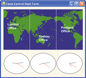
Figure 16** Time Zones **
This works quite nicely, but could lead to space problems, particularly if you have one clock control for each of the 24 time zones globally and, consequently, there are 24 implementations of the same logic on the form. Figure 17 shows how this might look.
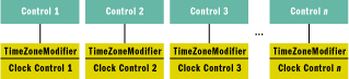
Figure 17** Too Many Instances **
Another approach might be to have a single clock control and update its TimeZoneModifier property with the relevant time zone from, say, the Click event of each picture box. This is a more cumbersome approach because it requires developers to write the code associating a time zone offset with each control that affects the time zone, as shown in Figure 18.
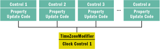
Figure 18** One Clock Control **
It would be nice to be able to access a single implementation of the clock control without forcing the developer to write code to associated per-control property values for the clock. The .NET Framework provides extender properties to do just this.
Logically, an extender property is a property provided by an extender control (like the clock control) on other controls in the same container (like the picture boxes). By implementing the TimeZoneModifier as an extender property, each picture box control on the form can get its own value, as shown in Figure 19.
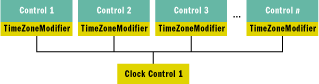
Figure 19** Better Way to Use One Control **
Exposing an extender property from your control first requires that you declare the property to extend using the ProvidePropertyAttribute, like this:
[ ProvidePropertyAttribute("TimeZoneModifier", typeof(PictureBox)) ]
public class ClockControl : System.Windows.Forms.Control { ... }
The first parameter to the attribute is the name of the property to extend. The second parameter is the "receiver" type, which specifies the type of object to extend, such as Control or Button. Only controls of the type specified by receiver can be extended. If you'd like to implement a more sophisticated algorithm, like supporting picture boxes and panels for example, you'll need to implement IExtenderProvider like so:
class ClockControl:
...,
IExtenderProvider {
    bool IExtenderProvider.CanExtend(object extendee) {
        // Don't extend self
        if (extendee == this) return false;
        // Extend suitable controls
        return ((extendee is PictureBox) || (extendee is Panel));
    }
    •••
}
As shown in Figure 20, the provider supports one or more extendee controls. Consequently, the provider control must be able to store and distinguish one extendee's property value from another. It does this with GetPropertyName and SetPropertyName methods, where PropertyName is the name you provided in the ProvidePropertyAttribute. GetTimeZoneModifier simply has to return the property value when requested by the property browser:
public class ClockControl: System.Windows.Forms.Control,
IExtenderProvider {
    private HashTable _timeZoneModifiers = new HashTable();
    public string GetTimeZoneModifier(Control extendee) {
        return Convert.ToString(_timeZoneModifiers[extendee]);
    }
    •••
}
Figure 20 Extended TimeZoneModifier Property Setter
class ClockControl:
...,
IExtenderProvider {
    private HashTable _timeZoneModifiers = new HashTable();
    public void SetTimeZoneModifier(Control extendee, object value) {
        string timeZoneModifier = (string) value;
        // If property isn't provided
        if ((timeZoneModifier == "") || (timeZoneModifier == null)) {
            // Remove it
            _timeZoneModifiers.Remove(extendee);
            if (!this.DesignMode) {
                extendee.Click -= new EventHandler(extendee_Click);
            }
        } else {
            // Add it, convert it to Int32 to make sure it's the right type
            _timeZoneModifiers[extendee] = Convert.ToInt32(timeZoneModifier);
            if (!this.DesignMode) {
                extendee.Click += new EventHandler(extendee_Click);
            }
        }
    }
    •••
}
SetTimeZoneModifier has the responsibility of storing and retrieving property values on behalf of the extendee control. Also, with the example TimeZoneModifier property, we need to hook into each extendee control's Click event unless the control isn't using the extended property. SetTimeZoneModifier is shown in Figure 20. As with normal properties, you can affect their appearance in the property browser by adorning the GetPropertyName property implementation with the usual suspects, which are shown here:
class ClockControl:
...,
IExtenderProvider {
    [Category("Behavior"),
     Description("Sets the timezone difference from the current time"),
     DefaultValue("")]
     public string GetTimeZoneModifier(Control extendee) {
         ...
    }
    •••
}
These attributes are applied to the extendee's property browser view. A compiled control's extended properties will appear in the extendee control's property browser as specified by the use or lack of attributes, with the following naming format:
<ExtendedPropertyName> on <ExtenderProviderName>
Figure 21 shows the extended TimeZoneModifier property in action, behaving like any other property, on a PictureBox control.
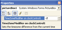
Figure 21** TimeZoneModifier **
If a property is set and is not the default value, it is serialized to InitializeComponent grouped with the extendee control, but set on the extender control:
void InitializeComponent() {
    •••
    // pictureBox1
    this.pictureBox1.Location = new System.Drawing.Point(62, 163);
    this.pictureBox1.Name = "pictureBox1";
    this.pictureBox1.TabIndex = 5;
    this.pictureBox1.TabStop = false;
    this.clockControl1.SetTimeZoneModifier(this.pictureBox1, "-2");
    •••
}
Where Are We?
We've given you an overview of building and debugging controls that target the .NET Framework design-time features. You've also seen how attributes and interfaces enhance a control's relationship with the property browser and InitializeComponent. In a future article we'll show you some more advanced design-time features including TypeConverters, UITypeEditors, and Designers, which really spruce up your control's usability and flexibility.
For background information see:
Windows Forms by Chris Sells (to be published by Addison-Wesley in 2003)
Michael Weinhardt is a software engineer at SERF, a retirement fund company where he develops applications for the .NET Framework. He can be reached at mikedub@optusnet.com.au.
Chris Sellsis an independent consultant, speaker, and author specializing in distributed applications in the .NET Framework and COM. More information about Chris and his various projects is available at https://www.sellsbrothers.com.