Code Name Avalon
Create Real Apps Using New Code and Markup Model
Charles Petzold
Code download available at:Avalon.exe(141 KB)
This article was based on the pre-PDC build of Microsoft Windows Code Name "Longhorn" and all information contained herein is subject to change.
Note: This document was developed prior to the product's release to manufacturing and, as such, we cannot guarantee that any details included herein will be exactly the same as those found in the shipping product. The information represents the product at the time this document was printed and should be used for planning purposes only. Information subject to change at any time without prior notice.
SUMMARY
The presentation subsystem in the next version of Windows, code-named "Longhorn," offers powerful new capabilities to developers. This subsystem, code-named "Avalon," allows developers to take advantage of its capabilities through a new markup language code-named "XAML." In addition, modern object-oriented programming languages such as C# and Visual Basic .NET can be used to tie everything together. Because most applications written to Avalon will probably be a mix of XAML and programming code, this article discusses XAML tags used to control page layout along with the procedural code written to respond to events.
Contents
Dueling Interfaces
Layout Options
Event Handling
Elements and Objects
Animation
Styles
An Avalon Color Scroll
Conclusion
For thousands of years, philosophers and scientists have attempted to explain the cosmos in terms of dual opposing but coexistent principles: good and evil, yin and yang, matter and energy, mind and body, waves and particles, and, of course, programming code and markup languages.
Programming and markup currently coexist in an uneasy truce. In theory, programming languages can do anything the computer is capable of, but they're often clunky for the job of laying out text, images, and controls in a simple visual interface. Markup is great for defining highly textured pages of text and images that adapt to different screen sizes and environments, but is hopelessly inept when it comes time to interact with the user in any nontrivial way.
In creating a new programming interface for building Windows®-based client applications, the developers at Microsoft have decided not to deny this dualism, but to embrace and celebrate it. They have created an environment in which programming and markup boldly and intricately mesh in mutually supporting roles. The result—the presentation subsystem code-named "Avalon"—may well be the greatest experiment in synergistic duality since Adam and Eve. Vive la différence!
Dueling Interfaces
Avalon, part of the next version of Windows, code-named "Longhorn," consists mostly of a new collection of classes added to the .NET Framework. The most important new namespaces for Avalon programming currently have names like MSAvalon.Windows, MSAvalon.Windows.Controls, and MSAvalon.Windows.Media. (Expect these names to change before Longhorn reaches final release.) With Avalon you can write applications in C#, Visual Basic® .NET, or any other language that supports the .NET Common Language Specification (CLS). These programs are quite similar to Windows Forms applications that you can write today. That's the normal part of Avalon.
In addition, Avalon also defines a new markup language you can use in Longhorn that's code-named "XAML"—Extensible Application Markup Language (pronounced "zammel"). You use XAML much like HTML to define a layout of text, images, and controls. Being based on XML, XAML has stricter and much less ambiguous syntax than HTML. It is expected that most XAML will be machine-generated by visual design programs, but it may be a good learning experience to hand-write your own XAML (initially).
Most applications written to Avalon will probably contain both program code and XAML. You'll use the XAML for defining the initial visual interface of your application, and write code for doing everything else. You can embed the program code directly in XAML or keep it in a separate file. Everything you can do in XAML you can also do in program code, so it's possible to write a program without using any XAML at all. The reverse is not true, however; there are many tasks that can only be done in program code, so only the simplest applications will consist entirely of XAML. Here's a little snippet of some XAML:
<Button Background="LightSeaGreen" FontSize="24pt"> Calculate </Button>
This snippet is a single XML element, which consists of a start tag, an end tag, and content between the two tags. The element type is Button. The start tag also includes two attribute specifications; the attribute names are Background and FontSize. They are assigned attribute values, which, under the requirements of XML, must be enclosed in single or double quotation marks. Between the start tag and end tag is the element content, which in this case is the text that appears on the face of the button.
What this Button element does not include is a width or height. Normally, buttons and other controls under Avalon are automatically sized to fit their content. (You can override that behavior, of course.) In this particular case, the Button is made large enough to accommodate the text string "Calculate" in a 24-point font. This Button element also does not include a coordinate location. Generally controls are dynamically positioned in a window at run time based on the size of the window and the controls.
XAML has very intimate ties with the Avalon class library: every element type you can use in XAML is actually a class and, specifically, a descendent of the UIElement or ContentElement classes declared in the MSAvalon.Windows namespace. Among the descendents of UIElement is Control, from which are descended all the common user-interface controls such as buttons, scroll bars, list boxes, edit fields, and so forth. Classes derived from ContentElement include Bold and Italic.
The attribute names you specify in the XAML start tags are actually properties of these classes. Properties have always played an important role in the .NET Framework and here are elevated to an even higher stature. If you haven't yet done any .NET Framework programming, you should know that properties are members of classes just like methods and fields. In use, they look like fields but they are implemented more like methods. Unlike fields, properties contain code. Properties can be readable, writable, or both. A read/write property named Background is basically equivalent to a pair of symmetric methods named set_Background and get_Background.
Of course, the modern programmer wants to know: can I use my own classes as XAML elements? And the answer is: of course you can. XAML is called the Extensible Application Markup Language for a reason. Any class that has a public parameterless constructor and settable properties can be used in XAML.
The Button element I just showed is equivalent to code that creates an object of type Button and then assigns the Background, FontSize, and Content properties. The equivalent C# code is:
Button btn = new Button(); btn.Background = Brushes.LightSeaGreen; btn.FontSize = new FontSize(24, FontSizeType.Point); btn.Content = "Calculate";
As you can see, defining the object in XAML considerably simplifies the assignment of these three properties. The Brushes class consists of static properties for all the predefined colors (the same colors commonly supported in HTML). FontSize is a structure encapsulating a unit-independent measurement. FontSizeType is an enumeration. Regardless of whether a property is defined as a string, an integer, a floating-point value, a Boolean, an enumeration, or some other type, the equivalent XAML attribute is simply assigned a text string.
The Content property indicates what appears on the surface of the button and corresponds to the content of the Button element in XAML. This means that the Button element could also be written in this way:
<Button Background="LightSeaGreen" FontSize="24pt" Content="Calculate"> </Button>
Because this Button element sets the Content attribute and no longer includes any content between its opening and closing tags, it could be written as an empty element tag:
<Button Background="LightSeaGreen" FontSize="24pt" Content="Calculate" />
Notice the closing slash at the end of the element.
In this example Content seems to be a property of type string, but that's not the whole story. The Content property is declared to be of type object, strongly suggesting that the button content doesn't necessarily have to be a simple text string. It could, for example, be an Image element:
<Button> <Image Source="Calc.jpg"/> </Button>
If you want your button to display both text and an image, you can include both:
<Button> Calculate <Image Source="Calc.jpg"/> </Button>
The text and image elements will appear side by side. (Such elements are often referred to as children of the parent Button element.) The Button element doesn't support more sophisticated layout qualities, but if you want it, it's available. The trick is to specify that the content of the Button is an XAML element such as Text that supports flexible layout options. Here's a button whose content is a single Text element, which in turn contains an image, a line break, and a text string:
<Button FontSize="24pt"> <Text> <Image Source="Calc.jpg"/> <LineBreak/> Calculate </Text> </Button>
The LineBreak element is equivalent to <br> in HTML. A button that displays an image with text underneath might be appropriate for a tool bar. You could make it a bit more dramatic with some italic text formatting:
<Button FontSize="24pt"> <Text> <Image Source="Calc.jpg"/> <LineBreak/> Calculate <Italic>this</Italic> </Text> </Button>
This is a good example of something that in markup looks very natural, but which is rather awkward when expressed in code. You can, in fact, specify all of these elements in code, but why would you want to?
Now that you've had a little taste of XAML, let's look at some complete programs. Figure 1 shows a simple XAML implementation of the traditional Hello World program. Only one root element is allowed in XML, and in XAML that root element is generally an output surface. TextPanel is an output surface that provides automatic layout similar to HTML. Normally you'll have one XAML file for each page of your application (if, indeed, your application has pages), and also a XAML file for each dialog box. A feature called Styles (that I'll discuss a little later on) can help you maintain a consistent visual style throughout your program.
Figure 1 Hello World
<TextPanel xmlns="https://schemas.microsoft.com/2003/xaml" Background="BlanchedAlmond" FontFamily="Comic sans MS" FontSize="36pt" HorizontalAlignment="Center"> Hello, world! </TextPanel>
The xmlns (XML namespace) attribute in the TextPanel element serves the same function as the using directive in C#. Because all the elements in a XAML file map to equivalent classes in the Microsoft .NET Framework, the xlmns attribute provides a URI pointing to a file that lists the names of the .NET namespaces where the classes are declared.
Just to make the Hello World program interesting, I added a few attributes to the TextPanel element to set colors and a font, and to specify that the element's children are centered horizontally within the panel. The content of the TextPanel element is the character data "Hello, world!" The content could also include images, controls, more text, and so forth.
Since it has no code in it, you can load the HelloWorld.xaml file directly into the Longhorn version of Microsoft Internet Explorer, and you'll see something that looks like a Web page. You can also compile HelloWorld.xaml using a program currently called MSBuild. You'll need a couple other short files (not shown here) for this compilation. A file with the extension PROJ or MSPROJ provides some information about the program and lists all the required source files (XAML and otherwise). Another short XAML file is also required to indicate the XAML page that is first displayed when the program is executed. Run the Hello World executable and you see something that looks like a Windows program. Figure 2 shows both versions.
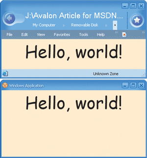
Figure 2** Hello World as a Page and a Program **
The roughly equivalent C# version of this program is shown in Figure 3. (I say roughly equivalent because MSBuild is capable of emitting C# code, and this is not exactly what it emits. My version is considerably less abstruse.) You can compile this program on the command line like this:
csc /r:WindowsBase.dll;PresentationCore.dll;PresentationFramework.dll
Anyone who has experience with Windows Forms will find the structure and look of this program vaguely familiar. The program is responsible for explicitly creating an application object and a window object before creating the TextPanel object. These preliminary jobs are implied in the XAML version of the program.
Figure 3 Hello World App in C#
using System; using MSAvalon.Windows; using MSAvalon.Windows.Controls; using MSAvalon.Windows.Media; class HelloWorldApp: Application { [STAThread] static void Main() { HelloWorldApp app = new HelloWorldApp(); app.Run(); } protected override void OnStartingUp(StartingUpCancelEventArgs args) { Window win = new Window(); TextPanel tp = new TextPanel(); tp.Background = Brushes.BlanchedAlmond; tp.FontFamily = "Comic sans MS"; tp.FontSize = new FontSize(72f, FontSizeType.Point); tp.HorizontalAlignment = MSAvalon.Windows.HorizontalAlignment.Center; tp.TextRange.Text = "Hello, world"; win.Children.Add(tp); win.Show(); } }
The odd part of this C# code involves the text string displayed in the window. Normally in a Windows program you'd specify a coordinate position where the text is to appear, but TextPanel incorporates automatic layout that arranges the panel's content based on the size of the window and the content. This is one way in which HTML has now influenced client application programming: with Avalon you can take advantage of automatic layout in your programming code.
Layout Options
The root element of an XAML file is generally a surface on which other elements appear. For this purpose, Avalon includes a Panel class and several descendents of Panel, including the TextPanel element used in HelloWorld.
FlowPanel is similar to TextPanel. Like HTML, both provide automatic layout based on the size of the elements and the size of the window. TextPanel has more sophisticated text-formatting abilities, and can even arrange text into multiple columns. FlowPanel is the more efficient choice if extensive text formatting is not required.
If you want to use a FlowPanel with the HelloWorld program, you'll have to change the way you specify text that appears on the panel. Unlike TextPanel, FlowPanel does not allow text content, but it does allow content consisting of a Text element. You'd need to use a Text element and move the FontFamily and FontSize attributes into it:
<Text FontFamily="Comic Sans MS" FontSize=36pt>Hello, world!</Text>
Another panel option is DockPanel, which arranges its child elements in a tiled fashion, fastened to the edges of the panel. Windows Explorer is a typical example of an application that uses docking; there's a tool bar at the top, a status bar at the bottom, a directory tree at the left, and directory contents at the right.
GridPanel arranges child elements in rows and columns. Avalon also provides a Table control that provides additional features similar to HTML tables.
The final layout option is called Canvas, to which fans of Descartes' coordinate system have been banished. You need to explicitly position elements on the Canvas panel using properties provided for that purpose.
You're not limited to using just one panel on a page. Everything in XAML is hierarchical. For example, you can divide a page into three areas using DockPanel, and then use FlowPanel, Canvas, and GridPanel for these three areas:
<DockPanel> <FlowPanel DockPanel.Dock="Left"> ••• </FlowPanel> <Canvas DockPanel.Dock="Top"> ••• </Canvas> <GridPanel DockPanel.Dock="Fill"> ••• </GridPanel> </DockPanel>
The hierarchical nature of XAML is one reason why a markup language makes more sense than programming code for defining a visual interface. The markup can mimic the hierarchy with nesting and indentation. In fact, when Windows 1.0 was first introduced in 1985, programmers used a text resource script to define the hierarchical structure of their menus and dialog boxes. At the time, the hierarchy only went one level deep, but it was a start. A XAML file is just the resource script.
The content of Button elements can be text, an image, or a combination of text and images in a nested Text element. The content of a Button can also be a panel onto which other elements are positioned. Figure 4 shows a program named SmileyButton that does precisely that. The content of this button is a Canvas. The program then puts several elements from the MSAvalon.Windows.Shapes namespace on the Canvas. Figure 5 shows the program running.
Figure 4 SmileyButton
<TextPanel xmlns="https://schemas.microsoft.com/2003/xaml" Background="Cyan" HorizontalAlignment="Center"> <Button Width="150" Height="140"> <Canvas Width="120" Height="120"> <Ellipse CenterX="60" CenterY="60" RadiusX="50" RadiusY="50" Fill="Gray" Stroke="Black"/> <Ellipse CenterX="40" CenterY="40" RadiusX="10" RadiusY="10" Fill="Blue"/> <Ellipse CenterX="80" CenterY="40" RadiusX="10" RadiusY="10" Fill="Blue"/> <Polyline Points="30, 70, 60, 80, 90, 70" StrokeThickness="10" Stroke="Red"/> </Canvas> </Button> </TextPanel>
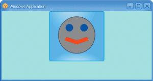
Figure 5** SmileyButton in Action **
The Shapes namespace consists of an abstract class named Shape and seven descendents: Line, Polyline, Rectangle, Ellipse, Polygon, Glyphs, and Path. Unfortunately there isn't an Arc or Bezier class in the Shapes namespace, so I drew the mouth as a two-segment polyline. I could have mimicked an arc using a Bezier curve in the Path element, but that would be showing off. You can do more extensive graphics in programming code attached to a XAML page.
Event Handling
Windows-based applications are more than just Web page wannabes. Programs need to respond to user interface events in very specialized ways. Here is where XAML must be supplemented by real programming code. You can put the code in a separate file or embed it directly in the XAML. In this article I'll be showing the latter approach for the sake of simplicity.
The .NET Framework and C# have a generalized mechanism called the event that classes use to signal each other. Events are members of a class just like methods, fields, and properties. One class declares an event. Another class can then choose to install an event handler for that event, which is simply a method with a specific signature and return type. The first class can then signal the second class by calling that method. Events are always associated with delegates, which are basically method prototypes. An event handler must be declared in accordance with this delegate.
The archetypal user interface event is the button click. The Button class has an event named Click that is associated with the ClickEventHandler delegate, which requires that an event handler for Click be declared something like this:
void ButtonClick(object el, ClickEventArgs args) { MessageBox.Show("The button has been clicked"); }
I've given the first parameter the name of el to indicate an element. In your XAML you specify the name of this event handler as an attribute in the Button element:
<Button Click="ButtonClick" ...>
Embedding that programming code into the XAML file requires some special syntax. Programming code often includes symbols such as < and & that have special meanings in XML. The XML specification includes a facility called the CDATA section precisely for including arbitrary character data in an XML file. Any programming code in an XAML file must be enclosed in a CDATA section. The CDATA section always begins with the string "<![CDATA[" and always ends with the string "]]>". Within the CDATA section, the characters "]]>" must not appear under any circumstances. That may actually be a problem if you write C# code that looks like this:
if (arr1[arr2[I]]>5)
Simply insert a little white space somewhere within that inadvertent CDATA delimiter ("]]>")and all will be well.
In XAML the CDATA section must also be enclosed in a def:Code element, and additional elements must indicate what programming language is being used. (At this time you can use C#, Visual Basic .NET, and JScript® .NET.) Figure 6 shows a complete XAML file with a button with a Click event handled by embedded C# code. This file must be compiled because the Longhorn version of Internet Explorer does not interpret C# code. Click the button and a message box pops up.
Figure 6 XAML Plus C# Event Handler
<TextPanel xmlns="https://schemas.microsoft.com/2003/xaml" xmlns:def="Definition" def:Language="C#" HorizontalAlignment="Center" Background="LightCyan"> <Button Click="ButtonClick" FontSize="72"> Push Me! </Button> <def:Code> <![CDATA[ void ButtonClick(object el, ClickEventArgs args) { MessageBox.Show("The button has been clicked."); } ]]> </def:Code> </TextPanel>
Elements and Objects
If your page has multiple buttons, you can have different event handlers for each button. Just give them different names. Or a single event handler can service more than one button. If so, the handler usually must determine precisely which button is being pressed. There are a couple solutions to this problem.
First, notice that the Click event handler has two parameters. The first parameter is the object generating the event. In this case it's the specific Button object that the user clicks. Within the event handler, you can cast that parameter to an object of type Button:
Button btn = el as Button;
You can then proceed to access all the members of the Button class. You can change the button color, change the text, perhaps disable the button, or even set a different event handler.
The FrameworkElement class (from which all controls and panels derive) includes a very special property named ID, which is of type string. You can set the property to a text string identifying the button. MSBuild requires that all the ID values on a page be unique. Here are two Button elements that have the same event handler but also include the following ID attributes:
<Button ID="OkButton" Click="ButtonClick">OK</Button> <Button ID="CancelButton" Click="ButtonClick">Cancel</Button>
Within the event handler, you can use the ID property to distinguish between the buttons, perhaps in a switch statement:
switch(el.ID) { case "OkButton": ••• break; case "CancelButton": ••• break; }
That's one way to use the ID property. But I said the ID property was very special and it truly is.
Let's look at these two XAML elements again:
<Button ID="OkButton" Click="ButtonClick">OK</Button> <Button ID="CancelButton" Click="ButtonClick">Cancel</Button>
When MSBuild converts this XAML to C# code in preparation for compilation, it also creates two fields of type Button named OkButton and CancelButton. These fields are set equal to the created Button objects. Within the event handler you can use these ID names just as if they were Button objects. For example:
if (el == OkButton) { ••• } else if (el == CancelButton) { ••• }
I'm using an if statement here rather than a switch because the switch allows only integer and string expressions.
Not only can you differentiate between objects using these ID names, but you also have the ability to explicitly access all the other elements on your page—or at least the ones to which you've assigned ID values. For example, some other control may want to enable or disable the OK button based on a Boolean value that it determines. It's as simple as this:
OkButton.IsEnabled = bEnable;
Actually, an event handler can access any element on the page—even those that don't have ID attributes—because the elements are all linked together in an element tree. Earlier I discussed how elements support children. The ILogicalTreeNode interface (which is implemented by the FrameworkElement class and thus by the many classes that serve as elements) defines two properties named Parent and Children. With these two properties you have access to the entire element tree, and therefore you have the ability to dynamically add elements to it, remove elements from it, or change it.
Figure 7 shows a program named MoveButtons that has three buttons labeled "Tom," "Dick," and "Harry." Whichever button you click moves itself between the other two simply by shifting elements in the panel's Children property. Can you imagine what the equivalent code would look like in a plain Win32® or MFC program, or even in a Windows Forms application?
Figure 7 MoveButtons
<FlowPanel xmlns="https://schemas.microsoft.com/2003/xaml" xmlns:def="Definition" def:Language="C#" HorizontalAlignment="Center" VerticalAlignment="Center"> <Button Click="ButtonClick" FontSize="72">Tom</Button> <Button Click="ButtonClick" FontSize="72">Dick</Button> <Button Click="ButtonClick" FontSize="72">Harry</Button> <def:Code> <![CDATA[ void ButtonClick(object el, ClickEventArgs cea) { Button btn = (Button) el; FlowPanel parent = (FlowPanel) btn.Parent; parent.Children.Remove(btn); parent.Children.Insert(1, btn); } ]]> </def:Code> </FlowPanel>
Animation
With the notable exception of animated GIF files, graphical animation almost always involves code. So one of the most surprising aspects of XAML is a whole animation facility you use entirely with markup. For better or for worse, it's fairly easy to slip a few animation effects into your XAML pages.
To understand how to use this facility, you must first know that there is an alternative to setting element attributes in a start tag. The element
<Button Background="Red"> Cancel </Button>
can also be written like this:
<Button> Cancel <Button.Background> Red </Button.Background> </Button>
The Background property is now a separate tag enclosed in the Button element, and the value of that property is now specified as the content of the Button.Background tag. That's the property I'm going to animate. Replace the content with a ColorAnimation element, like so:
<Button> Cancel <Button.Background> <ColorAnimation From="Red" To="Blue" Duration="10" Fill="Hold"/> </Button.Background> </Button>
Now when the button is first displayed, the color changes from red to blue over the course of 10 seconds. Actually, it's not quite as simple as this: because the Background property is defined not as a Color but as a Brush, you must include a SolidColorBrush element as a child of Button.Background, and also include a SolidColorBrush.ColorAnimations element as a child of SolidColorBrush. The ColorAnimation element is then a child of SolidColorBrush.ColorAnimations, as shown here:
<Button> Cancel <Button.Background> <SolidColorBrush> <SolidColorBrush.ColorAnimations> <ColorAnimation From="Red" To="Blue" Duration="10" Fill="Hold"/> </SolidColorBrush.ColorAnimations> </SolidColorBrush> </Button.Background> </Button>
This approach is bulkier but allows more flexibility in animating gradients and other complex brushes. With a Brush background, you can even introduce rich backgrounds like images and video.
There are many animation options, of course. You can specify that the animation repeat (either in terms of a number of repetitions or a time) and indicate that the animation reverses itself after each repetition. You can specify an acceleration and a deceleration. For much more control over the animation, you can even provide a series of key values and key times, and an interpolation method.
You can also animate floating-point values, coordinate points, sizes, and Length values. The AnimationButton program in Figure 8 is similar to the SmileyButton except that it animates one axis of the left eye to make it look like it's winking.
Figure 8 Smiley Winking
<?Mapping XmlNamespace="anim" ClrNamespace="MSAvalon.Windows.Media.Animation" Assembly="PresentationFramework" ?> <TextPanel xmlns="https://schemas.microsoft.com/2003/xaml" Background="Cyan" HorizontalAlignment="Center"> <Button Width="150" Height="140"> <Canvas Width="120" Height="120"> <Ellipse CenterX="60" CenterY="60" RadiusX="50" RadiusY="50" Fill="Gray" Stroke="Black"/> <Ellipse CenterX="40" CenterY="40" RadiusX="10" RadiusY="10" Fill="Blue"/> <Ellipse CenterX="80" CenterY="40" RadiusX="10" RadiusY="10" Fill="Blue"> <Ellipse.RadiusY> <LengthAnimationCollection xmlns="anim"> <LengthAnimation From="10" To="1" Duration="0.5" AutoReverse="True" RepeatDuration="Indefinite"/> </LengthAnimationCollection> </Ellipse.RadiusY> </Ellipse> <Polyline Points="30, 70, 60, 80, 90, 70" StrokeThickness="10" Stroke="Red"/> </Canvas> </Button> </TextPanel>
Styles
Sometimes you find yourself setting the same properties for a related group of controls. If you were working in HTML, you might use a Cascading Style Sheet (CSS) to help out. In Avalon, you do something similar using a Style element. If, for example, you wanted every button on your FlowPanel to have a cyan background and a 14-point font, you could include a Style tag like this:
<FlowPanel.Resources> <Style> <Button Background="Cyan" FontSize="14pt"/> </Style> </FlowPanel.Resources>
You can specify multiple element types in the same Resources section using one Style element for each element type. You can also specify that you want styles to apply to all classes that derive from a particular element, or which have a certain ID value, or which don't have a certain ID value.
You can also give a name to a particular style and apply that style only to certain elements. For example, suppose a dialog box has a bunch of radio buttons. You want some of these radio buttons to have a different size, or color, or whatever. For those, you can assign a named Style:
<RadioButton Style="{Special}" •••>
In the following Style declarations, the first style applies to those radio buttons that specify Style equal to "{Special}" and the second to those radio buttons that don't set the Style property:
<FlowPanel.Resources> <Style def:Name="Special"> <RadioButton •••/> </Style> <Style> <RadioButton •••/> </Style> </FlowPanel.Resources>
There's even a way for the property sheet to specify properties that apply only to elements that already have other properties set on them.
An Avalon Color Scroll
Figure 9 shows a program named ColorScroll.xaml that incorporates many of the Avalon features discussed in this article. ColorScroll is an Avalon version of a simple Windows program that was originally published in the May 1987 issue of Microsoft Systems Journal, the predecessor to this magazine, and which has also appeared in every edition of my book Programming Windows. More recently, I've converted the program to Windows Forms for my books Programming Microsoft Windows with C# (Microsoft Press®, 2001) and Programming Microsoft Windows with Microsoft Visual Basic .NET (Microsoft Press, 2002).
Figure 9 ColorScroll.xaml
<DockPanel xmlns="https://schemas.microsoft.com/2003/xaml" xmlns:def="Definition" def:Language="C#"> <FlowPanel Width="50%" DockPanel.Dock="Left" > <FlowPanel.Resources> <Style> <Text Height="36pt" FontSize="12pt" HorizontalAlignment="Center" VerticalAlignment="Center"/> </Style> <Style> <VerticalSlider Width="50%" Margin="25%,0,25%,0" Minimum="0" Maximum="255" SmallChange="1" LargeChange="16" DockPanel.Dock="Fill"/> </Style> </FlowPanel.Resources> <DockPanel Width="33.3%"> <Text DockPanel.Dock="Top" Foreground="Red">Red</Text> <Text DockPanel.Dock="Bottom" Foreground="Red">0</Text> <VerticalSlider ID="RedScroll" ValueChanged="OnScrolled"/> </DockPanel> <DockPanel Width="33.3%"> <Text DockPanel.Dock="Top" Foreground="Green">Green</Text> <Text DockPanel.Dock="Bottom" Foreground="Green">0</Text> <VerticalSlider ID="GreenScroll" ValueChanged="OnScrolled"/> </DockPanel> <DockPanel Width="33.3%"> <Text DockPanel.Dock="Top" Foreground="Blue">Blue</Text> <Text DockPanel.Dock="Bottom" Foreground="Blue">0</Text> <VerticalSlider ID="BlueScroll" ValueChanged="OnScrolled"/> </DockPanel> <def:Code> <![CDATA[ void OnScrolled(object el, ValueChangedEventArgs args) { // Set the text element to the new value Control slider = (Control) el; DockPanel parent = (DockPanel) ((ILogicalTreeNode) slider).Parent; Text elemText = (Text) parent.Children[1]; elemText.TextRange.Text = ((int) args.NewValue).ToString(); // Set the background color of the panel ColorPanel.Background= new SolidColorBrush( Color.FromRGB((byte) (RedScroll.Value), (byte) GreenScroll.Value, (byte) BlueScroll.Value)); } ]]> </def:Code> </FlowPanel> <TextPanel ID="ColorPanel" DockPanel.Dock="Right" Width="50%" Background="Black"/> </DockPanel>
Figure 10 shows the program in action. You manipulate the trio of sliders at the left of the program to select a color based on red, green, and blue primaries. The values of the primaries are shown below the sliders and the resulting color is shown in the right half of the window. As the window is resized the sliders adapt themselves to the total width and height of the window.
Part of the challenge of writing such a program using either the Windows API or Windows Forms involves moving and resizing all the components of the window. This is an area where Avalon really shines.
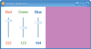
Figure 10** ColorScroll in Action **
The main panel is a DockPanel element. Two child elements each occupy half the width of the parent. On the left is a FlowPanel and on the right is a TextPanel, which is responsible for displaying the color. The TextPanel is given an ID value of ColorPanel.
The FlowPanel on the left has three DockPanel children, each of which occupies one-third of the width of the parent. Each of these DockPanel elements has three children: two Text elements at the top and bottom, and a Slider element in the middle.
The dimensions of the Text and Slider elements are provided in Style elements towards the beginning of the file. The size of the Text font is set at 12 points, and the height of the Text element is 36 points. The text is vertically centered in the Text element, so the additional space provides a visual comfort zone around the text. Because the two Text elements are docked at the top and bottom of the DockPanel, they occupy the full width of the parent, each of which is a sixth of the total width of the window.
The three Slider elements fill up the middle of each DockPanel. However, the property sheet gives each slider a width of 50 percent of its parent, and also provides a margin of 25 percent of the width of the parent on the left and right sides. These margins provide another area of visual breathing room at the sides of the slider.
Except for the font size and the height of the Text boxes, all dimensions are given in percentages of the width of the window. It took a little thought, of course, but it was much easier than determining the dimensions in pixels.
Each Slider element contains several attributes that must be initialized identically: Each slider has a range from 0 through 255. The arrow keys scroll by 1; paging up or down or clicking the central area of the slider scrolls the slider by 16. These properties are all included in the styles specification. (Perhaps an even better approach would have been to derive a new class from DockPanel that would have included the two Text elements and the Slider element, and then to create three objects of that class for the red, green, and blue scroll bars.)
The three scroll bars have ID values of RedScroll, GreenScroll, and BlueScroll; the TextPanel at the right side of the window has an ID value of ColorPanel. All these ID values are referred to in the OnScrolled event handler for the slider ValueChanged event.
The event handler first does something clever: it uses the Parent property and the panel's Children property to obtain the previous sibling of the particular slider raising the event. That's the Text element underneath the slider that displays the numeric color value. The method then sets the text of that element to the new value of the slider. The method obtains this value from the Value property of the ValueChangedEventArgs object passed to the event handler. It could also have cast the object parameter to a Slider and accessed the Value property of that.
The method then calculates a new color based on the Value properties of all three sliders, and uses that color to set a new Background property of the TextPanel at the right, which has the ID of ColorPanel.
The most recent Win32 API version of this program (called COLORS1 in the fifth edition of Programming Windows) is 250 lines long. The Windows Forms version in Programming Microsoft Windows with C# is about 100 lines. This new version is only about 60 lines long, and I'm pretty sure that it can be pruned even more by using inheritance.
From 250 lines to 100 and now 60. And that, my friends, is what is commonly called progress.
Conclusion
Avalon and XAML represent a departure from Windows-based application programming of the past. In many ways, designing your application's UI will be easier than it used to be and deploying it will be a snap. With a lightweight XAML markup for UI definition, Longhorn-based applications are the obvious next step in the convergence of the Web and desktop programming models, combining the best of both approaches.
Charles Petzold, a long-time contributing editor to MSDN Magazine (and its predecessor, MSJ), is the author of an upcoming book about Avalon from Microsoft Press tentatively titled Programming the Windows Client Platform. His Web site is https://www.charlespetzold.com.