Cutting Edge
The ASP.NET 2.0 Wizard Control
Dino Esposito
Code download available at:CuttingEdge0411.exe(129 KB)
Contents
What's Your Definition of a Wizard?
The Wizard Control in ASP.NET 2.0
Using the Wizard Control
Adding Steps to a Wizard
The "Add New Employee" Wizard
Wizard Events
The Wizard Sidebar
ASP.NET has a lot to offer to both the low-level programmer willing to control every little step of the code and the busiest of developers who needs to point-and-click his way through Web app development using just a few existing components.
For the fan of pre-built controls, ASP.NET 2.0 provides a number of rich controls that form the foundation for feature-rich Web applications. Components like the TreeView and Wizard are actually comprehensive services that the ASP.NET runtime makes available to Web pages. In order to give you a feel for how they operate, I'll dive into the Wizard control and its underpinnings in this month's column. As you read, however, remember that ASP.NET 2.0 is still in Beta and is therefore subject to change.
What's Your Definition of a Wizard?
Frequently when you develop for the Web and for Windows® you need to collect user input using forms (dialog boxes in the jargon of Windows). When the input that needs to be collected can be divided into specific categories, multiple forms are typical, one for each category. Often, the whole procedure is broken into various steps, each of which validates a particular subset of the expected data. This multistep procedure is usually called a wizard.
A wizard lets you proceed linearly (from Step 1 to Step N) but also lets the user skip unnecessary steps or return to previous ones to change values (nonlinear design can also be driven programmatically, as will be discussed shortly). Implementing a wizard over the Web is a task that many developers need to tackle, but in the past managing navigation and data collection in each step has not always been a simple process. Thankfully, ASP.NET 2.0 provides a new Wizard control to make the process easier.
To link a series of forms into a wizard-like user interface, you have to manage the navigation between forms, handle data persistence, and manage the state in each step. Cross-page posts and show/hide panels are the two main techniques that can be employed in ASP and ASP.NET to build wizards. The cross-page post technique consists of posting the input from the first page to a different page and storing previous content in hidden fields. With the show/hide panel technique, the various views are incorporated in a single page and are shown or hidden based on the current step.
The latter technique is ideal for ASP.NET 1.x applications. As you'll see later, show/hide is also the key idea behind the ASP.NET 2.0 implementation of the Wizard control.
The Wizard Control in ASP.NET 2.0
The ASP.NET Wizard control simplifies many of the tasks associated with building a series of forms to collect user data. The control provides a mechanism that allows you to easily build the desired wizard as a collection of steps, add a new step, or reorder the steps. You don't have to write any infrastructure whatsoever for navigation or to persist user data between steps.
To use the Wizard control—the <asp:Wizard> element—you follow these simple steps: drop a Wizard control onto your Web Forms, add constituent controls, images, and text to each wizard step, and access the wizard's data between steps.
The Wizard control is a composite control that inherits from the CompositeControl base class and gets integrated designer support from Visual Studio® 2005. It posts back to itself to maintain view state information. This fact alone allows for nonlinear navigation and guarantees that form elements are automatically repopulated across multiple views of the wizard procedure.
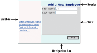
Figure 1** Wizard Control Architecture **
Each step in a wizard is a sort of panel—a container of text, markup, images, and custom user controls. Figure 1 shows the architecture of the Wizard control in ASP.NET 2.0.
Using the Wizard Control
A Wizard control is made up of four main parts: header, view of the current step, navigation bar, and sidebar. All of these constituent parts, and much more, can be styled using a number of properties, such as those listed in Figure 2. The contents of the header, sidebar, and navigation bar can be further customized through the templates listed in Figure 3.
Figure 3 Wizard Control Templates
| Template | Description |
|---|---|
| FinishNavigationTemplate | Specifies the navigation bar shown before the last page of the wizard; by default, navigation bar contains the Previous and Finish buttons |
| HeaderTemplate | Specifies the title bar of the wizard |
| SideBarTemplate | Used to display content in the left side of the wizard control |
| StartNavigationTemplate | Specifies the navigation bar for the first view in the wizard; by default, contains only the Next button |
| StepNavigationTemplate | Specifies the navigation bar for steps other than first, finish, or complete; by default, contains Previous and Next buttons |
Figure 2 Style Properties
| CancelButtonStyle | Wizard Cancel button |
|---|---|
| FinishStepButtonStyle | Wizard Finish button |
| FinishStepPreviousButtonStyle | Wizard Previous button at the finish step |
| HeaderStyle | Wizard header |
| NavigationButtonStyle | Navigation buttons |
| NavigationStyle | Navigation area |
| NextStepButtonStyle | Wizard Next button |
| PreviousStepButtonStyle | Wizard Previous button |
| SideBarButtonStyle | Buttons on the sidebar |
| StartStepNextButtonStyle | Wizard Next button at the start step |
| StepStyle | Area where steps are displayed |
The code in Figure 4 outlines the typical code of a Wizard control in an ASP.NET application. Top-level attributes let you configure the appearance of the control by changing its fonts, border, colors and title. Figure 5 lists the main properties of the Wizard class.
Figure 5 Main Properties of the Wizard Class
| Property | Description |
|---|---|
| ActiveStep | Returns the current wizard step object; the object is an instance of the WizardStep class |
| ActiveStepIndex | Gets and sets the zero-based index of current wizard step |
| DisplaySideBar | Toggles the visibility of the sidebar; the default value is True |
| FinishStepButtonText | Gets and sets the text for the Finish button |
| HeaderText | Gets and sets the title of the wizard |
| NextStepButtonText | Gets and sets the text for the Next button |
| PreviousStepButtonText | Gets and sets the text for the Previous button |
Figure 4 Typical Wizard Control Skeleton
<asp:wizard runat="server" id="MyWizard" HeaderText="Add a New Employee"> <wizardsteps> <asp:wizardstep runat="server" steptype="auto" title="Enter Employee Name"> ... </asp:wizardstep> ... <asp:wizardstep runat="server" steptype="auto" title="Finalizing..."> ... </asp:wizardstep> <asp:wizardstep runat="server" steptype="complete"> ... </asp:wizardstep> </wizardsteps> </asp:wizard>
Adding Steps to a Wizard
The <WizardSteps> block gathers all the defined steps in which the wizard procedure is articulated. The WizardSteps collection can be edited visually through the property dialog shown in Figure 6. You can add two types of steps to the collection—a simple wizard step or a templated wizard step. In the former case, you add a WizardStep control; in the latter case, an instance of the TemplatedWizardStep control is added to the page. The two-step controls work in a similar manner and accept a collection of server controls defined explicitly. A WizardStep control looks like this:
<asp:wizardstep runat="server" steptype="auto" title="One step"> <div> <!-- any controls go here --> </div> </asp:wizardstep>
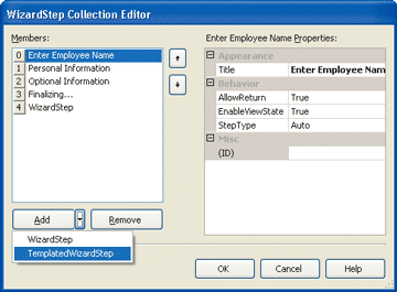
Figure 6** WizardStep Collection Editor **
The contents of a WizardStep can be dynamically adjusted and steps can be programmatically added or removed as you please. However, to allow for further customization, TemplatedWizardStep can be used instead of WizardStep, allowing users to change the content and navigation templates within it. By default, you can only have three different navigation templates: start, step, and finish. Using TemplatedWizardStep allows you to have different navigation buttons on each of the steps.
Here's how you define a templated step:
<asp:TemplatedWizardStep runat="server" steptype="auto"> <ContentTemplate> <!-- any UI goes here --> </ContentTemplate> </asp:TemplatedWizardStep>
The <ContentTemplate> element corresponds to an instance of an object that implements the ITemplate interface. This object gets or sets the template for displaying the content of a page in the Wizard. It goes without saying that you can define or change the template programmatically. In addition, a templated wizard step control lets you modify the navigation bar through a template:
<asp:TemplatedWizardStep runat="server" steptype="auto"> <ContentTemplate> <!-- any UI goes here --> </ContentTemplate> <CustomNavigationTemplate> <asp:Button Runat=Server Text="My Button" /> ... </CustomNavigationTemplate> </asp:TemplatedWizardStep>
By adding a <CustomNavigationTemplate> block you can take full control of the navigation usually displayed at the bottom of the current view. You normally fill the <CustomNavigationTemplate> block with a series of buttons, but other controls are acceptable as well, with the restriction that those controls must support command bubbling, as does Button.
A wizard step is just one of the forms in which you break up the original user interface to build the wizard. So a wizard step will typically contain input controls such as text and checkboxes, dropdown lists, calendars, validators, and whatever else you can use to collect data from users.
All step classes inherit from the WizardStepBase class. The base class provides each child class with a property named StepType. The property gets or sets the type of navigation buttons to display for a page in a Wizard control. Possible values are listed in Figure 7. By default, the type of a step is dynamically determined by the control. The first step is a Start step, and the last is the Finish step; unless specified by the user, the control doesn't automatically assign steps to be Complete steps. All other intermediate steps are ordinary steps. The main difference between the step types is in the list of buttons displayed in the navigation area. An ordinary step allows a user to move back and forth, whereas a Start step doesn't display a Back button, and a Complete step doesn't provide any navigation whatsoever. As mentioned, all these built-in rules can be altered if you use a templated solution.
Figure 7 Step Types
| Setting | Description |
|---|---|
| Auto | Default setting; forces the wizard to determine how each contained step should be treated. |
| Complete | The last page that the wizard displays, usually after the wizard has been completed. The navigation bar and the sidebar aren't displayed. |
| Finish | The last page used for collecting user data. It lacks the Next button, and it shows the Previous and Finish buttons. |
| Start | The first screen displayed, with no Previous button. |
| Step | All other intermediate pages, in which the Previous and Next buttons are displayed. |
Figure 8 shows the full source code of a sample wizard that collects any data that is relevant to add a new employee to a database. Needless to say, the employee of the sample can be replaced with any entity such as an invoice, a registration form, or a user of some sort of service.
Figure 8 Data Collection Wizard
<%@ page language="C#" %> <html> <head runat="server"> <title>Employee Wizard</title> </head> <body> <form runat="server"> <asp:wizard runat="server" id="MyWizard" Font-names="verdana" BackColor="lightcyan" ForeColor="navy" Style="border:outset 1px black" HeaderText="Add a New Employee" ActiveStepIndex="0"> <stepstyle backcolor="gainsboro" borderwidth="1" borderstyle="Outset" /> <sidebartemplate> <div style="height:300px"> <img src="/source/images/wizard.jpg" width=100% /> <asp:datalist runat="Server" id="SideBarList"> <ItemTemplate> <asp:linkbutton runat="server" id="SideBarButton" /> </ItemTemplate> </asp:datalist> </div> </sidebartemplate> <wizardsteps> <asp:wizardstep runat="server" steptype="auto" title="Enter Employee Name"> <div style="height:200px"> <table><tr><td>First Name</td><td> <asp:textbox runat=server id="FirstName" /> <asp:requiredfieldvalidator runat="server" id="FirstNameValidator" text="*" errormessage="Must indicate a first name" setfocusonerror="true" controltovalidate="FirstName" /> </td></tr> <tr><td>Last Name</td><td> <asp:textbox runat=server id="LastName" /> <asp:requiredfieldvalidator runat="server" id="LastNameValidator" text="*" errormessage="Must indicate a last name" setfocusonerror="true" controltovalidate="LastName" /> </td></tr> <tr><td height="100"></td></tr></table> <asp:validationsummary runat="server" displaymode="List" id="Summary" /> </div> </asp:wizardstep> <asp:wizardstep runat="server" steptype="auto" title="Personal Information"> <div style="height:200px"> <table> <tr><td>Hire date</td><td><asp:textbox runat="server" id="HireDate" /></td></tr> <tr><td>Title</td><td><asp:textbox runat="server" id="TheTitle" /></td></tr> <tr><td height="100px"></td></tr> </table> </div> </asp:wizardstep> <asp:wizardstep runat="server" steptype="auto" title="Optional Information"> <div style="height:200px"> <table> <tr><td valign="top">Notes</td><td> <asp:textbox runat="server" id="Notes" rows="10" columns="25" textmode="MultiLine"/> </td></tr> </table> </div> </asp:wizardstep> <asp:wizardstep runat="server" steptype="auto" title="Finalizing..."> <div style="height:200px"> <asp:label runat="server" id="ReadyMsg" /> </div> </asp:wizardstep> <asp:wizardstep runat="server" steptype="complete"> <div style="height:200px"> <asp:label runat="server" id="FinalMsg" /> </div> </asp:wizardstep> </wizardsteps> <navigationbuttonstyle borderwidth="1" width="80" borderstyle="Solid" backcolor="lightgray" /> <headerstyle horizontalalign="Right" font-bold="true" font-size="120%" /> <sidebarstyle backcolor="snow" borderwidth="1" font-names="Arial" /> </asp:wizard> </form> </body> </html>
Speaking of users, I'd like to mention another new control in ASP.NET 2.0—the CreateUserWizard control—which provides a built-in wizard to add a new user to the current membership data provider. This built-in control differs from other controls you might write in that it automatically targets the configured membership provider and data store for membership information you employ at login time in a Forms Authentication scenario.
The "Add New Employee" Wizard
As you can see, Figure 8 doesn't include any server-side code. You can save that code to an ASPX file, point the browser to it, and see the page shown in Figure 9.
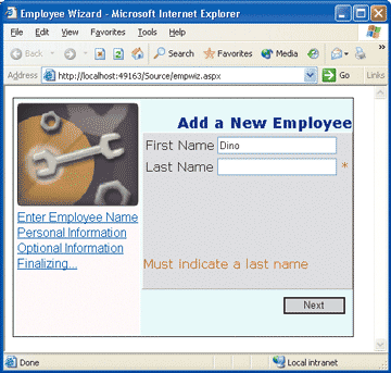
Figure 9** Employee Data Wizard **
The wizard consists of three steps. First you collect the name of the new employee, personal information, and notes. Next, you finalize the wizard by creating a summary page where all the collected information is shown to the user for confirmation. Then the wizard completes the operation, persists any data, and displays the final message through a completion step. As Figure 9 shows, you can easily (and declaratively) implement validation to make sure users move to the next step only if proper data has been entered. You should use ASP.NET validators in the wizard's view for quick client-side checks; you should use transition events (which I'll discuss a little later on) if you need to access any server-side resources to validate input.
Although a wizard's forms are related logically, they still need to look related. A few simple tricks shown in Figure 8 will help you get there. Most importantly, each step should be the same size, with special attention paid to each form's height. This ensures that the button bar is not moved up and down as you move through pages (an annoying habit of wizards that frustrates many users). If you're still a little bit skeptical, just try it: write a frequently clicked button bar (like a DataGrid pager), change the page size so that the button bar is displayed at different heights each time, then try clicking your way through it. Annoying, isn't it?
ASP.NET 2.0 provides customizable themes to make your wizard especially attractive. A theme is a set of graphical settings (stylesheets and control attributes) that apply to all server controls in the page or application. They provide a useful way to apply a standard, consistent look to Web pages and controls. Themes are deployed as text files and can be global to the application as well as local to the various individual pages. It's worth noting, however, that no global themes will be provided in the ASP.NET 2.0 final product. If you're looking for an attractive, easily applied set of built-in styles to use with your server controls you should use the Visual Studio 2005 AutoFormat feature instead.
In the top-left corner of your wizard you can add an image. It provides a little visual interest and can convey some additional information, especially if you're using a sidebar (see Figure 9).
Some of the style properties listed in Figure 2 refer to buttons in the navigation area. There are many ways for you to change the look of these controls. The easiest way to give all buttons a consistent appearance is to define a NavigationButtonStyle object. This setting ensures that all buttons share a common set of styles while allowing you to customize each button individually through a specific style such as CancelButtonStyle.
You can control the text on each button with text properties. You can also use images and alternate text. Here's an example:
MyWizard.NextStepButtonText = ">>"; MyWizard.NextStepButtonImageUrl = "...";
If both are set, the text takes precedence. Note that the NextStepButtonXxx properties used in the preceding example take effect only on ordinary steps. The Next button displayed in the Start page is customized using a different set of properties—further proof of the extreme flexibility of the Wizard control user interface.
Wizard Events
The Wizard control does a great job of shielding you from many of the details connected with a multistep input, especially in a Web scenario. However, there's nothing it can do about the core task for which the wizard exists; that must be manually coded. For this to happen, an event model is needed that signals when the wizard is about to accomplish a given task like moving to the Next or Previous page, or finishing or starting the procedure.
Besides the classic events of any server control like Init, Load, and PreRender, the Wizard control also features a number of more specific events, as listed in Figure 10. As you can see, five out of six events relate to click events on the navigation buttons and sidebar elements. The sixth event is ActiveStepChanged, which occurs when the active view changes as the result of user action. When the user clicks, the page posts back and after the default page reinitialization the first server event that fires is the click event for the selected button. Next, if the previously invoked event handler caused a view switch, the ActiveStepChanged event is triggered.
Figure 10 Wizard Control Events
| Event | Description |
|---|---|
| ActiveStepChanged | User switches to a new page in the control; requires an EventHandler delegate |
| CancelButtonClick | Cancel button is clicked; requires an EventHandler delegate |
| FinishButtonClick | Finish button is clicked; requires a WizardNavigationEventHandler delegate |
| NextButtonClick | Next button is clicked; requires a WizardNavigationEventHandler delegate |
| PreviousButtonClick | Previous button is clicked; requires a WizardNavigationEventHandler delegate |
| SideBarButtonClick | Button in the sidebar area is clicked; requires a WizardNavigationEventHandler delegate |
The delegate required by the ActiveStepChanged event is the simplest of all—EventHandler—which doesn't pass on any additional information and just works as a plain notification that something happened. CancelButtonClick denotes the abort of the wizard and likewise doesn't pass the page more information than the notification itself (as a note of warning, if you commit data as the user moves through steps rather than committing everything at the end, you are responsible for writing code to "undo" any changes that might have occurred prior to the point at which a user cancels). All other events require a richer delegate—WizardNavigationEventHandler—which uses the WizardNavigationEventArgs class to carry some extra information: public class WizardNavigationEventArgs
{ bool Cancel {get; set;} int CurrentStepIndex {get;} int NextStepIndex {get;} }
It is worth noting that all click events occur before the view switch happens; the click event is your last chance to perform any necessary validation and draw any definitive conclusions about the step. The two integer properties indicate the step index that's set when the user clicked (CurrentStepIndex) and the new step index to be set after the event processing is completed (NextStepIndex). This model is nearly identical to the one that ASP.NET 1.x uses for DataGrid paging. In that context, the PageIndexChanged event holds the CurrentPageIndex value and the NewPageIndex property which you can peruse. This also lets you programmatically accept the proposed step change.
Any step change can be rejected by setting the Cancel property to true. For example, you define a next button click handler and when the user clicks to see the next page, you check the last name entered against your own blacklist of names and, in that case, refuse to switch. Here's an example:
void OnNext(object sender, WizardNavigationEventArgs e) { if (LastName.Text == "Esposito") { e.Cancel = true; return; } }
To get and set values on view controls, you use the usual ASP.NET ID-based syntax. Technically speaking, this is supported because all the wizard views are part of the same page, although only one view is active and visible at a time. (For the same reason, you can't have two controls, even in different views, which share the same ID.)
You can set any required event handlers either using the declarative, attribute-based syntax of ASP.NET, or the delegate syntax supported by .NET languages. For example, the following snippet shows how to define an event handler through an attribute:
<asp:wizard runat="server" id="MyWizard" HeaderText="Add a New Employee" ... OnNextButtonClick="OnNext" />
FinishButtonClick is the place to add any code that finalizes the wizard. However, in most cases you might also want to display a summary of the input before proceeding with the finishing step. This is normally the function of that step. However, the text displayed in the Finish step view can only be determined dynamically by looking at what users entered in previous steps. To prepare the Finish step for display, you can write a Next button and Previous button click handler that share the same preliminary code to check the type of the step. You can do as follows:
WizardStepType t = MyWizard.WizardSteps[e.NextStepIndex].StepType; if (t == WizardStepType.Finish) { // Prepare the summary and fill the UI of the Finish step ... }
Basically, you check the type of the step and if it is a Finish step, you collect the input data and prepare the summary for the user. As mentioned previously, a Finish step displays only Previous and Finish buttons in the navigation bar in order for the user to move back or finalize the wizard.
Data persistence and integration of the input with the host application are tasks accomplished in the final Complete step. You need a FinishButtonClick handler for this.
The MoveTo method can be used to move to a particular step programmatically. The method's prototype is as follows:
public void MoveTo(WizardStep step)
The method is a simple wrapper around the setter of the ActiveStepIndex property and requires you to pass a WizardStep object, a requirement which can sometimes be problematic. If you want to jump to a particular step, however, setting the ActiveStepIndex property directly is just as effective. This can be useful in scenarios where a user's choice in a previous step eliminates the need to show a future step. For example, if a user selects "no gift wrapping" when making an online purchase, there's no point in showing them the step that presents gift wrapping options. When doing nonlinear navigation such as this, it's often beneficial to disable the sidebar display. Otherwise, a user would be able to randomly go to steps that might not have been part of their path.
To get the WizardStep object of a particular step, you can access the history of the wizard through the GetHistory method:
public ICollection GetHistory()
GetHistory returns a collection of WizardStep objects. The order of the items is determined by the order in which the wizard's pages were accessed by the user. The first WizardStep object returned—the one with an index of 0—is the currently selected step if the user post back to the same page. Otherwise, the first WizardStep is the previous step. The second object represents the view before the current one, and so on.
The Wizard Sidebar
The sidebar is an optional wizard element that, if enabled, sits on the left side of the control. It provides the user with a quick-launch user interface for the steps in the wizard. The sidebar is enabled by default and can be hidden with the DisplaySideBar Boolean property set to false. As mentioned, it can be useful to hide the sidebar when using nonlinear navigation. It can also be beneficial when using a commit-as-you-go model.
The layout of the sidebar is only partially customizable. You can use the SideBarTemplate property to define what the contents should be. You can do that either declaratively through the <SideBarTemplate> tag or programmatically by loading an ITemplate object into the SideBarTemplate property. Whichever approach you choose, bear in mind that the template must contain a DataList with a well-known ID and relatively standard internal structure. The DataList must have the ID "SideBarList," and its ItemTemplate block must contain a button object with the ID "SideBarButton." Any other template set on the DataList might cause runtime errors. The IDs are set in stone in the Wizard class through a couple of protected static members—DataListID and SideBarButtonID.
At loading time, the Wizard control populates the sidebar's button bar, which dynamically generates buttons that are each mapped to a defined wizard step. The Wizard seeks the internal DataList through the ID and fills its user interface. In addition to the DataList, any other combination of markup and controls, including images, can be added to the sidebar.
The ASP.NET Wizard control and all of the functionality it brings provides developers with advanced building blocks for feature-rich Web applications.
Send your questions and comments for Dino to cutting@microsoft.com.
Dino Esposito is a Wintellect instructor and consultant based in Italy. Author of Programming ASP.NET and the newest Introducing ASP.NET 2.0 (both from Microsoft Press), he spends most of his time teaching classes on ASP.NET and ADO.NET and speaking at conferences. Get in touch with Dino at cutting@microsoft.com or join the blog at https://weblogs.asp.net/despos.