WPF
Customizing Controls For Windows Presentation Foundation
Shawn Wildermuth
Code download available at:WpfControls2007_05.exe(173 KB)
This article discusses:
|
This article uses the following technologies: Windows Presentation Foundation |
Contents
Using Composition
Using Styles
Using Templates
Authoring Controls
Custom Properties
Where Are We?
The breadth of the control model in Windows Presentation Foundation is quite staggering, but it is impossible to supply every control that you could ever need. That is where control authoring comes to the rescue. In this article, I show you how to customize existing controls using Windows® Presentation Foundation and how to create entirely new controls (or elements) for use in your projects.
Before you develop a custom control, you need to ask yourself if you really need one. In Windows Presentation Foundation, composition, styling, and templating enable you to customize existing controls to an extent unprecedented with past technologies. Before you decide to create a new control, let’s quickly review these three methods for customizing controls.
Using Composition
A common requirement is to create a composite control—a control made up of more than one control. Suppose you have a Play button to start playback of a video. The XAML and control are shown in Figure 1.
Figure 1 A Simple Play Control
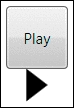
<StackPanel> <Button Height="50" Width="50" Content="Play" /> <Polygon HorizontalAlignment="Center" Points="0,0 0,26 17,13" Fill="Black" /> </StackPanel>
You need to be able to take the play icon and put it on the button. You can use composition to actually embed XAML elements inside other XAML elements. For example, you can change the XAML to create the label and icon as the contents of the button. Placing these elements inside a container (StackPanel in this case) inside the button assigns them to the Content property of the Button class, as seen in Figure 2. This results in a button that works like any other button but has your content inside it.
Figure 2 All of the Content Inside the Button

<StackPanel> <Button Height="50" Width="50"> <StackPanel> <TextBlock>Play</TextBlock> <Polygon Points="0,0 0,26 17,13" Fill="Black" /> </StackPanel> </Button> </StackPanel>
Using composition to create controls like this is simple. Unlike in presentation technologies like Windows Forms, Visual Basic® 6.0, and MFC, most controls are containers for other controls. It’s unnecessary to write a custom control when all you really need is a composite control.
Using Styles
What if all you need is to change the appearance of the control? Styles are the answer. You can specify a style of button that has a red border around it by creating a Style like this one.
<StackPanel> <StackPanel.Resources> <Style TargetType="Button" x:Key="RedButton"> <Setter Property="BorderBrush" Value="Red" /> </Style> </StackPanel.Resources> ... </StackPanel>
Now you can change the border of specific buttons by assigning a style to them, as seen in Figure 3. The first button is the standard appearance, while the second one binds itself to a shared style.
Figure 3 Applying a Style to a Button
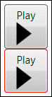
Figure 3
<Button Height="50" Width="50"> <StackPanel> <TextBlock>Play</TextBlock> <Polygon Points="0,0 0,26 17,13" Fill="Black" /> </StackPanel> </Button> <Button Height="50" Width="50" Style="{StaticResource RedButton}"> <StackPanel> <TextBlock>Play</TextBlock> <Polygon Points="0,0 0,26 17,13" Fill="Black" /> </StackPanel> </Button>
You can even use styles to change the appearance of all instances of a certain type of XAML element across a container. For example, instead of creating a reusable style to change the button, you could create a style that specifies the look of all buttons, as seen in Figure 4. This example sets the background of all buttons to a gray/green/gray gradient. The Style in this example omits the Key of the style. This causes it to affect all the elements specified in the TargetType attribute.
Figure 4 Applying a Style Across a Container
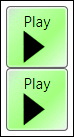
Figure 4
<StackPanel> <StackPanel.Resources> <Style TargetType="Button"> <Setter Property="Background"> <Setter.Value> <LinearGradientBrush> <GradientStop Color="#DDDDDD" Offset="0" /> <GradientStop Color="#88FF88" Offset=".6" /> <GradientStop Color="#EEEEEE" Offset="1" /> </LinearGradientBrush> </Setter.Value> </Setter> </Style> </StackPanel.Resources> <Button Height="50" Width="50"> <StackPanel> <TextBlock>Play</TextBlock> <Polygon Points="0,0 0,26 17,13" Fill="Black" /> </StackPanel> </Button> <Button Height="50" Width="50"> <StackPanel> <TextBlock>Play</TextBlock> <Polygon Points="0,0 0,26 17,13" Fill="Black" /> </StackPanel> </Button> </StackPanel>
Using Templates
Styles are limited to setting default properties on XAML elements. For example, when I set the BorderBrush in the earlier examples, I could specify the brush but not the width of the border. For complete freedom of a control’s appearance, you need to use templates. To do this, you create a style and specify the Template property (see Figure 5). The Value of the Template property becomes a ControlTemplate element that specifies how to compose the control itself. In this example, I specify a button that is a circle with the play icon in the center. I do this by layering the play icon over an Ellipse element. The new template button can be seen next to a normal button.
Figure 5 Using a Template
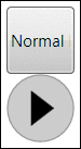
Figure 5
<StackPanel> <StackPanel.Resources> <Style TargetType="{x:Type Button}" x:Key="PlayButton" > <Setter Property="Template"> <Setter.Value> <ControlTemplate TargetType="{x:Type Button}"> <Grid> <Ellipse Width="{TemplateBinding Width}" Height="{TemplateBinding Height}" Stroke="DarkGray" VerticalAlignment="Top" HorizontalAlignment="Left" Fill="LightGray" /> <Polygon Points="18,12 18,38 35,25" Fill="Black" /> </Grid> </ControlTemplate> </Setter.Value> </Setter> </Style> </StackPanel.Resources> <Button Height="50" Width="50">Normal Button</Button> <Button Height="50" Width="50" Style="{StaticResource PlayButton}" /> </StackPanel>
In the end, styles and templates still only allow you to change the appearance of a control. To add behavior and other features to the button, you’ll need to create a custom control.
Authoring Controls
The first step you should take before writing your own control is to decide which method you will use for creating the control. There are two main ways to create controls in Windows Presentation Foundation: user controls and custom controls. There are benefits to both approaches.
With user controls, you get a simple development model that is similar to Windows Presentation Foundation application development. User controls are preferred when you need to compose a control out of existing components and do not need complex customization (as with templates and styles). Custom controls are a better choice when you want full control over appearance, need special rendering support, or want your control to be a container for other controls.
If you can’t decide which type of control to choose, pick a user control. If you run into a functionality wall with a user control, you can switch later to custom with little pain.
The first thing to do when creating a user control is to add a new item to your project. If you right-click your project and click Add, you might be tempted to pick the User Control option from the context menu. Unfortunately, this attempts to create a new Windows Forms user control. Instead, pick the Add New Item option. In the Add New Item dialog, pick the User Control (WPF) item.
Creating the new user control creates a new XAML file and backing code file. The XAML file is similar to the main file that is created with new Windows Presentation Foundation projects; the difference is that the root element of the new XAML file is a UserControl element. Inside the UserControl element, you create the content that composes your control.
For this example, continue with the same XAML used earlier to create a template for a PlayButton control. This new control will tie itself to a MediaElement to control playing or pausing some digital media. Figure 6 shows the PlayButton’s XAML.
Figure 6 PlayButton XAML
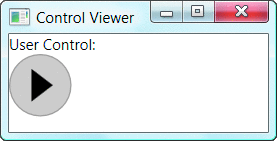
Figure 7** PlayButton in a WPF Window **
<!-- PlayButton.xaml --> <UserControl x:Class="CustomWPF.PlayButton" xmlns="https://schemas.microsoft.com/winfx/2006/xaml/presentation" xmlns:x="https://schemas.microsoft.com/winfx/2006/xaml"> <Grid> <Ellipse Width="50" Height="50" Stroke="DarkGray" VerticalAlignment="Top" HorizontalAlignment="Left" Name="ButtonBack" Fill="LightGray" /> <Path Name="PlayIcon" Fill="Black" Data="M18,12 18,38 35,25"/> <Path Name="PauseIcon" Fill="Black" Opacity="0" Data="M15,12 15,38 23,38 23,12z M27,12 27,38 35,38 35,12" /> </Grid> </UserControl>
From the template example, I have added a new Path, PauseIcon. Because the icon for pausing of the media could not be represented as a Polygon, it was easier to simply change PlayIcon to a Path so you can deal with each icon as a Path object in the codebehind. I want to be able to control a MediaElement element by pausing or playing the media when the button is clicked as well as changing the icon to correctly represent the action (pause or play) when the button is clicked.
Before adding that logic, let’s make sure that my button is displayed correctly and that it can be shown in a window. In this case, I want to show the new control on a window. Before you can use any custom element (user control or custom control) in a XAML document, you must create a reference to it. If the custom element is in the same project as the rest of your XAML, you can just refer to it by adding an XML namespace declaration. In the following lines of code, I created a namespace declaration (xmlns:cust) that specifies a common language runtime (CLR) namespace that the control is in.
<!-- MainWindow.xaml --> <Window x:Class="Tester.MainWindow" xmlns="https://schemas.microsoft.com/winfx/2006/xaml/presentation" xmlns:x="https://schemas.microsoft.com/winfx/2006/xaml" xmlns:cust="clr-namespace:CustomWPF" Title="Control Viewer" Height="100" Width="200"> <!-- ... --> </Window>
The clr-namespace (CustomWPF) specified in the XML namespace declaration matches the actual CLR namespace of the control (CustomWPF). If the control you want to use is in another assembly, you must also note the assembly name in the namespace declaration. The XML namespace declaration does not import the assembly into your project automatically; you must also add a reference to the assembly to your project manually.
<!-- MainWindow.xaml --> <Window x:Class="Tester.MainWindow" xmlns="https://schemas.microsoft.com/winfx/2006/xaml/presentation" xmlns:x="https://schemas.microsoft.com/winfx/2006/xaml" xmlns:cust="clr-namespace:CustomWPF;assembly=CustomWPF" Title="Control Viewer" Height="100" Width="200"> <!-- ... --> </Window>
Once you have the reference to the XML namespace, you can use it to create instances of your new user control. You do this using the name of the namespace declaration. This means the XML namespace alias, not the CLR namespace. After the XML namespace alias, you would specify the actual name of the control. This ensures that the name used in the XAML file matches the name of the class. To add an instance of the PlayButton class to the XAML you would specify cust:PlayButton as the element name.
<StackPanel> <TextBlock HorizontalAlignment="Center">User Control:</TextBlock> <cust:PlayButton /> </StackPanel>
Now you can see the PlayButton control hosted in a typical Windows Presentation Foundation Window as in Figure 7.
Custom Properties
As you author controls, you will find it necessary to implement properties to manage both the appearance of the control as well as its runtime behavior. For example, the PlayButton control will need the ability to get and set the color of the icon. To do this you can create a simple CLR property as seen in Figure 8 (note that Visual Basic sample code is available in the download for this article).
Figure 8 Getting the Icon’s Color
// PlayButton.xaml.cs public partial class PlayButton : System.Windows.Controls.UserControl { // ... Brush _iconColor = Brushes.Black; public Brush IconColor { get {return _iconColor; } set { _iconColor = value; PlayIcon.Fill = _iconColor; PauseIcon.Fill = _iconColor; } } }
Simple CLR properties like the IconColor property work well enough. You can set them in the XAML just using the name of the property:
<cust:PlayButton IconColor="Black" />
Simple properties are not sufficient for most controls, though, because they do not support advanced features like data binding or animation support. For example, if you want to specify the IconColor of your control by data binding to the fill color of a rectangle in the XAML, it does not work, as you can see in Figure 9.
Figure 9 This Data Binding Won’t Work
<!-- MainWindow.xaml --> <Window x:Class="Tester.MainWindow" xmlns="https://schemas.microsoft.com/winfx/2006/xaml/presentation" xmlns:x="https://schemas.microsoft.com/winfx/2006/xaml" xmlns:cust="clr-namespace:CustomWPF;assembly=CustomWPF" Title="Control Viewer" Height="100" Width="200"> <StackPanel> <Rectangle Name="theRect" Fill="Red" /> <TextBlock>User Control:</TextBlock> <!-- Simple Assignment Works --> <cust:PlayButton IconColor="Blue" /> <!—Data Binding Does Not --> <cust:PlayButton IconColor="{Binding ElementName=theRect, Path=Fill}" /> </StackPanel> </Window>
To exploit all the features available, you must use a Dependency Property instead of a simple CLR property. Dependency properties allow the value of an element to be set by a variety of means, including animations and data binding. To implement one, create a static (shared in Visual Basic) DependencyProperty field on the control by calling DependencyProperty.Register method. This method registers your property and returns an instance of the created DependencyProperty.
Once you have the DependencyProperty field, you can use it to set and get the property by using the GetValue/SetValue methods of your control. For example, you can change the IconColor property of the PlayButton to a DependencyProperty as seen in Figure 10.
Notice that I removed the Brush field from the class. The DependencyProperty stores the value for each instance as well as the metadata about the property. This means that each instance of the PlayButton does not need to have its own field to store the data about the property.
Now that you have a DependencyProperty, you can use it in data binding or animation. Currently there is no good way of determining that the property has changed, nor is there a default value. Because setting the value of the property is not routed through the public property (the CLR property is a wrapper for the DependencyProperty, not vice versa), you cannot just use the set accessor to change the icon color when that value is changed. You need to add an event to be called when the property changes. To do this, specify a static or shared method to be called back when the property changes when you register the DependencyProperty. You can amend the registration to include a FrameworkPropertyMetadata object that specifies both the default value and a change callback, as shown here:
public static readonly DependencyProperty IconColorProperty = DependencyProperty.Register( "IconColor", typeof(Brush), typeof(PlayButton), new FrameworkPropertyMetadata(Brushes.Black, new PropertyChangedCallback(OnIconColorChanged )));
Finally, you need to implement the callback. This callback is a static (or shared) method of your control that accepts the object that was changed as well as arguments that specify the old and new values. Typically, you would call a method on the changed object to update it. For example, if the IconColor has changed, you will want to set the Fill of both icons. Both the callback method and the update method are shown here:
private static void OnIconColorChanged(DependencyObject obj, DependencyPropertyChangedEventArgs args) { // When the color changes, set the icon color PlayButton control = (PlayButton)obj; control.PlayIcon.Fill = control.IconColor; control.PauseIcon.Fill = control.IconColor; }
To complete the control, you will also want a DependencyProperty to allow assigning of a MediaElement to control (see Figure 11).
Now that you have the property, you can add a MediaElement to the XAML and data bind that element to the new MediaPlayer property. When you add the MediaElement to the XAML, you need to set the LoadedBehavior to Manual, which allows you to manually control the playback. The new XAML is shown in Figure 12.
Figure 12 Revised MediaElement XAML
<!-- MainWindow.xaml --> <Window x:Class="Tester.MainWindow" xmlns="https://schemas.microsoft.com/winfx/2006/xaml/presentation" xmlns:x="https://schemas.microsoft.com/winfx/2006/xaml" xmlns:cust="clr-namespace:CustomWPF;assembly=CustomWPF" Title="Control Viewer" Height="100" Width="200"> <StackPanel> <MediaElement Width="150" Height="100" Name="theMedia" Source="https://download.microsoft.com/.../ctorrec9billg.wmv" LoadedBehavior="Manual" /> <TextBlock>User Control:</TextBlock> <cust:PlayButton MediaPlayer="{Binding ElementName=theMedia}" /> </StackPanel> </Window>
Next, implement a click event on the PlayButton user control. First, add a MouseLeftButtonUp event on the control’s main Grid.
<!-- PlayButton.xaml --> <UserControl x:Class="CustomWPF.PlayButton" xmlns="https://schemas.microsoft.com/winfx/2006/xaml/presentation" xmlns:x="https://schemas.microsoft.com/winfx/2006/xaml"> <Grid MouseLeftButtonUp="PlayButton_Clicked"> <!-- ... --> </Grid> </UserControl>
This allows you to implement the behavior of your control as well as changing the icon. This event handler implementation is seen in Figure 13. The completed control and video can be seen in Figure 14.
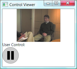
Figure 14** Completed User Control **
Custom Controls
The PlayButton control you just created works pretty well, but it lacks full template and theme support. If your control needs this support, you will need to build it as a custom control. Custom controls derive from other classes in the control hierarchy. For example, you can refactor the PlayButton control into a MediaButton control that is more reusable.
To create a MediaButton control, first pick Custom Control (WPF) in the Add New Item dialog of Visual Studio. This adds a new custom control class (MediaButton.cs) file to the project and also adds a theme folder with a generic.xaml file. The generic.xaml file contains a template for the new control class. It uses this XAML file to allow different themes for the control. The generic.xaml file is used as a fallback; for most controls this is the only theme file you will create. If you want to write a control that changes its appearance depending on the current theme, you can create theme files in this directory. Figure 15 shows the standard theme files and when they are used.
By specifying multiple themes, you can change the appearance of your controls based on the theme selection of the user. To develop a generic theme for my sample control, I can take the user control’s XAML file and place it inside the ControlTemplate tag. Once the XAML is in the template, you will want to use template binding to set properties of the XAML based on properties of the control. Until now, the PlayButton’s width and height were always set to fifty logical units. For a simple control that makes sense, but if you really want the control to be reusable, you should make the template resizable. To do this, replace the height and width of the template with the control’s height and width by marking the height and width in the template to {TemplateBinding Width} and {TemplateBinding Height}.
In the PlayButton, simply change the Opacity of the two icons based on whether it needs to show play or pause. Reaching down into the template to change the Opacity would work, but it would be rather clumsy. A better solution is to have a single icon Path object and change the drawing data to draw the right icon. This way, the size of the visual tree directly influences the performance of the XAML document. To make this work, introduce a new DependencyProperty to store the current icon to use. Create an enumeration that specifies which icon to use, then expose it as a DependencyProperty. With the new Icon property, you can modify the template to include triggers for when the Icon property changes.
The icon is using a Path element to define the appearance of each icon used by the button. This works fine if the button is always a fixed size, but since it is not, you need to find a way to resize the icon with the button. One solution is to create an overlay ellipse over the background circle and use a VisualBrush to paint the icon. The VisualBrush allows the background to size with the control. The completed generic.xaml template is shown in Figure 16.
This MediaButton should control a MediaElement like the one the PlayButton did. Copy the MediaPlayer DependencyProperty from the PlayButton to the MediaButton. Make sure to change any references in the copied code from PlayButton to MediaButton (especially in the DependencyProperty registration).
Unlike PlayButton, you do not need to handle the mouse click event in the template. Instead, you can override the OnMouseLeftButtonUp event to react to clicks. Inside this method, you can change the icon and play or pause media. The final custom control code can be seen in Figure 17. Now that the new control supports resizing and setting the icon property, you can give users more flexibility in changing the size and icon of the control. Figure 18 shows the control with different sizes and icons.
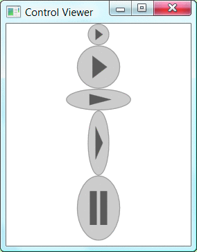
Figure 18** All Shapes and Sizes **
In this control example, I have directly derived from the System.Windows.Controls.Control class, but the nature of custom controls allows deriving from anywhere in the class hierarchy. You can use custom controls to override and change the behavior of built-in controls or build your own controls completely from scratch. For example, deriving from FrameworkElement would allow you to create a control with very little built-in layout mechanics. Deriving from Panel allows you to create your own specialized containers for other objects. Determining the right class to derive from is not easy; it depends on the requirements for your control.
Where Are We?
When you need specialized control functionality, you have several options, including composition, styles, and templates. By using componentization, you can often create compound controls, obviating the need for authoring a new control. When the appearance of a control is all you need to change, use styling. Lastly, templates allow complete control over the composition of an existing control. For more information on using templates to customize controls, see the Foundations column by Charles Petzold.
When you do decide to author a new control, you’ll still get the simplified programming model that appears to be just like writing your own Window or Page. Being able to create templates for your controls that look and even act differently in different operating system themes is a distinct advantage of custom controls.
Migrating an existing user control to a custom control is not particularly difficult, but because you are working with a template, instead of direct access to XAML objects, you will need to change how you engineer your custom control.
With Windows Presentation Foundation, the necessity for writing custom controls is the exception rather than the rule. Only when you are really creating custom behavior should you ever need to delve into the control authoring. For more information on controls in Windows Presentation Foundation, please see the SDK at msdn2.microsoft.com/ms754130.aspx.
Shawn Wildermuth is a Microsoft MVP, MCSD.NET, MCT, and the founder of Wildermuth Consulting Services. Shawn is also the author of Pragmatic ADO.NET (Addison-Wesley, 2002), and the coauthor of four Microsoft Certification Training Kits as well as the upcoming Prescriptive Data Architectures. He can be contacted through his Web site at www.wildermuthconsulting.com.