Cutting Edge
Customize Controls with AJAX Extenders, Part 2
Dino Esposito
Code download available at:CuttingEdge2008_02.exe(434 KB)
Contents
The Need for Masked Editing
The MaskedEdit Extender
Validating the Masked Input
Textbox Autocompletion
Building an Autocomplete Web Service
Styling the AutoComplete Extender
Incremental Search on Lists
Flying Context Menus
Wrapping Up
L ast month I discussed how ASP.NET input controls such as textboxes and buttons could be enhanced by using AJAX control extenders. This month I'll add more advanced features, such as masked editing and autocompletion, using the Microsoft® .NET Framework 3.5 and the newest version of ASP.NET, which was in Beta 2 at the time of this writing. In addition, I'll be using the most recently available build of the ASP.NET AJAX Control Toolkit. For information on how to get the required software toolkits, refer to last month's installment of Cutting Edge (see msdn.microsoft.com/msdnmag/issues/08/01/CuttingEdge).
The Need for Masked Editing
In HTML, the only way to accept input data is through the <input> tag. In ASP.NET, the input tag is simply wrapped by the TextBox control. One problem with this control is that it doesn't restrict what a user can type in it. But with a little bit of JavaScript code, you can filter out unwanted text. That's what I covered last month. This month I'm adding masked editing, which allows characters to be filtered as they are typed and also to appear in a culture-specific format. Masked editing can be used for filtering, validation, automatic formatting, and localization. It can also be applied to a number of real-world data types, including dates, currency, time, ZIP codes, phone numbers, Social Security or VAT IDs, and so on. In the AJAX Control Toolkit, the MaskedEdit extender is a free component that when attached to a TextBox control allows you to control input for a number of common scenarios.
The MaskedEdit Extender
In the AJAX Control Toolkit, the MaskedEdit extender supports a few data formats, which are specified by the MaskEditType enum type:
public enum MaskedEditType { None, Date, Number, Time, DateTime }
You can use the extender to enter numbers, dates, times, and date/times. The extender decides its output based on given culture settings. The following code snippet shows the typical way to use the MaskedEdit extender with a textbox that accepts a date:
<asp:TextBox runat="server" ID="TextBox1" /> <act:MaskedEditExtender ID="MaskedEditExtender1" runat="server" TargetControlID="TextBox1" Mask="99/99/9999" MaskType="Date" />
The extender features a number of properties, which are listed in Figure A. You define an input mask mainly through two properties: Mask and MaskType. Mask has a default value of "" and specifies the mask of characters that is acceptable to the extender. MaskType has a default value of ""and indicates the mask type using any of the values defined by the MaskedEditType enumeration.
Figure A MaskedEdit Extender Properties
| Property | Default Value | Description |
|---|---|---|
| AcceptAMPM | False | Boolean property that indicates whether an AM/PM symbol should be used. |
| AcceptNegative | None | Indicates whether a negative sign (-) is allowed. Feasible values come from the MaskedEditShowSymbol enumeration: None, Left, Right. |
| AutoComplete | True | Boolean property that indicates whether empty mask characters not specified by the user must be automatically filled in. |
| AutoCompleteValue | "" | Indicates the default character to use when Autocomplete is enabled. |
| Century | 1900 | Indicates the century to use when a date mask only has two digits for the year. |
| ClearMaskOnLostFocus | True | Boolean property that indicates whether to remove the mask when the textbox loses the input focus. |
| ClearTextOnInvalid | False | Boolean property that indicates whether to clear the textbox when the user has entered invalid text. |
| ClipboardEnabled | True | Boolean property that indicates whether to allow copy/paste with the clipboard. |
| ClipboardText | Your browser security settings don't permit the automatic execution of paste operations | Indicates the prompt text to use when a clipboard paste is performed. |
| CultureName | "" | Gets and sets the name of the culture to use. |
| DisplayMoney | None | Indicates whether the currency symbol is displayed. Feasible values come from the MaskedEditShowSymbol enumeration: None, Left, Right. |
| ErrorTooltipCssClass | "" | Gets and sets the CSS class for the tooltip message. |
| ErrorTooltipEnabled | False | Boolean property that indicates whether to show a tooltip message when the mouse hovers over a textbox with invalid content. |
| Filtered | "" | Gets and sets the list of valid characters for the mask type when the "C" placeholder is specified. |
| InputDirection | LeftToRight | Indicates the text input direction. Feasible values come from the MaskedEditInputDirection enumeration: LeftToRight, RightToLeft. |
| Mask | "" | Specifies the mask of characters that is acceptable to the extender. |
| MaskType | "" | Indicates the mask type using any of the values defined by the MaskedEditType enumeration. |
| MessageValidatorTip | True | Boolean property that indicates whether a help message will be displayed as the user types in the textbox. |
| OnBlurCssNegative | "" | Gets and sets the CSS class used when the textbox loses the input focus and contains a negative value. |
| OnFocusCssClass | "" | Gets and sets the CSS class used when the textbox receives the input focus. |
| OnFocusCssNegative | "" | Gets and sets the CSS class used when the textbox gets the input focus and contains a negative value. |
| OnInvalidCssClass | "" | Gets and sets the CSS class used when the text is not valid. |
| PromptCharacter | _ | Gets and sets the prompt character being used for unspecified mask characters. |
| UserDateFormat | None | Indicates a particular date format. Feasible values defined by the MaskedEditUserDateFormat enumeration. |
| UserTimeFormat | None | Indicates a particular time format. Feasible values defined by the MaskedEditUserTimeFormat enumeration. |
The MaskType property informs the extender that the target control is going to accept a specific data type. The Mask property (of type string) indicates the sequence of characters that represents valid input for the textbox. For example, "12/6/07" and "12-09-2007" are both valid dates, but they use different input masks.
To build a mask, you use predefined symbols as placeholders. The list of supported symbols is in Figure 1. For example, the "999,999.99" mask causes your code to accept a number with a decimal separator and at most one thousand separator. Figure 2 shows the final user interface presented by a textbox extended with a masked editor. The appearance of the currency symbol is controlled by the DisplayMoney property, and each character the user must type is represented by a prompt. The default prompt is the underscore, but you can change it via the PromptCharacter property.
Figure 1 Predefined Placeholders for Input Masks
| Symbol | Description |
|---|---|
| 9 | A numeric character |
| L | A letter |
| $ | A letter or a blank |
| C | A custom, case-sensitive character as defined by the Filtered property |
| A | A letter or a custom character as defined by the Filtered property |
| N | A numeric or custom character as defined by the Filtered property |
| ? | Any character |
| / | A date separator according to the current culture |
| : | A time separator according to the current culture |
| . | A decimal separator according to the current culture |
| , | A thousand separator according to the current culture |
| \ | An escape character |
| { | The initial delimiter for repetition of masks |
| } | The final delimiter for repetition of masks |
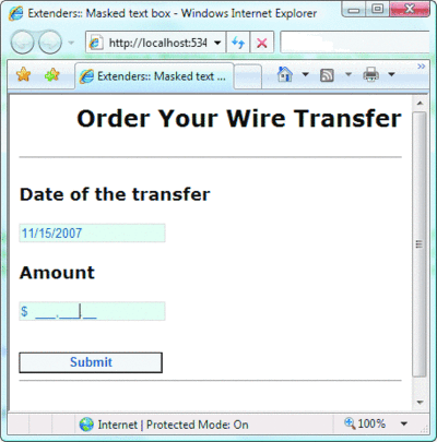
Figure 2** MaskedEdit Extender in Action **(Click the image for a larger view)
For dates, you can also use extra properties such as AcceptAMPM, Century, and even a custom user format in addition to the predefined formats found in the MaskedEditUserDateFormat enumeration, shown here:
public enum MaskedEditUserDateFormat { None, DayMonthYear, DayYearMonth, MonthDayYear, MonthYearDay, YearDayMonth, YearMonthDay }
Many of the settings that influence the formatting applied by the MaskedEdit extender descend from the current culture. The CultureName property indicates the culture to apply. Note that this setting overrides the culture setting defined for the page through the UICulture attribute in the @Page directive.
Validating the Masked Input
While the masked extender provides dynamic formatting capabilities, an additional component—the masked validator—ensures that any text entered can be parsed back to the expected type:
<act:MaskedEditValidator ID="MaskedEditValidator1" runat="server" ControlExtender="MaskedEditExtender1" ControlToValidate="TextBox2" IsValidEmpty="False" EmptyValueMessage="Number is required " InvalidValueMessage="Number is invalid" />
The MaskedEditValidator control is a custom validator that you optionally attach to the MaskedEdit extender so that the contents of the edited textbox are carefully verified. The validator ensures that the text matches the mask. It performs server and client validation and can be associated with a validation group, just like any other ASP.NET validator control. The properties exposed by the validator are listed in Figure B. The Text property of a masked textbox returns formatted text. For a date, the property returns something like "02/04/2007"; for a number input field, the property returns text like "1,200.00". The currency symbol is not included in the Text property, even though it is shown to the user in the page.
Figure B MaskedEditValidator Properties
| Property | Description |
|---|---|
| AcceptAMPM | Indicates whether or not AM/PM is accepted on a time value. |
| ConTRolToValidate | Indicates the ID of the textbox to validate. |
| ConTRolExtender | Indicates the ID of the MaskedEditExtender conTRol attached to the textbox. |
| ClientValidationFunction | Gets and sets the name of the client JavaScript function used for custom validation. |
| EmptyValueBlurredText | Gets and sets the message displayed when the textbox doesn't have the input focus and is empty. |
| EmptyValueMessage | Gets and sets the message displayed when the textbox has the input focus but is empty. |
| InitialValue | Gets and sets the initial value of the textbox. |
| InvalidValueMessage | Gets and sets the message displayed when the textbox has the input focus but invalid content. |
| InvalidValueBlurredMessage | Gets and sets the message displayed when the textbox doesn't have the input focus but has invalid content. |
| IsValidEmpty | Indicates whether the textbox can be left empty. |
| MaximumValue | Gets and sets the maximum value of the input. |
| MaximumValueBlurredMessage | Gets and sets the message displayed when maximum value is exceeded and textbox doesn't have focus. |
| MaximumValueMessage | Gets and sets the message displayed when maximum value is exceeded and the textbox has focus. |
| MinimumValue | Gets and sets the minimum value of the input. |
| MinimumValueBlurredText | Gets and sets the message displayed when minimum value is exceeded and textbox does not have focus. |
| MinimumValueMessage | Gets and sets the message displayed when minimum value is exceeded and textbox has focus. |
| ValidationExpression | Gets and sets the regular expression used to validate the input. |
| TooltipMessage | Gets and sets the message displayed when the textbox has the input focus. |
So how can you parse the value returned by Text into the logical data type—be it a date or a decimal? You can use the static Parse method on the DateTime and Decimal types. But you must pay attention to the culture you use. For example, "02/04/2007" can be either the fourth of February (U.S. culture) or the second of April (European culture). The fact is that there's no guaranteed matching between the culture used by the input page and the server page. There's a risk that the user will type the date according to the European culture and have it processed as U.S. culture data. Worse yet, the 1200 value entered using, say, Italian decimal and thousand separators in a numeric textbox may cause an exception to be thrown because the parser of the Decimal type defaults to the U.S. culture. Let's see how to work around these issues.
The key fact to remember is that extenders default to the en-US culture unless the CultureName property is explicitly set. On the server, the system defaults to the value of the UICulture property on the Page class.
In your codebehind class, you first obtain a CultureInfo object that reflects the culture used for the user interface. You can proceed as shown here:
string culture = "en-us"; if (!String.IsNullOrEmpty(MaskedEditExtender1.CultureName)) culture = MaskedEditExtender1.CultureName; CultureInfo info = new CultureInfo(culture);
Next, you call the Parse method specifying a format provider based on the selected culture:
NumberFormatInfo numberInfo = info.NumberFormat; DateTimeFormatInfo dateInfo = info.DateTimeFormat; DateTime when = DateTime.Parse(TextBox1.Text, dateInfo); decimal amount = Decimal.Parse(TextBox2.Text, numberInfo);
Figure 3 shows the behavior of the same page when using different cultures for input.
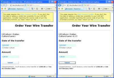
Figure 3** Parsing Data Back to .NET Types Using Different Cultures **(Click the image for a larger view)
Textbox Autocompletion
Autocompletion is a feature you're undoubtedly familiar with. It predicts the word the user is typing based on the first few characters that are entered. Internet Explorer keeps track of all that's been typed into the address bar and form fields to populate autocomplete.
Of course, this feature is entirely browser-based and can be turned on and off for <input> and <form> tags by setting the autocomplete attribute to off. The autocomplete attribute is not a standard HTML attribute, but today nearly all browsers support it.
The AutoComplete extender in the AJAX Control Toolbox provides the same behavior for textbox controls, but it makes the developer responsible for all the logic that provides suggestions to the user. The extender creates a dropdown list-style panel and positions it right at the bottom of the textbox. You can style and animate the panel to your liking. Here's the code to associate an autocomplete extender with a textbox:
<act:AutoCompleteExtender runat="server" ID="AutoComplete1" TargetControlID="TextBox1" EnableCaching="true" MinimumPrefixLength="1" ServicePath="Suggestions.asmx" ServiceMethod="GetSuggestions" />
The extender is bound to a Web service that provides the words to populate the list. The MinimumPrefixLength property instructs the control about when to place a call to the Web service. The text already typed in will be used as input for the specified Web service method. The response is used to populate the dropdown list. Caching may be turned on, too. In this way, typing the same prefix more than once results in a single call to the Web service. Furthermore, depending on the way the Web service retrieves its data, you can also enable caching on the server and save some extra round-trips to a database or another remote data store.
The full list of properties supported by the AutoComplete extender can be found in Figure C. It should be noted that other extenders have properties in addition to those you'll find listed there. There is TargetControlID, which gets and sets the ID of the extended control, and Enabled, which allows the extender's capabilities to be turned on and off programmatically and is set to true by default. There's also the BehaviorID property, which sets the name of the client-side JavaScript object that provides the extended behavior. Finally, there are two more properties of interest—ClientState and EnableClientState. ClientState is a string property that holds the client state of the extender. The state is persisted using a hidden field whose name can be set through the ClientStateFieldID property. EnableClientState is a Boolean property that controls whether client state is enabled.
Figure C AutoComplete Extender Properties
| Property | Description |
|---|---|
| Animations | Sets animations to be played when the flyout is shown and hidden. |
| CompletionInterval | Gets and sets the number of milliseconds after which the extender gets suggestions using the bound Web service. |
| CompletionListCssClass | Indicates the CSS class used to style the completion list flyout. |
| CompletionListHighlightedItemCssClass | Indicates the CSS class used to style the highlighted item in the completion list flyout. |
| CompletionListItemCssClass | Indicates the CSS class used to style the item in the completion list flyout. |
| CompletionSetCount | Gets and sets the number of suggestions to get from the bound Web service. Default is 10. |
| ContextKey | STRing property that indicates any page or user-specific information to pass to the bound Web service. |
| DelimiterCharacters | Indicates one or more characters that the extender will use to tokenize the text box content. The Web service will then use the last of these token to provide suggestions. Not set by default. |
| EnableCaching | Boolean property that indicates whether client-side caching is enabled. True by default. |
| FirstRowSelected | Boolean property that indicates whether the first option in the list will be automatically selected. False by default. |
| MinimumPrefixLength | Gets and sets the minimum number of characters in the text box buffer that TRigger the bound Web service. Default is 3. |
| ServiceMethod | Gets and sets the name of the method to invoke on the bound Web service. |
| ServicePath | Gets and sets the URL of the bound Web service. |
| UseContextKey | Boolean property that indicates whether the value of the ContextKey property should be used, if specified. False by default. |
Building an Autocomplete Web Service
A Web service that works with the AutoComplete extender is an ASP.NET AJAX script service. It looks nearly the same as a regular ASP.NET Web service except that its class must be decorated with the ScriptService attribute. If you employ a Web service that lacks the attribute, each request to the associated ASMX endpoint causes an HTTP 500 error. While an exceptions interface is not shown to the end user (the extender manages to always degrade gracefully), no flyout with suggestions is ever displayed either:
[ScriptService] public class SuggestionService : WebService { ... }
Note that while the script service doesn't require the WebService attribute, it can still use it to provide namespace information.
The name of any public method on the script service class that is flagged with the WebMethod attribute can be successfully assigned to the ServiceMethod property on the extender. A method that provides suggestions must have the following signature:
[WebMethod] public string[] GetSuggestions(string prefixText, int count)
The first argument is the prefix text to generate suggestions. It matches the current content of the textbox, and its length is not smaller than the value of the MinimumPrefixLength property. The count parameter indicates how many suggestions are to be provided. The value of the count parameter comes from the value of the CompletionSetCount property.
If you plan to take advantage of the context key, which is a String property that indicates any page or user-specific information to pass to the bound Web service, then you should provide an override for any Web service methods you intend to use. Here's the signature:
public string[]GetSuggestions( string prefixText, int count, string contextKey) { ... }
The return value is always packed as an array of strings. Because of the ScriptService attribute, any communication between the server and client occurs through JavaScript Object Notation (JSON) strings.
You can leverage any supported attributes on Web service methods to improve the service's performance. For example, the CacheDuration attribute on the WebMethod attribute can force the service to cache the response of the method call for a specified duration. Likewise, you can enable session state if strictly required by the method's logic.
Figure 4 shows a sample service that offers suggestions on the customer name, which is coming from the Northwind database. A call made to a Web service every few characters typed may sound like a bad idea from a performance perspective. There are some factors, though, that make autocompletion more affordable than you might think. Client-side caching for the AutoComplete extender is based on local memory and is never persisted through a hidden field. The completion list associated with a given prefix is stored into an internal array using the prefix as the key. Then it is retrieved whenever the same prefix is isolated in the textbox buffer. As a result, if the user types the same prefix repeatedly, no new request is placed over the wire to the back-end service.
Figure 4 Sample Suggestion Service
using System; using System.Web; using System.Web.Services; using System.Web.Services.Protocols; using System.Data; using System.Data.SqlClient; using System.Web.Script.Services; [WebService(Namespace = "MsdnMag.Articles")] [ScriptService] public class SuggestionService : System.Web.Services.WebService { [WebMethod] public string[] GetSuggestions(string prefixText, int count) { DataView data = GetData(); data = FilterData(data, prefixText); int totalCount = data.Count; if (data.Count > count) totalCount = count; string[] suggestions = new string[totalCount]; int i = 0; foreach (DataRowView row in data) { suggestions[i++] = (string) row["companyname"]; if (i >= count) break; } return suggestions; } private DataView GetData() { DataView view = (DataView)HttpContext.Current.Cache["Suggestions"]; if (view == null) { SqlDataAdapter adapter = new SqlDataAdapter( "SELECT * FROM customers", "..."); DataTable table = new DataTable(); adapter.Fill(table); view = table.DefaultView; HttpContext.Current.Cache["Suggestions"] = view; } return view; } private DataView FilterData(DataView view, string prefix) { view.RowFilter = String.Format("companyname LIKE '{0}%'", prefix); return view; } }
Client-side caching is clearly more effective than server-side caching, which would save you a few round-trips to the database but not round-trips to the Web server. In the code shown in Figure 4, the service loads all customers in the database and stores the list in the ASP.NET cache. It then retrieves the list of customers from there and filters the names that match the prefix.
As mentioned, the Web service you use to provide suggestions has to be an ASP.NET AJAX script service and will talk to the client via JSON. You'll need to decide if the service will be publicly available to SOAP clients as well. ASP.NET AJAX services have dual functionalities by default—both JSON and SOAP. You can turn off SOAP clients by adding the following to the web.config file of the host application:
<system.web> <webServices> <protocols> <clear /> </protocols> </webServices> </system.web>
With ASP.NET 3.5, you can also bind the AutoComplete extender to a Windows® Communication Foundation (WCF) service using a service (SVC) endpoint. The extender uses the following JavaScript code to place the call:
Sys.Net.WebServiceProxy.invoke( this.get_servicePath(), this.get_serviceMethod(), false, params, Function.createDelegate(this, this._onMethodComplete), Function.createDelegate(this, this._onMethodFailed), text);
For the WebServiceProxy class in the Microsoft AJAX client library, all that matters is that the specified endpoint can successfully handle requests with the content-type request header set to "application/json; charset=utf-8". To create a WCF service for providing suggestions, you need a class similar to the following:
[ServiceContract(Namespace = "MsdnMag.Services")] [AspNetCompatibilityRequirements( RequirementsMode = AspNetCompatibilityRequirementsMode.Allowed)] public class MySuggestionService { [OperationContract] public string[] GetSuggestions(string prefixText, int count) { ... } }
In addition, you need an SVC endpoint, as shown here:
<%@ ServiceHost Language="C#" Service="MySuggestionService" CodeBehind="~/App_Code/WcfSuggestions.cs" %>
To register the service, you can add an explicit endpoint to the serviceModel section of the web.config file using the webHttpBinding binding model. Or, you can specify the Factory attribute in the @ServiceHost directive and make it point to the following class:
System.ServiceModel.Activation.WebScriptServiceHostFactory
Styling the AutoComplete Extender
The AutoComplete extender supports properties through which you indicate the CSS classes to be used to style parts of the control. In particular, you can style the overall flyout region including borders and background color. You can also use different settings for all items and the selected item. No predefined style is supplied for the alternating item. By default, the first element in the dropdown completion list is not selected. The FirstRowSelected property, though, can be used to force the automatic selection of the first item.
The completion list shows up after the specified number of milliseconds has elapsed. This is controlled via the CompletionInterval property and set to one second by default. After that time has elapsed, the extender places the call to the service to get the list of suggestions.
You can use the Animations property to add an action to the procedure that brings up the list. You can define animations for two events—OnShow and OnHide. Animations are performed through the Animation extender and its related framework (see the example in Figure 5).
Figure 5 Using the Animations Property
<Animations> <OnShow> <Sequence> <OpacityAction Opacity="0" /> <HideAction Visible="true" /> <Parallel Duration=".4"> <FadeIn /> </Parallel> </Sequence> </OnShow> <OnHide> <Parallel Duration=".4"> <FadeOut /> </Parallel> </OnHide> </Animations>
The animation script fades the completion list in and out. The OpacityAction node sets the transparency, and HideAction displays the completion list along with any other visual effects. Finally, the FadeIn and FadeOut actions perform fading. Figure 6 shows an animated completion list.
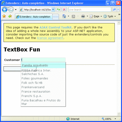
Figure 6** The AutoComplete Extender in Action **(Click the image for a larger view)
Incremental Search on Lists
Have you ever tried to find a particular item in a long list—for example, a country name in the list of all countries in the world? If you're fast enough to type a few consecutive letters, you may get the country you want, but even a few milliseconds of hesitating means that the next letter you type becomes the first letter of the search term. The ListSearch extender fixes this limitation. Note that the extender only applies to ASP.NET Web and HTML controls and can't be used with regular HTML elements such as SELECT or OPTION.
So, basically, the primary benefit of the ListSearch extender is that it lets you search for items in a list control by typing and prevents your search string from being lost after a few seconds; instead, it will remain there until you press Esc or post back to the server (both full and partial postbacks included). Any other character you type is appended to the search string and used to further narrow the list of items. Here's how you use a ListSearch extender:
<act:ListSearchExtender ID="ListSearchExtender1" runat="server" TargetControlID="DropDownList1" PromptCssClass="Prompt" />
The extender features three main properties: PromptText, PromptCssClass, and PromptPosition. All of them refer to the prompt text—the string that appears around the target control to provide visual feedback about the text being searched. The default value for PromptText is "Type to search." This text is usually displayed just above the target list control, as soon as the control gets focus. The PromptCssClass property gets and sets the name of the CSS class to apply to the prompt message. The prompt text is replaced by the search text as typed by the user. The Escape and Delete buttons play a key role here. The Esc button clears the current search and resets the list to the default selected item. The Del button removes the last typed character from the search text and updates the selection in the list. In addition, the Animations property works as I discussed for the AutoComplete extender a moment ago.
Flying Context Menus
It's good to offer users options for what they can do just as they are about to do it. Years ago, tooltips were a huge improvement because they provided additional information on the fly about the role of a certain control. The advent of Dynamic HTML made HTML tooltips possible.
Today, the HoverMenu extender makes it possible to display a flyout panel next to any ASP.NET server control. One of the most common uses of this extender is to display context menus that are activated by mouse movement events rather than a right-click.
The HoverMenu extender is activated when the user moves the mouse over the control. As a result, the specified popup panel is displayed near the control; the actual position can be controlled programmatically. In addition, a CSS style can be applied to the control to mark it with a hot state.
Figure 7 shows a radio button menu that provides suggestions about the text to insert in the textbox. Here's the declaration for the related extender:
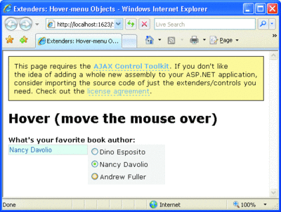
Figure 7** HoverMenu Extender in Action **(Click the image for a larger view)
<act:HoverMenuExtender ID="HoverMenu1" runat="server" TargetControlID="TextBox1" PopupControlID="Panel1" />
The Panel1 control contains the list of radio buttons. To make sure that any selection makes its way into the textbox target control, you define a SelectedIndexChanged event in the radio button list and wrap everything in an UpdatePanel control. (See the companion source code in the download for this column for more details.)
The HoverMenu extender features a few properties in addition to PopupControlID and TargetControlID. The HoverCssClass property indicates the CSS class to apply to the target control when the hover menu is visible. PopupPosition indicates the position of the popup with respect to the target control—center, top, right, left, and bottom are possible values. OffsetX and OffsetY properties set horizontal and vertical offsets from the determined position. Finally, PopDelay indicates the delay between the DOM event and the display of the popup. 100 milliseconds is the default.
The DOM event that triggers the HoverMenu extender is the mouseover. The HoverMenu extender is not very different from the Popup extender. The key differences are in the activation mechanism and trigger. The Popup extender is activated when the user gives focus to a given target control. For the HoverMenu extender to activate, the user only has to move the mouse over the control.
Wrapping Up
The richer and more interactive you want your Web site to be, the more JavaScript you'll need. However, while hand-coded JavaScript is fine for simple features, it is often insufficient to achieve greater levels of interactivity. For these more complex features, you really need extenders and the Microsoft AJAX Client Library (see Cutting Edge, December 2007, at msdn.microsoft.com/msdnmag/issues/07/12/cuttingedge).
This installment of Cutting Edge completes my review of extenders in the Microsoft AJAX Control Toolkit. However, the toolkit contains much more than what I discussed here. To see what I mean, pay a visit to asp.net/ajax.
Send your questions and comments for Dino to cutting@microsoft.com.
Dino Esposito is a mentor at Solid Quality Learning and the author of Introducing ASP.NET AJAX (Microsoft Press, 2007). Based in Italy, Dino is a frequent speaker at industry events worldwide. You can reach him at cutting@microsoft.com or join his blog at weblogs.asp.net/despos.