Extreme ASP.NET
The Only Data-binding Control You'll Ever Need
Fritz Onion
Code download available at:ExtremeASPNET2008_03.exe(192 KB)
Contents
ListView Basics
ListView and CSS
Pagination
Sorting, Editing, Inserting, and Deleting
Grouping
Putting ListView to Work
The ASP.NET 3.5 release that accompanies Visual Studio® 2008 introduces a new data-binding control—the ListView. I know what you're thinking: why do we need yet another data-bound control in ASP.NET? After all, we already have more than 10 controls to choose from when displaying collections of data, including the semi-retired DataGrid, the new and improved GridView, the ever-solid and simple Repeater, the unique and flexible DataList, the handy FormView and its somewhat redundant sibling the DetailsView. And of course there are the single-dimensional list controls BulletedList, ListBox, DropDownList, RadioButtonList and CheckBoxList.
Well, the ListView can literally replace all other data-binding controls in ASP.NET. That's right, every last one. You could literally eschew every other control in the above list in lieu of the ListView control. The ListView also makes several data-binding tasks much easier than they were with previous controls, including styling with CSS, flexible pagination, and the full complement of sorting, inserting, deleting, and updating features.
Let me begin by describing the typical usage model of the ListView, and then I will progress through the features of the control, illustrating its flexibility and power. By the end of this column you should have enough information to decide how many databound controls to keep in your ASP.NET toolbox.
ListView Basics
The ListView is a template-driven control, meaning that it will not render anything by default—you must completely specify the HTML you want it to render in the form of templates. Like most template controls, the ItemTemplate is going to be the focus of most of your efforts, as that is where you place the HTML content that will be repeated for each row of the bound data set.
What is new in the ListView—and what really sets it apart from other controls—is the introduction of a LayoutTemplate. The LayoutTemplate is where you define the top-level HTML to be output as part of the control rendering. If you want the ListView to render as a table, for example, you would include the top-level <table> and perhaps <thead> elements in the LayoutTemplate, leaving the row and cell rendering to the ItemTemplate as shown in Figure 1 (in this case, bound to a data source exposing a simple table containing movie titles and release dates). Figure 2 shows the browser rendering.
Figure 1 Using LayoutTemplate and ItemTemplate
<asp:ListView runat="server" ID="_simpleTableListView"
  DataSourceID="_moviesDataSource">
  <LayoutTemplate>
    <table>
      <thead>
        <tr>
          <th>ID</th>
          <th>Title</th>
          <th>Release Date</th>
        </tr>
      </thead>
      <tbody>
        <asp:PlaceHolder runat="server" ID="itemPlaceholder" />
      </tbody>
    </table>
  </LayoutTemplate>
  <ItemTemplate>
    <tr>
      <td><%# Eval("movie_id") %></td>
      <td><%# Eval("title") %></td>
      <td><%# Eval("release_date", "{0:d}") %></td>
    </tr>
  </ItemTemplate>
</asp:ListView>
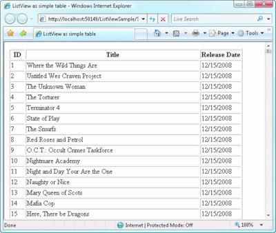
Figure 2** The List Displayed in a Table **(Click the image for a larger view)
The association between the LayoutTemplate and the ItemTemplate is made by the single server-side control in the LayoutTemplate with an ID set to itemPlaceholder. (You can change the ID string from its default with the ItemPlaceholderID property of the ListView.) In my first example, I used the technique of placing an instance of a PlaceHolder control at the location in the template where I wanted the contents of the ItemTemplate to be injected. Note that although it must support child controls, there is no restriction on what type of control you use as a placeholder—the ID is what is important. For example, I could have written the LayoutTemplate using a server-side table row instead of the PlaceHolder control to achieve the same effect:
<LayoutTemplate>
  <table>
    <thead>
      <tr>
        <th>ID</th>
        <th>Title</th>
        <th>Release Date</th>
      </tr>
    </thead>
    <tbody>
      <tr runat="server" ID="itemPlaceholder" />
    </tbody>
  </table>
</LayoutTemplate>
In general, I prefer to use the generic PlaceHolder control for two reasons. The first is because the names match up nicely. And furthermore, this control renders no HTML of its own and is instead replaced with the contents of the ItemTemplate, so using a control that has no purpose besides reserving a place in the control hierarchy seems a more logical choice.
Of course, what makes the ListView so flexible is the fact that you completely control what goes into the LayoutTemplate. You're not restricted to using a table—you can place whatever arbitrary HTML you want to render in the LayoutTemplate, as long as the contents of your ItemTemplate make sense when they are injected at the itemPlaceholder control's location. Here's an example of a ListView bound to the same movie data source, but this time instead of a table, the movies are displayed in a bulleted list with the title and release date (the resulting list is shown in Figure 3):
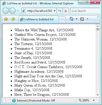
Figure 3** Same List, Different Format **(Click the image for a larger view)
<asp:ListView runat="server"
     ID="_simpleTableListView"
     DataSourceID="_moviesDataSource">
     <LayoutTemplate>
       <ul>
         <asp:PlaceHolder runat="server"
              ID="itemPlaceholder" />
       </ul>
     </LayoutTemplate>
     <ItemTemplate>
       <li><%# Eval("title") %>,
           <%# Eval("release_date", "{0:d}") %> </li>
     </ItemTemplate>
    </asp:ListView>
ListView and CSS
ASP.NET developers have long been at the mercy of individual controls when it comes to creating CSS-driven sites. Many of the default controls render inline styles or make it difficult to associate CSS classes with portions of their HTML output. Microsoft actually released a toolkit in April 2006 called the CSS Control Adapter Toolkit that provided an alternate rendering mechanism for several controls (including the GridView) that were completely CSS-driven to help remedy this problem (see the October 2006 Extreme ASP.NET column for more details at msdn.microsoft.com/msdnmag/issues/06/10/ExtremeASPNET). These alternate renderings were never incorporated into the full release, though, so they remain a separate installation and lack designer support.
The ListView offers a refreshing simplicity to leveraging CSS in your site by putting you in complete control of where and when to apply stylesheets. One very common scenario is for a developer to be handed a preset design for a particular page, typically consisting of HTML and CSS. Using a traditional GridView in order to render a specific design for a table has always been tricky to get right because the GridView class only provides a limited set of hooks modifying the resulting HTML.
I have seen many developers resort to trial and error, applying style attributes to a grid, viewing the source of the page to understand exactly where the styles were placed, and iterating until the grid rendered as desired. With the ListView, the guesswork is gone as you are now responsible for the layout as well as the content.
As an example, suppose you were given a table that needed to look like the one shown in Figure 4, with the design consisting of the .htm and .css files shown in Figure 5.
Figure 5 HTML and CSS for the Table
HTML
<div class="PrettyGrid">
  <table cellpadding="0" cellspacing="0" summary="">
    <thead>
      <tr>
        <th scope="col"><a href="https://.">ID</a></th>
        <th scope="col"><a href="https://.">Title</a></th>
        <th scope="col"><a href="https://.">Release date</a></th>
      </tr>
    </thead>
    <tbody>
      <tr>
        <td>1</td>
        <td>Where the Wild Things Are</td>
        <td>12/15/2008</td>
      </tr>
  <!-- ... -->
    </tbody>
  </table>
  <div class="Pagination">
    <span>1</span>
    <a href="https://.">2</a>
    <a href="https://.">3</a>
  </div>
</div>
CSS
.PrettyGrid
{
  width: 100%;
}

.PrettyGrid div.Pagination,
.PrettyGrid div.Pagination a,
.PrettyGrid div.Pagination span
{
  color: #00FFFF;
  background: #284775;
  font-weight: normal;
  padding: 2px;
}
.PrettyGrid table
{
  border: solid 1px #CCCCCC;
  width: 100%;
}
/*...*/
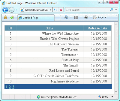
Figure 4** Target Design for a Table **(Click the image for a larger view)
You could quickly construct a ListView that renders exactly as the HTML/CSS combination requires by plucking the appropriate sections from the HTML and placing them within the corresponding templates as shown in Figure 6. The end result will look exactly like the original HTML styled completely with CSS. It's also easy to make modifications to the design by simply updating the HTML or corresponding CSS.
Figure 6 ListView to Construct the Table
<asp:ListView ID="_moviesGrid" runat="server" DataKeyNames="movie_id"
  DataSourceID="_moviesDataSource">
  <LayoutTemplate>
    <div class="PrettyGrid">
      <table cellpadding="0" cellspacing="0" summary="">
        <thead>
          <tr>
            <th scope="col"><a href="https://.">ID</a ></th>
            <th scope="col"><a href="https://.">Title</a></th>
            <th scope="col"><a href="https://.">Release date</a></th>
          </tr>
        </thead>
        <tbody>
          <asp:PlaceHolder ID="itemPlaceholder" runat="server" />
        </tbody>
      </table>
      <div class="Pagination">
        <span>1</span>
        <a href="https://.">2</a>
        <a href="https://.">3</a>
      </div>
    </div>
  </LayoutTemplate>

  <AlternatingItemTemplate>
    <tr class="Alternate">
      <td><asp:Label ID="movie_idLabel" runat="server"
        Text='<%# Eval("movie_id") %>' /></td>
      <td><asp:Label ID="titleLabel" runat="server"
        Text='<%# Eval("title") %>' /></td>
      <td><asp:Label ID="release_dateLabel" runat="server"
        Text='<%# Eval("release_date", "{0:d}") %>' />  </td>
    </tr>
  </AlternatingItemTemplate>

  <ItemTemplate>
    <tr>
      <td><asp:Label ID="movie_idLabel" runat="server"
        Text='<%# Eval("movie_id") %>' /></td>
      <td><asp:Label ID="titleLabel" runat="server"
        Text='<%# Eval("title") %>' /></td>
      <td><asp:Label ID="release_dateLabel" runat="server"
        Text='<%# Eval("release_date", "{0:d}") %>' /> </td>
    </tr>
  </ItemTemplate>
</asp:ListView>
Pagination
The original HTML design that I started with in the previous section had both pagination and sorting implied by the design, so my task to fully implement this grid based on the specification is not yet complete. Let's start with pagination, and I'll get to sorting next.
Pagination is accomplished in the ListView control through the introduction of another new control, the DataPager. By separating paging into a separate control, the DataPager decouples the paging UI from whatever the ListView is using to present the data. This means that you can place the paging UI pretty much wherever you like on the page, and you can also create as many DataPager controls as you like. One common application of multiple pager controls is to provide a pagination interface both at the top and the bottom of a grid of data so the user doesn't have to scroll the grid to navigate to the next page—something that is easily accomplished with the DataPager.
Let's start by implementing pagination in the ListView example from the previous section. The simplest way to create a DataPager control associated with a ListView is to actually embed the DataPager control within the LayoutTemplate of the ListView:
<asp:ListView ID="_moviesGrid"
  runat="server" DataKeyNames="movie_id"
  DataSourceID="_moviesDataSource">
  <LayoutTemplate>
    <!-- ... -->
    <div class="Pagination">
      <asp:DataPager ID="_moviesGridDataPager" runat="server">
        <Fields>
          <asp:NumericPagerField />
        </Fields>
      </asp:DataPager>
    </div>
  </LayoutTemplate>
</asp:ListView>
By embedding the DataPager within the LayoutTemplate of the ListView, they are implicitly associated. The other option would be to place the DataPager elsewhere on the page and associate it with the ListView by setting its PagedControlID to the ID of the associated ListView.
In this particular case, the NumericPagerField displays the exact interface I wanted—just a series of numbers displayed as hyperlinks to navigate pages. The DataPager supports three types of fields:
- NumericPagerField displays the 1 2 3... pagination interface.
- NextPreviousPagerField displays a Next, Previous, First, and Last buttons to iterate across rows.
- TemplatePagerField lets you define the exact design and function of the pagination interface using a PagerTemplate.
The DataPager control is implemented generically to provide paging support for any control that implements the IPageableItemContainer interface (currently the ListView is the only control that implements this interface), like so:
public interface IPageableItemContainer
{
    event EventHandler<PageEventArgs> TotalRowCountAvailable;
    void SetPageProperties(int startRowIndex, int maximumRows,
                           bool databind);
    int MaximumRows { get; }
    int StartRowIndex { get; }
}
Figure 7 shows the relationship among the ListView, a DataPager, and an associated DataSource control. The DataPager never interacts directly with the DataSource used to populate the ListView, but rather queries the data it needs through this interface.
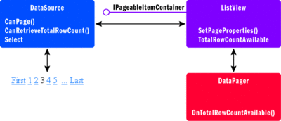
Figure 7** Relationship among a ListView, a DataPager, and a DataSource **
(Click the image for a larger view)
The first thing that happens in preparing the pagination is the ListView queries the DataSource to see whether it supports paging, and if so, whether it can return the total row count. If it can, the ListView retrieves the total number of rows in the data source and then raises the TotalRowCountAvailable event implemented as part of its IPageableItemContainer interface. Any associated DataPager controls will have subscribed to this event and will use the total rowcount number to initialize the fields needed to present the pagination interface. The DataPager will then invoke the SetPageProperties method of the ListView to set the initial row index as well as the maximum number of rows to return.
When the ListView retrieves data from the associated data source, it will request only a subset of rows based on the values set by the DataPager. Whenever the DataPager changes its current page index (generally because of user interaction), it will call the ListView's SetPageProperties again to reflect the current subset of rows to retrieve. You can change the number of records displayed on a page by setting the PageSize property of the DataPager control, which affects the maximum row count information that it sets in the corresponding ListView.
The DataPager also supports the QueryStringField property, which rather drastically changes how the DataPager works. By setting the QueryStringField property to some string (pageNum, for example), you are requesting that the DataPager issue an HTTP GET request in response to the user clicking page numbers, with the requested page number sent through a query string parameter using the string you assign instead of the traditional POST-back model.
One useful side-effect of this change is that it makes it possible for clients to create bookmarks to specific pages in your databound ListView control since the page number will be visible in the URL. Beware that if you switch to this GET model of communication, the POST-back hooking mechanism used by the ASP.NET AJAX UpdatePanel control will not be able to intercept the pagination requests and turn them into asynchronous postbacks:
<asp:DataPager ID="_moviesGridDataPager" runat="server"
  QueryStringField="pageNum" >
  <Fields>
    <asp:NumericPagerField />
  </Fields>
</asp:DataPager>
Note that because the DataPager is completely reliant on the ListView for performing the actual pagination of data, which in turn relies on the associated DataSource control, you have the same constraints on paging that you do with other databound controls. For example, paging only works for SqlDataSource controls when they are set to DataSet mode, which means the entire resultset is loaded into memory to perform pagination. You can, of course, implement your own custom paging either with a custom DataSource control or by using the ObjectDataSource control.
Sorting, Editing, Inserting, and Deleting
The ListView would not be complete without the ability to support sorting and the full complement of create, read, update, and delete (CRUD) operations. Its implementation for each of these commands is similar to the way the FormView control implements commands.
Because the ListView is entirely template driven, it recognizes certain buttons within its templates that have the CommandName property set to one of seven specific command strings: Cancel, Delete, Select, Edit, Insert, Update, and Sort. Each command initiates the corresponding action on the ListView—so if you want to add sorting to your ListView, you need to place a button (the example in Figure 8 uses a LinkButton) within the LayoutTemplate with a CommandName property set to Sort and a CommandArgument set to the column name on which you want the data source to sort. In Figure 8 I have modified the previously static header links for each column in my grid to be clickable links that request the ListView to sort the data based on the column.
Figure 8 Sorting in ListView
<asp:ListView ID="_moviesGrid" runat="server" DataKeyNames="movie_id"
  DataSourceID="_moviesDataSource">
  <LayoutTemplate>
    <div class="PrettyGrid">
      <table cellpadding="0" cellspacing="0" summary="">
        <thead>
          <tr>
            <th scope="col">
              <asp:LinkButton ID="_movieIdSortLink"
                CommandName="Sort" CommandArgument="movie_id"
                runat="server">ID</asp:LinkButton>
            </th>
            <th scope="col">
              <asp:LinkButton ID="_titleSortLink"
                CommandName="Sort" CommandArgument="title"
                runat="server">Title</asp:LinkButton>
            </th>
            <th scope="col">
              <asp:LinkButton ID="_releaseDateSortLink"
                CommandName="Sort" CommandArgument="release_date"
                runat="server">Release date</asp:LinkButton>
            </th>
          </tr>
        </thead>
    <!-- ... -->
  </LayoutTemplate>
</asp:ListView>
You can similarly add command buttons for initiating editing mode, deleting a row, or inserting a new row into the data set, the details of which are essentially identical to other template-based data-binding controls (like the FormView and GridView) and thus will not be shown here.
Grouping
The last major feature of the ListView is the ability to group data into subsets, much like the DataList control provides. The DataList is a tabular control that renders a single row of data in each cell of the rendered table. You control how many rows of the underlying dataset are grouped into a single table row by setting the RepeatColumns property.
Since the ListView is not constrained to render as a table, it needs a more generic way of specifying groups of items to be rendered together, which is what GroupTemplate does. Figure 9 shows the relationship among the LayoutTemplate, GroupTemplate, and ItemTemplate elements within a ListView. The GroupTemplate lets you specify the surrounding HTML for every n elements in the underlying dataset, where n is specified by the GroupItemCount property of the ListView.
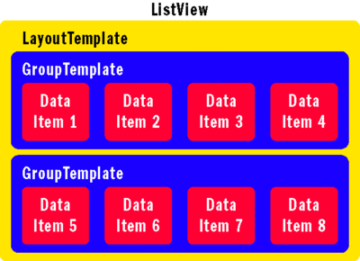
Figure 9** Templates in a ListView **(Click the image for a larger view)
When you use a GroupTemplate within a ListView, you won't specify a control with an ID of itemPlaceholder within your LayoutTemplate—that control now needs to be in your GroupTemplate. Instead, you will specify a control with an ID of groupPlaceholder in the LayoutTemplate (you can change the control ID by setting the GroupPlaceholderID property of the ListView) to describe where the contents of the GroupTemplate should be injected for each n items encountered in the underlying dataset.
For example, the ListView in Figure 10 shows how I could display four movies from my database in each row of a table by defining a GroupTemplate to delineate rows and leaving the ItemTemplate to lay out only the cell. The result is shown in Figure 11.
Figure 10 Defining Rows with GroupTemplate
<asp:ListView ID="_groupListView" runat="server"
  DataKeyNames="movie_id" DataSourceID="_moviesDataSource"
  GroupItemCount="4" >
  <GroupTemplate>
    <tr>
      <asp:PlaceHolder runat="server" ID="itemPlaceholder" />
    </tr>
  </GroupTemplate>
  <LayoutTemplate>
    <table>
      <asp:PlaceHolder ID="groupPlaceholder" runat="server" />
    </table>
  </LayoutTemplate>
  <ItemTemplate>
    <td>
      movie_id:
      <asp:Label ID="_movie_idLabel" runat="server"
        Text='<%# Eval("movie_id") %>' /> <br />
      title:
      <asp:Label ID="_titleLabel" runat="server"
        Text='<%# Eval("title") %>' /> <br />
      release_date:
      <asp:Label ID="_release_dateLabel" runat="server"
        Text='<%# Eval("release_date", "{0:d}") %>' /> <br />
      <br />
    </td>
  </ItemTemplate>
</asp:ListView>
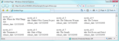
Figure 11** GroupTemplate Rows in the Resulting Web Page **(Click the image for a larger view)
This is very similar to what you could do with a DataList, but because you are working with a ListView, you can just as easily add both pagination and sorting as you did earlier with your grid rendering, a task that would be rather daunting with the DataList. The code download for this article contains an example that implements both pagination and sorting for your reference.
Putting ListView to Work
You may want to begin your experiments with the ListView control by using the designer in Visual Studio 2008, which lets you select from among five different layouts: grid, tiled, bulleted list, flow, and single row. You can quickly see the different layout options that are possible—but the real power of the ListView lies in the control you have over the HTML that it renders, so you're more likely to spend your time building the LayoutTemplate yourself in real projects. Will you end up using the ListView for every data-binding opportunity in the future? That may be a bit extreme—but it's nice to know you could. I know I'll be reaching for this flexible data-binding control more often than not.
Send your questions and comments for Fritz to xtrmaspt@microsoft.com.
Fritz Onion is a co-founder of Pluralsight, a Microsoft .NET training provider, where he heads the Web development curriculum. Fritz is the author of Essential ASP.NET and Essential ASP.NET 2.0. Reach him at pluralsight.com/fritz.