Microsoft Dynamics CRM 2011 Charts Customization
Introduction
One of the best features of the Microsoft Dynamics CRM 2011 is its charts. Each user could create his/her desired charts (permissions needed), does the aggregations such as count and sum, select data series and select the chart type. All of this could be done without one line of coding. The story could be more interesting when you know the charts could be exported and imported easily. In this article some basic concepts and customization methods of Dynamics CRM 2011 would be discussed.
The main procedure of customizing a chart includes three steps:
- Exporting the chart which was build in CRM.
- Editing the XML file.
- Importing the customized chart to CRM.
you have to select the charts at the section you are, and then export it as in the figure below:
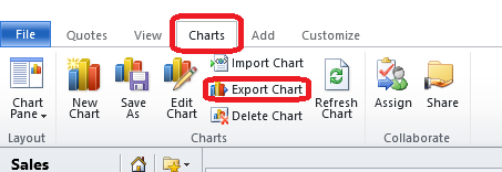
Then, you have to save the chart as an XML file at an appropriate destination. After you have edited the chart XML file, then you could import it from this tab. At the import, if the chart name exists, the wizard asks you to "Replace" or "Keep both", and for a name obviously!
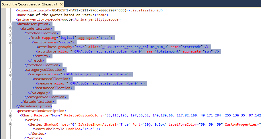
Editing chart XML
To edit the chart XML file, open it in Visual Studio (you could open it in any editor). A chart is rendered as a single image with its series and category. But the XML consists of two main parts:
- The "data description" part (the data used to render chart).
- The "presentation description" part (appearance parameters such as colors and legends).
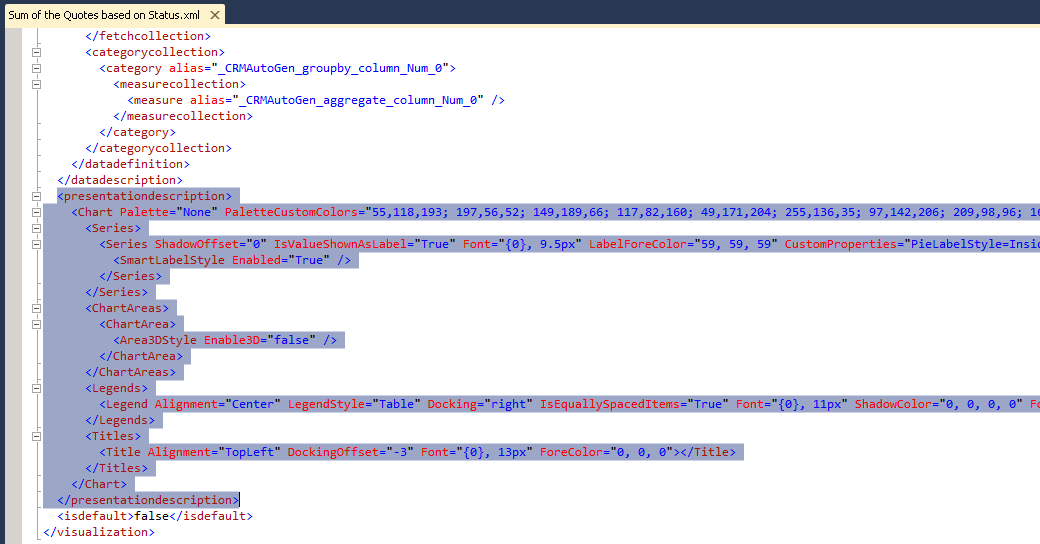
The good news is that the CRM 2011 charts uses standard ASP .NET chart controls. Then, the presentation description uses .NET chart controls. As you know CRM 2011 has a limited chart types, but you could customize them to have more than 40 chart types. Refer to MSDN article on chart types.
At the rest of this article some of the most used tricks about customizing the data description and presentation description sections would be discussed.
Useful Tricks
Some useful tricks of charts are as follows:
Large difference in data ranges
If there is a lot of difference in data ranges, it could result in a ugly view! This ugly view could be eliminated with the gaps in the chart. You have to add the below section under the AxisY:
<AxisY LabelAutoFitMinFontSize="8" TitleForeColor="59, 59, 59" TitleFont="{0}, 10.5px" LineColor="165, 172, 181" IntervalAutoMode="VariableCount"> <MajorGrid LineColor="239, 242, 246" /> <MajorTickMark LineColor="165, 172, 181" /> <LabelStyle Font="{0}, 10.5px" ForeColor="59, 59, 59" /> <ScaleBreakStyle Enabled="True" BreakLineStyle="Straight" Spacing="2" /> </AxisY>
The customized chart should look like:

Customizing series name and legends
The series name in CRM 2011 charts are the aggregation of the field names, such as Sum(Estimated Revenue). You could change these names as you desire. To display the series names as won use:
<Series Name="o:opportunity_statecode,1" Color="149, 189, 66" IsValueShownAsLabel="False" BackGradientStyle='TopBottom" BackSecondaryColor="112, 142, 50" Font="{0}, 9.5px" LabelForeColor="59, 59, 59">
And to display the series name as lost use:
<Series Name="o:opportunity_statecode,2" Color="255,124,31" IsValueShownAsLabel="False" BackGradientStyle='TopBottom" BackSecondaryColor="235,98,0" Font="{0}, 9.5px" LabelForeColor="59, 59, 59">
To use the option sets as the series label use:
<Series Name = “o:optionsetLogicalName,optionSetValue” Color="255,124,31" IsValueShownAsLabel="False" BackGradientStyle='TopBottom" BackSecondaryColor="235,98,0" Font="{0}, 9.5px" LabelForeColor="59, 59, 59">

3D charts
You could enable 3D for almost all of the charts. You only have to add Area3DStyle Enable3D="True" to chart XML as follows:
<ChartAreas>
   <ChartArea BorderColor="White" BorderDashStyle="Solid">
       <AxisY LabelAutoFitMinFontSize="8" TitleForeColor="59, 59, 59" TitleFont="{0}, 10.5px" LineColor="165, 172, 181" IsReversed="False">
      <MajorGrid LineColor="128, 128, 128" />
      <LabelStyle Font="{0}, 10.5px" ForeColor="59, 59, 59" />
      </AxisY>
      <AxisX LabelAutoFitMinFontSize="8" TitleForeColor="59, 59, 59" TitleFont="{0}, 10.5px" LineColor="165, 172, 181" IsReversed="False">
      <MajorGrid Enabled="False" />
      <MajorTickMark Enabled="False" />
      <LabelStyle Font="{0}, 10.5px" ForeColor="59, 59, 59" />
      </AxisX>
      <Area3DStyle Enable3D="True" LightStyle="Realistic" WallWidth="5" IsRightAngleAxes="true" />
   </ChartArea>
</ChartAreas>
The result of the customization is as:
Hiding the bar values
To hide the values on the bar charts use:
<Series>
   <Series ChartType="Bar" IsValueShownAsLabel="False" Color="149, 189, 66"  BackGradientStyle="TopBottom"BackSecondaryColor="112, 142, 50" Font="{0}, 9.5px" LabelForeColor="59, 59, 59" CustomProperties="PointWidth=0.75, MaxPixelPointWidth=40">
      <SmartLabelStyle Enabled="True" />
   </Series>
</Series>
3D Cylinder
To create 3D cylinder charts instead of stacked chart use:
<Series>
   <Series ChartType="Column" Font="{0}, 9.5px" LabelForeColor="59, 59, 59" CustomProperties="PointWidth=0.75, MaxPixelPointWidth=40, DrawingStyle=Cylinder"></Series>
</Series>
<ChartAreas>
and this:
</AxisX>
   <Area3DStyle Enable3D="True" LightStyle="Realistic" WallWidth="5" IsRightAngleAxes="true" />
</ChartArea>

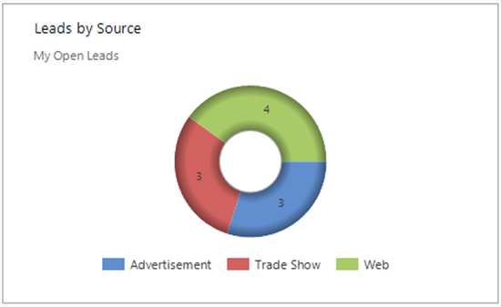
Soft Edge Doughnut
To have a soft edges for a doughnut chart type use:
<Series>
 <Series ShadowOffset="0" IsValueShownAsLabel="true" Font="{0}, 9.5px" LabelForeColor="59, 59, 59" CustomProperties="PieLabelStyle=Inside, PieDrawingStyle=SoftEdge" ChartType=" Doughnut">
         <SmartLabelStyle Enabled="True" />
     </Series>
</Series>
<ChartAreas>
      <ChartArea>
          <Area3DStyle Enable3D="False" />
      </ChartArea>
</ChartAreas>
The resulting chart is as:
Square base Funnel
For a square base funnel use the snippet below:
Funnel3DDrawingStyle=SquareBase
Which results in:

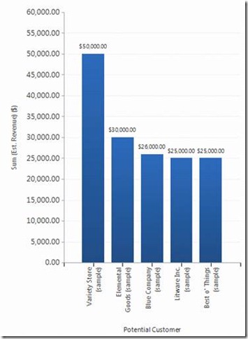
Multi series chart
As a last trick, we discuss about the multi series chart. To create such a chart, first build a single series chart about the Estimated Revenue of each Potential Customer. The chart looks like:
And the XML file is as:
<visualizationid>{A3A9EE47-5093-DE11-97D4-00155DA3B01E}</visualizationid>
  <name>Sum(Estimated Revenue) by Owner</name >
  <description>Shows the estimated revenue by owner.</description>
  <primaryentitytypecode>opportunity</primaryentitytypecode>
  <datadescription>
    <datadefinition>
      <fetchcollection>
        <fetch mapping="logical" aggregate="true">
          <entity name="opportunity">
            <attribute alias="aggregate_column" name="estimatedvalue" aggregate="sum" />
            <attribute groupby="true" alias="groupby_column" name="ownerid" />
          </entity>
        </fetch>
      </fetchcollection>
      <categorycollection>
        <category>
          <measurecollection>
            <measure alias="aggregate_column" />
          </measurecollection>
        </category>
      </categorycollection>
    </datadefinition>
  </datadescription>
  <presentationdescription>
    <Chart>
      <Series>
        <Series ChartType="Column" IsValueShownAsLabel="True" Color="55, 118, 19"
BackGradientStyle="TopBottom" BackSecondaryColor="41, 88, 145" Font="{0}, 9.5px" LabelForeColor="59, 59, 59" CustomProperties="PointWidth=0.75, MaxPixelPointWidth=40">
          <SmartLabelStyle Enabled="True" />
        </Series>
      </Series>
      <ChartAreas>
        <ChartArea BorderColor="White" BorderDashStyle="Solid">
          <AxisY LabelAutoFitMinFontSize="8" TitleForeColor="59, 59, 59" TitleFont="{0}, 10.5px" LineColor="165, 172, 181" IsReversed="False">
            <MajorGrid LineColor="239, 242, 246" />
            <LabelStyle Font="{0}, 10.5px" ForeColor="59, 59, 59" />
          </AxisY>
          <AxisX LabelAutoFitMinFontSize="8" TitleForeColor="59, 59, 59" TitleFont="{0}, 10.5px" LineColor="165, 172, 181" IsReversed="False">
            <MajorGrid Enabled="False" />
            <MajorTickMark Enabled="False" />
            <LabelStyle Font="{0}, 10.5px" ForeColor="59, 59, 59" />
          </AxisX>
        </ChartArea>
      </ChartAreas>
      <Titles>
        <Title DockingOffset="-3" Font="{0}, 13px" ForeColor="59, 59, 59" Alignment="TopLeft"></Title>
      </Titles>
    </Chart>
  </presentationdescription>
  <isdefault>false</isdefault>
</visualization>
First you have to add a new attribute alias:
<``attribute alias``=``"aggregate_column1" name``=``"actualvalue" aggregate``=``"sum" />
Then, add a new measure collection:
<measurecollection>
  <measure alias="aggregate_column1" />
</measurecollection>
Add a new series in the presentation section:
<Series BorderWidth="3" ChartType="Line" Color="49,171,204" MarkerStyle="Square"
MarkerSize="4" MarkerColor="37,128,153" MarkerBorderColor="37,128,153"> </Series>
Finally you have to add legends:
<Legends>
  <Legend Alignment="Center" LegendStyle="Table" Docking="Bottom" Font="{0}, 11px" ShadowColor="0, 0, 0, 0" ForeColor="59, 59, 59/>
</Legends>
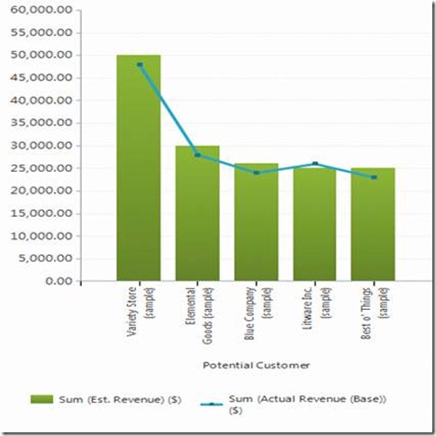
The result is as:
In case of any suggestion, please revise or advice!