Multiple Columns in WPF ListBox
In this article we will discuss ways to have multiple columns in WPF ListBox control and layout the ListBox such that each row has 3 items. All WPF controls deriving from ItemsControl provide an '*ItemsPanel' *property that allows us to replace the internal layout panel that arranges the items. So to have multiple columns in a ListBox we have to change the 'ItemsPanel' property of the control.
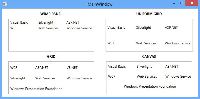
WrapPanel
One of the simplest way of displaying content horizontally in ListBox is to have WrapPanel in 'ItemsPanel' property of ListBox. But if we need to display fixed number of items in a row then we have to disable the horizontal scrollBar so that item get wrap to next row and set fixed width for ListBox. As item get wrap the ListBoxItem are not positioned uniformly. So we have to set Width for each ListBoxItem so that all the items are positioned in a tabular way.
<ListBox Width="300" ScrollViewer.HorizontalScrollBarVisibility="Disabled">
    <ListBox.ItemsPanel>
          <ItemsPanelTemplate>
                 <WrapPanel Orientation="Horizontal"/>
            </ItemsPanelTemplate>
    </ListBox.ItemsPanel>

    <ListBoxItem Content="Visual Basic" Width="80"/>
    <ListBoxItem Content="Silverlight" Width="80"/>
    <ListBoxItem Content="ASP.NET" Width="80"/>
    <ListBoxItem Content="WCF" Width="80"/>
    <ListBoxItem Content="Web Services" Width="80"/>
   <ListBoxItem Content="Windows Service" Width="80"/>
</ListBox>
UniformGrid
One of the drawback with WrapPanel was we had to disable horizontal scrollbar, set width for ListBox and ListBoxItem. UniformGrid is another option which we can use instead of WrapPanel in '*ItemsPanel' *property and set 'Columns' property which would be number of items we need to display in a row. Using UniformGrid all the items in the ListBox will have same width and height.
<ListBox>
    <ListBox.ItemsPanel>
        <ItemsPanelTemplate>
            <UniformGrid Columns="3"/>
        </ItemsPanelTemplate>
    </ListBox.ItemsPanel>

    <ListBoxItem Content="Visual Basic" />
    <ListBoxItem Content="Silverlight" />
    <ListBoxItem Content="ASP.NET" />
    <ListBoxItem Content="WCF" />
    <ListBoxItem Content="Web Services" />
    <ListBoxItem Content="Windows Service" />
</ListBox>
**Grid
**
Although UniformGrid is the best solution for multiple column in ListBox but sometime we don’t want all the columns in the ListBox of same size. Also in some scenario we could have a requirement where we need to merge two or more columns (or rows) for a larger text. In this situation Grid is very useful option.
<ListBox>
    <ListBox.ItemsPanel>
        <ItemsPanelTemplate>
            <Grid>
                <Grid.RowDefinitions>
                    <RowDefinition Height="*"/>
                    <RowDefinition Height="*"/>
                    <RowDefinition Height="*"/>
                </Grid.RowDefinitions>
                <Grid.ColumnDefinitions>
                    <ColumnDefinition Width="0.8*"/>
                    <ColumnDefinition Width="*"/>
                    <ColumnDefinition Width="Auto"/>
                </Grid.ColumnDefinitions>
            </Grid>
        </ItemsPanelTemplate>
    </ListBox.ItemsPanel>

    <ListBoxItem Content="WCF"  Grid.Row="0" Grid.Column="0"/>
    <ListBoxItem Content="ASP.NET"  Grid.Row="0" Grid.Column="1"/>
    <ListBoxItem Content="VB.NET" Grid.Row="0" Grid.Column="2"/>
    <ListBoxItem Content="Silverlight" Grid.Row="1" Grid.Column="0"/>
    <ListBoxItem Content="Web Services" Grid.Row="1" Grid.Column="1"/>
    <ListBoxItem Content="Windows Service" Grid.Row="1" Grid.Column="2"/>
    <ListBoxItem Content="Windows Presentation Foundation" Grid.Row="2" Grid.ColumnSpan="3"/>
</ListBox>
Drawback of using Grid in 'ItemsPanel' is that we have to set '*RowDefinitions' *and '*ColumnDefinitions' *for the Grid. Also we have to set the 'Grid.Row' and 'Grid.Column' for each item to position them in the ListBox. But in some scenario as described above it is very useful.
**Canvas
**
We can also use Canvas control in 'ItemsPanel' property. Using Canvas control we can explicity position ListBox items by using coordinates that are relative to the Canvas area. Canvas.Left and Canvas.Top property are used to position the item in the ListBox. The Canvas.Left property represents the distance between the left side of a ListBoxItem and the left side of ListBox. The Canvas.Top property represents the distance between the top of a ListBoxItem and ListBox.
<ListBox Width="300" >
    <ListBox.ItemsPanel>
        <ItemsPanelTemplate>
            <Canvas />
        </ItemsPanelTemplate>
    </ListBox.ItemsPanel>

    <ListBoxItem Content="Visual Basic" Width="98" Canvas.Left="0" Canvas.Top="5" />
    <ListBoxItem Content="Silverlight" Width="98" Canvas.Left="100" Canvas.Top="5"/>
    <ListBoxItem Content="ASP.NET" Width="98" Canvas.Left="200" Canvas.Top="5"/>
    <ListBoxItem Content="WCF" Width="98" Canvas.Left="0" Canvas.Top="30"/>
    <ListBoxItem Content="Web Services" Width="98" Canvas.Left="100" Canvas.Top="30"/>
    <ListBoxItem Content="Windows Service" Width="98" Canvas.Left="200" Canvas.Top="30"/>
    <ListBoxItem Content="Windows Presentation Foundation"  Canvas.Left="55" Canvas.Top="55"/>
</ListBox>
Following are few useful articles which may help if you want to add items using ItemsSource property and use Grid or Canvas control in ItemsPanel property.
http://www.scottlogic.com/blog/2010/11/15/using-a-grid-as-the-panel-for-an-itemscontrol.html
http://www.codebullets.com/demystify-the-itemscontrol-using-canvas-831