What's New for the AppBar in Windows 8.1
In Windows 8.1 the AppBar has many fantastic improvements that make it much easier to use than in Windows 8.0. In this article I start to show you how the AppBar is used in Windows 8 - especially how the layout and styling of Buttons in your AppBar is done. After that I'll introduce the new features for the AppBar in Windows 8.1 that make it really comfortable to use.
The AppBar in Windows 8
To add a bottom AppBar in a 8.0-Windows Store App, you assign an AppBar-object to the BottomAppBar-Property of your Page. This stays the same in Windows 8.1 and is shown in the snippet below:
<Page ...>
<!--your Page-content goes here-->
<Page.BottomAppBar>
<AppBar>
<!--your AppBar-content goes here-->
</AppBar>
</Page.BottomAppBar>
</Page>
Now let's go on with the AppBar-content. If you take a look at Microsoft's UX-Guidelines, you should place primary commands on the right side of your AppBar, and secondary commands on the left side. To fulfill these Guidelines, often a layout like the one in the next snippet is used: A Grid with two columns contains two StackPanels. The first StackPanel is placed in the second column via Grid.Column="1". It is even attached to the right side of the right column via the HorizontalAlignment-Property. So the first StackPanel is positioned on the right side of the AppBar and therefore should be used for primary commands. The second StackPanel is on the left side of the AppBar and so for secondary commands.
<AppBar>
<Grid>
<Grid.ColumnDefinitions>
<ColumnDefinition/>
<ColumnDefinition/>
</Grid.ColumnDefinitions>
<StackPanel Orientation="Horizontal"
Grid.Column="1" HorizontalAlignment="Right">
<!--your primary commands go here-->
</StackPanel>
<StackPanel Orientation="Horizontal">
<!--your secondary commands go here-->
</StackPanel>
</Grid>
</AppBar>
The procedure to create such a layout for an AppBar stays the same in Windows 8.1. But in Windows 8.1 there's a special subclass called CommandBar that helps you a lot. With the CommandBar you don't have to define the layout manually. I'll come back later on the CommandBar in the Windows 8.1 section. Here in the Windows 8.0 section I now want to show how to add and style Buttons in the AppBar, so let's add the two primary commands "Add" and "Delete" and the secondary command "Sort". For that we add the Buttons like shown below:
<StackPanel Orientation="Horizontal"
Grid.Column="1" HorizontalAlignment="Right">
<Button Content="Add"/>
<Button Content="Delete"/>
</StackPanel>
<StackPanel Orientation="Horizontal">
<Button Content="Sort"/>
</StackPanel>
Now when we start the application, the AppBar looks like this:

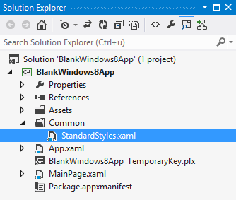
Ok, that's not exactly what Buttons in an AppBar should look like. Buttons in an AppBar don't look like Rectangles, they're much more like circles. To make real AppBar-Button's, we need to reference an appropriate Style.The Style for different kind of AppBar buttons is found in the StandardStyles.xaml-File that is part of every Windows Store App-Project in Windows 8. It's located in the Common-Folder:
Inside of the StandardStyles.xaml-file there is a style with a key AppBarButtonStyle (x:Key="AppBarButtonStyle"). This style is the basic style for an AppBar-Button. Below that style in the StandardStyles.xaml-file there are many out-commented specific AppBar-Button-Styles, like Add, Delete, Play, Pause, Sort, Filter etc. You need to uncomment these blocks with the Styles you need before you can use them. For the AppBar we've created above with the Buttons Add, Delete and Sort, you find the three Styles below:
<Style x:Key="DeleteAppBarButtonStyle" TargetType="ButtonBase" BasedOn="{StaticResource AppBarButtonStyle}">
<Setter Property="AutomationProperties.AutomationId" Value="DeleteAppBarButton"/>
<Setter Property="AutomationProperties.Name" Value="Delete"/>
<Setter Property="Content" Value=""/>
</Style>
<Style x:Key="AddAppBarButtonStyle" TargetType="ButtonBase" BasedOn="{StaticResource AppBarButtonStyle}">
<Setter Property="AutomationProperties.AutomationId" Value="AddAppBarButton"/>
<Setter Property="AutomationProperties.Name" Value="Add"/>
<Setter Property="Content" Value=""/>
</Style>
<Style x:Key="SortAppBarButtonStyle" TargetType="ButtonBase" BasedOn="{StaticResource AppBarButtonStyle}">
<Setter Property="AutomationProperties.AutomationId" Value="SortAppBarButton"/>
<Setter Property="AutomationProperties.Name" Value="Sort"/>
<Setter Property="Content" Value=""/>
</Style>
Notice that the Content-Property is set to a hexadecimal value like "" for the Add-Button. This value specifies a character code for the Segoe UI Symbol font. This font is defined in the base-style AppBarButtonStyle, there the FontFamily-Property is set to "Segoe UI Symbol". The Label for an AppBarButton is defined with the Attached-Property AutomationProperties.Name. That one is used in the ControlTemplate, that's also set in the base-style AppBarButtonStyle. Ok, I don't want to go deeper on that. Let's go on with our AppBar and the Buttons in it.
After uncommenting the Styles in the StandardStyles.xaml-file, you can use them in your Application. By default the StandardStyles.xaml-file and so the resources defined in that file are loaded into the App-Resources in the App.xaml-file. You'll find the following ResourceDictionary loaded into the App-Resources in the App.xaml-file:
<ResourceDictionary Source="Common/StandardStyles.xaml"/>
The line above is already out of the box in your Windows 8-Windows Store App-Project. You can use the uncommented Styles from the StandardStyles.xaml in your AppBar (or anywhere else) by using the StaticResource-Markup-Extension with the corresponding Resource-Key:
<StackPanel Orientation="Horizontal"
Grid.Column="1" HorizontalAlignment="Right">
<Button Style="{StaticResource AddAppBarButtonStyle}"/>
<Button Style="{StaticResource DeleteAppBarButtonStyle}"/>
</StackPanel>
<StackPanel Orientation="Horizontal">
<Button Style="{StaticResource SortAppBarButtonStyle}"/>
</StackPanel>
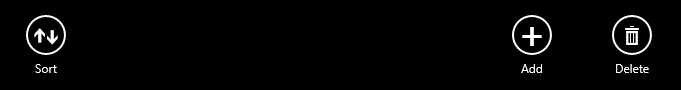
The AppBar - or better say its Buttons - with the new Styles now look like this:

Ok, that's it. The AppBar now looks like an AppBar.
Now we've seen how to use the Styles for AppBar-Buttons in Windows 8. To be honest, it's a bit cumbersome with the StandardStyles.xaml, and that's one reason why it has been improved in Windows 8.1. But there are other reasons. Let's say you want to create a special AppBar-Button with a custom image. Then you need to create your custom style for that in Windows 8, because the Styles in the StandardStyles.xaml-file are just prepared for symbols from the Segoe UI Symbol-font. You need to create a custom style that sets a ControlTemplate that makes use of an Image. Sounds more complicated and time-consuming than it should be? Yes, it is. But in Windows 8.1, everything get's much better and is very easy to do. So let's take a look into Windows 8.1 features for the AppBar.
The AppBar in Windows 8.1
The usage of the AppBar in Windows 8.1 is much easier:
- There is no StandardStyles.xaml anymore
- There are special subclasses like AppBarButton, AppBarToggleButton and AppBarSeparator
- With the CommandBar there is a special subclass of AppBar that's suitable for a Command-based AppBar like the one we've created above with the Add, Delete and Sort-command.
The AppBarButton
The AppBarButton is a subclass of Button. But the content is not specified Button-typical (or typical for its baseclass ContentControl) by using its Content-Property. On an AppBarButton the Content-Property is ignored. Instead you should use the two properties Label and Icon. To create an AppBar like the one in the Windows 8 section, you can use now the new AppBarButton-class instead of uncommenting and referencing Styles in/from the StandardStyles.xaml-file. Below is a small Codesnippet that shows the usage of AppBarButtons in that mentioned AppBar from the Windows 8 section.
<AppBar>
<Grid>
...
<StackPanel Orientation="Horizontal"
Grid.Column="1" HorizontalAlignment="Right">
<AppBarButton Icon="Add" Label="Add"/>
<AppBarButton Icon="Delete" Label="Delete"/>
</StackPanel>
<StackPanel Orientation="Horizontal">
<AppBarButton Icon="Sort" Label="Sort"/>
</StackPanel>
</Grid>
</AppBar>
As you can see in the snippet above, there's no more usage of the StandardStyles.xaml. Instead you used special AppBarButtons.
The Icon-Property
The Icon-Property of an AppBarButton is not of type String or of type of an Enumeration as you might have thought. It's of type IconElement - a new subclass of FrameworkElement. When writing
<AppBarButton Icon="Add" Label="Add"/>
behind the scenes the XAML-Parser creates a SymbolIcon for the Add-string. With the Property-Element-Syntax you can define this SymbolIcon explicitly in XAML like this:
<AppBarButton Label="Add">
<AppBarButton.Icon>
<SymbolIcon Symbol="Add"/>
</AppBarButton.Icon>
</AppBarButton>
The SymbolIcon-class inherits from IconElement. Its Symbol-Property takes a value from the Symbol-enum. The values in the Symbol-enumeration are mapped to glyphs from the Segoe UI Symbol font. So you are using one of those glyphs from Segoe UI Symbol to display a Symbol with your SymbolIcon. If you use the short syntax (Attribute-Syntax), the values displayed for the Icon-Property are also those from the Symbol-Enumeration, but as mentioned, the XAML-Parser creates a SymbolIcon for the specified value.
Beside the SymbolIcon there are three other classes inheriting from IconElement: FontIcon,PathIcon and BitmapIcon. Let's look at all four IconElement-subclasses:
SymbolIcon
You already know that one. It lets you define a Symbol from the Segoe UI Symbol font
FontIcon
Use this to specify a glyph of a specific font as a symbol. There are 4 different Font*-Properties: FontFamily, FontSize, FontStyle, FontWeight. The character code to use is defined with the Glyph-Property. Here you specify the hexadecimal representation of the character code. Here a sample for the Add-Button that's using a FontIcon to display a Plus-glyph from the Segoe UI Symbol-Font:
<AppBarButton Label="Add">
<AppBarButton.Icon>
<FontIcon FontFamily="Segoe UI Symbol" Glyph="" />
</AppBarButton.Icon>
</AppBarButton>
Keep in mind that the above snippet sets the Glyph-Property in XAML. It uses XAMLs "&#x" to specify a numeric character mapping into the current encoding.
If you set the Glyph-Property via C#, the "&#x" is not valid, so guess what the following statement will display as an icon:
fontIcon.Glyph = "";
What do you think? Yes, you're right. The C#-statement above displays the text "" on your AppBarButton, because "&#x" is a XAML-thing. In C# you should use the "\u"-escape for hexadecimal unicode values. So this will work in C# to display a Plus-glyph:
fontIcon.Glyph = "\uE109";
PathIcon
The PathIcon defines just one Property, the Path-Property. It takes a Geometry-Object. So you can define anything you're familiar with from 2D-Drawing as an icon. For example create a complex Geometry-Object with the PathGeometry and use it for the Data-Property of the PathIcon. Below is a codesnippet that creates something like a Plus-sign by grouping two RectangleGeometries:
<AppBarButton Label="Add">
<AppBarButton.Icon>
<PathIcon>
<PathIcon.Data>
<GeometryGroup>
<RectangleGeometry Rect="4,19,30,3"/>
<RectangleGeometry Rect="19,4,3,30"/>
</GeometryGroup>
</PathIcon.Data>
</PathIcon>
</AppBarButton.Icon>
</AppBarButton>
BitmapIcon
Use this to specify any bitmap as a symbol. Take a .png-file with transparency-informations in it, as it is only displayed in white and transparent. While the AppBarButton is pressed, the Bitmap is inverted. To use the BitmapIcon just set its UriSource-Property to your .png-file. Below the add.png-File from an Images-folder that is part of the App-Package is used.
<AppBarButton Label="Add">
<AppBarButton.Icon>
<BitmapIcon UriSource="ms-appx:///Images/add.png"/>
</AppBarButton.Icon>
</AppBarButton>
AppBarSeparator and AppBarToggleButton
Beside the AppBarButton there are two other new controls for the AppBar:
- AppBarToggleButton
- AppBarSeparator
The AppBarToggleButton is much like the AppBarButton. It has an Icon- and a Label-Property. The big difference to the AppBarButton is that it inherits from ToggleButton and not from Button. And ToggleButton contains the Properties IsChecked, IsThreeState and the events Checked, Unchecked and Indeterminate.
The AppBarSeparator is a simple class that lets you add a small separator to your AppBarButtons:
<StackPanel Orientation="Horizontal"
Grid.Column="1" HorizontalAlignment="Right">
<AppBarButton Icon="Add" Label="Add"/>
<AppBarSeparator/>
<AppBarButton Icon="Delete" Label="Delete"/>
</StackPanel>
The AppBarSeparator between the two AppBarButtons will draw a small line and add some additional Margin:

The IsCompact-Property
All three classes, AppBarButton, AppBarToggleButton and AppBarSeparator contain an additional Property: The IsCompact-Property. If you set this Property to true, the Label is not displayed anymore and the Margin around your object is reduced. If the user makes your app smaller and the AppBarButtons don't have enough space anymore, set the IsCompact-Property to true:
<StackPanel Orientation="Horizontal" ...>
<AppBarButton Icon="Add" Label="Add" IsCompact="True"/>
<AppBarSeparator IsCompact="True"/>
<AppBarButton Icon="Delete" Label="Delete" IsCompact="True"/>
</StackPanel>
The AppBarButtons and the Separator defined in the snippet above are rendered like below. Notice the missing labels and the reduced Margins:

Ok, so far so good. Now you've seen the classes AppBarButton, AppBarSeparator and AppBarToggleButton. Let's look at another improvement in Windows 8.1, the new CommandBar-class.
The CommandBar
For a Command-based Application Bar, like the one we've created in the sections before with Add, Delete and Sort-Buttons, there's a special subclass from AppBar, the CommandBar-class. The CommandBar-class has just two Properties:
- PrimaryCommands
- SecondaryCommands
The great thing is, that the CommandBar takes care of the UX-Guidelines. The PrimaryCommands are automatically displayed on the right side of the Bar, the SecondaryCommands on the left side. Both Properties are of type IObservableVector<ICommandBarElement>. The ICommandBarElement-Interface looks really simple:
public interface ICommandBarElement
{
bool IsCompact { get; set; }
}
And guess who implements the ICommandBarElement-Interface:
- AppBarButton
- AppBarToggleButton
- AppBarSeparator
The really great thing is, that the CommandBar not only takes care of the UX-Guidelines. It also automatically sets the IsCompact-Property on the ICommandBarElements to true if there's not enough space. If there's still not enough spaces, it hides the SecondaryCommands and just displays the PrimaryCommands. If there is still not enough space, PrimaryCommands are clipped on the edge and you need some logic to e.g. display one command with just three dots "...".
Ok, let's look at how to use the CommadBar: The AppBar we've created so far by using a Grid with two Columns and two StackPanels inside could be created really easy with the CommandBar like this:
<Page.BottomAppBar>
<CommandBar>
<CommandBar.PrimaryCommands>
<AppBarButton Icon="Add" Label="Add"/>
<AppBarButton Icon="Delete" Label="Delete"/>
</CommandBar.PrimaryCommands>
<CommandBar.SecondaryCommands>
<AppBarButton Icon="Sort" Label="Sort"/>
</CommandBar.SecondaryCommands>
</CommandBar>
</Page.BottomAppBar>
On the CommandBar-class the PrimaryCommands-Property is defined as ContentProperty for XAML:
[ContentProperty(Name = "PrimaryCommands")]
...
public class CommandBar : AppBar
With the PrimaryCommands-Property as ContentProperty, the Property-Element <CommandBar.PrimaryCommands> is optional. So the CommandBar from above could be written without that Property-Element:
<Page.BottomAppBar>
<CommandBar>
<!--<CommandBar.PrimaryCommands>-->
<AppBarButton Icon="Add" Label="Add"/>
<AppBarButton Icon="Delete" Label="Delete"/>
<!--</CommandBar.PrimaryCommands>-->
<CommandBar.SecondaryCommands>
<AppBarButton Icon="Sort" Label="Sort"/>
</CommandBar.SecondaryCommands>
</CommandBar>
</Page.BottomAppBar>
Anyway, the result is the same. A great Application Bar showing primary commands on the right, and secondary commands on the left:
Summary
In Windows 8.1, there's no StandardStyles.xaml-file anymore.
We have new classes to use in the AppBar: AppBarButton, AppBarToggleButton and AppBarSeparator. The AppBarButton and AppBarToggleButton are ignoring their Content-Property. Instead you should set the Properties Icon and Label. As we've seen, the Icon-Property can take a SymbolIcon, FontIcon, PathIcon or a BitmapIcon. All three classes contain a IsCompact-Property. When it is set to true, Margins are reduced and Labels are collapsed.
With the CommandBar we now have a brand new subclass of AppBar. It has two Properties: PrimaryCommands and SecondaryCommands. To both you can add AppBarButtons, AppBarToggleButtons and AppBarSeparator or any other ICommandBarElement. The CommandBar displays primary commands on the right, secondary commands on the left side. If there's not enough space, it set's the IsCompact-Property on the elements to true. If there's still not enough space, it collapses the secondary commands.
Thanks a lot for reading so far. If you liked it, write a comment or an email via the contact-form on
www.thomasclaudiushuber.com
Happy coding,
Thomas