WPF: Thinking outside the box with the adorner
Introduction
Sometimes you need to break out the box of the control you're in and show something above or on top if it.
When this is just for a short period of time the tooltip is a pretty good candidate. There are complications with a tooltip though it's a pop up so binding from it is complicated and what it really expects to be doing is showing on mouseover.
When you have a requirement for the label in some nodes of a TreeListView to cross columns.
Visual Studio is now itself written in WPF, on the design surface as you select a control you see these little squares appear just outside the corners and middle of the sides.
When you think about it this is pretty weird. A control has a root container of some sort - a grid or something.
Anything in that control should be inside that.
Adorners
So how do they do those little boxes? Those things are adorners. See: http://msdn.microsoft.com/en-us/library/ms743737(v=vs.110).aspx
So if you read about those you can see they are rendered in an AdornerLayer.
Put simply, this is a special layer which is on top of EVERYTHING.
This is always on top of an adorned element and rendered independent of the UIElement the adorner is bound to.
What that means is that it's not inside any container of the it's control and can be pretty much wherever you like relative to the adorner's parent element. The adorner is a bit like a tooltip but still in the same window and binding context, above regular controls and containers.
An adorner is outside any box the parent control is in.
Aside from indicators, permanent tooltips and handles on controls this can be very useful when you just want some more space. You can make a control inside a Datagrid or Listview appear to take up more than one cell. I first used an adorner with a TextBlock in it on a TreeListView where I wanted the parent node to have a name column which crossed several columns until that row had focus.
How's that for thinking outside the box?
Examples of usage:
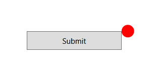
<Window x:Class="WPFAdorner.MainWindow"
xmlns="http://schemas.microsoft.com/winfx/2006/xaml/presentation"
xmlns:x="http://schemas.microsoft.com/winfx/2006/xaml"
xmlns:local="clr-namespace:WPFAdorner"
Title="MainWindow" Height="350"Width="525">
<Grid>
<Grid>
<local:AdornedControl
Width="150"
Height="50"
HorizontalAdornerPlacement="Outside"
IsAdornerVisible="True"
>
<Button Height="30"Width="150" Content="Submit"/>
<local:AdornedControl.AdornerContent>
<Grid VerticalAlignment="Top"
HorizontalAlignment="Right">
<Ellipse
Width="20"
Height="20"
Stroke="Red"
Fill="Red"
/>
</Grid>
</local:AdornedControl.AdornerContent>
</local:AdornedControl>
</Grid>
</Grid>
</Window>
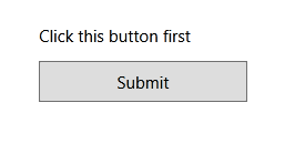
<Window x:Class="WPFAdorner.MainWindow"
xmlns="http://schemas.microsoft.com/winfx/2006/xaml/presentation"
xmlns:x="http://schemas.microsoft.com/winfx/2006/xaml"
xmlns:local="clr-namespace:WPFAdorner"
Title="MainWindow" Height="350"Width="525">
<Grid>
<Grid>
<local:AdornedControl
Width="150"
Height="50"
VerticalAdornerPlacement="Outside"
IsAdornerVisible="True"
>
<Button Height="30"Width="150" Content="Submit"/>
<local:AdornedControl.AdornerContent>
<Grid VerticalAlignment="Top"
HorizontalAlignment="Left">
<TextBlock Text="Click this button first"
/>
</Grid>
</local:AdornedControl.AdornerContent>
</local:AdornedControl>
</Grid>
</Grid>
</Window>
Codeplex article providing an easy way to use Adorner:
http://www.codeproject.com/Articles/54472/Defining-WPF-Adorners-in-XAML