WPF: Keeping your MVVM Views DRY
Introduction
Most applications require common styling and processing for a group of controls to be encapsulated for re-use.
When these are always the same controls a UserControl is the obvious candidate to use.
What isn't quite so easy is when you need different controls in the middle of that re-usable code and mark up.
What would be useful would be some way that you can conveniently surround a variable set of content with routed event handlers and controls defined in the one place.
Something like a UserControl but one you can put your content in the middle via markup.
Sample Requirements
The sample was written using VS2013, targets .net4.51 and uses Blend Interactivity and the MVVM Light Libraries. The NuGet package for MVVM Light is included.
You can download the sample from here.
A Solution
So how do we do that then?
Since we want to put stuff inside something this is pretty much the definition of a ContentControl.
How would we use one of them, exactly?
A common approach to passing events from the View to ViewModel is to use Blend's Interaction Triggers.
These allow you to handle an event in xaml and invoke a command bound from the ViewModel.
Let's go with an interaction Trigger then.
Handling routed events is a little tricky and passing parameters particularly so, but this can also be done.
Sounds great so far?
There are a few pesky complications doing this in a re-usable manner.
You cannot add these via a style for example.
You can, however, put them in a template and apply that template to any control of a matching type.
Templating a ContentControl
Using a Template allows you to put pretty much whatever you like in a control. After all, WPF controls are lookless and it's their template defines what they consist of. We can therefore easily define controls which go into our ContentControl above and below variable content which is placed in the control as "content".
The part of the ContentControl which grabs markup out your window's XAML is the ContentPresenter. Put a ContentPresenter in the template and whatever is above that will become the "header" of our control. Whatever is below will become the "Footer".
Or you could get clever and put everything in one container making the "header" go behind the content and the "footer" on top of it.
Now you might be thinking - "Hang on I could re-template any control?".
Yes you can but they already have a template which you'd have to change. Which can be quite tricky - it's pretty easy to break templates if you don't know what you're doing.
Using a ContentControl also avoids the complication of completely re-template a control that you might want to use elsewhere with the original template. The markup can be kept discrete.
That template can go in a resource dictionary as a ControlTemplate targetting ContentControl
In order to use the template you put a ContentControl in your window and set the template.
There is actually something called a HeaderedContentControl and should you find setting just a header set of controls via a style is attractive then this is something to consider.
Explaining the Sample
The idea of the (primary) sample is to hand error messages raised by conversion errors to the ViewModel. By definition, a ViewModel will know nothing about such a conversion error. The setter for the property in the ViewModel will not be hit because the property cannot be set. If you want to do anything with it in the ViewModel then it needs to be passed to it.
Additionally there are rather simple headers and footers displayed. These are there just to give you a flavour of how they would work in a real application. Very few requirements are going to just be for a simple TextBlock above and below your content. A menu above and buttons below are more likely but that would mean complicating the sample considerably. Simple is easier to understand.
It's probably best if you spin the sample up now and see what happens before diving into the details of exactly how it works.
When you do so you will see MainWindow contains a TextBox showing 0 initially. Beneath that is a TextBlock containing the user instructions ( you expected a manual? ).
Like it says, Type a letter in the textbox and watch it do it's stuff.
As is standard for a WPF TextBox with an associated error, the border of the textbox gets a red surround. The textblock beneath will now show an error message saying "Value ... could not be converted.".
You will also notice if you mouse over the textbox you that error message appears in a tooltip.
Replace your letter with a number such as 3 and the red outline disappears, the TextBlock now shows "OK" and there is no tooltip.
You will also notice there are light blue TextBlocks above and below. These are right aligned to make them less of a distraction from the main action. These would be replaced by more meaningful content in a real world application. These are the equivalent of the "Header" and "Footer" outlined above.
In the Window
As explained above, you put these bound controls "inside" a ContentControl:
<ContentControl Template="{StaticResource AddingTriggers}">
    <StackPanel>
        <TextBox Text="{Binding ANumber, UpdateSourceTrigger=PropertyChanged,
           NotifyOnValidationError=True}" Width="100" />
        <TextBlock Text="{Binding TheResult}"/>
    </StackPanel>
</ContentControl>
MainWindowViewModel
The viewmodel subscribes to that PropertyError which the code behind sends and will update TheResult appropriately:
public MainWindowViewModel()
{
    Messenger.Default.Register<PropertyError>(this, propertyError =>
    {
        if (propertyError.Added)
        {
            TheResult = propertyError.Error;
        }
        else
        {
            TheResult = "OK";
        }
    });
}
The result is pretty unobtrusive, all the error handling markup is pushed into the resource dictionary and you don't need to wade through it as you look at your window. The same markup would be shared every time you want some data edited and any changes can be made once and affect the whole of a system.
The Binding UpdateSourceTrigger=PropertyChanged means an error is raised straight away as the user inputs an invalid character.
In the sample, AddingTriggers is in App.XAML. In practice it would instead be in a resource dictionary merged by app.xaml.
The Template
Here's that markup from app.xaml.
<Application.Resources>
    <local:BindingErrorEventArgsConverter x:Key="BindingErrorEventArgsConverter" />
    <local:ErrorCollectionConverter x:Key="ErrorCollectionConverter"/>

    <Style x:Key="ErrorToolTip" TargetType="Control">
        <Style.Triggers>
            <Trigger Property="Validation.HasError" Value="true">
                <Setter Property="ToolTip" Value="{Binding RelativeSource={x:Static RelativeSource.Self},
                                        Path=(Validation.Errors), Converter={StaticResource ErrorCollectionConverter}}"/>
            </Trigger>
        </Style.Triggers>
    </Style>

    <ControlTemplate x:Key="AddingTriggers" TargetType="ContentControl">
        <ControlTemplate.Resources>
            <Style TargetType="{x:Type TextBox}" BasedOn="{StaticResource ErrorToolTip}">
                <Setter Property="HorizontalAlignment" Value="Left"/>
            </Style>

        </ControlTemplate.Resources>
        <StackPanel>
            <i:Interaction.Triggers>
                <local:RoutedEventTrigger RoutedEvent="{x:Static Validation.ErrorEvent}">
                    <e2c:EventToCommand   Command="{Binding ConversionErrorCommand, Mode=OneWay}"
                                            EventArgsConverter="{StaticResource BindingErrorEventArgsConverter}"
                                            PassEventArgsToCommand="True" />
                </local:RoutedEventTrigger>
            </i:Interaction.Triggers>
            <TextBlock Text="This would be some sort of a common header" Foreground="LightBlue" HorizontalAlignment="Right"/>
            <ContentPresenter/> <!-- This is how you can have variable content "within" the control -->
            <TextBlock Text="This would some sort of a common footer" Foreground="LightBlue"  HorizontalAlignment="Right"/>
        </StackPanel>
    </ControlTemplate>
</Application.Resources>
There are a lot of things going on in there.
The first thing to notice is the header and footer above and below the ContentPresenter.
A Blend Interaction trigger allows use of an EventTrigger.
Validation errors are bubbled as routed events Validation.ErrorEvent.
A complication here is that RoutedEvents aren't handled quite straight out the box so there's a RoutedEventTrigger class in the project to cope with them.
Let's come back to that in a minute.
Inside the RoutedEventTrigger you can see there's an MVVM Light EventToCommand. This is used as an event aggregator - to call the ConversionErrorCommand which is bound from the ViewModel. As is probably obvious from the markup the eventargs are converted by the BindingErrorEventArgsConverter class so they can be passed to the command. This allows the source property and error message to be passed through into the ViewModel.
BindingErrorEventArgsConverter
If we take a look at the code for this:
public class BindingErrorEventArgsConverter : IEventArgsConverter
{
    public object Convert(object value, object parameter)
    {
        ValidationErrorEventArgs e = (ValidationErrorEventArgs)value;
        PropertyError err = new PropertyError();
        err.PropertyName = ((System.Windows.Data.BindingExpression)(e.Error.BindingInError)).ResolvedSourcePropertyName;
        err.Error = e.Error.ErrorContent.ToString();
        // Validation.ErrorEvent fires for both addition and removal
        if (e.Action.ToString() == "Added")
        {
            err.Added = true;
        }
        else
        {
            err.Added = false;
        }
        return err;
    }
}
The converter implements the MVVM Light IEventArgsConverter interface with a Convert method. At the risk of stating the obvious, this exists so that there is a standard way of handling an object as a parameter. You can read more about this here.
The code gets the BindingExpression for the Binding producing the error and uses that to get the Source property which is involved. ResolvedSourcePropertyName is the most reliable property to use if you decide to dig through the list of properties yourself and wonder why that one was chosen.
The error string is comparatively simply obtained out the ErrorContent.
A PropertyError object is newed up to hold the property name and error string.
Something which is perhaps somewhat counter intuitive about the Validation.ErrorEvent is that you get this bubbling as an error is added and again when that error is removed. As you fix the input you get this fired again with Removed in the Action. That's one of those "what the?" moments when first exploring this behaviour.
Once you understand that then the handling here is pretty simple in that you can expect a conversion error to be either added or removed.
ConversionErrorCommand
All that markup will invoke a relaycommand, passing that PropertyError object. In the MainWindowViewModel that will invoke the bound RelayCommand:
// From Validation.Error routed Event
private RelayCommand<PropertyError> conversionErrorCommand;
public RelayCommand<PropertyError> ConversionErrorCommand
{
    get
    {
        return conversionErrorCommand
            ?? (conversionErrorCommand = new  RelayCommand<PropertyError>
                (PropertyError =>
                {
                    if (PropertyError.Added)
                    {
                        TheResult=PropertyError.Error;
                    }
                    else
                    {
                        TheResult = "OK";
                    }
                }));
    }
}
This particular way of setting up a RelayCommand with an anonymous delegate may look a bit convoluted if you've not seen it. The plus is it's self contained. The first time this getter is hit there will be nothing in the private backer so it sets up a new RelayCommand and returns that, thereafter it returns the private backer.
The technique is particularly useful where you want a RelayCommand in a class and cannot change the constructor. That isn't a problem in the sample but it can be if you say put this into an entity framework model "buddy" partial class for validation of an entity.
This is one of those things which is largely down to personal preference in styles but the author usually prefers a concrete method wired up to a RelayCommand in a constructor.
TheResult is a Public string Property which the TextBlock Text property is bound to. Hence it will try and update the bound property as soon as the user types anything. If the input is invalid then this will result in a conversion error straight away.
MainWindowViewModel implements INotifyPropetychanged indirectly - by inheriting from NotifyUIBase. That means as TheResult changes it will notify the view.
Together, this means you type something and will immediately see a result in the TextBlock below.
private string  theResult = "Type in a letter above to raise a conversion error";
public string  TheResult
{
    get
    {
        return theResult;
    }
    set
    {
        theResult = value;
        RaisePropertyChanged();
    }
}
RoutedEventTrigger
It would be nice to attribute this to the original author. This code is in several places on the web and it's not clear who wrote the class originally.
This inherits from Blend EventTriggerBase and uses OnAttached to add OnRoutedEvent as a routed eventhandler. As the name suggest this then handles the whatever the RoutedEvent property is set to.
public class  RoutedEventTrigger : EventTriggerBase<DependencyObject>
    {
        RoutedEvent routedEvent;
        public RoutedEvent RoutedEvent
        {
            get
            {
                return routedEvent;
            }
            set
            {
                routedEvent = value;
            }
        }

        public RoutedEventTrigger()
        {
        }
        protected override  void OnAttached()
        {
            Behavior behavior = base.AssociatedObject as  Behavior;
            FrameworkElement associatedElement = base.AssociatedObject as  FrameworkElement;
            if (behavior != null)
            {
                associatedElement = ((IAttachedObject)behavior).AssociatedObject as  FrameworkElement;
            }
            if (associatedElement == null)
            {
                throw new  ArgumentException("This only works with framework elements");
            }
            if (RoutedEvent != null)
            {
                associatedElement.AddHandler(RoutedEvent, new  RoutedEventHandler(this.OnRoutedEvent));
            }
        }
        void OnRoutedEvent(object sender, RoutedEventArgs args)
        {
             base.OnEvent(args);
        }
        protected override  string GetEventName()
        {
            return RoutedEvent.Name;
        }
    }
ErrorToolTip
As if to emphasise how much you can do in there. The ControlTemplate applies the ErrorToolTip style to all TextBox in the contentcontrol. As it's name suggests, this shows errors for a control in a tooltip as you MouseOver. You would want to do the same for DatePicker, ComboBox and any other controls your users will edit data in.
The Binding finds the Validation.Errors for whatever the tooltip is associated with using a RelativeSource.
A particular thing to notice is that it's quite tricky binding to that collection of errors to display them. The solution uses a converter to fill and return a ListBox.
public class  ErrorCollectionConverter : IValueConverter
{
    public object  Convert(object  value, Type targetType, object parameter, CultureInfo culture)
    {
        if (value == null) return  null;
        ObservableCollection<string> _Errors = new  ObservableCollection<string>();
        ReadOnlyObservableCollection<ValidationError> errors= (ReadOnlyObservableCollection<ValidationError>)value;
        foreach(ValidationError err in  errors)
        {
            _Errors.Add(err.ErrorContent.ToString());
        }
        return new  ListBox
        {
            ItemsSource = _Errors,
            BorderThickness = new  Thickness(0),
            Background = Brushes.Transparent
        };
    }
    public object  ConvertBack(object  value, Type targetType, object parameter, CultureInfo culture)
    {
        throw new  NotImplementedException();
    }
}
Alternative Solutions
As is often the case with WPF, there are a number of other potential approaches.
Code Behind
If you wire up a routed event handler in code behind you can do so at any level in the control tree because they bubble up it.
So long as the event isn't marked handled as it bubbles up, it will carry on going. You can therefore handle routed events at the Window level for any controls inside that window.
For MVVM friendliness you can then use an event aggregator from PRISM or MVVM Light to tell your viewmodel to act. One approach is explained here.
Handling routed events in code is pretty straight forward. Inheriting markup is a whole different matter and particularly problematic.
It's possible to add controls and apply styles in code but this is inelegant at best. Technically possible but not particularly attractive.
For a moment, let's take controls and styling out the mix and imagine we just want a common input error handler.
For that sort of requirement we're looking at a solution which is in arguably a better candidate than the ContentControl.
Base Window
We can extend the Window class using a partial class which inherits from Window then we can inherit all our Windows from this and add our special functionality on. Making this approach suitably DRY. This doesn't need to be window level - you could go with Page or UserControl instead.
In the sample you will find BaseWindow:
public partial  class BaseWindow : Window
{
    private void  Window_Error_Event(object sender, RoutedEventArgs args)
    {
        ValidationErrorEventArgs e = (ValidationErrorEventArgs)args;
        PropertyError err = new  PropertyError();
        err.PropertyName = ((System.Windows.Data.BindingExpression)(e.Error.BindingInError)).ResolvedSourcePropertyName;
        err.Error = e.Error.ErrorContent.ToString();
        if (e.Action.ToString() == "Added")
        {
            err.Added = true;
        }
        else
        {
            err.Added = false;
        }
        Messenger.Default.Send<PropertyError>(err);
    }
    public BaseWindow()
    {
        EventManager.RegisterClassHandler(typeof(Window), Validation.ErrorEvent, new RoutedEventHandler(Window_Error_Event));
    }
}
This is "just" a partial class which inherits from Window.
The code to get the details of the error is pretty much as described above.
The code adding a RoutedEventHandler is worth highlighting.
A developer could go a long time and only ever add RoutedEventHandler via XAML. The thing to focus on is that EventManager RegisterClassHandler is used to wire up the RoutedEventHandler rather than the usual sort of += eventhandler one might expect.
Handling an error is pretty simple and less code than the ContentControl approach.
If you prefer the code behind routed event handler to the xaml based approach then you could mix and match techniques. Inherit from ContentControl instead of Window and put your code in the inherited class.
Inheriting from BaseWindow
There is a small point to watch out for in your xaml whilst inheriting from that base class
<local:BaseWindow x:Class="wpf_DRY.EventWindow"
        xmlns="http://schemas.microsoft.com/winfx/2006/xaml/presentation"
        xmlns:x="http://schemas.microsoft.com/winfx/2006/xaml"
        xmlns:local="clr-namespace:wpf_DRY"
        Title="Window1 Inheriting from Base Window" Height="350" Width="525" >
    <StackPanel>
        <TextBox Text="{Binding ANumber, UpdateSourceTrigger=PropertyChanged, NotifyOnValidationError=True}" Width="100" />
        <TextBlock Text="{Binding TheResult}"/>
    </StackPanel>
</local:BaseWindow>
Note that instead of starting "Window" the markup specifies the base class.
The code behind inherits from BaseWindow as you would expect if you're used to C# inheritance and explicitly calls the constructor of the base class from it's own constructor. That's the :base() if you're unfamiliar with that.
public partial  class EventWindow : BaseWindow
{
    public EventWindow()
        : base()
    {
        InitializeComponent();
        this.DataContext = new  MainWindowViewModel();
    }
}
Seeing it Work
The approach rather simplifies connection to the viewmodel because in practice you would probably have a number of viewmodels received the same message. That might not actually matter - if you nothing is connected up to the viewmodel then you're not going to see anything in a view.
In App.XAML change the StartupURI to "EventWindow.xaml".
Spin it up and input an invalid character and you should hit the break point with the error.
Code behind Complications
You might not really want to handle everything at the same level - which would mean multiple similar base classes.
If you need to add controls then this can quickly become rather a chore and xaml of some sort would be preferable to code.
Code Behind Conclusions
This approach is great for handling routed events where you know all the use cases will be very similar. Styling or templating are complications which probably mean a different approach is a better idea.
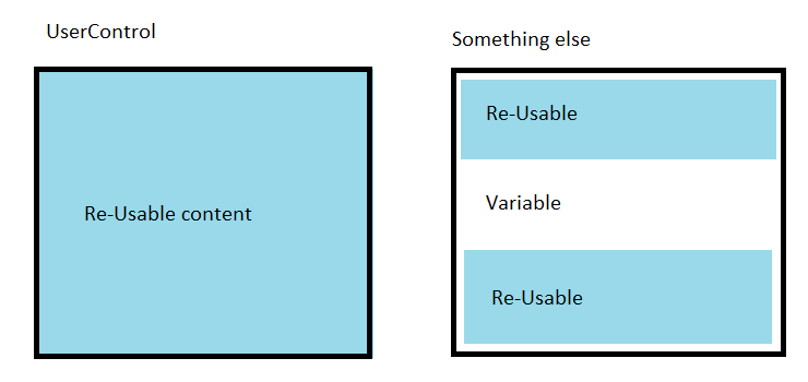
UserControl
A UserControl is the conventional choice for re-usability. There are some complications though.
Inserting content into a user control is possible, but you need to expose dependency properties from your usercontrol and then add controls in code using what you set in the property from XAML.
You could have a text dependency property and use XAMLReader.Load() to create controls from a string.
<local:SomeSortofUserControl>
    <local:SomeSortofUserControl.MyContent>
        <Grid
            xmlns="http://schemas.microsoft.com/winfx/2006/xaml/presentation"
            xmlns:x="http://schemas.microsoft.com/winfx/2006/xaml">
            ...........
        </Grid>
    </local:SomeSortofUserControl.MyContent>
</local:SomeSortofUserControl>
This approach limits content somewhat since you need some sort of a container you're going to apply the xaml to. This could be a panel like a Grid. You could conceivably have more than one of these properties and Usercontrol content inbetween.
A downside is the string would be just a string as far as the designer is concerned. You would design your content in a separate window and paste in.
Working with dependency properties is a bit of a nuisance and this approach would be take a bit more coding skill.
UserControl conclusion
This is probably best used where you have quite a complicated requirement which a ConentControl simply cannot handle.
Something to bear in mind but not the first choice.
Custom Control
Rather than inheriting a class from ContentControl and using a template to set content you could create your own Custom Control containing a contentpresenter or whatever you like.
Custom controls are notoriously tricky to tame. You either already know all about writing these or are best advised to use another of the alternatives described above.
Do Not Repeat Yourself
DRY is a software engineering principle.
What's it all about?
Identify where code would be the same as existing code. Re-factor this into one piece of code which is then re-used rather than the same code cut and pasted numerous times.
The opposite of DRY is WET - some wit suggested this stands for "We Enjoy Typing".
Witty but not terribly precise since you'd probably be cutting and pasting rather than typing.
"We enjoy changing very similar code many times when requirements change" would be nowhere near as catchy though.