WPF: Tips - Lookless Controls
One of the things which is very difficult to grasp for developers new to WPF is that controls are completely lookless.
A new developer can be told this any number of times and it just doesn't take.
This definitely applied to the author.
There are several reasons this is particularly hard to accept as a fundamental truth:
- In the designer, a button looks like a button. Clearly it has some sort of look.
- Controls in any other technology like winforms have a fixed look
- It just doesn't seem quite right
The sample for this article can be downloaded here.
Explanation
Behaviour for WPF controls is fixed. For example, a button has a fixed set of events including a click event. Do what you like with a button control and it will still have a click event.
There is no fixed "look" for a WPF control. Lookless is a lot snappier way of saying this in the one word.
What you see is defined by a default XAML template. This is how a button looks like a button in the designer. That default XAML template is applied and so it is sort of that template you see rather than the control.
You can substitute a totally different template and completely utterly change the look of a control.
Going back to that Button you see in the Designer. It's only rectangular because there's a rectangular thing defines it in the default template.
Default Template?
A default template for a control is a piece of xaml which is squirrelled away somewhere in the framework. This can be ( often is ) different for controls depending on what operating system you deliver your application to. This means on Windows 7 your combo box will have a windows 7 look and on windows 8 it will have a windows 8 look.
That's great until you go trying to change some property and find it works differently depending on whose machine your application runs on. But this is something of a digression.
What's a Default Template Look Like?
You can extract a default template for a control in Visual Studio 2013 - but it's quite an esoteric process. You can develop for some time with WPF and not realise this is possible. Nor need to, for that matter.
Start by adding a new resource dictionary ( to put the template in later ).
Add a control to a window.
Select your new control in the designer.
In the properties window expand the Miscellaneous section.
Scroll down to the bottom if necessary and you will find "Template".
This will have some text in grey saying something like "System.Windows.ControlTemplate..."
To the right of this is a box.
Click the box and you get a context menu.
Choose Convert To New Resource.
You then have some options - add to an empty resource dictionary is the neatest.
Click on OK.
You will notice that a specific Template is now applied to your control.
<Button Template="{DynamicResource ButtonControlTemplate1}" />
If you think about it, that's a bit strange actually. Template is a property of a Control. Any Control. This is something which you just don't have in most other technologies.
Let's go take a look in your resource dictionary.
<ControlTemplate x:Key="ButtonControlTemplate1" TargetType="{x:Type Button}">
    <Border x:Name="border" BorderBrush="{TemplateBinding BorderBrush}" BorderThickness="{TemplateBinding BorderThickness}" Background="{TemplateBinding Background}" SnapsToDevicePixels="True">
        <ContentPresenter x:Name="contentPresenter" ContentTemplate="{TemplateBinding ContentTemplate}" Content="{TemplateBinding Content}" ContentStringFormat="{TemplateBinding ContentStringFormat}" Focusable="False" HorizontalAlignment="{TemplateBinding HorizontalContentAlignment}" Margin="{TemplateBinding Padding}" RecognizesAccessKey="True" SnapsToDevicePixels="{TemplateBinding SnapsToDevicePixels}" VerticalAlignment="{TemplateBinding VerticalContentAlignment}"/>
    </Border>
    <ControlTemplate.Triggers>
        <Trigger Property="IsDefaulted" Value="True">
            <Setter Property="BorderBrush" TargetName="border" Value="{DynamicResource {x:Static SystemColors.HighlightBrushKey}}"/>
        </Trigger>
        <Trigger Property="IsMouseOver" Value="True">
            <Setter Property="Background" TargetName="border" Value="#FFBEE6FD"/>
            <Setter Property="BorderBrush" TargetName="border" Value="#FF3C7FB1"/>
        </Trigger>
        <Trigger Property="IsPressed" Value="True">
            <Setter Property="Background" TargetName="border" Value="#FFC4E5F6"/>
            <Setter Property="BorderBrush" TargetName="border" Value="#FF2C628B"/>
        </Trigger>
        <Trigger Property="ToggleButton.IsChecked" Value="True">
            <Setter Property="Background" TargetName="border" Value="#FFBCDDEE"/>
            <Setter Property="BorderBrush" TargetName="border" Value="#FF245A83"/>
        </Trigger>
        <Trigger Property="IsEnabled" Value="False">
            <Setter Property="Background" TargetName="border" Value="#FFF4F4F4"/>
            <Setter Property="BorderBrush" TargetName="border" Value="#FFADB2B5"/>
            <Setter Property="TextElement.Foreground" TargetName="contentPresenter" Value="#FF838383"/>
        </Trigger>
    </ControlTemplate.Triggers>
</ControlTemplate>
You can see there's a Border which defines the outside and shape of the button. Borders are rectangular so the button is.
Inside that is a ContentPresenter. This is the thing which holds anything you put in a button - often just text. You might not have thought about it but you can actually put a container like a Grid and then other controls inside a button or a picture or pretty much anything. Try doing that in Winforms and see how far you get !
Most of the markup though is triggers which make it greyed when disabled, give you a bit of an animation when you click it and change the look slightly as you mouse over.
Changing the Template
You can easily substitute something else for that template.
Often you will want a common look and feel in an application. To give all your buttons the same special look you could put such a substitute template in a Resource Dictionary and apply it to all Buttons.
You can also do this inline - directly there inside a button.
For the purposes of making absolutely clear how powerful changing a control template is, the sample substitutes a button's template inline.
The sample has two ridiculously big buttons. You'll see why they're so big later - there's method in the madness.
It looks like this:
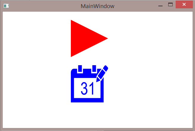
The markup for MainWindow:
<Grid>
    <StackPanel>
        <Button Name="NextButton"
                      Width="100" Height="100"
                      BorderThickness="0"
                      Margin="0,22,44,0"
                Click="NextButton_Click"
                     >
            <Button.Template>
                <ControlTemplate>
                    <Path Data="{StaticResource NextIcon}"  Fill="Red" Stretch="Fill"/>
                </ControlTemplate>
            </Button.Template>
        </Button>
        <Button Name="CalendarButton"
                      Width="100" Height="100"
                      BorderThickness="0"
                      Margin="0,22,44,0"
                Click="CalendarButton_Click"
                     >
            <Button.ToolTip>
                <TextBlock Text="Mouse is over Calendar button now"/>
            </Button.ToolTip>
            <Button.Template>
                <ControlTemplate>
                    <Path Data="{StaticResource CalendarIcon}"  Fill="Blue" Stretch="Fill"/>
                </ControlTemplate>
            </Button.Template>
        </Button>
    </StackPanel>
</Grid>
You can see that NextButton and CalendarButton both have their Templates set. That Button.Template markup replaces the default template with whatever is inside them. Both have paths. These are pointing at StaticResources. The icons are actually Geometries which are in a merged Resource Dictionary.
You will also notice that both buttons have click events wired up and tooltips.
<Geometry x:Key="NextIcon">
    M0,0L496.000005990267,315 0,630z
</Geometry>
<Geometry x:Key="CalendarIcon">
    M28.019493,17.409L2......
</Geometry>
The path for CalendarIcon is pretty long so that's truncated above rather than show you a huge long string. Once you've seen one "17.409L2" your interest wanes way before you get through 10 more lines of them.
If you're unfamiliar with Path, it's basically a XAML representation of some sort of a shape. A pretty complicated shape for the calendar.
See it Working
You have to really see it working before you can see what happens for yourself.
Spin the sample up with an f5.
NextButton
Move your cursor over the NextButton red triangle.
You will notice the tooltip appears.
No surprise there.
It only appears as you move your cursor over the triangle.
There is no blank retangle anywhere like you might think. The button conforms to that triangle.
The path is the button.
CalendarButton
Next move your cursor over the blue CalendarButton and experiment with it to show the tooltip.
Again, the path is the button.
This has quite an odd effect though,
If you put your cursor over one of the white bits inside the calendar - say just to the right of the 1 in 31.
No tooltip appears.
Click there.
No MessageBox.
Hover over a blue bit.
You see the tooltip.
Click there.
You see a MessageBox pops up.
This is because the path defines the button - literally.
There is no button there where the white of the background shows through but there is in all the pieces of blue - some of which are disconnected.
All of which is a bit odd.
That's kind of....
The Point
Because WPF controls are lookless you can define them in some quite strange ways which would be totally unthinkable in other technologies such as Winforms.
WPF might look a bit like Winforms but it is very different and in many ways much more flexible.
Sometimes in quite surprising ways.
By substituting a path for that Border from the default template what you get is a button which is any shape you can define in a path. Since a path can have a number of disconnected pieces that means a button can also. In winforms or asp.net you could put an image on a button but you would end up with a rectangle with a picture on it. That path hasn't got transparent bits of button round it, there is literally only button where you see the blue of that calendar path.
See Also
This article is part of the WPF Tips Series, if WPF is your area of interest then you will probably find other useful articles there.