Excel: Using Sparklines To Easily Spot Trends In Your Dataset
Introduction
A ***Sparkline ***is an amazing trick in Excel that enables you to easily and almost instantly create visual representations of data with a few clicks.
Sometimes it is hard to spot the patterns/trends from the large set of data. Sparkline is a quick and easy solution for such situations. Taking up a small amount of room, a Sparkline can display a trend based on connecting data in a clear and compact graphical representation. Although it's not mandatory for a Sparkline cell to be directly next to its underlying data, but it is highly recommended.
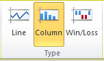
There are three different types of Sparklines we can use to show trends:
- Line,
- Column, and** **
- Win/Loss.

Example
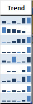
Here we have sample sales data of different salesperson for the year of 2015. By just looking at the table, we do get an idea of how the individual is doing, but it would be great if we can see the pattern/trend of their performance.

In order to show trend of their performance, we will add Sparklines in the very next column.
Insert Sparklines
To insert Sparklines, perform the following steps:
1. Select the cells where you want to see the Sparklines. In this example, select the range** I5 : I13**.

2. From the Insert Tab, in the Sparklines group, click Line.

3. In the Create Sparklines dialog box, select the range C5:H13 and click OK.

Now, you will be able to see the trend of every salesperson’s performance in the trend column.

Customize Sparklines
When you click on the Sparklines, the Sparkline tools tab activates on the upper ribbon.
Try using the High Point and Low Point options. You can see that the Sparklines will mark high and low points on the trendline.

Now, in the Type group, click Column.
You will see line charts will turn into Columns.
Win/Loss Sparkline is useful for showing group of wins and losses where 1 = WIN & -1 = LOSS

**Sparkline **is definitely a great feature in the world of data visualization. It brings ease and stability to most users who want better visualization while presenting their data. I am really looking forward to using this feature to make my data set stand out.