Modify SharePoint List View to Create Business Intelligence Charts using Client Side Rendering and ChartJS
Introduction
Business Intelligence charts are one of the primary tools used by the business to derive conclusions. SharePoint List stores business data that serves as the source for deriving business intelligence. In order to create BI charts based on SharePoint List we had to use SQL Server Reporting Services/Performance Point/Power Pivot/Power View/Custom Development. But with Client Side Rendering it has become easier to modify the SharePoint List data during run time. In this article, we will see how to create Business Intelligence Charts using Client Side Rendering and Chart JS.
Client Side Rendering
Client-side rendering was introduced in SharePoint 2013. The primary purpose of CSR is to provide the conditional formatting of the data present within the List Views. Prior to SharePoint 2013, XSLT formatting was the way to implement the conditional formatting of List Views. XSLT formatting required in-depth knowledge of working with XSL and debugging was also cumbersome. However, with CSR, we can tap into the rendering process and override the default properties of the List View, using JavaScript and convert the SharePoint List Data to modified HTML.
Some of the properties that can be overridden are given below.
- OnPreRender
- OnPostRender
- View
- Body
- Item
- Fields
- Header
- Footer
OnPreRender allows us to write some logic even before the List View is rendered, while OnPostRender allows us to modify the List View once the view has been rendered. Similarly, each of the properties can be overridden during runtime to accomplish different List View modifications and at different List View locations.
Chart JS
Chart JS is an open source JavaScript charting library using which we can create different types of chart by pumping in data to the chart creation command. We can download the latest version of Chart.js on GitHub or just use these Chart.js CDN links.
What are we going to do?
We will be exploring the options of converting the SharePoint List View to the various Business Intelligence Charting options using Client Side Rendering and Chart JS . The charting options that we will cover in this article are :
- Bar Chart
- Pie Chart
- Line Chart
- Radar Chart
- Doughnut Chart
- Polar Chart
The SharePoint List that we will be making use of in this walk through is :
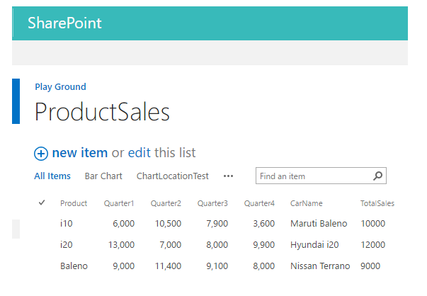
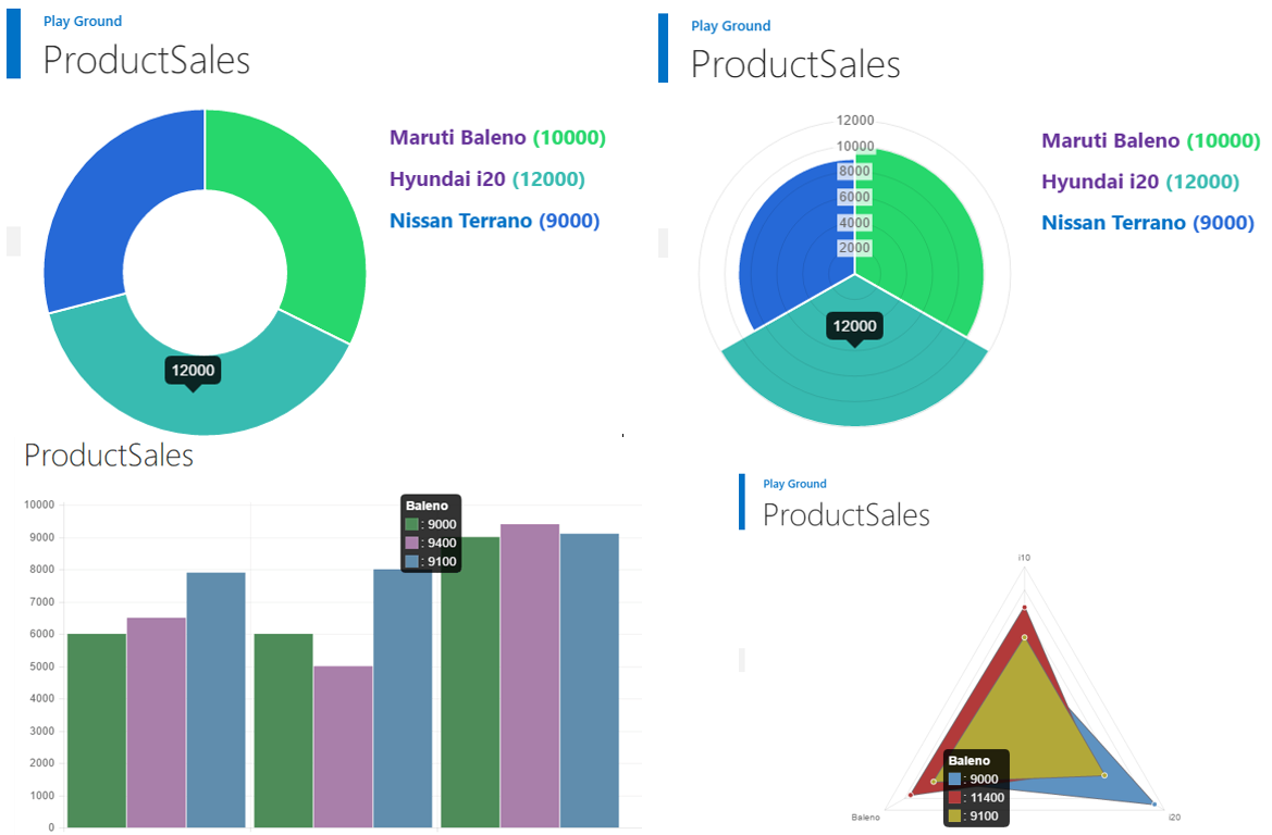
As we progress we will create multiple charts from this list view using CSR and Chart JS. A sneak peak of some of the Charts we will create is shown below :
Create Bar Chart from List View
Let's see how we can use Chart JS along with Client Side Rendering (CSR) to convert the SharePoint List View data into a Bar Chart during runtime. Initially, the SharePoint List will have the Quarter Sales details of vehicles.
During run time, we will use Chart JS and Client Side Rendering to convert the above view to a Bar Chart, as shown below.
Prerequisites
- A SharePoint List with the below columns. Create a new View named Bar Chart which we will convert to the graphical representation using CSR and Chart JS. http://csharpcorner.mindcrackerinc.netdna-cdn.com/article/create-business-intelligence-bar-charts-from-sharepoint-list-view-using-client-s/Images/image004.png
- Download Chart JS from js on GitHub or just use these Chart.js CDN links. Upload it to SharePoint Site Assets.
- Get jQuery minified version. Upload it to SharePoint Site Assets.
Implementation
Once the above prerequisites are in place, let’s go to the implementation logic. At a high level, ChartJS works by placing an html canvas with id "ProductSalesChart" in the page and uses the new command to create a chart using the available values at that particular canvas. In order to get started, we will require a couple of arrays that will hold the values from the SharePoint List which will be plotted against the X-Y axis. Q1Values, Q2Values, and Q3Values will be used to hold the Quarter 1, Quarter 2, and Quarter 3 SharePoint List Column values.
      // Declare the arrays used for Chart Creation
      var productSalesChart = productSalesChart || {};

      productSalesChart.ChartTitle =[];
      productSalesChart.Q1Values = [];
      productSalesChart.Q2Values = [];
      productSalesChart.Q3Values= [];
The main starting point function of Client Side rendering is discussed below. During runtime, we will override the Header, Footer, and Item properties of the context information object.
      // Starting Function. Override the SharePoint List View Rendering.
      productSalesChart.Build = function () {

                    var contextOverride = {};
                    contextOverride.Templates = {};
                    contextOverride.Templates.Header = productSalesChart.Header;
                    contextOverride.Templates.Item = productSalesChart.Item;
                    contextOverride.Templates.Footer = productSalesChart.Footer;

                    SPClientTemplates.TemplateManager.RegisterTemplateOverrides(contextOverride);
      };
The Item override method will run for each SharePoint list item. It will push the SharePoint list item values to the variable arrays which we had declared earlier. These data arrays will be used to plot the chart.
      //Repeat the action for each list item
      productSalesChart.Item = function (ctx) {

                    var Q1Val =ctx.CurrentItem.Quarter1.replace(",", "");
                    var Q2Val =ctx.CurrentItem.Quarter2.replace(",", "");
                    var Q3Val =ctx.CurrentItem.Quarter3.replace(",", "");

                    productSalesChart.ChartTitle.push(ctx.CurrentItem.Product);
                    productSalesChart.Q1Values.push(parseInt(Q1Val));
                    productSalesChart.Q2Values.push(parseInt(Q2Val));
                    productSalesChart.Q3Values.push(parseInt(Q3Val));
                    return '';
      }
Chat JS requires a canvas element with an id which will be used while running the new command to create the chart. This canvas element will be added to the page by overriding the Header property. In the Footer Property override method, we will create the chart using the new chart command. The new command takes in parameters like color scheme that has to be used for chart bars and the data parameter which will contain the values that will be used to plot the chart.
      //Create a div with id - ProductSalesChart that will be populated with the Bar Chart
      productSalesChart.Header = function (ctx) {

                    return '<      canvas id="ProductSalesChart" width="800" height="400" style="float:left;margin-right:30px;"></canvas><div id="chartDesc"></div>';

      }

      // Override the footer and draw the Bar Chart
      productSalesChart.Footer = function () {

                    var data = {
                        labels: productSalesChart.ChartTitle,
                        datasets: [
                            {
                                fillColor: "#4E8C59",
                                strokeColor: "#4E8C59",
                                pointColor: "#4E8C59",
                                pointStrokeColor: "#fff",
                                data: productSalesChart.Q1Values
                            },
                            {
                                fillColor: "#A97FAA",
                                strokeColor: "#A97FAA",
                                pointColor: "#A97FAA",
                                pointStrokeColor: "#fff",
                                data: productSalesChart.Q2Values
                            },
                            {
                                fillColor: "#608DAD",
                                strokeColor: "#608DAD",
                                pointColor: "#608DAD",
                                pointStrokeColor: "#fff",
                                data: productSalesChart.Q3Values
                            }
                        ]
                    }

                    // Bar Chart options.
                    var options = {
                        scaleOverride: true,
                        scaleSteps: 12,
                        scaleStepWidth: 1000
                    };

                    var Barchart = $("#ProductSalesChart").get(0).getContext("2d");
                    new Chart(Barchart).Bar(data,  {animationSteps: 10});

                    return '';
      }
The new Chart command will create the bar chart with the provided parameters. We can customize the bar chart by adding legends, responsiveness, The other configurable properties can be set to the chart as described in the official documentation here.
Full Code
// Declare the arrays used for Chart Creation
var productSalesChart = productSalesChart || {};

productSalesChart.ChartTitle =[];
productSalesChart.Q1Values = [];
productSalesChart.Q2Values = [];
productSalesChart.Q3Values= [];


productSalesChart.Desc = '';

// Starting Function. Override the SharePoint List View Rendering.
productSalesChart.Build = function () {

    var contextOverride = {};
    contextOverride.Templates = {};
    contextOverride.Templates.Header = productSalesChart.Header;
    contextOverride.Templates.Item = productSalesChart.Item;
    contextOverride.Templates.Footer = productSalesChart.Footer;

    SPClientTemplates.TemplateManager.RegisterTemplateOverrides(contextOverride);
};

//Repeat the action for each list item
productSalesChart.Item = function (ctx) {

    var Q1Val =ctx.CurrentItem.Quarter1.replace(",", "");
    var Q2Val =ctx.CurrentItem.Quarter2.replace(",", "");
    var Q3Val =ctx.CurrentItem.Quarter3.replace(",", "");

    productSalesChart.ChartTitle.push(ctx.CurrentItem.Product);
    productSalesChart.Q1Values.push(parseInt(Q1Val));
    productSalesChart.Q2Values.push(parseInt(Q2Val));
    productSalesChart.Q3Values.push(parseInt(Q3Val));
    return '';
}

//Create a div with id - ProductSalesChart that will be populated with the Bar Chart
productSalesChart.Header = function (ctx) {

    return '<canvas id="ProductSalesChart" width="800" height="400" style="float:left;margin-right:30px;"></canvas><div id="chartDesc"></div>';

}

// Override the footer and draw the Bar Chart
productSalesChart.Footer = function () {

    var data = {
        labels: productSalesChart.ChartTitle,
        datasets: [
            {
                fillColor: "#4E8C59",
                strokeColor: "#4E8C59",
                pointColor: "#4E8C59",
                pointStrokeColor: "#fff",
                data: productSalesChart.Q1Values
            },
            {
                fillColor: "#A97FAA",
                strokeColor: "#A97FAA",
                pointColor: "#A97FAA",
                pointStrokeColor: "#fff",
                data: productSalesChart.Q2Values
            },
            {
                fillColor: "#608DAD",
                strokeColor: "#608DAD",
                pointColor: "#608DAD",
                pointStrokeColor: "#fff",
                data: productSalesChart.Q3Values
            }
        ]
    }

    // Bar Chart options.
    var options = {
        scaleOverride: true,
        scaleSteps: 12,
        scaleStepWidth: 1000
    };

    var Barchart = $("#ProductSalesChart").get(0).getContext("2d");
    new Chart(Barchart).Bar(data,  {animationSteps: 10});

    return '';
}


$(document).ready(productSalesChart.Build());
Add JS Link
We can save the above code to a JS file and upload it to say: Site Assets within the SharePoint Site. We can, then, go the List View’s "Edit" page by appending “?toolpaneview=2” . In the edit page of the View, go to the edit properties of the List View and add the JS file in the JSLink section. We will be adding reference to 3 JS files using the short hand.
~site/siteassets/jquery-1.12.1.min.js|~site/siteassets/Chart.js|~site/siteassets/Bar.js
The JS files that are referenced as JSLink are,
- jQuery file which we have uploaded to the Site assets library
- JS file which is uploaded to same Site Assets Library
- JS file which contains our override and chart creation logic which is uploaded to SiteAssets.
We can add it to other locations as well, and make the changes in the JSLink URL accordingly. Once we save the page after adding the JSLink, the List View will be rendered as a Bar Chart, as shown below.
Create Pie Chart from List View
Now lets see how we can use Chart JS along with Client Side Rendering (CSR) to convert the SharePoint List View data into a Pie Chart during run time. Initially the SharePoint List will have the Car Sales details of vehicles.
During run time, we will make use of JSLink and convert it to the below Pie Chart representation.
You can see how we can convert the list view to bar chart from this article.
Prerequisites
- A SharePoint List with the below columns. Create a new View named ‘PieView’ which we will convert to the graphical representation using CSR and Chart JS.
http://csharpcorner.mindcrackerinc.netdna-cdn.com/article/convert-sharepoint-list-view-to-pie-chart-using-client-side-rendering-and-chart/Images/image004.png
- Download Chart JS from js on GitHub or just use these Chart.js CDN links. Upload it to SharePoint Site Assets.
- Get jQuery minified version. Upload it to SharePoint Site Assets.
Implementation
Once the above prerequisites are in place, let’s go to the implementation logic. At a high level, ChartJS works by placing a Canvas in the page and uses the new command to create a chart using the available values at that particular canvas. In order to get started, we will require a couple of arrays that will hold the values from the SharePoint List which will be plotted in the Pie Chart.
      // Declare the arrays used for Chart Creation
      var CarSalesPieChart = CarSalesPieChart || {};
      // Array with colors for the pie chart.
      CarSalesPieChart.Items = [];
      CarSalesPieChart.ChartColors = [    '#27d76c'    ,     '#38bbb1'    ,  '#2669d7', '#ec5dbc', '#4D5360',  '#f5cd6a'];
      CarSalesPieChart.Description =     ''    ;
The main starting point function of Client Side rendering is discussed below. During runtime, we will override the Header, Footer, and Item properties of the context information object.
      // Starting Function. Override the SharePoint List View Rendering.
      CarSalesPieChart.BuildChart =     function  () {

                    var contextOverride = {};
                    contextOverride.Templates = {};
                    contextOverride.Templates.Header = CarSalesPieChart.Header;
                    contextOverride.Templates.Item = CarSalesPieChart.Item;
                    contextOverride.Templates.Footer = CarSalesPieChart.Footer;

                    SPClientTemplates.TemplateManager.RegisterTemplateOverrides(contextOverride);
      };
The header override function creates a Canvas with id "CarSalesPieChart" in the page where the chart will be rendered using the list data. The Item override method will run for each SharePoint list item. It will push the SharePoint list item values to the variable arrays which we had declared earlier. These data arrays will be used to plot the pie chart. The Value attribute will store the SharePoint Values and Color attribute stores the pie chart color to be associated with it. Description will store the legend details that will also act as a hyperlink towards the corresponding list item.
      //Create a div with id - CarSalesChart that will be populated with the Pie Chart
      CarSalesPieChart.Header =     function  (ctx) {
                    return '<canvas id="CarSalesPieChart" width="400" height="400" style="float:left;margin-right:10px;"></canvas><div id="ChartDescription"></div>';
      }

                 //Repeat the action for each list item
      CarSalesPieChart.Item =     function  (ctx) {

                    var itemColor = CarSalesPieChart.ChartColors[CarSalesPieChart.Items.length];
                    CarSalesPieChart.Items.push({
                        value: parseInt(ctx.CurrentItem.TotalSales),
                        color: itemColor
                    });

                    CarSalesPieChart.Description +=       '<p><h2><span style="font-family:Segoe UI;color:' + itemColor + ';font-weight:bold;">' + '<a href=https://ctsplayground.sharepoint.com/sites/Playground/Lists/ProductSales/DispForm.aspx?ID=' + ctx.CurrentItem.ID +'>'+ ctx.CurrentItem.CarName +'</a>' + ' ('  +ctx.CurrentItem.TotalSales + ')</span></h2></p>';

                    return '';
      }
Chat JS requires a canvas element with an id which will be used while running the new command to create the chart. This canvas element will be added to the page by overriding the Header property. In the Footer Property override method, we will create the chart using the new chart command. The new command takes in parameters ‘CarSalesPieChart.Items’ which contains the list data and color schemes to be used.
      // Override the footer and draw the pie Chart
      CarSalesPieChart.Footer =     function  () {

                   //Customize pie chart . Refer               http://www.chartjs.org/docs/
                    var options = {
                    };

                    var pie = $("#CarSalesPieChart").get(0).getContext("2d");
                    new Chart(pie).Pie(CarSalesPieChart.Items, options);

                    // Add the description for all the SharePoint List Column values.
                    $(      '#ChartDescription'      ).html(CarSalesPieChart.Description);

                    return '';
      }
The new Chart command will create the bar chart with the provided parameters. We can customize the bar chart by adding legends and responsiveness. The other configurable properties can be set to the chart as described in the official documentation here.
Full Code
// Declare the arrays used for Chart Creation
var CarSalesPieChart = CarSalesPieChart || {};
// Array with colors for the pie chart.
CarSalesPieChart.Items = [];
CarSalesPieChart.ChartColors = ['#27d76c', '#38bbb1',  '#2669d7', '#ec5dbc', '#4D5360',  '#f5cd6a'];
CarSalesPieChart.Description = '';

// Starting Function. Override the SharePoint List View Rendering.
CarSalesPieChart.BuildChart = function  () {

    var contextOverride = {};
    contextOverride.Templates = {};
    contextOverride.Templates.Header = CarSalesPieChart.Header;
    contextOverride.Templates.Item = CarSalesPieChart.Item;
    contextOverride.Templates.Footer = CarSalesPieChart.Footer;

    SPClientTemplates.TemplateManager.RegisterTemplateOverrides(contextOverride);
};

//Create a div with id - CarSalesChart that will be populated with the Pie Chart
CarSalesPieChart.Header = function  (ctx) {
    return '<canvas id="CarSalesPieChart" width="400" height="400" style="float:left;margin-right:10px;"></canvas><div id="ChartDescription"></div>';
}

 //Repeat the action for each list item
CarSalesPieChart.Item = function  (ctx) {

    var itemColor = CarSalesPieChart.ChartColors[CarSalesPieChart.Items.length];
    CarSalesPieChart.Items.push({
        value: parseInt(ctx.CurrentItem.TotalSales),
        color: itemColor
    });

    CarSalesPieChart.Description += '<p><h2><span style="font-family:Segoe UI;color:' + itemColor + ';font-weight:bold;">' + '<a href=https://ctsplayground.sharepoint.com/sites/Playground/Lists/ProductSales/DispForm.aspx?ID=' + ctx.CurrentItem.ID +'>'+ ctx.CurrentItem.CarName +'</a>' + ' ('  +ctx.CurrentItem.TotalSales + ')</span></h2></p>';

    return '';
}

// Override the footer and draw the pie Chart
CarSalesPieChart.Footer = function  () {

   //Customize pie chart . Refer http://www.chartjs.org/docs/
    var options = {
    };

    var pie = $("#CarSalesPieChart").get(0).getContext("2d");
    new Chart(pie).Pie(CarSalesPieChart.Items, options);

    // Add the description for all the SharePoint List Column values.
    $('#ChartDescription').html(CarSalesPieChart.Description);

    return '';
}

//Call the Starting Point Function
$(document).ready(CarSalesPieChart.BuildChart());
Add JS Link
We can save the above code to a JS file and upload it to say: Site Assets within the SharePoint Site. We can, then, go the List View’s "Edit" page by appending “?toolpaneview=2” . In the edit page of the View, go to the edit properties of the List View and add the JS file in the JSLink section. We will be adding reference to 3 JS files using the short hand.
~site/siteassets/jquery-1.12.1.min.js|~site/siteassets/Chart.js|~site/siteassets/Pie.js
The JS files that are referenced as JSLink are:
- jQuery file which we have uploaded to the Site assets library
- JS file which is uploaded to same Site Assets Library
- JS file which contains our override and chart creation logic which is uploaded to Site Assets.
We can add it to other locations as well, and make the changes in the JSLink URL accordingly. Once we save the page after adding the JSLink, the List View will be rendered as a Pie Chart, as shown below.
Create Line Chart and Radar Chart
The creation of Line Chart and Radar chart are similar to the creation of Bar Chart. So the Pre-requisites and Implementation section of Bar Chart can be referenced to understand the below code that will be used for converting the List View to Line/Radar Chart.
Code to Convert List View to Line Chart
// Declare the arrays used for Chart Creation
var LineChart = LineChart || {};

LineChart.Colors = ['#2669d7', '#ec5dbc', '#4D5360'];
LineChart.ChartTitle =[];
LineChart.Q1Values = [];
LineChart.Q2Values = [];
LineChart.Q3Values= [];

LineChart.Description = '';

// Starting Function. Override the SharePoint List View Rendering.
LineChart.BuildChart = function () {

    var ContextOverride = {};
    ContextOverride.Templates = {};
    ContextOverride.Templates.Header = LineChart.Header;
    ContextOverride.Templates.Item = LineChart.Item;
    ContextOverride.Templates.Footer = LineChart.Footer;

    SPClientTemplates.TemplateManager.RegisterTemplateOverrides(ContextOverride);
};

//Repeat the action for each list item
LineChart.Item = function (ctx) {

    debugger;
    var Q1Val =ctx.CurrentItem.Quarter1.replace(",", "");
    var Q2Val =ctx.CurrentItem.Quarter2.replace(",", "");
    var Q3Val =ctx.CurrentItem.Quarter3.replace(",", "");

    LineChart.ChartTitle.push(ctx.CurrentItem.Product);
    LineChart.Q1Values.push(parseInt(Q1Val));
    LineChart.Q2Values.push(parseInt(Q2Val));
    LineChart.Q3Values.push(parseInt(Q3Val));
    return '';
}

//Create a div with id - ProductSalesChart that will be populated with the Bar Chart
LineChart.Header = function (ctx) {

    return '<canvas id="lineChart" width="700" height="400" style="float:left;margin-right:20px;"></canvas><div id="chartDescription"></div>';

}

// Override the footer and draw the Bar Chart
LineChart.Footer = function () {


    var data = {
        labels: LineChart.ChartTitle,
        datasets: [
            {
                strokeColor: LineChart.Colors[0],
                pointColor: LineChart.Colors[0],
                pointStrokeColor: "#fff",
                data: LineChart.Q1Values
            },
            {
                strokeColor: LineChart.Colors[1],
                pointColor: LineChart.Colors[1],
                pointStrokeColor : "#fff",
                data: LineChart.Q2Values
            },
            {
                strokeColor: LineChart.Colors[2],
                pointColor: LineChart.Colors[2],
                pointStrokeColor : "#fff",
                data: LineChart.Q3Values
            }
        ]
    }

    // Line chart options.
    var options = {
        scaleOverride: true,
        scaleSteps: 12,
        scaleStepWidth: 1000,
        scaleStartValue: 0,
        pointDotRadius: 7,
        datasetFill: false
    };

    var chart = $("#lineChart").get(0).getContext("2d");
    new Chart(chart).Line(data, options);

    LineChart.Description += '<h2><span style="color:' + LineChart.Colors[0] + ';font-weight:italic;">Quarter1 Sales</span><h2>';
    LineChart.Description += '<h2><span style="color:' + LineChart.Colors[1] + ';font-weight:italic;">Quarter2 Sales</span><h2>';
    LineChart.Description += '<h2><span style="color:' + LineChart.Colors[2] + ';font-weight:italic;">Quarter3 Sales</span><h2>';

    $('#chartDescription').html(LineChart.Description);

    return '';
}

//Call the starting point function
$(document).ready(LineChart.BuildChart());
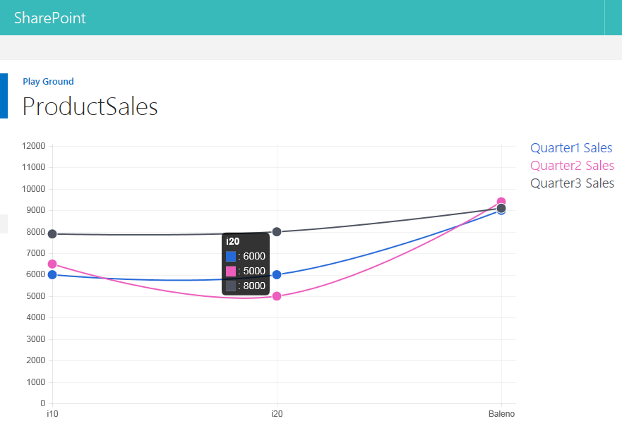
Line Chart Output
After adding the above code as JSLink, the list view will be converted to Line Chart as shown below:
Code to Convert List View to Radar Chart
The code to create the radar chart from list view is similar to Bar Chart, hence Bar Chart code walk through which is explained earlier can be referred for a better understanding.
// Declare the arrays used for Chart Creation
var RadarChart = RadarChart || {};
RadarChart.Colors = ['#5e92c1', '#b23a3a', '#b2a839'];
RadarChart.ChartTitle =[];
RadarChart.Q1Values = [];
RadarChart.Q2Values = [];
RadarChart.Q3Values= [];

RadarChart.Description = '';

// Starting Function. Override the SharePoint List View Rendering.
RadarChart.BuildChart = function () {

    var ContextOverride = {};
    ContextOverride.Templates = {};
    ContextOverride.Templates.Header = RadarChart.Header;
    ContextOverride.Templates.Item = RadarChart.Item;
    ContextOverride.Templates.Footer = RadarChart.Footer;

    SPClientTemplates.TemplateManager.RegisterTemplateOverrides(ContextOverride);
};

//Repeat the action for each list item
RadarChart.Item = function (ctx) {

    var Q1Val =ctx.CurrentItem.Quarter1.replace(",", "");
    var Q2Val =ctx.CurrentItem.Quarter2.replace(",", "");
    var Q3Val =ctx.CurrentItem.Quarter3.replace(",", "");

    RadarChart.ChartTitle.push(ctx.CurrentItem.Product);
    RadarChart.Q1Values.push(parseInt(Q1Val));
    RadarChart.Q2Values.push(parseInt(Q2Val));
    RadarChart.Q3Values.push(parseInt(Q3Val));
    return '';
}

//Create a div with id - ProductSalesChart that will be populated with the Bar Chart
RadarChart.Header = function (ctx) {

    return '<canvas id="RadarChart" width="600" height="400" style="float:left;margin-right:20px;"></canvas><div id="chartDescription"></div>';

}

// Override the footer and draw the Radar Chart
RadarChart.Footer = function () {

    debugger;
    var data = {
        labels: RadarChart.ChartTitle,
        datasets: [
            {
                fillColor: RadarChart.Colors[0],
                strokeColor: "#6e6b70",
                pointColor: RadarChart.Colors[0],
                pointStrokeColor: "#fff",
                data: RadarChart.Q1Values
            },
            {
                fillColor: RadarChart.Colors[1],
                strokeColor: "#6e6b70",
                pointColor: RadarChart.Colors[1],
                pointStrokeColor: "#fff",
                data: RadarChart.Q2Values
            },
            {
                fillColor: RadarChart.Colors[2],
                strokeColor: "#6e6b70",
                pointColor: RadarChart.Colors[2],
                pointStrokeColor: "#fff",
                data: RadarChart.Q3Values
            }
        ]
    }

    // Radar chart options.
    var options = {
        scaleOverride: true,
        scaleSteps: 12,
        scaleStepWidth: 1000
    };

    var chart = $("#RadarChart").get(0).getContext("2d");
    new Chart(chart).Radar(data,  {animationSteps: 15});

    RadarChart.Description += '<h2><span style="color:' + RadarChart.Colors[0] + ';font-weight:italic;">Quarter1 Sales</span><h2>';
    RadarChart.Description += '<h2><span style="color:' + RadarChart.Colors[1] + ';font-weight:italic;">Quarter2 Sales</span><h2>';
    RadarChart.Description += '<h2><span style="color:' + RadarChart.Colors[2] + ';font-weight:italic;">Quarter3 Sales</span><h2>';

    $('#chartDescription').html(RadarChart.Description);


    return '';
}


//Call the starting point function
$(document).ready(RadarChart.BuildChart());
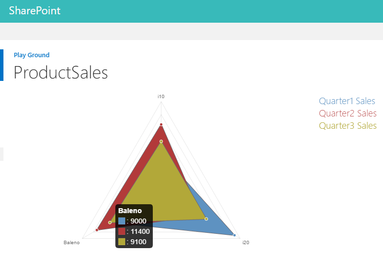
Radar Chart Output
After adding the above code as JSLink, the list view will be converted to Radar Chart as shown below:
Create Doughnut Chart and Polar Chart
The creation of Doughnut Chart and Polar Chart are similar to the creation of Pie Chart. So, the prerequisites and Implementation section of Pie Chart can be referenced to understand the below code that will be used for converting the List View to Doughnut/Polar Chart.
Code to Convert List View to Doughnut Chart
var carSalesDoughnutChart = carSalesDoughnutChart || {};

// Declare the arrays used for Chart Creation
carSalesDoughnutChart.DoughnutChartColors = ['#27d76c', '#38bbb1', '#2669d7', '#ec5dbc', '#4D5360', '#f5cd6a'];
carSalesDoughnutChart.Items = [];
carSalesDoughnutChart.Description = '';

// Starting Function. Override the SharePoint List View Rendering.
carSalesDoughnutChart.BuildChart = function () {

        var OverrideContext = {};
        OverrideContext.Templates = {};
        OverrideContext.Templates.Header = carSalesDoughnutChart.Header;
        OverrideContext.Templates.Item = carSalesDoughnutChart.Item;
        OverrideContext.Templates.Footer = carSalesDoughnutChart.Footer;

        SPClientTemplates.TemplateManager.RegisterTemplateOverrides(OverrideContext);
};

//Create a div with id - pieChart that will be populated with the DoughNut Chart
carSalesDoughnutChart.Header = function (ctx) {
    return '<canvas id="pieChart" width="300" height="300" style="float:left;margin-right:20px;"></canvas><div id="DoughnutDescription"></div>';
}

//Repeat the action for each list item
carSalesDoughnutChart.Item = function (ctx) {

    var itemColor = carSalesDoughnutChart.DoughnutChartColors[carSalesDoughnutChart.Items.length];
    carSalesDoughnutChart.Items.push({
        value: parseInt(ctx.CurrentItem.TotalSales),
        color: itemColor
    });

    carSalesDoughnutChart.Description += '<p><h2><span style="font-family:Segoe UI;color:' + itemColor + ';font-weight:bold;">' + '<a href=https://ctsplayground.sharepoint.com/sites/Playground/Lists/ProductSales/DispForm.aspx?ID=' + ctx.CurrentItem.ID +'>'+ ctx.CurrentItem.CarName +'</a>' + ' (' +ctx.CurrentItem.TotalSales + ')</span></h2></p>';

    return '';
}

// Override the footer and draw the Doughnut Chart
carSalesDoughnutChart.Footer = function () {

     //Customize pie chart . Refer http://www.chartjs.org/docs/
    var options = {
    };

    var DoughNut = $("#pieChart").get(0).getContext("2d");
    new Chart(DoughNut).Doughnut(carSalesDoughnutChart.Items, options);

    // Add the description for all the SharePoint List Column values.
    $('#DoughnutDescription').html(carSalesDoughnutChart.Description);

    return '';
}

    //Call the Starting Point Function
$(document).ready(carSalesDoughnutChart.BuildChart());
Doughnut Chart Output
After adding the above code as JSLink, the list view will be converted to Doughnut Chart as shown below :

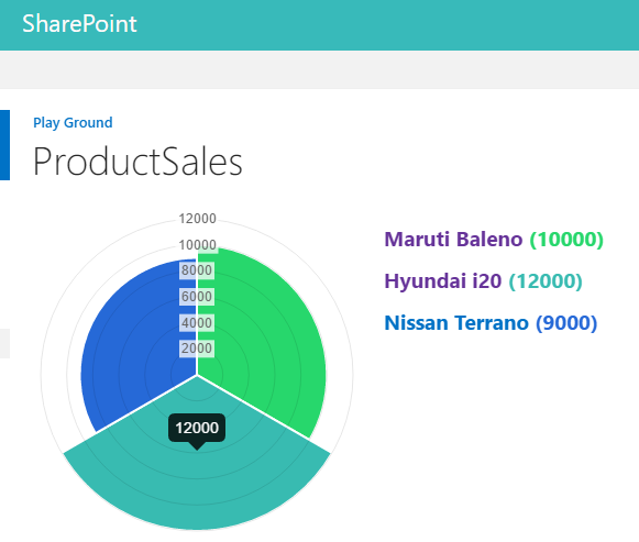
Code to Convert List View to Polar Chart
The code to create the radar chart from list view is similar to Pie Chart, hence Pie Chart code walk through which is explained earlier can be referred for a better understanding.
var PolarChart = PolarChart || {};
// Declare the arrays used for Polar Chart Creation
PolarChart.PolarChartColors = ['#27d76c', '#38bbb1', '#2669d7', '#ec5dbc', '#4D5360', '#f5cd6a'];
PolarChart.Items = [];
PolarChart.Description = '';

// Starting Function. Override the SharePoint List View Rendering.
PolarChart.BuildChart = function () {

    var OverrideContext = {};
    OverrideContext.Templates = {};
    OverrideContext.Templates.Header = PolarChart.Header;
    OverrideContext.Templates.Item = PolarChart.Item;
    OverrideContext.Templates.Footer = PolarChart.Footer;

    SPClientTemplates.TemplateManager.RegisterTemplateOverrides(OverrideContext);
};

//Create a div with id - PolarChart that will be populated with the Pie Chart
PolarChart.Header = function (ctx) {
    return '<canvas id="PolarChart" width="300" height="300" style="float:left;margin-right:20px;"></canvas><div id="PolarDescription"></div>';
}

//Repeat the action for each list item
PolarChart.Item = function (ctx) {

    var itemColor = PolarChart.PolarChartColors[PolarChart.Items.length];
    PolarChart.Items.push({
        value: parseInt(ctx.CurrentItem.TotalSales),
        color: itemColor
    });

    PolarChart.Description += '<p><h2><span style="font-family:Segoe UI;color:' + itemColor + ';font-weight:bold;">' + '<a href=https://ctsplayground.sharepoint.com/sites/Playground/Lists/ProductSales/DispForm.aspx?ID=' + ctx.CurrentItem.ID +'>'+ ctx.CurrentItem.CarName +'</a>' + ' (' +ctx.CurrentItem.TotalSales + ')</span></h2></p>';

    return '';
}

 // Override the footer and draw the Polar Chart
PolarChart.Footer = function () {

     //Customize Polar chart . Refer http://www.chartjs.org/docs/
    var options = {
    };

    var PolarChartContext = $("#PolarChart").get(0).getContext("2d");
    new Chart(PolarChartContext).PolarArea(PolarChart.Items, options);

    // Add the description for all the SharePoint List Column values.
    $('#PolarDescription').html(PolarChart.Description);

    return '';
}

//Call the Starting Point Function
$(document).ready(PolarChart.BuildChart());
Polar Chart Output
After adding the above code as JSLink, the list view will be converted to Polar Chart as shown below :
Summary
Thus, we have seen how we can make use of Client Side Rendering and Chart JS to modify and convert SharePoint List Views to various Business Intelligence Chart options like Bar Chart, Pie Chart, Line Chart, Polar Chart, Radar Chart and Doughnut Chart.
Reference
- Modify List View using CSR
- Create bar charts from SharePoint List
- Create Pie Charts from SharePoint List using Chart JS and CSR