Note
Access to this page requires authorization. You can try signing in or changing directories.
Access to this page requires authorization. You can try changing directories.
Introduction
*This article is an extension of a previous article, which explores on how to create client web part using SharePoint Framework(SPFx) and use of SharePoint Pattern and Practice (PnP). In this article, we will explain on how to create Custom Property Pane Field in SharePoint Framework.
*
*Below is the list of Property Pane fields which are provided by SharePoint framework *
export declare enum propertypanefieldtype {
    custom = 1,
    checkbox = 2,
    textfield = 3,
    toggle = 5,
    dropdown = 6,
    label = 7,
    slider = 8,
    heading = 9,
    choicegroup = 10,
    button = 11,
    horizontalrule = 12,
    link = 13,
}
From above enum list, we will use ‘Custom’ Property Pane Field Type to create our new Property Pane field. In this article, we have taken an example to create a multi-select dropdown which will get displayed on SPFx Client webpart Property Pane. For this example, we have used external JavaScript library to create multi-select dropdown. Details can be found here: http://wenzhixin.net.cn/p/multiple-select/docs/
Steps to Create Custom Property Pane Field
First, we will create skeleton client-side web part as described in this link (Build First Client WebPart) . We have given my solution (folder) name as ‘SPFx-multi-select’ and webpart name as ‘TestWebPart’.
Follow the steps described in above link till the command
Code .
This will open ‘Visual Studio Code’ IDE.
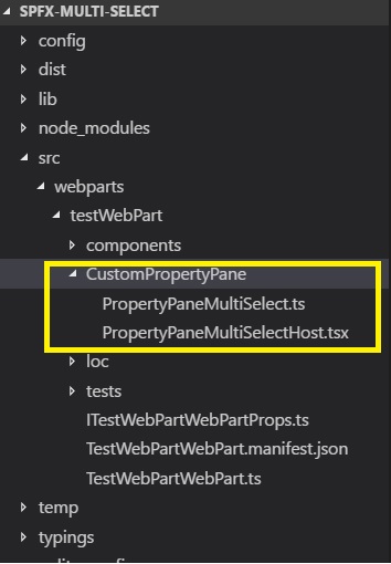
Create a folder ‘CustomPropertyPane’ inside the web part folder and add below 2 files:
- ** PropertyPanMultiSelectHost.tsx:** tsx is typescript counterpart of JSX which is an embedded XML like syntax. This class is used to define React Component for our custom control. For more information on JSX check this link
- PropertyPaneMultiSelect.ts: Typescript file which contain builder class “MultiSlectBuilder” which will render our PropertyPaneMultiSelectHost control. Also, contains public function ‘PropertyPaneMultSelect’ used from WebPart to include Custom field in Property Pane.
PropertyPaneMultiSelect.ts file looks as follows:
import * as React from 'react';
import * as ReactDom from 'react-dom';
import { IPropertyPaneCustomFieldProps, IPropertyPaneField, PropertyPaneFieldType } from '@microsoft/sp-webpart-base';
import { IMultiSelectHostProp, MultiSelectHost } from './PropertyPaneMultiSelectHost';

export interface IItemProp {
    Id: string;
    label: string;
}
export interface IMultiSelectProp {
    label: string; //Label
    selectedItemIds?: string[]; //Ids of Selected Items
    onload: () => Promise<IItemProp[]>; //On load function to items for drop down
    onPropChange: (targetProperty: string, oldValue: any, newValue: any) => void; // On Property Change function
    properties: any; //Web Part properties
    key?: string;  //unique key
}

export interface IMultiSelectPropInternal extends IPropertyPaneCustomFieldProps {
    targetProperty: string;
    label: string;
    selectedItemIds?: string[];
    onload: () => Promise<IItemProp[]>;
    onPropChange: (targetPropery: string, oldValue: any, newValue: any) => void;
    onRender: (elem: HTMLElement) => void;
    onDispose: (elem: HTMLElement) => void;
    properties: any;
    selectedKey: string;
}

export class MultiSelectBuilder implements IPropertyPaneField<IMultiSelectPropInternal>{
    public type: PropertyPaneFieldType = PropertyPaneFieldType.Custom;
    public targetProperty: string;
    public properties: IMultiSelectPropInternal;

    private label: string;
    private selectedItemIds: string[] = [];
    private onLoad: () => Promise<IItemProp[]>;
    private onPropChange: (targetPropery: string, oldValue: any, newValue: any) => void;
    private key: string;
    private cumstomProperties: any;

    constructor(targetProperty: string, prop: IMultiSelectPropInternal) {
        this.targetProperty = prop.targetProperty;
        this.properties = prop;
        this.label = prop.label;
        this.selectedItemIds = prop.selectedItemIds;
        this.cumstomProperties = prop.properties;
        this.onLoad = prop.onload.bind(this);
        this.onPropChange = prop.onPropChange.bind(this);
        this.properties.onRender = this.render.bind(this);
        this.properties.onDispose = this.dispose.bind(this);
        this.key = prop.key;
    }

    public render(elem: HTMLElement): void {
        let element: React.ReactElement<IMultiSelectHostProp> = React.createElement(MultiSelectHost, {
            targetProperty: this.targetProperty,
            label: this.label,
            properties: this.cumstomProperties,
            selectedItemIds: this.selectedItemIds,
            onDispose: null,
            onRender: null,
            onPropChange: this.onPropChange.bind(this),
            onload: this.onLoad.bind(this),
            selectedKey: this.key,
            key: this.key
        });
        ReactDom.render(element, elem);
    }

    private dispose(elem: HTMLElement): void {
    }
}

export function  PropertyPaneMultiSelect(targetProperty: string, properties: IMultiSelectProp): IPropertyPaneField<IMultiSelectPropInternal> {
    const multiSelectProp: IMultiSelectPropInternal = {
        targetProperty: targetProperty,
        label: properties.label,
        properties: properties.properties,
        selectedItemIds: properties.selectedItemIds,
        onDispose: null,
        onRender: null,
        onPropChange: properties.onPropChange.bind(this),
        onload: properties.onload.bind(this),
        selectedKey: properties.key,
        key: properties.key
    }
    return new  MultiSelectBuilder(targetProperty, multiSelectProp);
}
- IItemProp: Interface to define properties of drop-down item, we can add more properties such as 'picture url', 'alt-text' etc as per need.
- IMultiSelectProp: Interface contain properties of our custom control.
- IMultiSelectPropInternal: Internal Interface which extends IPropertyPaneCustomFieldProps provided by SharePoint Framework
- MultiSelectBuilder: Class which implements IPropertyPaneField provided by SPFx and have properties as IMultiSelectPropInternal
- PropertyPaneMultiSelect: Function which will be called from our webpart to display custom Property Pane Field.
In our Control property interface, we have declared one function 'onLoad’ which will be used by our web part to load items of drop down. Also, 'selectedItemIds' property will be used to track which all items been selected.
PropertyPaneMultiSelectHost.tsx looks as follows:
import * as React from 'react';
import * as ReactDom from 'react-dom';
import { IItemProp, IMultiSelectProp, IMultiSelectPropInternal } from './PropertyPaneMultiSelect';
import { SPComponentLoader } from '@microsoft/sp-loader';

export interface IMultiSelectHostProp extends IMultiSelectPropInternal {
}
export interface IMultiSelectHostState {
    items?: IItemProp[];
    selectedItems: string[];
}

export class MultiSelectHost extends React.Component<IMultiSelectHostProp, IMultiSelectHostState>{
    constructor(prop: IMultiSelectHostProp) {
        super(prop);
        SPComponentLoader.loadCss("https://cdnjs.cloudflare.com/ajax/libs/multiple-select/1.2.0/multiple-select.min.css");
        this.state = ({
            items: [],
            selectedItems: this.props.selectedItemIds
        });
        this.onClick = this.onClick.bind(this);

        this.props.onload()
            .then((items) => {
                this.state.items = items;
                this.setState(this.state);
                this._applyMultiSelect(this.props.selectedKey, this.props.selectedItemIds);
            });
    }

    private _applyMultiSelect(selectControlId: string, selectedIds: string[]) {
        SPComponentLoader.loadScript("https://code.jquery.com/jquery-3.2.1.min.js", { globalExportsName: 'jQuery'  })
            .then((jQuery: any): void => {
                SPComponentLoader.loadScript("https://cdnjs.cloudflare.com/ajax/libs/multiple-select/1.2.0/multiple-select.min.js", { globalExportsName: 'jQuery'  })
                    .then(() => {
                        jQuery("#" + selectControlId + "").multipleSelect({
                            width: "100%",
                            selectAll: false,
                            onClick: (item) => { this.onClick(item) }
                        });
                        jQuery("#" + selectControlId + "").multipleSelect('setSelects', selectedIds);
                    });
            });
    }

    private getAllItems(): IItemProp[] {
        let resours: IItemProp[] = [];
        this.props.onload().then((items) => {
            resours = items;
        });
        return resours;
    }
    private onClick(item: any) {
        let oldValues = this.props.properties[this.props.targetProperty];
        if (item.checked) {
            this.state.selectedItems.push(item.value);
        }
        else {
            var index = this.getSelectedNodePosition(item);
            if (index != -1)
                this.state.selectedItems.splice(index, 1);
        }
        this.setState(this.state);

        this.props.properties[this.props.targetProperty] = this.state.selectedItems;
        this.props.onPropChange(this.props.targetProperty, oldValues, this.state.selectedItems);
    }
    private getSelectedNodePosition(node): number {
        for (var i = 0; i < this.state.selectedItems.length; i++) {
            if (node.value === this.state.selectedItems[i])
                return i;
        }
        return -1;
    }

    public render(): JSX.Element {
        const allItems = this.state.items.map((item: IItemProp) => {
            return <option id={item.Id} value={item.Id}>{item.label}</option>
        })
        return (
            <div>
                <select id={this.props.selectedKey} width="100%">
                    {allItems}
                </select>
            </div>
        );
    }
}
- IMultiSelectHostProp: Extends IMultiSelectPropInternal as a Property container for MultiSelectHost class
- IMultiSelectHostState: Interface for control ‘Stage’
- MultiSelectHost: Extends React.Component and provide HTML Element component of control.
Constructor of MultiSelectHost uses 'sp-loader' to load CSS specific for multi-select control. It also calls ‘onLoad’ function from property to load the dropdown item after that setting the ‘State’ and applying multi-select JavaScript logic.
Item click in a drop -down is bound to OnClick event, which will propagate and save selected item ids.
Modify web part property interface to hold selected ids string array
export interface ITestWebPartWebPartProps {
  description: string;
  selectedIds:string[];
}
Also, modify web part manifest.json to add selectedIds default selection list
"properties": {
  "description": "Demo Web Part",
  "selectedIds":[]
}
Now, our custom property is ready to use. Use custom property in getPropertyPaneConfiguration() of our web part to display in Property Pane
PropertyPaneMultiSelect("selectedIds",{
               label:"Multi Select Dropdown",
               onload:this.onload,
               onPropChange:this.onPropertyPaneFieldChanged,
               properties:this.properties,
               key:"targetKey",
               selectedItemIds:this.properties.selectedIds
             })
‘onload’ is a custom function which provides the developer with flexibility to load items at runtime. For demo purpose, we directly provided the array values
private onload():Promise<IItemProp[]>{
    return new  Promise<IItemProp[]>((resolve)=>{
         let items:IItemProp[] =[
           {Id:"1",label:"SPFx"},
           {Id:"2",label:"SharePoint 2010"},
          {Id:"3",label:"ShrePoint 2013"},
          {Id:"4",label:"SharePonint 2016"},
         ]
         resolve(items);
    });
  }
Finally, our Custom Property Field will look as follows and will persist the data on refresh

Conclusion
This article is to demonstrate an example of how to create a Custom Property Pane in Client Side webpart using SharePoint Framework.the Developer can use and extend this control as per need. This article also demonstrates how to use external JavaScript libraries in SPFx.
