Note
Access to this page requires authorization. You can try signing in or changing directories.
Access to this page requires authorization. You can try changing directories.
Upwards of 20% of internet users have a need for accessible web applications. As such, it's important to make sure your application is designed such that any user can easily use it. Rather than thinking of accessibility as a set of tasks to complete, think of it as part of your overall user experience. The more accessible your application, the more people who can use it.
When it comes to rich interactive content like a map, some common accessibility considerations are:
- Support the screen reader for users who have difficulty seeing the web application.
- Have multiple methods for interacting with and navigating the web application such as mouse, touch, and keyboard.
- Ensure color contrast is such that colors don't blend together and become hard to distinguish from each other.
The Azure Maps Web SDK comes prebuilt with accessibility features such as:
- Screen reader descriptions when the map moves and when the user focuses on a control or popup.
- Mouse, touch, and keyboard support.
- Accessible color contrast support in the road map style.
- High contrast support.
For accessibility conformance details for all Microsoft products, see Accessibility Conformance Reports. Search for "Azure Maps web" to find the document specifically for the Azure Maps Web SDK.
Navigating the map
There are several different ways in which the map can be zoomed, panned, rotated, and pitched. The following details all the different ways to navigate the map.
Zoom the map
- Using a mouse, double-click the map to zoom in one level.
- Using a mouse, scroll the wheel to zoom the map.
- Using a touch screen, touch the map with two fingers and pinch together to zoom out or spread the fingers apart to zoom in.
- Using a touch screen, double tap the map to zoom in one level.
- With the map focused, use the Plus sign (
+) or Equals sign (=) to zoom in one level. - With the map focused, use the Minus sign, Hyphen (
-), or Underscore (_) to zoom out one level. - Using the zoom control with a mouse, touch or keyboard tab/enter keys.
- Press and hold the
Shiftbutton and press the left mouse button down on the map and drag to draw out an area to zoom the map into. - Using some multi-touch pads, dragging two fingers up to zoom out, or down to zoom in.
Pan the map
- Using a mouse, press down with the left mouse button on the map and drag in any direction.
- Using a touch screen, touch the map and drag in any direction.
- With the map focused, use the arrow keys to move the map.
Rotate the map
- Using a mouse, press down with the right mouse button on the map and drag left or right.
- Using a touch screen, touch the map with two fingers and rotate.
- With the map focused, use the shift key and the left or right arrow keys.
- Using the rotation control with a mouse, touch or keyboard tab/enter keys.
Pitch the map
- Using the mouse, press down with the right mouse button on the map and drag up or down.
- Using a touch screen, touch the map with two fingers and drag them up or down together.
- With the map focused, use the shift key plus the up or down arrow keys.
- Using the pitch control with a mouse, touch or keyboard tab/enter keys.
Change the Map Style
Not all developers want all possible map styles to be available in their application. If the developer displays the style picker control of the map, then the user may change the map style using the mouse, a touch, or the keyboard with the tab or enter key. The developer can specify which map styles they want to make available in the map style picker control. Also, the developer can programmatically set and change the map style.
Use high contrast
- When the map control is loaded, it checks to see if high contrast is enabled and the browser supports it.
- The map control doesn't monitor the high contrast mode of the device. If the device mode changes, the map won't. Thus, the user needs to reload the map by refreshing the page.
- When high contrast is detected the map style automatically switches to high contrast, and all built-in controls use a high contrast style. For example, ZoomControl, PitchControl, CompassControl, StyleControl, and other built-in controls, use a high contrast style.
- There are two types of high contrast, light and dark. If the type of high contrast can be detected by the map controls, then the behavior of the map adjusts accordingly. If light, then the grayscale_light map style is loaded. If the type can't be detected or is dark, then the high_contrast_dark style is loaded.
- If creating custom controls, it's useful to know if the built-in controls are using a high contrast style. Developers can add a css class on the map container div to check. The css classes that would be added are
high-contrast-darkandhigh-contrast-light. To check using JavaScript, use:
map.getMapContainer().classList.contains("high-contrast-dark")
or, use:
map.getMapContainer().classList.contains("high-contrast-light")
Keyboard shortcuts
The map has keyboard shortcuts built in that make it easier to use the map. These keyboard shortcuts work when the map has focus.
| Key | Action |
|---|---|
Tab |
Navigate across the controls and popups in the map. |
ESC |
Move focus from any element in the map to the top-level map element. |
Ctrl + Alt + D |
Toggle screen reader detail level. |
| Left arrow key | Pan the map left 100 pixels |
| Right arrow key | Pan the map right 100 pixels |
| Down arrow key | Pan the map down 100 pixels |
| Up arrow key | Pan the map up 100 pixels |
Shift + up arrow |
Increase map pitch by 10 degrees |
Shift + down arrow |
Decrease map pitch by 10 degrees |
Shift + right arrow |
Rotate the map 15 degrees clockwise |
Shift + left arrow |
Rotate the map 15 degrees counterclockwise |
Plus sign (+) or *Equals sign (=) |
Zoom in |
Minus sign, Hyphen (-), or *Underscore (_) |
Zoom out |
Shift + mouse drag on map to draw area |
Zoom into area |
* These key shortcuts usually share the same key on a keyboard. These shortcuts were added to improve the user experience. It also doesn't matter if the user uses the shift key or not for these shortcuts.
Screen Reader support
Users can navigate the map using the keyboard. If a screen reader is running, the map notifies the user of changes to its state. For example, users are notified of map changes when the map is panned or zoomed. By default, the map provides simplified descriptions that exclude the zoom level and coordinates of the center of the map. The user can toggle the detail level of these descriptions by using the keyboard short cut Ctrl + Shift + D.
Any additional information that is placed on the base map should have corresponding textual information for screen reader users. Be sure to add Accessible Rich Internet Applications (ARIA), alt, and title attributes where appropriate.
Make popups keyboard accessible
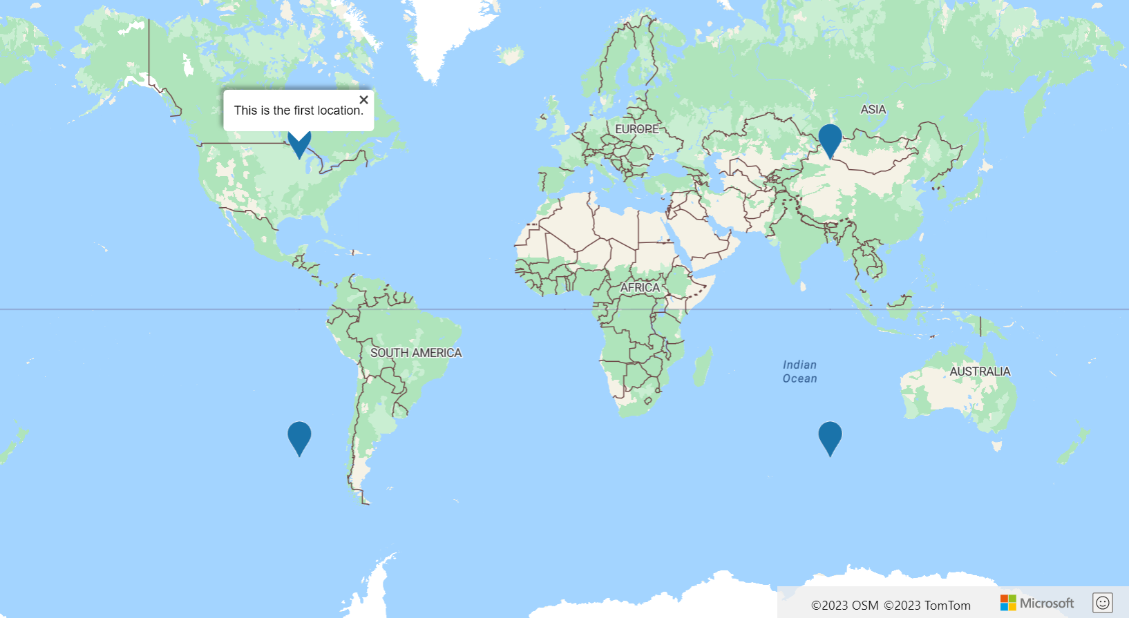
A marker or symbol is often used to represent a location on the map. Additional information about the location is typically displayed in a popup when the user interacts with the marker. In most applications, popups appear when a user selects a marker. However, clicking and tapping require the user to use a mouse and a touch screen, respectively. A good practice is to make popups accessible when using a keyboard. This functionality can be achieved by creating a popup for each data point and adding it to the map.
The Accessible popups example loads points of interests on the map using a symbol layer and adds a popup to the map for each point of interest. A reference to each popup is stored in the properties of each data point. It can also be retrieved for a marker, such as when a marker is selected. When focused on the map, pressing the tab key allows the user to step through each popup on the map. For the source code for this sample, see Accessible popups source code.
More accessibility tips
Here are some more tips to make your web-mapping application more accessible.
- If displaying many interactive point data on the map, consider reducing the clutter and use clustering.
- Ensure color contrast ratio between text/symbols and background colors is 4.5:1 or more.
- Keep your screen reader (ARIA, alt, and title attributes) messages short, descriptive, and meaningful. Avoid unnecessary jargon and acronyms.
- Try to optimize messages sent to the screen reader to provide short meaningful information that is easy for the user to digest. For example, if you want to update the screen reader at a high frequency, such as when the map is moving, consider doing the following points:
- Wait until the map has finished moving to update the screen reader.
- Throttle the updates to once every few seconds.
- Combine messages together in a logical way.
- Avoid using color as the only means of conveying information. Use text, icons, or patterns to supplement or replace the color. Some considerations:
- If using a bubble layer to show the relative value between data points, consider scaling the radius of each bubble, coloring the bubble, or both.
- Consider using a symbol layer with different icons for different metric categories, such as triangles, stars, and squares. The symbol layer also supports scaling the size of the icon. A text label can also be displayed.
- If displaying line data, the width can be used to represent weight or size. A dash-array pattern can be used to represent different categories of lines. A symbol layer can be used in combination with a line to overlay icons along the line. Using an arrow icon is useful for showing the flow or direction of the line.
- If displaying polygon data, a pattern, such as stripes, can be used as an alternative to color.
- Some visualizations such as heatmaps, tile layers, and image layers aren't accessible for users with vision impairments. Some considerations:
- Have the screen reader describe what the layer is displaying when added to the map. For example, if a weather radar tile layer is displayed, then have the screen reader say "Weather radar data is overlaid on the map."
- Limit the amount of functionality that requires a mouse hover. These functionalities are inaccessible to users who are using a keyboard or touch device to interact with your application. Note, it's still a good practice to have a hover style for interactive content such as clickable icons, links, and buttons.
- Try navigating your application using the keyboard. Make sure tab ordering is logical.
- If creating keyboard shortcuts, try to limit it to two keys or less.
Next steps
Learn about accessibility in the Web SDK modules.
Learn about developing accessible apps:
Take a look at these useful accessibility tools: