Note
Access to this page requires authorization. You can try signing in or changing directories.
Access to this page requires authorization. You can try changing directories.
Metrics are numerical values that are collected at regular intervals and describe some aspect of an Azure resource. They are automatically collected for most Azure resources at no cost. For example, a metric might tell you the processor utilization of a virtual machine, the free space in a storage account, or the incoming traffic for a virtual network.
Metrics explorer is a feature of Azure Monitor in the Azure portal. You can use it to create charts from metric values, visually correlate trends, and investigate spikes and dips in metric values. Use the metrics explorer to plot charts from metrics created by your Azure resources and investigate their health and utilization.
In this tutorial, you learn how to:
- Open metrics explorer for an Azure resource.
- Select a metric to plot on a chart.
- Perform different aggregations of metric values.
- Modify the time range and granularity for the chart.
The following video shows a more extensive scenario than the procedure outlined in this tutorial.
Prerequisites
To complete the steps in this tutorial, you need an Azure resource to monitor. You can use any resource in your Azure subscription that supports metrics. To determine whether a resource supports metrics, go to its menu in the Azure portal. Then verify that a Metrics option is in the Monitoring section of the menu.
Open metrics explorer
Select Metrics under the Monitoring section of your resource's menu. The scope is already populated with your resource. The following example is for a storage account, but other Azure services will look similar.
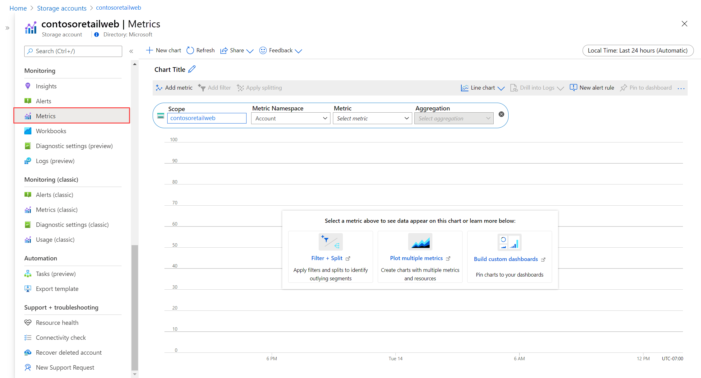
Select a Namespace if the scope has more than one. The namespace is a way to organize metrics so that you can easily find them. For example, storage accounts have separate namespaces for storing Files, Tables, Blobs, and Queues metrics. Many resource types have only one namespace.
Select a metric from a list of available metrics for the selected scope and namespace.
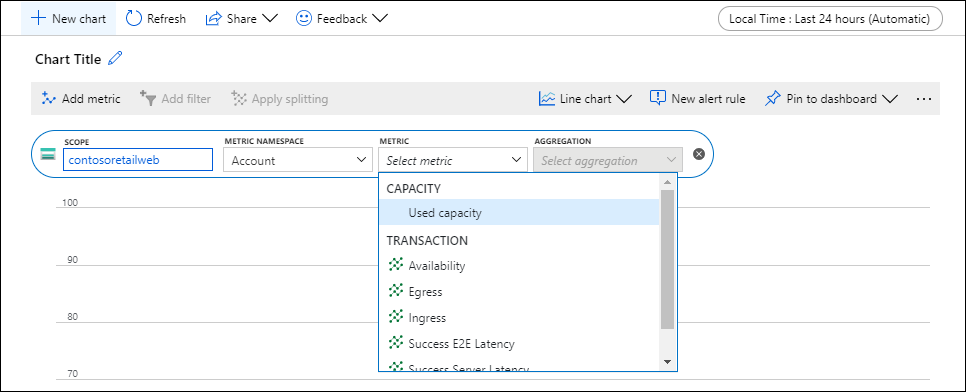
Alternatively, change the metric Aggregation. This option defines how the metric values will be aggregated across the time granularity for the graph. For example, if the time granularity is set to 15 minutes and the aggregation is set to Sum, each point in the graph will be the sum of all collected values over each 15-minute segment.

Select Add metric and repeat these steps if you want to see multiple metrics plotted in the same chart. For multiple charts in one view, select New chart.


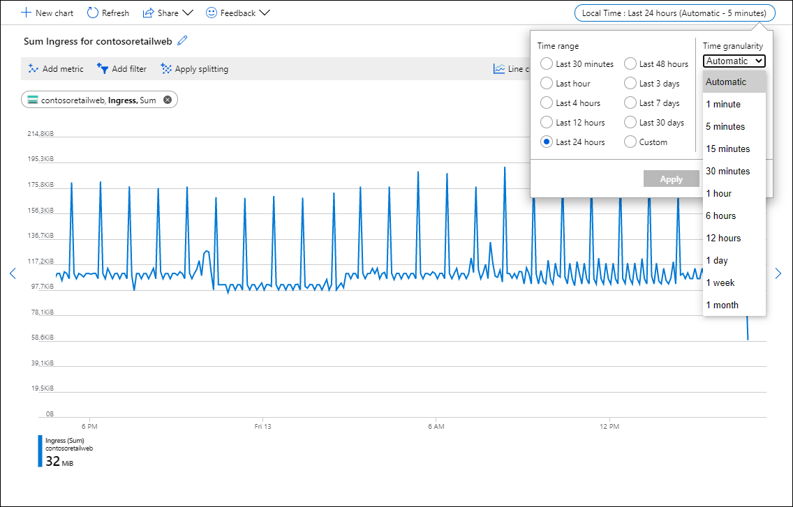
Select a time range and granularity
By default, the chart shows the most recent 24 hours of metrics data.
Use the time picker to change the Time range for the chart or the Time granularity, which defines the time range for each data point. The chart uses the specified aggregation to calculate all sampled values over the time granularity specified.
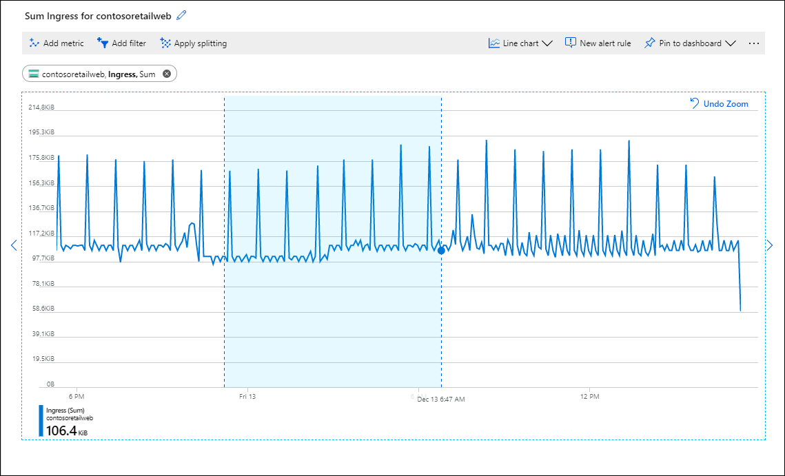
Use the time brush to investigate an interesting area of the chart, such as a spike or a dip. Put the mouse pointer at the beginning of the area, click and hold the left mouse button, drag to the other side of the area, and release the button. The chart will zoom in on that time range.


Apply dimension filters and splitting
See the following references for advanced features you can use to perform more analysis on your metrics and identify potential outliers in your data:
- Filtering lets you choose which dimension values are included in the chart. For example, you might want to show only successful requests when you chart a server response time metric.
- Splitting controls whether the chart displays separate lines for each value of a dimension or aggregates the values into a single line. For example, you might want to see one line for an average response time across all server instances. Or you might want separate lines for each server.
See examples of charts that have filtering and splitting applied.
Advanced chart settings
You can customize the chart style and title and modify advanced chart settings. When you're finished with customization, pin the chart to a dashboard to save your work. You can also configure metrics alerts. To learn about these options and other advanced features of Azure Monitor metrics explorer, see Advanced features of Azure metrics explorer.
Next steps
Now that you've learned how to work with metrics in Azure Monitor, learn how to create a metric alert rule to be notified when a metric value indicates a potential problem.