Workbook visualizations
Workbooks provide a rich set of capabilities for visualizing Azure Monitor data. The exact set of capabilities depends on the data sources and result sets, but you can expect them to converge over time. These controls allow you to present your analysis in rich interactive reports.
Workbooks support these kinds of visual components:
- Text parameters
- Using queries:
Note
Each visualization and data source might have its own limits.
Examples
Text parameters
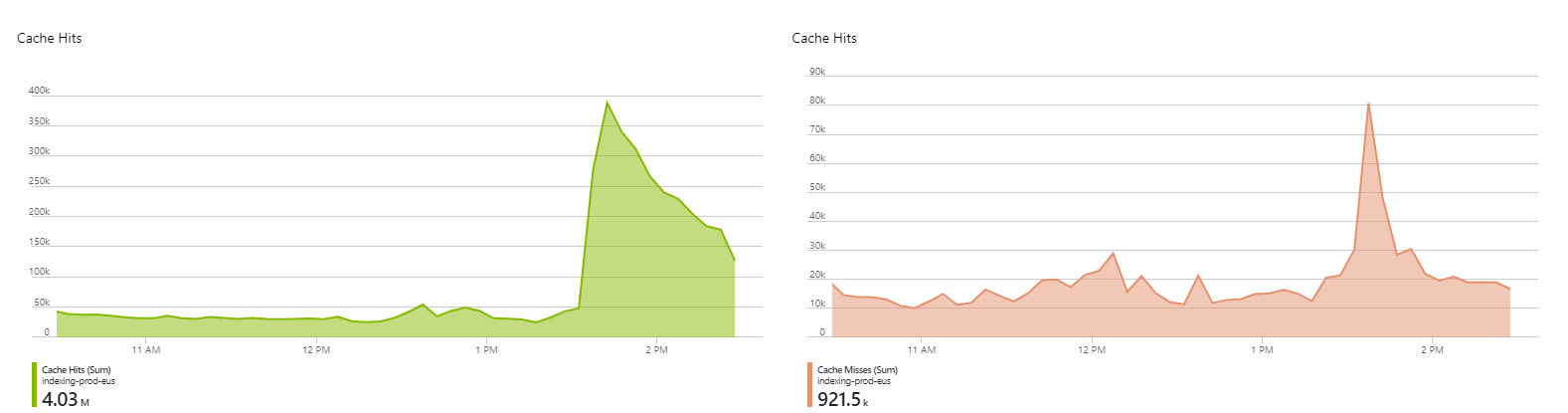
Charts
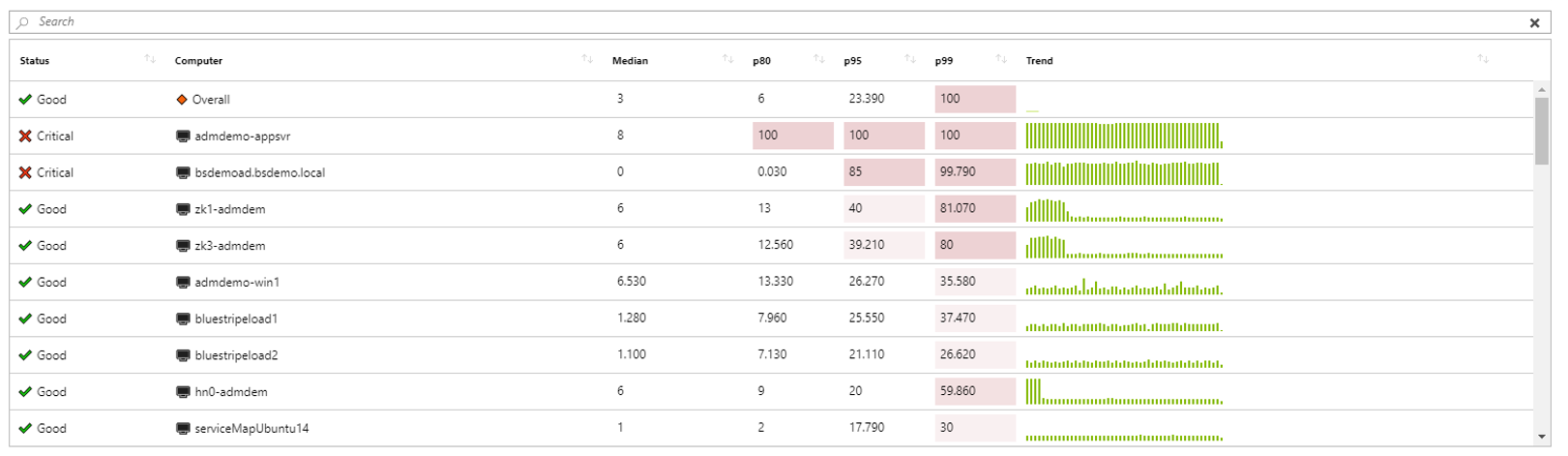
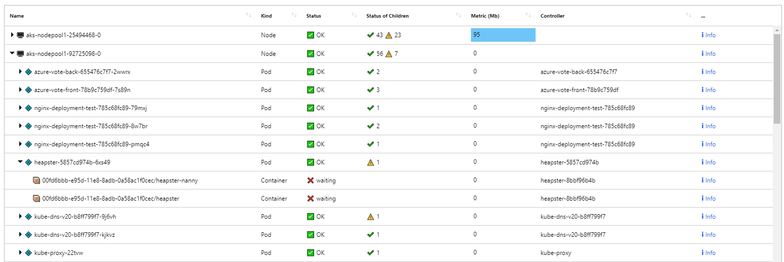
Grids
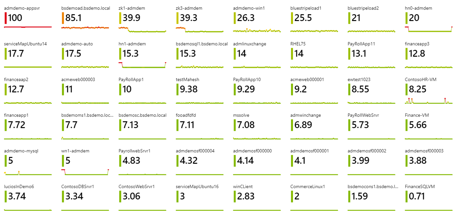
Tiles
Trees
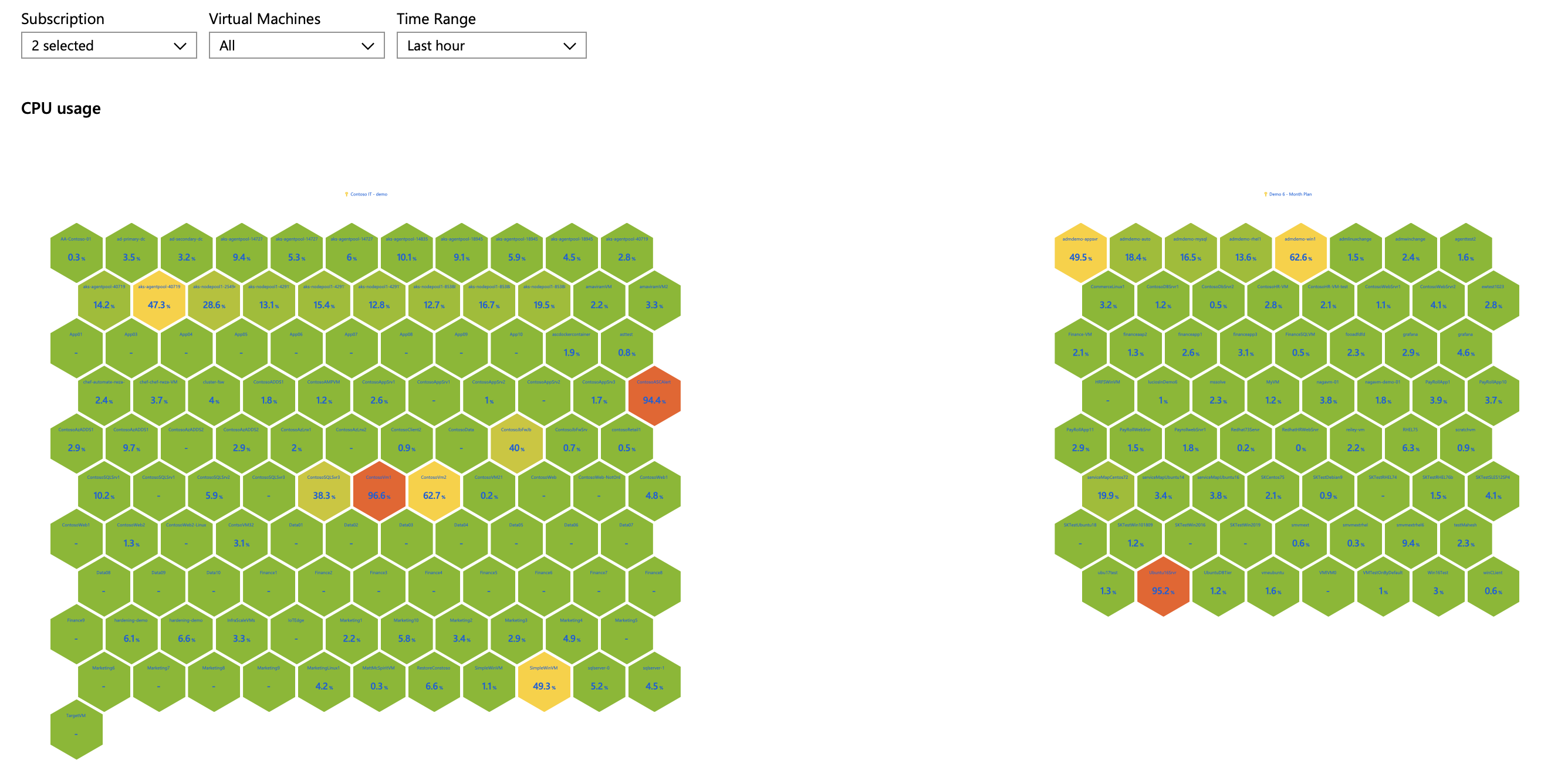
Honeycomb
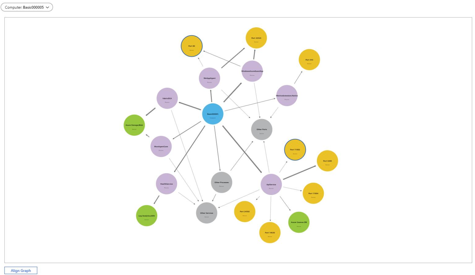
Graphs
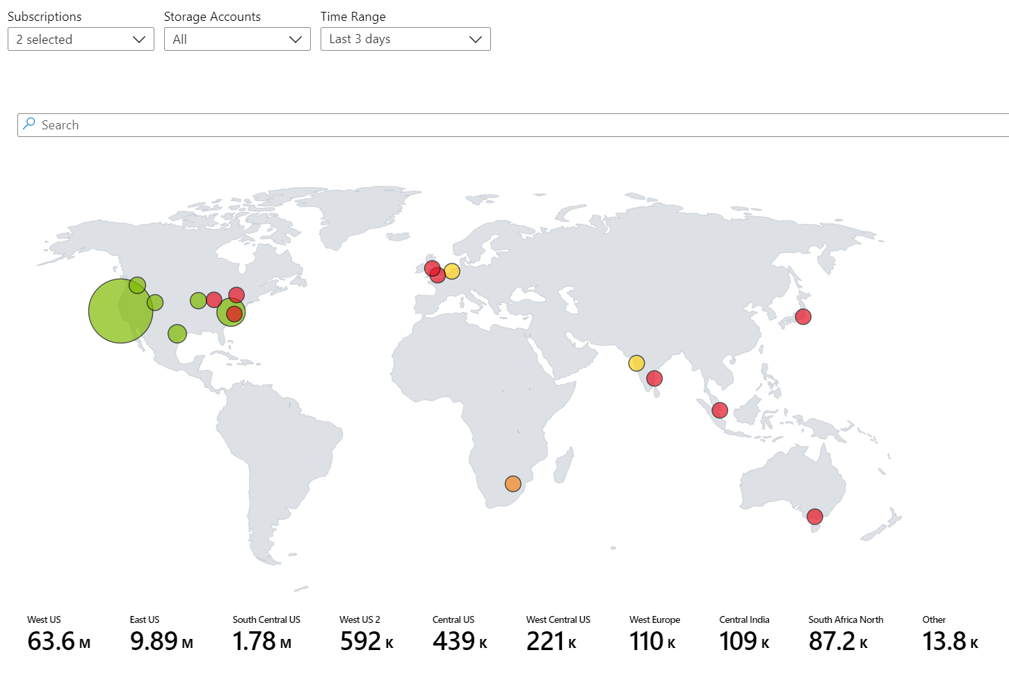
Maps
Text visualizations
Next steps
Feedback
Coming soon: Throughout 2024 we will be phasing out GitHub Issues as the feedback mechanism for content and replacing it with a new feedback system. For more information see: https://aka.ms/ContentUserFeedback.
Submit and view feedback for