Note
Access to this page requires authorization. You can try signing in or changing directories.
Access to this page requires authorization. You can try changing directories.
This article describes the Azure Workbooks rendering options you can use with grids, tiles, and graphs to produce visualizations in optimal format.
Column renderers
| Column renderer | Description | More options |
|---|---|---|
| Automatic | The default. Uses the most appropriate renderer based on the column type. | |
| Text | Renders the column values as text. | |
| Right aligned | Renders the column values as right-aligned text. | |
| Date/Time | Renders a readable date/time string. | |
| Heatmap | Colors the grid cells based on the value of the cell. | Color palette and min/max value used for scaling. |
| Bar | Renders a bar next to the cell based on the value of the cell. | Color palette and min/max value used for scaling. |
| Bar underneath | Renders a bar near the bottom of the cell based on the value of the cell. | Color palette and min/max value used for scaling. |
| Composite bar | Renders a composite bar by using the specified columns in that row. For more information, see Composite bar. | Columns with corresponding colors to render the bar and a label to display at the top of the bar. |
| Spark bars | Renders a spark bar in the cell based on the values of a dynamic array in the cell. An example is the Trend column from the screenshot at the top. | Color palette and min/max value used for scaling. |
| Spark lines | Renders a spark line in the cell based on the values of a dynamic array in the cell. | Color palette and min/max value used for scaling. |
| Icon | Renders icons based on the text values in the cell. Supported values include:
|
|
| Link | Renders a link when selected or performs a configurable action. Use this setting if you only want the item to be a link. Any of the other types of renderers can also be a link by using the Make this item a link setting. For more information, see Link actions. | |
| Location | Renders a friendly Azure region name based on a region ID. | |
| Resource type | Renders a friendly resource type string based on a resource type ID. | |
| Resource | Renders a friendly resource name and link based on a resource ID. | Option to show the resource type icon. |
| Resource group | Renders a friendly resource group name and link based on a resource group ID. If the value of the cell isn't a resource group, it will be converted to one. | Option to show the resource group icon. |
| Subscription | Renders a friendly subscription name and link based on a subscription ID. If the value of the cell isn't a subscription, it will be converted to one. | Option to show the subscription icon. |
| Hidden | Hides the column in the grid. Useful when the default query returns more columns than needed but a project-away isn't desired. |
Link actions
If the Link renderer is selected or the Make this item a link checkbox is selected, you can configure a link action. The action can occur when the user selects the cell to take the user to another view with context coming from the cell or to open a URL. For more information, see link renderer actions.
Use thresholds with links
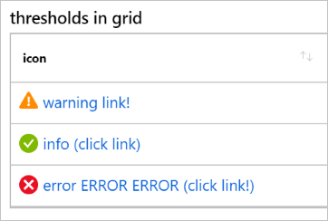
The following instructions show you how to use thresholds with links to assign icons and open different workbooks. Each link in the grid opens a different workbook template for that Application Insights resource.
Switch the workbook to edit mode by selecting Edit.
Select Add > Add query.
Change Data source to JSON and change Visualization to Grid.
Enter this query:
  [
      { "name": "warning", "link": "Community-Workbooks/Performance/Performance Counter Analysis" },
      { "name": "info", "link": "Community-Workbooks/Performance/Performance Insights" },
      { "name": "error", "link": "Community-Workbooks/Performance/Apdex" }
  ]
Run the query.
Select Column Settings to open the settings.
Under Columns, select name.
Under Column renderer, select Thresholds.
Enter and choose the following Threshold Settings:
- Keep the Default row as is.
- Enter whatever text you like.
- The Text column takes a string format as an input and populates it with the column value and unit if specified. For example, if warning is the column value, the text can be
{0} {1} link!. It will be displayed aswarning link!.
Operator Value Icons == warning Warning == error Failed 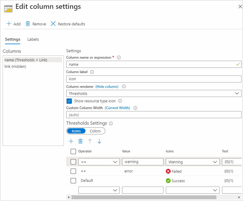
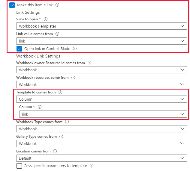
Select the Make this item a link checkbox.
- Under View to open, select Workbook (Template).
- Under Link value comes from, select link.
- Select the Open link in Context pane checkbox.
- Choose the following settings in Workbook Link Settings:
- Under Template Id comes from, select Column.
- Under Column, select link.
Under Columns, select link. Under Settings, next to Column renderer, select (Hide column).
To change the display name of the name column, select the Labels tab. On the row with name as its Column ID, under Column Label, enter the name you want displayed.
Select Apply.