Visual indicators and icons
You can summarize status by using a simple visual indication instead of presenting the full range of data values. For example, you can categorize your computers by CPU utilization as cold, warm, or hot and categorize performance as satisfied, tolerated, or frustrated. You can use an indicator or icon that represents the status next to the underlying metric.
Create a traffic light icon
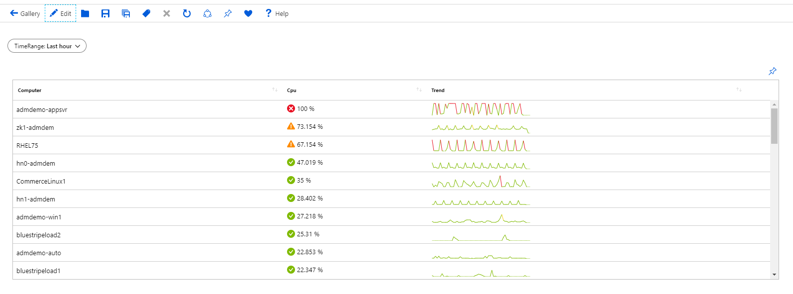
The following example shows how to set up a traffic light icon per computer based on the CPU utilization metric.
Add a parameter, make it a time range parameter, and name it TimeRange.
Select Add query to add a log query control to the workbook.
For Query type, select
Logs, and for Resource type, selectLog Analytics. Select a Log Analytics workspace in your subscription that has VM performance data as a resource.In the query editor, enter:
Perf
| where ObjectName == 'Processor' and CounterName == '% Processor Time'
| summarize Cpu = percentile(CounterValue, 95) by Computer
| join kind = inner (Perf
    | where ObjectName == 'Processor' and CounterName == '% Processor Time'
    | make-series Trend = percentile(CounterValue, 95) default = 0 on TimeGenerated from {TimeRange:start} to {TimeRange:end} step {TimeRange:grain} by Computer
    ) on Computer
| project-away Computer1, TimeGenerated
| order by Cpu desc
Set Visualization to
Grid.Select Column Settings.
In the Columns section, set:
- Cpu
- Column renderer:
Thresholds - Custom number formatting:
checked - Units:
Percentage - Threshold settings (last two need to be in order):
- Icon:
Success, Operator:Default - Icon:
Critical, Operator:>, Value:80 - Icon:
Warning, Operator:>, Value:60
- Icon:
- Column renderer:
- Trend
- Column renderer:
Spark line - Color palette:
Green to Red - Minimum value:
60 - Maximum value:
80
- Column renderer:
- Cpu
Select Save and Close to commit the changes.

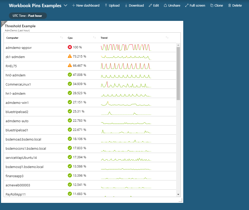
You can also pin this grid to a dashboard by using Pin to dashboard. The pinned grid automatically binds to the time range in the dashboard.
Next Steps
Feedback
Coming soon: Throughout 2024 we will be phasing out GitHub Issues as the feedback mechanism for content and replacing it with a new feedback system. For more information see: https://aka.ms/ContentUserFeedback.
Submit and view feedback for