Note
Access to this page requires authorization. You can try signing in or changing directories.
Access to this page requires authorization. You can try changing directories.
APPLIES TO: SDK v4
This article details how to customize the Web Chat samples to fit your bot.
Integrate Web Chat into your website
The Web Chat overview describes how to integrate the Web Chat control into your website.
Customizing styles
The Web Chat control provides rich customization options: you can change colors, sizes, placement of elements, add custom elements, and interact with the hosting webpage. Below are several examples of how to customize the Web Chat UI.
You can find the full list of all the settings that you can modify in Web Chat in the StyleOptions.ts file. The default values for Web Chat can be found in the defaultStyleOptions.ts file
These settings will generate a style set, which is a set of CSS rules enhanced with glamor. You can find the full list of CSS styles generated in the style set in the createStyleSet.ts file.
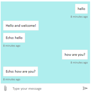
Set the size of the Web Chat container
To adjust the size of the Web Chat container, use the style set's rootHeight and rootWidth properties. The following example also sets the container's background color to show the size of the controller.
<!DOCTYPE html>
<head>
    <script src="https://cdn.botframework.com/botframework-webchat/latest/webchat.js"></script>
</head>
<body>
  <div style="height: 60%; width: 40%; margin-top:5%; margin-left:10%" id="webchat" role="main"></div>
  <script>
     // Set  the CSS rules.
     const styleSet = window.WebChat.createStyleSet({
         rootHeight: '100%',
         rootWidth: '50%',
         backgroundColor: 'paleturquoise'
      });

    window.WebChat.renderWebChat({
      directLine: window.WebChat.createDirectLine({
          token: '<Your Direct Line token>'}),
      styleSet
    }, document.getElementById('webchat'));

  </script>
</body>
Warning
In the hosting webpage, don't use your Direct Line key in plain sight. Use a token as explained in the Production embedding option section of how to Connect a bot to Web Chat.
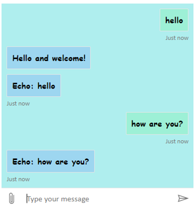
Change chat bubble font and color
You can customize the background color and the fonts used in the chat bubbles to match the style of the webpage hosting the Web Chat control. The code snippet below shows how to do it.
<!DOCTYPE html>
<head>
    <script src="https://cdn.botframework.com/botframework-webchat/latest/webchat.js"></script>
</head>
<body>
  <div style="height: 60%; width: 40%; margin-top:5%; margin-left:10%" id="webchat" role="main"></div>
  <script>

     // Set  the CSS rules.
     const styleSet = window.WebChat.createStyleSet({
         bubbleBackground: 'rgba(0, 0, 255, .1)',
         bubbleFromUserBackground: 'rgba(0, 255, 0, .1)',
         rootHeight: '100%',
         rootWidth: '50%',
         backgroundColor: 'paleturquoise'
      });

      // After generated, you can modify the CSS rules.
      // Change font family and weight.
      styleSet.textContent = {
         ...styleSet.textContent,
         fontFamily: "'Comic Sans MS', 'Arial', sans-serif",
         fontWeight: 'bold'
      };
    window.WebChat.renderWebChat({
      directLine: window.WebChat.createDirectLine({
          token: '<Your Direct Line token>'}),
      styleSet
    }, document.getElementById('webchat'));

  </script>
</body>
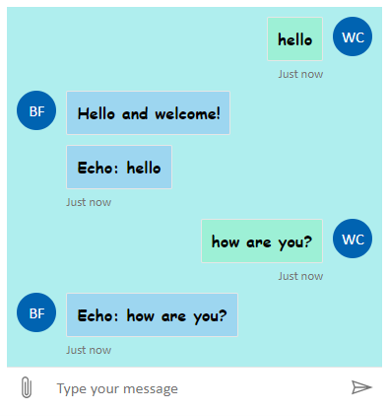
Change bot and user avatars
Web Chat supports avatars, which you can customize by setting botAvatarInitials and userAvatarInitials in the styleOptions property.
<!DOCTYPE html>
<head>
    <script src="https://cdn.botframework.com/botframework-webchat/latest/webchat.js"></script>
</head>
<body>
  <div style="height: 60%; width: 40%; margin-top:5%; margin-left:10%" id="webchat" role="main"></div>
  <script>

     // Set  the CSS rules.
     const styleSet = window.WebChat.createStyleSet({
         bubbleBackground: 'rgba(0, 0, 255, .1)',
         bubbleFromUserBackground: 'rgba(0, 255, 0, .1)',
         rootHeight: '100%',
         rootWidth: '50%',
         backgroundColor: 'paleturquoise'
      });

      // After generated, you can modify the CSS rules.
      // Change font family and weight.
      styleSet.textContent = {
         ...styleSet.textContent,
         fontFamily: "'Comic Sans MS', 'Arial', sans-serif",
         fontWeight: 'bold'
      };

    // Set the avatar options.
     const avatarOptions = {
         botAvatarInitials: 'BF',
         userAvatarInitials: 'WC'
         };

    window.WebChat.renderWebChat({
      directLine: window.WebChat.createDirectLine({
          token: '<Your Direct Line token>'}),
      styleSet,
      styleOptions: avatarOptions
    }, document.getElementById('webchat'));

  </script>
</body>
Use the botAvatarInitials property to set the avatar initials for the bot, which appears on the left-hand side of the control.
Use the userAvatarInitials property to set the avatar initials for the user, which appear on the right-hand side.
Use the botAvatarImage and userAvatarImage properties to provide image URLs for the bot and user avatars. The control will display these in place of the initials, as shown below.
const avatarOptions = {
   botAvatarImage: '<URL to your bot avatar image>',
   botAvatarInitials: 'BF',
   userAvatarImage: '<URL to your user avatar image>',
   userAvatarInitials: 'WC'
};
Custom rendering activity or attachment
With the latest version of Web Chat, you can also render activities or attachments that Web Chat doesn't support out-of-the-box. Activities and attachments render are sent thru a customizable pipeline that modeled after Redux middleware. The pipeline is flexible enough that you can do the following tasks easily:
- Decorate existing activities/attachments
- Add new activities/attachments
- Replace existing activities/attachments (or remove them)
- Daisy chain middleware together
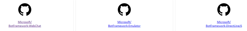
Show GitHub repository as an attachment
For example, if you want to display a deck of GitHub repository cards, you can create a new React component for the GitHub repository and add it as middleware. The following image and code snippets are from the sample the customization-card-components sample.
The following is the output when you enter the default message: sample:github-repository.
If you enter help you obtain the selection of all the cards you can choose. This is one of many examples:
import ReactWebChat from 'botframework-webchat';
import ReactDOM from 'react-dom';

// Create a new React component that accept render a GitHub repository attachment
const GitHubRepositoryAttachment = props => (
   <div
      style={{
         fontFamily: "'Calibri', 'Helvetica Neue', Arial, sans-serif",
         margin: 20,
         textAlign: 'center'
      }}
   >
      <svg
         height="64"
         viewBox="0 0 16 16"
         version="1.1"
         width="64"
         aria-hidden="true"
      >
         <path
            fillRule="evenodd"
            d="M8 0C3.58 0 0 3.58 0 8c0 3.54 2.29 6.53 5.47 7.59.4.07.55-.17.55-.38 0-.19-.01-.82-.01-1.49-2.01.37-2.53-.49-2.69-.94-.09-.23-.48-.94-.82-1.13-.28-.15-.68-.52-.01-.53.63-.01 1.08.58 1.23.82.72 1.21 1.87.87 2.33.66.07-.52.28-.87.51-1.07-1.78-.2-3.64-.89-3.64-3.95 0-.87.31-1.59.82-2.15-.08-.2-.36-1.02.08-2.12 0 0 .67-.21 2.2.82.64-.18 1.32-.27 2-.27.68 0 1.36.09 2 .27 1.53-1.04 2.2-.82 2.2-.82.44 1.1.16 1.92.08 2.12.51.56.82 1.27.82 2.15 0 3.07-1.87 3.75-3.65 3.95.29.25.54.73.54 1.48 0 1.07-.01 1.93-.01 2.2 0 .21.15.46.55.38A8.013 8.013 0 0 0 16 8c0-4.42-3.58-8-8-8z"
         />
      </svg>
      <p>
         <a
            href={`https://github.com/${encodeURI(props.owner)}/${encodeURI(
               props.repo
            )}`}
            target="_blank"
         >
            {props.owner}/<br />
            {props.repo}
         </a>
      </p>
   </div>
);

// Creating a new middleware pipeline that will render <GitHubRepositoryAttachment> for specific type of attachment
const attachmentMiddleware = () => next => card => {
   switch (card.attachment.contentType) {
      case 'application/vnd.microsoft.botframework.samples.github-repository':
         return (
            <GitHubRepositoryAttachment
               owner={card.attachment.content.owner}
               repo={card.attachment.content.repo}
            />
         );

      default:
         return next(card);
   }
};

ReactDOM.render(
   <ReactWebChat
      // Prepending the new middleware pipeline
      attachmentMiddleware={attachmentMiddleware}
      directLine={window.WebChat.createDirectLine({ token })}
   />,
   document.getElementById('webchat')
);
In this sample, we are adding a new React component called GitHubRepositoryAttachment:
const GitHubRepositoryAttachment = props => (
   <div
      style={{
         fontFamily: "'Calibri', 'Helvetica Neue', Arial, sans-serif",
         margin: 20,
         textAlign: 'center'
      }}
   >
      <svg
         height="64"
         viewBox="0 0 16 16"
         version="1.1"
         width="64"
         aria-hidden="true"
      >
         <path
            fillRule="evenodd"
            d="M8 0C3.58 0 0 3.58 0 8c0 3.54 2.29 6.53 5.47 7.59.4.07.55-.17.55-.38 0-.19-.01-.82-.01-1.49-2.01.37-2.53-.49-2.69-.94-.09-.23-.48-.94-.82-1.13-.28-.15-.68-.52-.01-.53.63-.01 1.08.58 1.23.82.72 1.21 1.87.87 2.33.66.07-.52.28-.87.51-1.07-1.78-.2-3.64-.89-3.64-3.95 0-.87.31-1.59.82-2.15-.08-.2-.36-1.02.08-2.12 0 0 .67-.21 2.2.82.64-.18 1.32-.27 2-.27.68 0 1.36.09 2 .27 1.53-1.04 2.2-.82 2.2-.82.44 1.1.16 1.92.08 2.12.51.56.82 1.27.82 2.15 0 3.07-1.87 3.75-3.65 3.95.29.25.54.73.54 1.48 0 1.07-.01 1.93-.01 2.2 0 .21.15.46.55.38A8.013 8.013 0 0 0 16 8c0-4.42-3.58-8-8-8z"
         />
      </svg>
      <p>
         <a
            href={`https://github.com/${encodeURI(props.owner)}/${encodeURI(
               props.repo
            )}`}
            target="_blank"
         >
            {props.owner}/<br />
            {props.repo}
         </a>
      </p>
   </div>
);
Then, we create a middleware that will render the new React component when the bot sends an attachment of content type application/vnd.microsoft.botframework.samples.github-repository. Otherwise, it will continue on the middleware by calling next(card).
const attachmentMiddleware = () => next => card => {
   switch (card.attachment.contentType) {
      case 'application/vnd.microsoft.botframework.samples.github-repository':
         return (
            <GitHubRepositoryAttachment
               owner={card.attachment.content.owner}
               repo={card.attachment.content.repo}
            />
         );

      default:
         return next(card);
   }
};
The activity sent from the bot looks like the following:
{
   "type": "message",
   "from": {
      "role": "bot"
   },
   "attachmentLayout": "carousel",
   "attachments": [
      {
         "contentType": "application/vnd.microsoft.botframework.samples.github-repository",
         "content": {
            "owner": "Microsoft",
            "repo": "BotFramework-WebChat"
         }
      },
      {
         "contentType": "application/vnd.microsoft.botframework.samples.github-repository",
         "content": {
            "owner": "Microsoft",
            "repo": "BotFramework-Emulator"
         }
      },
      {
         "contentType": "application/vnd.microsoft.botframework.samples.github-repository",
         "content": {
            "owner": "Microsoft",
            "repo": "BotFramework-DirectLineJS"
         }
      }
   ]
}