Note
Access to this page requires authorization. You can try signing in or changing directories.
Access to this page requires authorization. You can try changing directories.
Azure Data Explorer is a fast and highly scalable data exploration service for log and telemetry data. Power BI is a business analytics solution that lets you visualize your data and share the results across your organization. In this tutorial, you first learn how to render visuals in Azure Data Explorer. You then connect to Azure Data Explorer with Power BI, build a report based on sample data, and publish the report to the Power BI service.
If you're not signed up for Power BI Pro, sign up for a free trial before you begin.
In this tutorial, you learn how to:
- Render visuals in Azure Data Explorer
- Connect to Azure Data Explorer in Power BI Desktop
- Work with data in Power BI Desktop
- Create a report with visuals
- Publish and share the report
Prerequisites
In addition to a Power BI subscription, you need the following to complete this tutorial:
- A Microsoft account or a Microsoft Entra user identity. An Azure subscription isn't required.
- An Azure Data Explorer cluster and database. Create a cluster and database.
- The StormEvents sample data. The StormEvents sample dataset contains weather-related data from the National Centers for Environmental Information..
- Power BI Desktop (select DOWNLOAD FREE).
Render visuals in Azure Data Explorer
Before jumping into Power BI, let's look at how to render visuals in Azure Data Explorer. This is great for some quick analysis.
Sign in to https://dataexplorer.azure.com.
In the left pane, select the test database that contains the StormEvents sample data.
Paste the following query into the right window, and select Run.
StormEvents
| summarize event_count=count() by State
| where event_count > 1800
| project State, event_count
| sort by event_count
| render columnchart
This query counts weather events by state. It then renders a column chart for all states that have more than 1800 weather events.

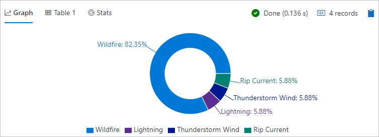
Paste the following query into the right window, and select Run.
StormEvents
| where State == "WASHINGTON" and StartTime >= datetime(2007-07-01) and StartTime <= datetime(2007-07-31)
| summarize StormCount = count() by EventType
| render piechart
This query counts weather events by type for the month of July in the state of Washington. It then renders a pie chart showing the percentage of each event type.
It's now time to look at Power BI, but there's a lot more you can do with visuals in Azure Data Explorer.
Connect to Azure Data Explorer
Now you connect to Azure Data Explorer in Power BI Desktop.
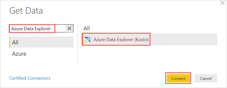
In Power BI Desktop on the Home tab, select Get Data then More.

Search for Azure Data Explorer, select Azure Data Explorer, then Connect.
On the Preview connector screen, select Continue.
On the next screen, enter the name of your test cluster and database. Cluster should be in the form
https://<ClusterName>.<Region>.kusto.windows.net. Enter StormEvents for the name of the table. Leave all other options with default values, and select OK.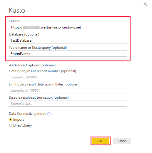
On the data preview screen, select Edit.
The table opens in Power Query Editor, where you can edit rows and columns before importing the data.
Work with data in Power BI Desktop
Now that you have a connection to Azure Data Explorer, you edit the data in Power Query Editor. You drop rows with null values in the BeginLat column and drop the StormSummary JSON column entirely. These are simple operations, but you can also perform complex transformations when importing data.
Select the arrow for the BeginLat column, clear the null check box, then select OK.

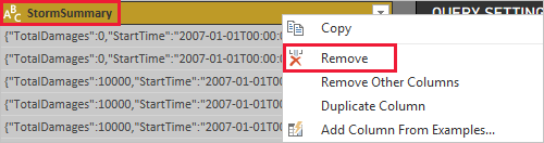
Right-click the StormSummary column header, then select Remove.
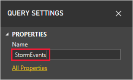
In the QUERY SETTINGS pane, change the name from Query1 to StormEvents.
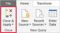
On the Home tab of the ribbon, select Close and apply.
Power Query applies your changes, then imports the sample data into a data model. The next few steps show you how to enrich that model. Again, this is just a simple example to give an idea of what's possible.
On the left side of the main window, select the data view.

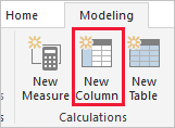
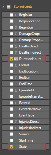
On the Modeling tab of the ribbon, select New column.
Enter the following Data Analysis Expressions (DAX) formula into the formula bar, then press Enter.
DurationHours = DATEDIFF(StormEvents[StartTime], StormEvents[EndTime], hour)
This formula creates the column DurationHours that calculates how many hours each weather event lasted. You use this column in a visual in the next section.
Scroll to the right side of the table to see the column.
Create a report with visuals
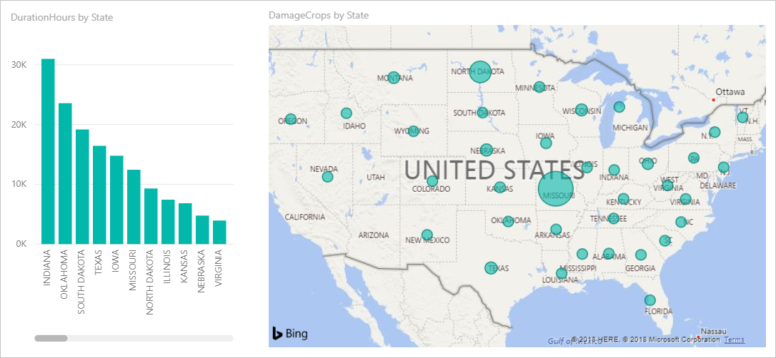
Now that the data is imported and you've improved the data model, it's time to build a report with visuals. You add a column chart based on event duration and a map that shows crop damage.
On the left side of the window, select the report view.

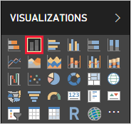
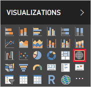
In the VISUALIZATIONS pane, select the clustered column chart.
A blank chart is added to the canvas.
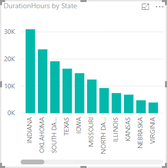
In the FIELDS list, select DurationHours and State.
You now have a chart that shows the total hours of weather events by state over the course of a year.
Click anywhere on the canvas outside the column chart.
In the VISUALIZATIONS pane, select the map.
In the FIELDS list, select CropDamage and State. Resize the map so you can see the US states clearly.

The size of the bubbles represents the dollar value of crop damage. Mouse over the bubbles to see details.
Move and resize the visuals so you have a report that looks like the following image.
Save the report with the name storm-events.pbix.
Publish and share the report
Until this point, the work you've done in Power BI has all been local, using Power BI Desktop. Now you publish the report to the Power BI service where you can share it with others.
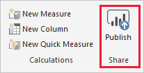
In Power BI Desktop, on the Home tab of the ribbon, select Publish.
If you're not already signed in to Power BI, go through the sign-in process.
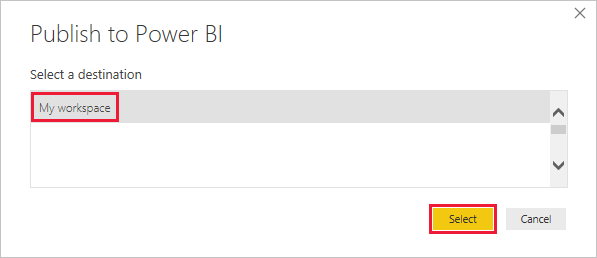
Select My workspace, then Select.
When publishing is finished, select Open storm-events.pbix in Power BI.
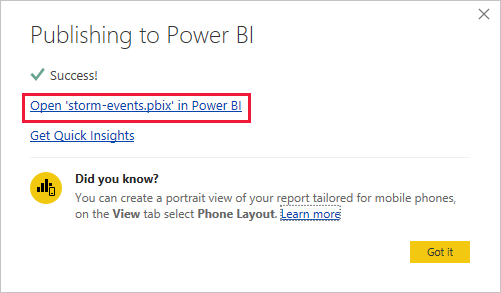
The report opens in the service, with the same visuals and layout you defined in Power BI Desktop.
In the upper-right corner of the report, select Share.

In the Share report screen, add a colleague in your organization, add a note, then select Share.
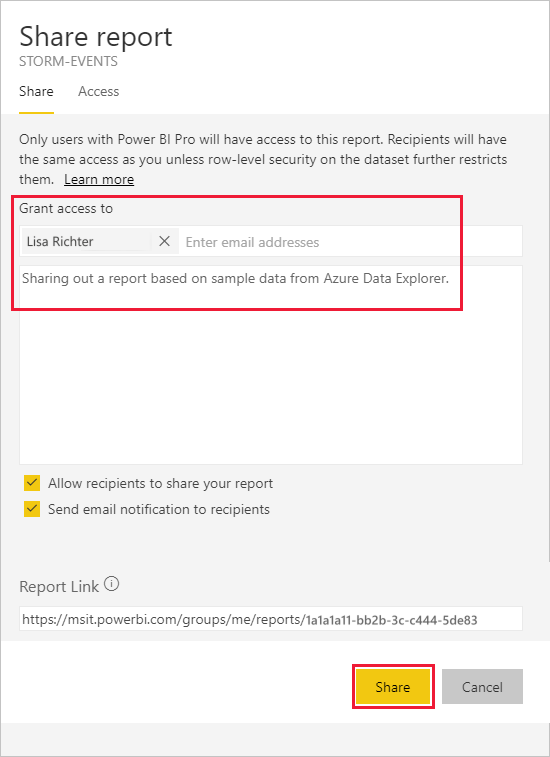
If your colleague has appropriate permissions, they can access the report that you shared.
Clean up resources
If you don't want to keep the report you created, simply delete the storm-events.pbix file. If you want to remove the report you published, follow these steps.
Under My workspace, scroll down to REPORTS and find storm-events.
Select the ellipsis (. . .) next to storm-events, then select REMOVE.
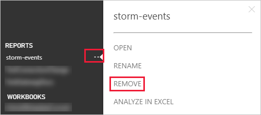
Confirm the removal.