View SAFe® progress, roadmaps, and metrics
Azure DevOps Services | Azure DevOps Server 2022 - Azure DevOps Server 2019
With team's configured and working backlogs and boards, you're ready to start viewing and monitoring progress.
Azure Boards provides many in-context charts and dashboard widgets that allow you to monitor and report on various SAFe® metrics. Specifically Azure Boards provides access to the following tools to support teams in deriving SAFe® metrics and monitoring and reporting progress.
- Roll up columns on backlogs
- In-context reports
- Managed query charts such as pie, bar, stacked bar, trend, and pivot
- Dashboard widgets
- Team and project dashboards
- Analytic Views to support Power BI reports
- OData queries to use with Power BI reports
For an overview of these tools, see About dashboards, charts, reports, & widgets. Another backlog tool is Forecast which teams can use in their iteration planning.
In this tutorial, we illustrate some of the out-of-the-box charts and widgets that you'll have instant access to monitor some of these key SAFe® metrics
- Progress reports
- Cumulative Flow Diagram
- Lead time and cycle time charts
- Iteration planning, team velocity, and forecast
Note
This article is one of a set of Scaled Agile Framework® tutorials that applies to Azure Boards and Azure DevOps Services. Most of the guidance is valid for both the cloud and on-premises versions. However, some of the features and procedures are specific to the cloud or the latest version of Azure DevOps Server.
View progress rollup
Quick progress views are available from each team's backlog through rollup columns. Here's an example that shows progress based on completion of child work items.
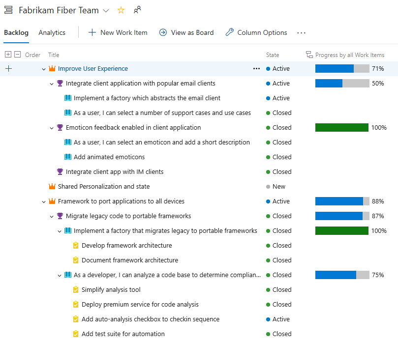
Other rollup options include progress by specific work item types, progress by story points, count of work items, or sum of a numeric field. For more information, see Display rollup progress or totals.
View team velocity
Each team has access to their velocity through the in-context velocity report. These reports show a bar chart count of planned, completed, completed late, and incomplete work items for the last six or more iterations. As shown in the example below, the chart also provides the average velocity calculated for the number of iterations shown.
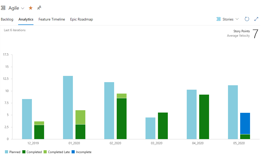
This average can be used to forecast work by plugging it into the forecast tool.
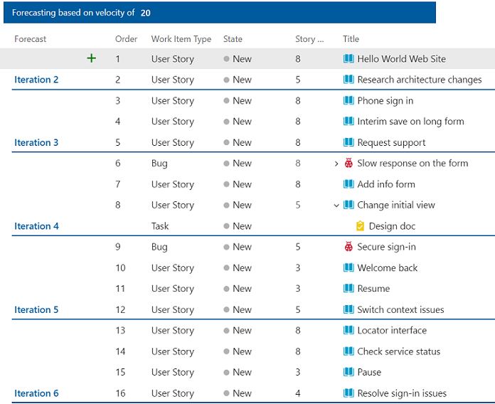
Use the Forecast tool
By assigning Story Points to each User Story, a team can determine how much work they can complete using the Forecast tool. For details on its usage, see Forecast your product backlog.
View the Cumulative Flow Diagram (CFD)
Each Azure Boards backlog and board provide configurable CFD views. So each team at every level of SAFe® implementation can monitor progress using these built-in charts.
The following image shows an example CFD chart for User Stories with all columns displayed.
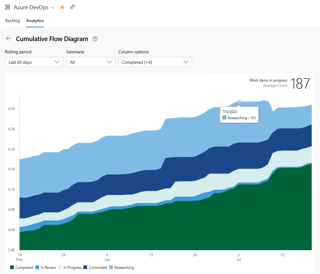
Teams can use their CFD to identify bottlenecks and monitor the batch size of work in their various states.
In-context CFD charts are quickly accessible from each backlog and board view. Also, CFD charts can be added to team and project dashboards. For more information, see View/configure a Cumulative Flow Diagram.
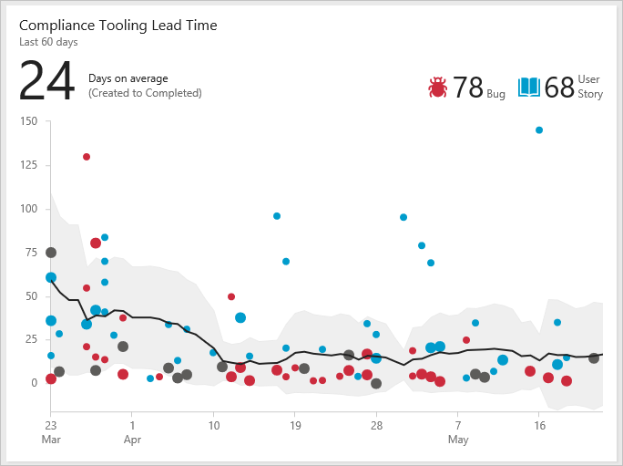
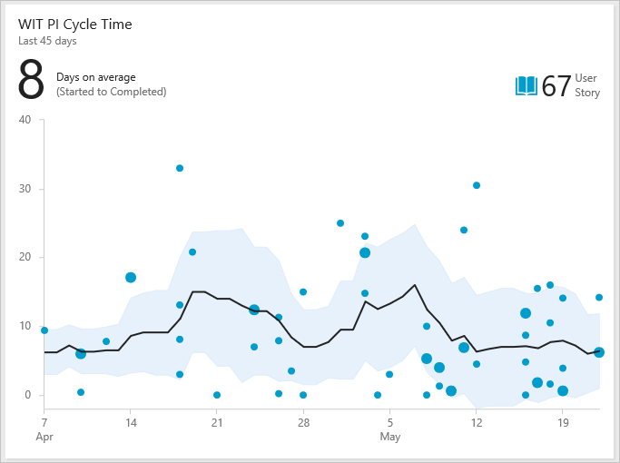
View Lead Time and Cycle Time charts
Other metrics that teams use are derived from the Lead time and cycle time charts. These charts can be added to a team dashboard and monitored to learn the following information:
- Lead time: Days on average to complete deliverables from date created
- Cycle time: Days on average to complete deliverables from date work started
- Number of outliers
Both Lead Time and Cycle Time widgets display as scatter-plot control charts. They display summary information and provide several interactive elements. For more information, see Cumulative flow, lead time, and cycle time guidance.
Example Lead Time widget
Example Cycle Time widget
View and update roadmaps
You can review roadmaps of SAFe® deliverables using the Delivery Plans, Feature Time, and Epic Roadmap tools. Delivery Plans are fully configurable to show the teams and work item types of interest.
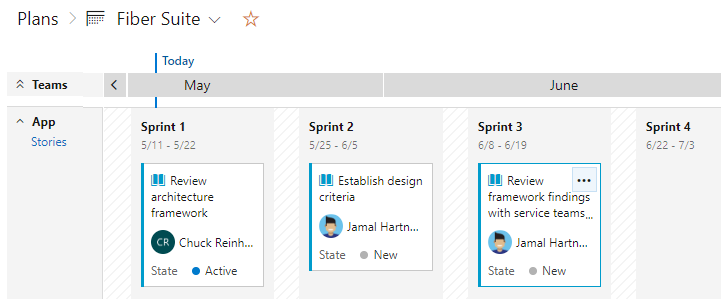
Review feature team Delivery Plans
Program teams can review roadmaps of the deliverables of their Agile Release Teams. As an example, the following image shows a snapshot of the Fiber Suite teams story deliverables.
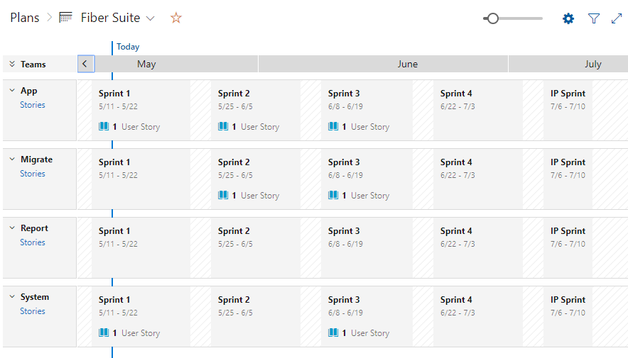
You can expand each feature team to see details. Story deliverables are assigned to the PI 1 sprints. Delivery Plans are fully interactive, allowing you to drag and drop work items to update their sprint assignments, or open work items to update fields, add comments, and other information.
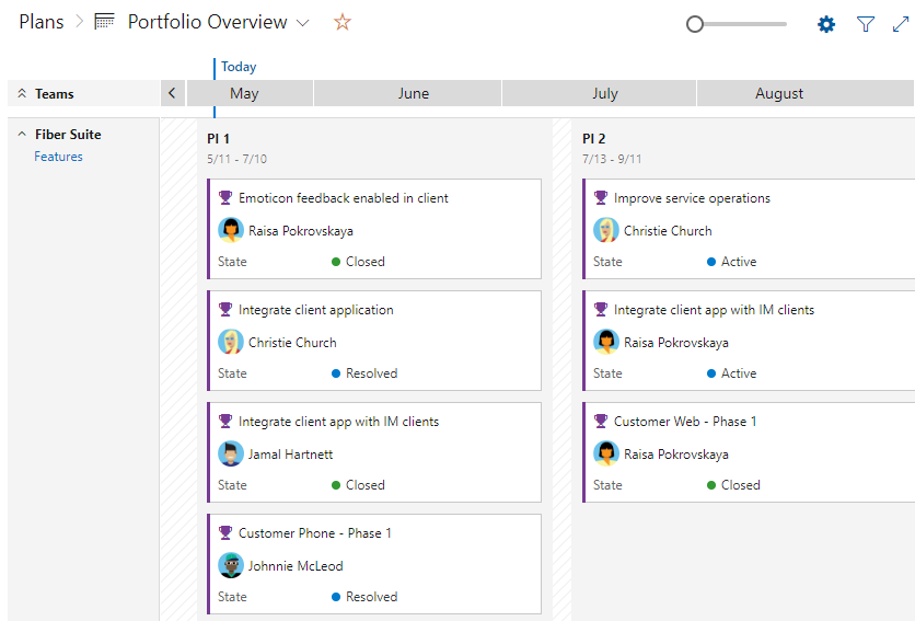
Review the portfolio features deliverable
Portfolio teams can review the Features under development by their program teams. For example, Features under development by the Fiber Suite team are shown in the following delivery plan view. The Features under development show up under the Program Increment timeboxes.
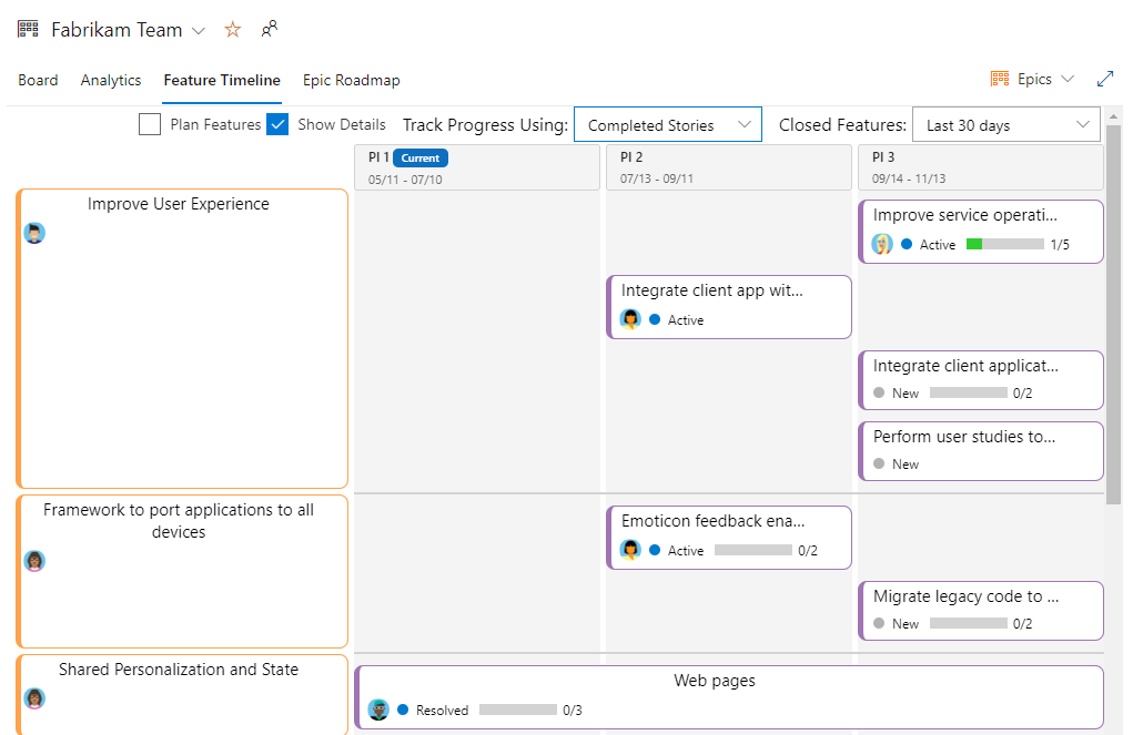
Review feature timeline roadmaps
The feature timeline tool provides another view into progress of deliverables. Here we show the Fabrikam Team's Epics as shown in the Feature Timeline tool. Progress bars are configurable based on completed stories or effort.