Visualize training results in studio (preview)
Explore your experimentation results with a dashboard. The dashboard contains a combination of different tiles – chart visualizations, comparison table, markdown, and more for a view that is dynamic, flexible, and customizable for you to explore your experimentation results.
The dashboard will help you save time, keep your results organized, and make informed decisions such as whether to re-train or deploy your model.
This article will show you how to use and customize your dashboard with the following tasks:
- Explore the dashboard view.
- Change job colors.
- Visualize training jobs.
- Add charts.
- Edit charts.
- Compare training jobs using the compare tile.
- Monitor your resources across jobs.
- Add markdown tile.
- Create and save custom views.
Tip
- If you're looking for information on using the Azure Machine Learning SDK v1 or CLI v1, see How to track, monitor, and analyze jobs (v1).
- If you're looking for information on monitoring training jobs from the CLI or SDK v2, see Track experiments with MLflow and CLI v2.
- If you're looking for information on monitoring the Azure Machine Learning service and associated Azure services, see How to monitor Azure Machine Learning.
- If you're looking for information on monitoring models deployed to online endpoints, see Monitor online endpoints.
Important
Items marked (preview) in this article are currently in public preview. The preview version is provided without a service level agreement, and it's not recommended for production workloads. Certain features might not be supported or might have constrained capabilities. For more information, see Supplemental Terms of Use for Microsoft Azure Previews.
Prerequisites
You'll need the following items:
-
To use Azure Machine Learning, you need a workspace. If you don't have one, complete Create resources you need to get started to create a workspace and learn more about using it.
Run one or more jobs in your workspace to have results available in the dashboard. Complete Tutorial: Train a model in Azure Machine Learning if you don't have any jobs yet.
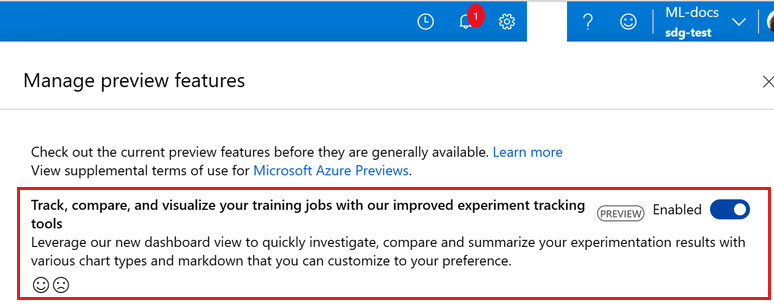
Enable this preview feature via the preview panel.
Explore the dashboard view
Next, let's view your jobs in the studio:
- Select Jobs on the left side navigation panel.
- Select either All experiments to view all the jobs in an experiment or select All jobs to view all the jobs submitted in the workspace.
You are now on the default dashboard view where you will find your job list consolidated into the left side bar and dashboard content on the right.
If you select a specific experiment, then you will automatically land into the Dashboard view.
Jobs list view
The left side bar is a collapsed view of your jobs list. You can filter, add columns, and pin columns by clicking the respective icon next to the search bar.
By pinning columns, you can simplify your list view to only show columns you pinned. You can also change the width on the jobs list to either view more or less.

For sweep and AutoML jobs, you can easily identify the best trial and best model with the Best label positioned next to the appropriate job display name. This will simplify comparisons across these jobs.
Sections
The dashboard is made up of sections that can be used to organize different tiles and information.
By default, you'll find all of your logged training metrics in Custom metrics section and resource usage in Resource metrics section.
You can perform the following actions:
- Update the section name by clicking on the pencil icon when hovering on the section name.
- Move sections up and down as well as remove sections that you no longer need.
- Hide/show tiles and order tiles in a section.

Tiles
Tiles are various forms of content such as line chart, bar chart, scatter plot, and markdown that can be added to a section to build a dashboard.
By default, the Custom metrics and Resource metrics sections will generate chart tiles for each of the metrics.
To easily find the tile with the metric you care most about, use the search bar to search for specific tiles based on metric names you logged.

Change job colors
Each job that is visualized in your dashboard is assigned a color by default from the system color palette.
You can either stick to the colors assigned or take advantage of the color picker to easily change between the colors of the jobs displayed in the charts.
To open the color picker, select the colored dot next to the job and change color via the palette, RGB, or hex code.

Visualize jobs
Select the eye icon to show or hide jobs in the dashboard view and narrow down to results that matter most to you. This provides flexibility for you to maintain your job list and explore different groups of jobs to visualize.
To reduce the list to show only jobs that are visualized in the dashboard, click on the eye at the top to Show only visualize.
To reset and start choosing a new set of jobs to visualize, you can click on the eye at the top to Visualize None to remove all jobs from surfacing in the dashboard. Then go ahead and select the new set of jobs.

Add charts
Create a custom chart to add to your dashboard view if you’re looking to plot a set of metrics or specific style. Azure Machine Learning studio supports line, bar, scatter, and parallel coordinates charts for you to add to your view.

Edit charts
Add data smoothing, ignore outliers, and change the x-axis for all the charts in your dashboard view through the global chart editor.
Perform these actions for an individual chart as well by selecting the pencil icon to customize specific charts to your desired preference. You can also edit the style of the line type and marker for line and scatter charts respectively.

Compare your training jobs using Compare Tile
Compare the logged metrics, parameters, and tags between your visualized jobs side-by-side in this comparison table. By default, there will be baseline set by the system to easily view the delta between metric values across jobs.
Change the baseline by hovering over the display name and clicking on the “baseline” icon. Show differences only will reduce the rows in the table to only surface rows that have different values so you can easily spot what factors contributed to the results.
Monitor your resources across jobs
Scroll down to the Resource metrics section to view your resource usage across jobs. This view provides insights on your job's resources on a 30 day rolling basis.
Note
This view supports only compute that is managed by Azure Machine Learning. Jobs with a runtime of less than 5 minutes will not have enough data to populate this view.
Add markdown tile
Add markdown tiles to your dashboard view to summarize insights, add comments, take notes, and more. This is a great way for you to provide additional context and references for yourself and your team if you share this view.

Create and save custom views
After applying changes to your jobs list and dashboard, save all these customizations as a Custom View so you can easily return to work. Select View options > Save as new view to save a custom view.
Users with workspace permissions can edit or view the custom view. Also, share the custom view with team members for enhanced collaboration by selecting Share view.
Note
You cannot save changes to the Default view, but you can save them into your own Custom view. Manage your views from View options to create new, edit existing, rename, or delete them.

Next steps
- To learn how to organize and track your training jobs, see Organize & track training jobs.
- To learn how to log metrics for your experiments, see Log metrics during training jobs.
- To learn how to monitor resources and logs from Azure Machine Learning, see Monitoring Azure Machine Learning.