Note
Access to this page requires authorization. You can try signing in or changing directories.
Access to this page requires authorization. You can try changing directories.
APPLIES TO: Composer v1.x and v2.x
Cards let you create bots that can communicate with users in various ways. You can think of a card as an object with a standard set of rich user controls that you can choose from to communicate with and gather input from users. There are times when you need messages that are plain text only, and there are times when you need richer message content, like images, animated GIFs, video clips, audio clips, and buttons. If you're new to the concept of cards, it might be helpful to read the Cards section of the design the user experience article.
The structured response template
All of the Bot Responses are defined in a .lg file that is exposed in Composer in the Bot Responses page. Templates are the core element of an .lg file and there are three types of templates that can be used in .lg files: simple response, conditional response and structured response templates. Cards are defined using the structured response template format.
A structured response template for cards consists of the following elements:
# TemplateName
[Card-name
    title = title of the card
    subtitle = subtitle of the card
    text = description of the card
    image = url of your image
    buttons = name of the button you want to show in the card
]
| Template Component | Description |
|---|---|
| # TemplateName | The template name. Always starts with "#". This is used when invoking the card. |
| [ ] | The entire template is contained within square brackets. |
| Card-name | The name of the type of card being referenced. |
| title | The title that will appear in the card when displayed to the user. |
| subtitle | The subtitle that will appear in the card when displayed to the user. |
| text | The text that will appear in the card when displayed to the user. |
| image | The url pointing to the image that will appear in the card when displayed to the user. |
| buttons | Name of the button you want to show in the card. |
Additional resources for structured response templates
- The structured response template section of the .lg file format article.
- For more information on language generation in general, you can refer to the language generation concept article.
Card types
Composer currently supports the following card types:
| Card type | Description |
|---|---|
| Hero card | A card that typically contains a single large image, one or more buttons, and simple text. |
| Thumbnail card | A card that typically contains a single thumbnail image, one or more buttons, and simple text. |
| Sign-in card | A card that requests a user to sign in. It typically contains text and one or more buttons that the user can click to initiate the sign-in process. |
| Animation card | A card that can play animated GIFs or short videos. |
| Video card | A card that can play a video file. |
| Audio card | A card that can play an audio file. |
| Adaptive Card | A customizable card that can contain any combination of text, speech, images, buttons, and input fields. |
The Responding with Cards example
This section is an introduction to the Responding with Cards example (sample bot) that is used in this article to explain how to incorporate cards into your bot using Composer.
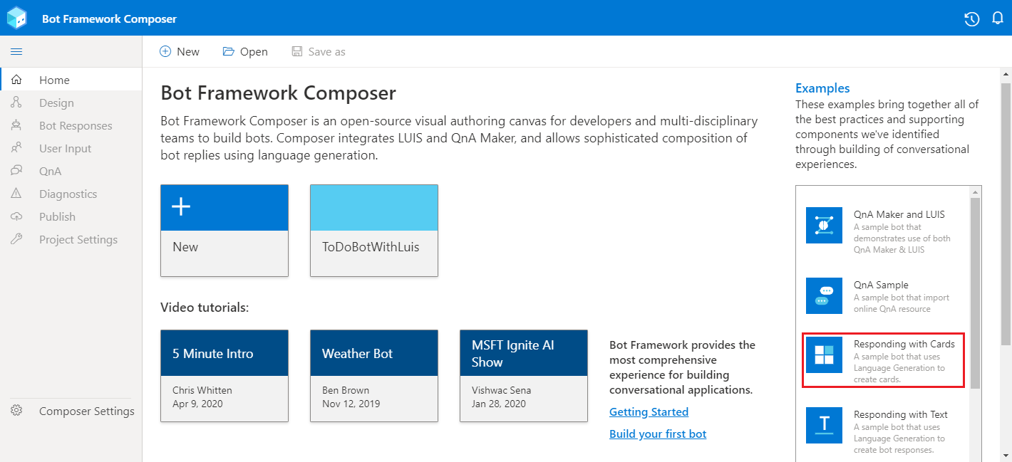
Do the following to get the Responding with Cards example running in Composer:
To see a card template in a sample bot:
Clone the Bot Builder samples GitHub repository onto your machine.
Within the
composer-samplesfolder, you'll find C# and JavaScript projects, choose a language and navigate into theprojectssubfolder.In this folder, locate the
RespondingWithCardsSampleproject and open it in Composer.Select Start Bot and then Open in Web Chat to explore the sample interactively.
Select Create from the navigation pane.
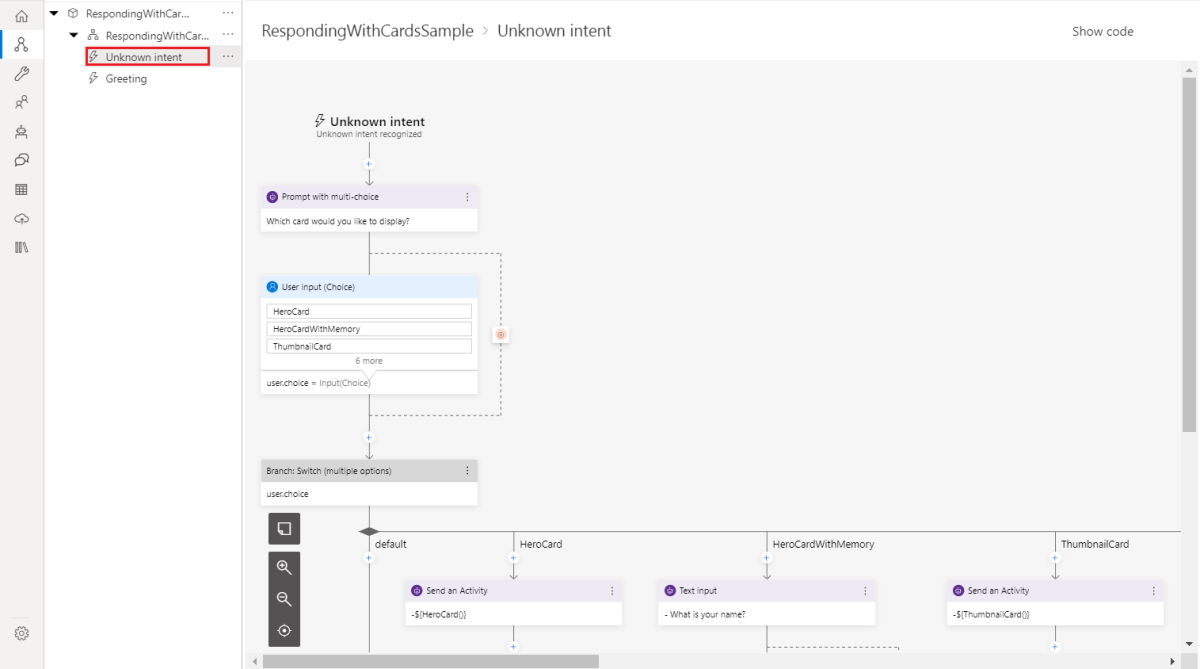
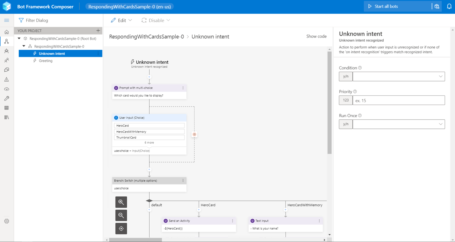
Select the Unknown intent trigger in the main dialog to get an idea of how this sample works.
Note
In this sample, the Unknown intent trigger contains a Prompt with multi-choice action (from the Ask a question menu) where the User Input list style is set to list, and the user's selection is stored into the
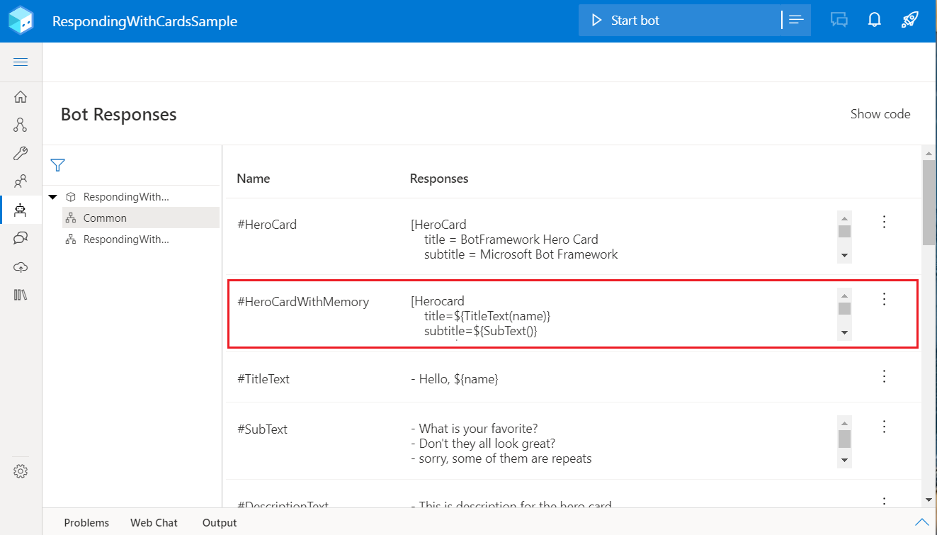
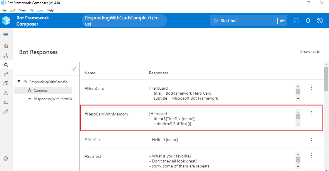
user.choiceproperty. Theuser.choiceproperty is passed to the next action, which is a Branch: Switch (multiple options) action (from the Create a condition menu). The item that the user selects from the list will determine which flow is taken.For example, if HeroCardWithMemory is selected, HeroCardWithMemory() is called, which calls the HeroCardWithMemory template in the .lg file that can be found by selecting Bot Responses from the navigation pane as shown in the following image.
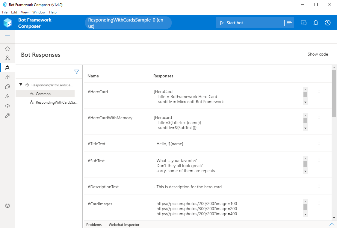
Select Bot Responses from the navigation pane to see the templates that are called when the user selects one of the items from the choices they're presented with when the Prompt with multi-choice action executes. You'll be referring to these templates throughout this article as each card is discussed in detail.
Define rich cards
Each of the sections below will detail how each card is defined as a structured response template in the .lg file that is exposed in Composer in the Bot Responses page.
Note
LG provides some variability in card definition, which will eventually be converted to be aligned with the SDK card definition. For example, both the image and images fields are supported in all the card definitions in LG even though only images are supported in the SDK card definition. For HeroCard and Thumbnail cards in LG, the values defined in either image or images field will be converted to an images list. For the other types of cards, the last defined value will be assigned to the image field. The values you assign to the image/images field can be in one of the following formats: string, adaptive expression, or array in the format using |. Read more here.
Hero card
A hero card is a basic card type that allows you to combine images, text and interactive elements such as buttons in one object and present a mixture of them to the user. A hero card is defined using a structured template as follows:
# HeroCard
[HeroCard
    title = BotFramework Hero Card
    subtitle = Microsoft Bot Framework
    text = Build and connect intelligent bots to interact with your users naturally wherever they are, from text/sms to Skype, Slack, Office 365 mail and other popular services.
    image = https://sec.ch9.ms/ch9/7ff5/e07cfef0-aa3b-40bb-9baa-7c9ef8ff7ff5/buildreactionbotframework_960.jpg
    buttons = ${cardActionTemplate('imBack', 'Show more cards', 'Show more cards')}
]

This example of hero card will enable your bot to send an image from a designated URL back to users when an event to send a hero card is triggered. The hero card will include a button to show more cards when pressed.
Hero card with memory
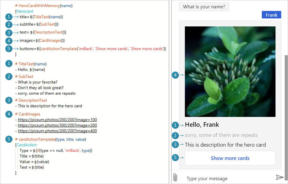
A HeroCardWithMemory is a hero card that demonstrates how to call simple response templates in the .lg file just as you would call a function.
# HeroCardWithMemory(name)
[Herocard
    title=${TitleText(name)}
    subtitle=${SubText()}
    text=${DescriptionText()}
    images=${CardImages()}
    buttons=${cardActionTemplate('imBack', 'Show more cards', 'Show more cards')}
]
If you look in the Bot Responses page, you'll see where the values come from that populate the hero card:
Thumbnail card
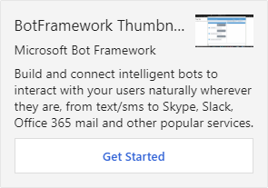
A thumbnail card is another type of basic card that combines a mixture of images, text and buttons. Unlike hero cards, which present designated images in a large banner, thumbnail cards present images as thumbnail. They typically contain a single thumbnail image, one or more buttons, and simple text. A thumbnail card is defined using a structured template as follows:
# ThumbnailCard
[ThumbnailCard
    title = BotFramework Thumbnail Card
    subtitle = Microsoft Bot Framework
    text = Build and connect intelligent bots to interact with your users naturally wherever they are, from text/sms to Skype, Slack, Office 365 mail and other popular services.
    image = https://sec.ch9.ms/ch9/7ff5/e07cfef0-aa3b-40bb-9baa-7c9ef8ff7ff5/buildreactionbotframework_960.jpg
    buttons = Get Started
]
Sign-in card
A sign-in card is a card that requests a user to sign in. A sign-in card is defined using a structured template as follows:
# SigninCard
[SigninCard
    text = BotFramework Sign-in Card
    buttons = ${cardActionTemplate('signin', 'Sign in', 'https://login.microsoftonline.com/')}
]

Animation card
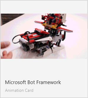
Animation cards contain animated image content (such as .gif files). Typically this content doesn't contain sound, and is presented with minimal transport controls (like pause or play), or no transport controls at all. Animation cards follow all shared rules defined for transport controls (like rewind, restart, pause, and play). Video cards follow all shared rules defined for Media cards. An animation card is defined using structured template as follows:
# AnimationCard
[AnimationCard
    title = Microsoft Bot Framework
    subtitle = Animation Card
    image = https://learn.microsoft.com/bot-framework/media/v1x/how-it-works/architecture-resize.png
    media = http://i.giphy.com/Ki55RUbOV5njy.gif
]
Video card
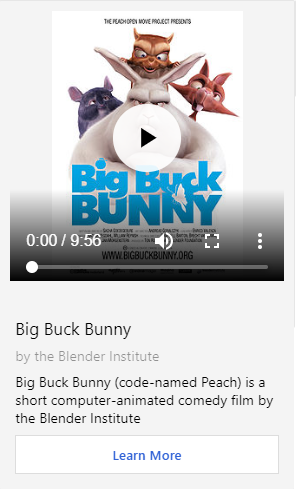
Video cards contain video content in video format such as .mp4. Typically this content is presented to the user with advanced transport controls (like rewind, restart, pause, and play). Video cards follow all shared rules defined for Media cards. A video card is defined using structured template as follows:
# VideoCard
[VideoCard
    title = Big Buck Bunny
    subtitle = by the Blender Institute
    text = Big Buck Bunny (code-named Peach) is a short computer-animated comedy film by the Blender Institute
    image = https://upload.wikimedia.org/wikipedia/commons/thumb/c/c5/Big_buck_bunny_poster_big.jpg/220px-Big_buck_bunny_poster_big.jpg
    media = http://download.blender.org/peach/bigbuckbunny_movies/BigBuckBunny_320x180.mp4
    buttons = Learn More
]
Audio card
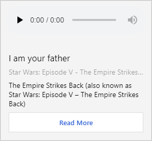
Audio cards contain audio content in audio formats such as .mp3 and .wav. Audio cards follow all shared rules defined for Media cards. An audio card is defined using a structured template as follows:
# AudioCard
[AudioCard
    title = I am your father
    subtitle = Star Wars: Episode V - The Empire Strikes Back
    text = The Empire Strikes Back (also known as Star Wars: Episode V - The Empire Strikes Back)
    image = https://upload.wikimedia.org/wikipedia/en/3/3c/SW_-_Empire_Strikes_Back.jpg
    media = http://www.wavlist.com/movies/004/father.wav
    buttons = Read More
]
Adaptive Card
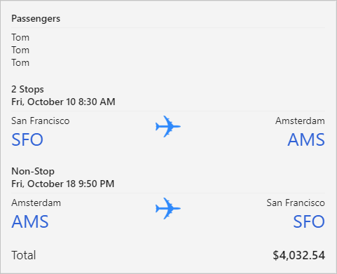
Adaptive Cards is a card exchange format adopted by Composer that lets developers define their card content in a common and consistent way using JSON. Once defined, the Adaptive Card can be used in any supported channel, automatically adapting to the look and feel of the host.
Adaptive Cards not only support custom text formatting; they also support the use of containers, speech, images, buttons, customizable backgrounds, user input controls for dates, numbers, text, and even customizable drop-down lists.
An Adaptive Card is defined as follows:
# AdaptiveCard
[Activity
    Attachments = ${json(adaptivecardjson())}
]
This tells Composer that it's referencing a template named adaptivecardjson that is in the JSON format. If you look in the Bot Responses, you'll see that template. The following is the template used to generate the Adaptive Card:
{
  "$schema": "http://adaptivecards.io/schemas/adaptive-card.json",
  "version": "1.0",
  "type": "AdaptiveCard",
  "speak": "Your flight is confirmed for you and 3 other passengers from San Francisco to Amsterdam on Friday, October 10 8:30 AM",
  "body": [
    {
      "type": "TextBlock",
      "text": "Passengers",
      "weight": "bolder",
      "isSubtle": false
    },
    {
      "type": "TextBlock",
      "text": "${PassengerName()}",
      "separator": true
    },
    {
      "type": "TextBlock",
      "text": "${PassengerName()}",
      "spacing": "none"
    },
    {
      "type": "TextBlock",
      "text": "${PassengerName()}",
      "spacing": "none"
    },
    {
      "type": "TextBlock",
      "text": "2 Stops",
      "weight": "bolder",
      "spacing": "medium"
    },
    {
      "type": "TextBlock",
      "text": "Fri, October 10 8:30 AM",
      "weight": "bolder",
      "spacing": "none"
    },
    {
      "type": "ColumnSet",
      "separator": true,
      "columns": [
        {
          "type": "Column",
          "width": 1,
          "items": [
            {
              "type": "TextBlock",
              "text": "San Francisco",
              "isSubtle": true
            },
            {
              "type": "TextBlock",
              "size": "extraLarge",
              "color": "accent",
              "text": "SFO",
              "spacing": "none"
            }
          ]
        },
        {
          "type": "Column",
          "width": "auto",
          "items": [
            {
              "type": "TextBlock",
              "text": " "
            },
            {
              "type": "Image",
              "url": "http://adaptivecards.io/content/airplane.png",
              "size": "small",
              "spacing": "none"
            }
          ]
        },
        {
          "type": "Column",
          "width": 1,
          "items": [
            {
              "type": "TextBlock",
              "horizontalAlignment": "right",
              "text": "Amsterdam",
              "isSubtle": true
            },
            {
              "type": "TextBlock",
              "horizontalAlignment": "right",
              "size": "extraLarge",
              "color": "accent",
              "text": "AMS",
              "spacing": "none"
            }
          ]
        }
      ]
    },
    {
      "type": "TextBlock",
      "text": "Non-Stop",
      "weight": "bolder",
      "spacing": "medium"
    },
    {
      "type": "TextBlock",
      "text": "Fri, October 18 9:50 PM",
      "weight": "bolder",
      "spacing": "none"
    },
    {
      "type": "ColumnSet",
      "separator": true,
      "columns": [
        {
          "type": "Column",
          "width": 1,
          "items": [
            {
              "type": "TextBlock",
              "text": "Amsterdam",
              "isSubtle": true
            },
            {
              "type": "TextBlock",
              "size": "extraLarge",
              "color": "accent",
              "text": "AMS",
              "spacing": "none"
            }
          ]
        },
        {
          "type": "Column",
          "width": "auto",
          "items": [
            {
              "type": "TextBlock",
              "text": " "
            },
            {
              "type": "Image",
              "url": "http://adaptivecards.io/content/airplane.png",
              "size": "small",
              "spacing": "none"
            }
          ]
        },
        {
          "type": "Column",
          "width": 1,
          "items": [
            {
              "type": "TextBlock",
              "horizontalAlignment": "right",
              "text": "San Francisco",
              "isSubtle": true
            },
            {
              "type": "TextBlock",
              "horizontalAlignment": "right",
              "size": "extraLarge",
              "color": "accent",
              "text": "SFO",
              "spacing": "none"
            }
          ]
        }
      ]
    },
    {
      "type": "ColumnSet",
      "spacing": "medium",
      "columns": [
        {
          "type": "Column",
          "width": "1",
          "items": [
            {
              "type": "TextBlock",
              "text": "Total",
              "size": "medium",
              "isSubtle": true
            }
          ]
        },
        {
          "type": "Column",
          "width": 1,
          "items": [
            {
              "type": "TextBlock",
              "horizontalAlignment": "right",
              "text": "$4,032.54",
              "size": "medium",
              "weight": "bolder"
            }
          ]
        }
      ]
    }
  ]
}
Adaptive Card references
All cards
The #AllCards template displays all of the cards as Attachments in an Activity object.
# AllCards
[Activity
        Attachments = ${HeroCard()} | ${ThumbnailCard()} | ${SigninCard()} | ${AnimationCard()} | ${VideoCard()} | ${AudioCard()} | ${AdaptiveCard()}
        AttachmentLayout = ${AttachmentLayoutType()}
]
Additional information
- Information about language generation in Composer
- Information about connections in Composer
- The structured response template reference
- The Bot Framework Cards schema
- How to send media attachments with the Bot Framework SDK
