Position and layout of controls (Windows Forms .NET)
Control placement in Windows Forms is determined not only by the control, but also by the parent of the control. This article describes the different settings provided by controls and the different types of parent containers that affect layout.
Fixed position and size
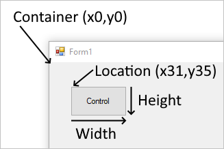
The position a control appears on a parent is determined by the value of the Location property relative to the top-left of the parent surface. The top-left position coordinate in the parent is (x0,y0). The size of the control is determined by the Size property and represents the width and height of the control.
When a control is added to a parent that enforces automatic placement, the position and size of the control is changed. In this case, the position and size of the control may not be manually adjusted, depending on the type of parent.
The MaximumSize and MinimumSize properties help set the minimum and maximum space a control can use.
Margin and Padding
There are two control properties that help with precise placement of controls: Margin and Padding.
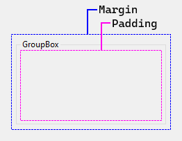
The Margin property defines the space around the control that keeps other controls a specified distance from the control's borders.
The Padding property defines the space in the interior of a control that keeps the control's content (for example, the value of its Text property) a specified distance from the control's borders.
The following figure shows the Margin and Padding properties on a control.
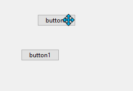
The Visual Studio Designer will respect these properties when you're positioning and resizing controls. Snaplines appear as guides to help you remain outside the specified margin of a control. For example, Visual Studio displays the snapline when you drag a control next to another control:
Automatic placement and size
Controls can be automatically placed within their parent. Some parent containers force placement while others respect control settings that guide placement. There are two properties on a control that help automatic placement and size within a parent: Dock and Anchor.
Drawing order can affect automatic placement. The order in which a control is drawn determined by the control's index in the parent's Controls collection. This index is known as the Z-order. Each control is drawn in the reverse order they appear in the collection. Meaning, the collection is a first-in-last-drawn and last-in-first-drawn collection.
The MinimumSize and MaximumSize properties help set the minimum and maximum space a control can use.
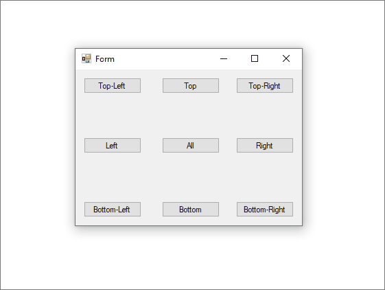
Dock
The Dock property sets which border of the control is aligned to the corresponding side of the parent, and how the control is resized within the parent.
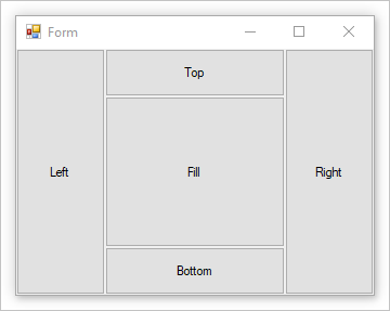
When a control is docked, the container determines the space it should occupy and resizes and places the control. The width and height of the control are still respected based on the docking style. For example, if the control is docked to the top, the Height of the control is respected but the Width is automatically adjusted. If a control is docked to the left, the Width of the control is respected but the Height is automatically adjusted.
The Location of the control can't be manually set as docking a control automatically controls its position.
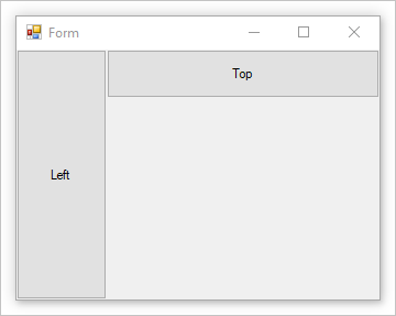
The Z-order of the control does affect docking. As docked controls are laid out, they use what space is available to them. For example, if a control is drawn first and docked to the top, it will take up the entire width of the container. If a next control is docked to the left, it has less vertical space available to it.
If the control's Z-order is reversed, the control that is docked to the left now has more initial space available. The control uses the entire height of the container. The control that is docked to the top has less horizontal space available to it.
As the container grows and shrinks, the controls docked to the container are repositioned and resized to maintain their applicable positions and sizes.
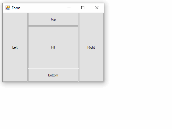
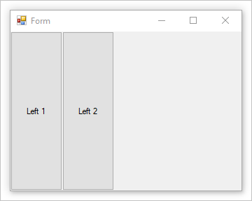
If multiple controls are docked to the same side of the container, they're stacked according to their Z-order.
Anchor
Anchoring a control allows you to tie the control to one or more sides of the parent container. As the container changes in size, any child control will maintain its distance to the anchored side.
A control can be anchored to one or more sides, without restriction. The anchor is set with the Anchor property.
Automatic sizing
The AutoSize property enables a control to change its size, if necessary, to fit the size specified by the PreferredSize property. You adjust the sizing behavior for specific controls by setting the AutoSizeMode property.
Only some controls support the AutoSize property. In addition, some controls that support the AutoSize property also supports the AutoSizeMode property.
| Always true behavior | Description |
|---|---|
| Automatic sizing is a run-time feature. | This means it never grows or shrinks a control and then has no further effect. |
| If a control changes size, the value of its Location property always remains constant. | When a control's contents cause it to grow, the control grows toward the right and downward. Controls do not grow to the left. |
The Dock and Anchor properties are honored when AutoSize is true. |
The value of the control's Location property is adjusted to the correct value. The Label control is the exception to this rule. When you set the value of a docked Label control's AutoSize property to true, the Label control will not stretch. |
| A control's MaximumSize and MinimumSize properties are always honored, regardless of the value of its AutoSize property. | The MaximumSize and MinimumSize properties are not affected by the AutoSize property. |
| There is no minimum size set by default. | This means that if a control is set to shrink under AutoSize and it has no contents, the value of its Size property is (0x,0y). In this case, your control will shrink to a point, and it will not be readily visible. |
| If a control does not implement the GetPreferredSize method, the GetPreferredSize method returns last value assigned to the Size property. | This means that setting AutoSize to true will have no effect. |
| A control in a TableLayoutPanel cell always shrinks to fit in the cell until its MinimumSize is reached. | This size is enforced as a maximum size. This is not the case when the cell is part of an AutoSize row or column. |
AutoSizeMode property
The AutoSizeMode property provides more fine-grained control over the default AutoSize behavior. The AutoSizeMode property specifies how a control sizes itself to its content. The content, for example, could be the text for a Button control or the child controls for a container.
The following list shows the AutoSizeMode values and its behavior.
-
The control grows or shrinks to encompass its contents.
The MinimumSize and MaximumSize values are honored, but the current value of the Size property is ignored.
This is the same behavior as controls with the AutoSize property and no
AutoSizeModeproperty. -
The control grows as much as necessary to encompass its contents, but it will not shrink smaller than the value specified by its Size property.
This is the default value for
AutoSizeMode.
Controls that support the AutoSize property
The following table describes the level of auto sizing support by control:
| Control | AutoSize supported |
AutoSizeMode supported |
|---|---|---|
| Button | ✔️ | ✔️ |
| CheckedListBox | ✔️ | ✔️ |
| FlowLayoutPanel | ✔️ | ✔️ |
| Form | ✔️ | ✔️ |
| GroupBox | ✔️ | ✔️ |
| Panel | ✔️ | ✔️ |
| TableLayoutPanel | ✔️ | ✔️ |
| CheckBox | ✔️ | ❌ |
| DomainUpDown | ✔️ | ❌ |
| Label | ✔️ | ❌ |
| LinkLabel | ✔️ | ❌ |
| MaskedTextBox | ✔️ | ❌ |
| NumericUpDown | ✔️ | ❌ |
| RadioButton | ✔️ | ❌ |
| TextBox | ✔️ | ❌ |
| TrackBar | ✔️ | ❌ |
| CheckedListBox | ❌ | ❌ |
| ComboBox | ❌ | ❌ |
| DataGridView | ❌ | ❌ |
| DateTimePicker | ❌ | ❌ |
| ListBox | ❌ | ❌ |
| ListView | ❌ | ❌ |
| MaskedTextBox | ❌ | ❌ |
| MonthCalendar | ❌ | ❌ |
| ProgressBar | ❌ | ❌ |
| PropertyGrid | ❌ | ❌ |
| RichTextBox | ❌ | ❌ |
| SplitContainer | ❌ | ❌ |
| TabControl | ❌ | ❌ |
| TabPage | ❌ | ❌ |
| TreeView | ❌ | ❌ |
| WebBrowser | ❌ | ❌ |
| ScrollBar | ❌ | ❌ |
AutoSize in the design environment
The following table describes the sizing behavior of a control at design time, based on the value of its AutoSize and AutoSizeMode properties.
Override the SelectionRules property to determine whether a given control is in a user-resizable state. In the following table, "can't resize" means Moveable only, "can resize" means AllSizeable and Moveable.
AutoSize setting |
AutoSizeMode setting |
Behavior |
|---|---|---|
true |
Property not available. | The user can't resize the control at design time, except for the following controls: - TextBox - MaskedTextBox - RichTextBox - TrackBar |
true |
GrowAndShrink | The user can't resize the control at design time. |
true |
GrowOnly | The user can resize the control at design time. When the Size property is set, the user can only increase the size of the control. |
false or AutoSize is hidden |
Not applicable. | User can resize the control at design time. |
Note
To maximize productivity, the Windows Forms Designer in Visual Studio shadows the AutoSize property for the Form class. At design time, the form behaves as though the AutoSize property is set to false, regardless of its actual setting. At runtime, no special accommodation is made, and the AutoSize property is applied as specified by the property setting.
Container: Form
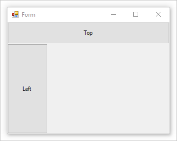
The Form is the main object of Windows Forms. A Windows Forms application will usually have a form displayed at all times. Forms contain controls and respect the Location and Size properties of the control for manual placement. Forms also respond to the Dock property for automatic placement.
Most of the time a form will have grips on the edges that allow the user to resize the form. The Anchor property of a control will let the control grow and shrink as the form is resized.
Container: Panel
The Panel control is similar to a form in that it simply groups controls together. It supports the same manual and automatic placement styles that a form does. For more information, see the Container: Form section.
A panel blends in seamlessly with the parent, and it does cut off any area of a control that falls out of bounds of the panel. If a control falls outside the bounds of the panel and AutoScroll is set to true, scroll bars appear and the user can scroll the panel.
Unlike the group box control, a panel doesn't have a caption and border.
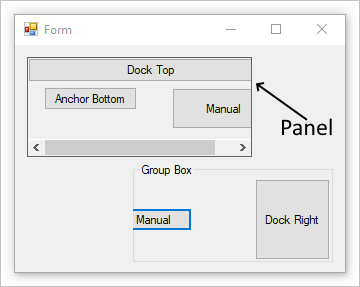
The image above has a panel with the BorderStyle property set to demonstrate the bounds of the panel.
Container: Group box
The GroupBox control provides an identifiable grouping for other controls. Typically, you use a group box to subdivide a form by function. For example, you may have a form representing personal information and the fields related to an address would be grouped together. At design time, it's easy to move the group box around along with its contained controls.
The group box supports the same manual and automatic placement styles that a form does. For more information, see the Container: Form section. A group box also cuts off any portion of a control that falls out of bounds of the panel.
Unlike the panel control, a group box doesn't have the capability to scroll content and display scroll bars.
Container: Flow Layout
The FlowLayoutPanel control arranges its contents in a horizontal or vertical flow direction. You can wrap the control's contents from one row to the next, or from one column to the next. Alternately, you can clip instead of wrap its contents.
You can specify the flow direction by setting the value of the FlowDirection property. The FlowLayoutPanel control correctly reverses its flow direction in Right-to-Left (RTL) layouts. You can also specify whether the FlowLayoutPanel control's contents are wrapped or clipped by setting the value of the WrapContents property.
The FlowLayoutPanel control automatically sizes to its contents when you set the AutoSize property to true. It also provides a FlowBreak property to its child controls. Setting the value of the FlowBreak property to true causes the FlowLayoutPanel control to stop laying out controls in the current flow direction and wrap to the next row or column.
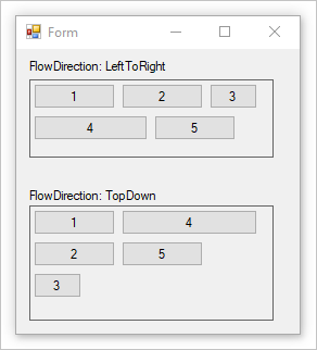
The image above has two FlowLayoutPanel controls with the BorderStyle property set to demonstrate the bounds of the control.
Container: Table layout
The TableLayoutPanel control arranges its contents in a grid. Because the layout is done both at design time and run time, it can change dynamically as the application environment changes. This gives the controls in the panel the ability to resize proportionally, so they can respond to changes such as the parent control resizing or text length changing because of localization.
Any Windows Forms control can be a child of the TableLayoutPanel control, including other instances of TableLayoutPanel. This allows you to construct sophisticated layouts that adapt to changes at run time.
You can also control the direction of expansion (horizontal or vertical) after the TableLayoutPanel control is full of child controls. By default, the TableLayoutPanel control expands downward by adding rows.
You can control the size and style of the rows and columns by using the RowStyles and ColumnStyles properties. You can set the properties of rows or columns individually.
The TableLayoutPanel control adds the following properties to its child controls: Cell, Column, Row, ColumnSpan, and RowSpan.
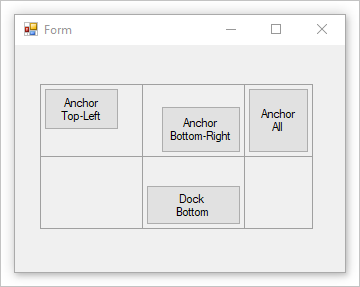
The image above has a table with the CellBorderStyle property set to demonstrate the bounds of each cell.
Container: Split container
The Windows Forms SplitContainer control can be thought of as a composite control; it's two panels separated by a movable bar. When the mouse pointer is over the bar, the pointer changes shape to show that the bar is movable.
With the SplitContainer control, you can create complex user interfaces; often, a selection in one panel determines what objects are shown in the other panel. This arrangement is effective for displaying and browsing information. Having two panels lets you aggregate information in areas, and the bar, or "splitter," makes it easy for users to resize the panels.
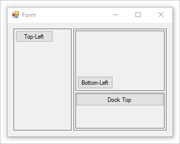
The image above has a split container to create a left and right pane. The right pane contains a second split container with the Orientation set to Vertical. The BorderStyle property is set to demonstrate the bounds of each panel.
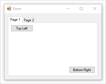
Container: Tab control
The TabControl displays multiple tabs, like dividers in a notebook or labels in a set of folders in a filing cabinet. The tabs can contain pictures and other controls. Use the tab control to produce the kind of multiple-page dialog box that appears many places in the Windows operating system, such as the Control Panel and Display Properties. Additionally, the TabControl can be used to create property pages, which are used to set a group of related properties.
The most important property of the TabControl is TabPages, which contains the individual tabs. Each individual tab is a TabPage object.
.NET Desktop feedback