Note
Access to this page requires authorization. You can try signing in or changing directories.
Access to this page requires authorization. You can try changing directories.
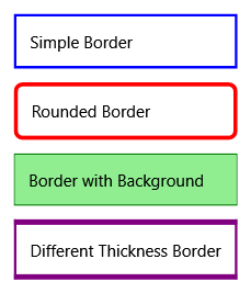
The Border control draws a border, background, or both around another element. Use Border to create a visual frame around content or to add spacing between UI elements.
| Title | Description |
|---|---|
| Animate a BorderThickness Value | Shows how to animate the thickness of a border to create dynamic visual effects. |
| Wrap a Border Around the Content of a Canvas | Demonstrates how to use a Border control to frame Canvas content. |
Styles and templates
The Border control inherits from Decorator and provides visual styling capabilities through its border and background properties.
Content property
The content property for this control is Child. This property allows you to place a single child element inside the border.
Parts
This control doesn't define any template parts.
Visual states
This control doesn't use visual states.
Key concepts
Understanding how Border works within the WPF layout system helps you create effective visual designs.
Border as a decorator
The Border control is a Decorator, which means it can contain only one child element. If you need to place multiple elements inside a border, wrap them in a panel such as StackPanel or Grid.
Border properties
Border provides several key properties for visual customization:
- BorderBrush - Sets the color or pattern of the border line.
- BorderThickness - Defines how thick the border appears on each side.
- Background - Fills the area inside the border with a color or pattern.
- CornerRadius - Creates rounded corners for a softer appearance.
- Padding - Adds space between the border and its child content.
Layout considerations
Border participates in the WPF layout system by measuring and arranging its single child element. The border's thickness and padding affect the final size calculations, so consider these values when designing your layout.
Examples
The following examples demonstrate common Border usage scenarios.
Basic border usage
The following XAML creates a simple border around a TextBox:
<Border BorderBrush="Black" BorderThickness="2" CornerRadius="5" Padding="5">
    <TextBox Text="Enter text here" />
</Border>
Styling with brushes
You can use gradients and other brushes to create more sophisticated border effects:
<Border BorderThickness="3" CornerRadius="10" Padding="10">
    <Border.BorderBrush>
        <LinearGradientBrush StartPoint="0,0" EndPoint="1,1">
            <GradientStop Color="Blue" Offset="0" />
            <GradientStop Color="LightBlue" Offset="1" />
        </LinearGradientBrush>
    </Border.BorderBrush>
    <Border.Background>
        <SolidColorBrush Color="LightGray" />
    </Border.Background>
    <TextBlock Text="Styled content" />
</Border>
Containing multiple elements
Since Border can only contain one child, use a panel to group multiple elements:
<Border BorderBrush="Gray" BorderThickness="1" CornerRadius="3" Padding="8">
    <StackPanel>
        <TextBlock Text="Title" FontWeight="Bold" />
        <TextBlock Text="Description text goes here." />
        <Button Content="Action" />
    </StackPanel>
</Border>
See also
Collaborate with us on GitHub
The source for this content can be found on GitHub, where you can also create and review issues and pull requests. For more information, see our contributor guide.
.NET Desktop feedback