Note
Access to this page requires authorization. You can try signing in or changing directories.
Access to this page requires authorization. You can try changing directories.
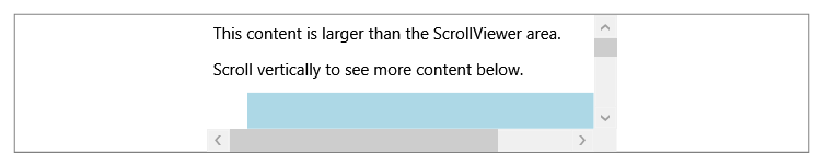
The ScrollViewer control creates a scrollable region wherein content can be scrolled horizontally or vertically. Content within a user interface is often larger than a computer screen's display area, and ScrollViewer provides a convenient way to enable scrolling of content in Windows Presentation Foundation (WPF) applications.
The ScrollViewer control encapsulates horizontal and vertical ScrollBar elements and a content container (such as a Panel element) to display other visible elements in a scrollable area. You can use the ScrollViewer element by itself because it's a composite control that encapsulates ScrollBar functionality.
The ScrollViewer control responds to both mouse and keyboard commands, and defines numerous methods with which to scroll content by predetermined increments. You can use the ScrollChanged event to detect a change in a ScrollViewer state.
A ScrollViewer can only have one child, typically a Panel element that can host a Children collection of elements. The Content property defines the sole child of the ScrollViewer.
Physical vs. logical scrolling
Physical scrolling is used to scroll content by a predetermined physical increment, typically by a value that's declared in pixels. Logical scrolling is used to scroll to the next item in the logical tree. Physical scrolling is the default scroll behavior for most Panel elements. WPF supports both types of scrolling.
The IScrollInfo interface
The IScrollInfo interface represents the main scrolling region within a ScrollViewer or derived control. The interface defines scrolling properties and methods that can be implemented by Panel elements that require scrolling by logical unit, rather than by a physical increment. Casting an instance of IScrollInfo to a derived Panel and then using its scrolling methods provides a useful way to scroll to the next logical unit in a child collection, rather than by pixel increment. By default, the ScrollViewer control supports scrolling by physical units.
StackPanel and VirtualizingStackPanel both implement IScrollInfo and natively support logical scrolling. For layout controls that natively support logical scrolling, you can still achieve physical scrolling by wrapping the host Panel element in a ScrollViewer and setting the CanContentScroll property to false.
The following code example demonstrates how to cast an instance of IScrollInfo to a StackPanel and use content scrolling methods (LineUp and LineDown) defined by the interface.
private void spLineUp(object sender, RoutedEventArgs e)
{
    ((IScrollInfo)sp1).LineUp();
}
private void spLineDown(object sender, RoutedEventArgs e)
{
    ((IScrollInfo)sp1).LineDown();
}
Private Sub spLineUp(ByVal sender As Object, ByVal args As RoutedEventArgs)

    CType(sp1, IScrollInfo).LineUp()
End Sub
Private Sub spLineDown(ByVal sender As Object, ByVal args As RoutedEventArgs)

    CType(sp1, IScrollInfo).LineDown()
End Sub
Example
The following example creates a ScrollViewer in a window that contains some text and a rectangle. ScrollBar elements appear only when they're necessary. When you resize the window, the ScrollBar elements appear and disappear, due to updated values of the ComputedHorizontalScrollBarVisibility and ComputedVerticalScrollBarVisibility properties.
// Create the application's main window
mainWindow = gcnew System::Windows::Window();
mainWindow->Title = "ScrollViewer Sample";

// Define a ScrollViewer
myScrollViewer = gcnew ScrollViewer();
myScrollViewer->HorizontalScrollBarVisibility = ScrollBarVisibility::Auto;

// Add Layout control
myStackPanel = gcnew StackPanel();
myStackPanel->HorizontalAlignment = HorizontalAlignment::Left;
myStackPanel->VerticalAlignment = VerticalAlignment::Top;

TextBlock^ myTextBlock = gcnew TextBlock();
myTextBlock->TextWrapping = TextWrapping::Wrap;
myTextBlock->Margin = System::Windows::Thickness(0, 0, 0, 20);
myTextBlock->Text = "Scrolling is enabled when it is necessary. Resize the Window, making it larger and smaller.";

Rectangle^ myRectangle = gcnew Rectangle();
myRectangle->Fill = Brushes::Red;
myRectangle->Width = 500;
myRectangle->Height = 500;

// Add child elements to the parent StackPanel
myStackPanel->Children->Add(myTextBlock);
myStackPanel->Children->Add(myRectangle);

// Add the StackPanel as the lone child of the ScrollViewer
myScrollViewer->Content = myStackPanel;

// Add the ScrollViewer as the Content of the parent Window object
mainWindow->Content = myScrollViewer;
mainWindow->Show();
// Create the application's main window
mainWindow = new Window ();
mainWindow.Title = "ScrollViewer Sample";

// Define a ScrollViewer
myScrollViewer = new ScrollViewer();
myScrollViewer.HorizontalScrollBarVisibility = ScrollBarVisibility.Auto;

// Add Layout control
myStackPanel = new StackPanel();
myStackPanel.HorizontalAlignment = HorizontalAlignment.Left;
myStackPanel.VerticalAlignment = VerticalAlignment.Top;

TextBlock myTextBlock = new TextBlock();
myTextBlock.TextWrapping = TextWrapping.Wrap;
myTextBlock.Margin = new Thickness(0, 0, 0, 20);
myTextBlock.Text = "Scrolling is enabled when it is necessary. Resize the Window, making it larger and smaller.";

Rectangle myRectangle = new Rectangle();
myRectangle.Fill = Brushes.Red;
myRectangle.Width = 500;
myRectangle.Height = 500;

// Add child elements to the parent StackPanel
myStackPanel.Children.Add(myTextBlock);
myStackPanel.Children.Add(myRectangle);

// Add the StackPanel as the lone child of the ScrollViewer
myScrollViewer.Content = myStackPanel;

// Add the ScrollViewer as the Content of the parent Window object
mainWindow.Content = myScrollViewer;
mainWindow.Show ();
'Define a ScrollViewer.
Dim myScrollViewer As New ScrollViewer
myScrollViewer.HorizontalScrollBarVisibility = ScrollBarVisibility.Auto

'Add Layout control.
Dim myStackPanel As New StackPanel
myStackPanel.HorizontalAlignment = System.Windows.HorizontalAlignment.Left
myStackPanel.VerticalAlignment = System.Windows.VerticalAlignment.Top

Dim myTextBlock As New TextBlock
myTextBlock.TextWrapping = TextWrapping.Wrap
myTextBlock.Margin = New Thickness(0, 0, 0, 20)
myTextBlock.Text = "Scrolling is enabled when it is necessary. Resize the Window, making it larger and smaller."

Dim myRectangle As New Rectangle
myRectangle.Fill = Brushes.Red
myRectangle.Width = 500
myRectangle.Height = 500

'Add child elements to the parent StackPanel.
myStackPanel.Children.Add(myTextBlock)
myStackPanel.Children.Add(myRectangle)

'Add the StackPanel as the lone child of the ScrollViewer
myScrollViewer.Content = myStackPanel

'Add the ScrollViewer as the Content of the parent Window object
Me.Content = myScrollViewer
<Page xmlns="http://schemas.microsoft.com/winfx/2006/xaml/presentation"
      xmlns:x="http://schemas.microsoft.com/winfx/2006/xaml"
      WindowTitle="ScrollViewer Sample">
  <ScrollViewer HorizontalScrollBarVisibility="Auto">
    <StackPanel VerticalAlignment="Top" HorizontalAlignment="Left">
      <TextBlock TextWrapping="Wrap" Margin="0,0,0,20">Scrolling is enabled when it is necessary.
      Resize the window, making it larger and smaller.</TextBlock>
      <Rectangle Fill="Red" Width="500" Height="500"></Rectangle>
    </StackPanel>
  </ScrollViewer>
</Page>
How-to topics
| Title | Description |
|---|---|
| Handle the ScrollChanged Event | Learn how to handle the ScrollChanged event in a ScrollViewer control. |
| Scroll Content by Using the IScrollInfo Interface | Learn how to scroll content by using the IScrollInfo interface. |
| Use the Content-Scrolling Methods of ScrollViewer | Learn how to use the content-scrolling methods of ScrollViewer. |
Styles and templates
This section describes the styles and templates for the ScrollViewer control. You can modify the default ControlTemplate to give the control a unique appearance. For more information, see What are styles and templates? and How to create a template for a control.
Content property
The Content property defines the sole child of the ScrollViewer.
Parts
The following table lists the named parts for the ScrollViewer control.
| Part | Type | Description |
|---|---|---|
| PART_HorizontalScrollBar | ScrollBar | The ScrollBar used to scroll the content horizontally. |
| PART_ScrollContentPresenter | ScrollContentPresenter | The placeholder for content in the ScrollViewer. |
| PART_VerticalScrollBar | ScrollBar | The ScrollBar used to scroll the content vertically. |
Visual states
The following table lists the visual states for the ScrollViewer control.
| VisualState Name | VisualStateGroup Name | Description |
|---|---|---|
| InvalidFocused | ValidationStates | The Validation.HasError attached property is true and the control has focus. |
| InvalidUnfocused | ValidationStates | The Validation.HasError attached property is true and the control doesn't have focus. |
| Valid | ValidationStates | The control uses the Validation class and the Validation.HasError attached property is false. |
Paginating documents
For document content, an alternative to scrolling is to choose a document container that supports pagination. FlowDocument is for documents that are designed to be hosted within a viewing control, such as FlowDocumentPageViewer, that supports paginating content across multiple pages, preventing the need for scrolling. DocumentViewer provides a solution for viewing FixedDocument content, which uses traditional scrolling to display content outside the realm of the display area.
For additional information about document formats and presentation options, see Documents in WPF.
See also
Collaborate with us on GitHub
The source for this content can be found on GitHub, where you can also create and review issues and pull requests. For more information, see our contributor guide.
.NET Desktop feedback