Note
Access to this page requires authorization. You can try signing in or changing directories.
Access to this page requires authorization. You can try changing directories.
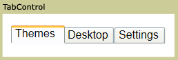
The TabControl displays content on discrete pages that you access by selecting the appropriate tab. The TabControl serves as a container that manages a collection of TabItem objects. Each TabItem represents both the clickable tab header and its associated content page.
Key concepts
The TabControl and TabItem controls work together to create a tabbed interface:
- TabControl: Acts as the container that manages tab selection, layout, and presentation. It handles user interactions like clicking tabs and displays the content of the currently selected tab.
- TabItem: Represents an individual tab within the TabControl. Each TabItem contains a header (the visible tab text or content) and content (what displays when you select the tab).
- Relationship: The TabControl's Items collection contains TabItem objects. When you select a TabItem, the TabControl displays that item's content and updates the visual state to show which tab is active.
For detailed information about individual tabs, see TabItem.
Styles and templates
This section describes the styles and templates for the TabControl control. You can modify the default ControlTemplate to give the control a unique appearance. For more information, see Styles and templates overview and Create a template for a control.
Content property
The TabControl uses the Items property as its content property. This property contains the collection of TabItem objects that represent the individual tabs and their associated content. When you add TabItem objects to this collection, they appear as selectable tabs in the TabControl interface.
Parts
The following table lists the named parts for the TabControl control.
| Part | Type | Description |
|---|---|---|
| PART_SelectedContentHost | ContentPresenter | The object that shows the content of the currently selected TabItem. |
When you create a ControlTemplate for a TabControl, your template might contain an ItemsPresenter within a ScrollViewer. (The ItemsPresenter displays each item in the TabControl; the ScrollViewer enables scrolling within the control). If the ItemsPresenter is not the direct child of the ScrollViewer, you must give the ItemsPresenter the name, ItemsPresenter.
Visual states
The following table lists the visual states for the TabControl control.
| VisualState Name | VisualStateGroup Name | Description |
|---|---|---|
| Normal | CommonStates | The default state. |
| Disabled | CommonStates | The control is disabled. |
| Valid | ValidationStates | The control uses the Validation class and the Validation.HasError attached property is false. |
| InvalidFocused | ValidationStates | The Validation.HasError attached property is true has the control has focus. |
| InvalidUnfocused | ValidationStates | The Validation.HasError attached property is true has the control does not have focus. |
See also
Collaborate with us on GitHub
The source for this content can be found on GitHub, where you can also create and review issues and pull requests. For more information, see our contributor guide.
.NET Desktop feedback