Note
Access to this page requires authorization. You can try signing in or changing directories.
Access to this page requires authorization. You can try changing directories.
The WPF data templating model provides you with great flexibility to define the presentation of your data. WPF controls have built-in functionality to support the customization of data presentation. This topic first demonstrates how to define a DataTemplate and then introduces other data templating features, such as the selection of templates based on custom logic and the support for the display of hierarchical data.
Prerequisites
This topic focuses on data templating features and is not an introduction of data binding concepts. For information about basic data binding concepts, see the Data Binding Overview.
DataTemplate is about the presentation of data and is one of the many features provided by the WPF styling and templating model. For an introduction of the WPF styling and templating model, such as how to use a Style to set properties on controls, see the Styling and Templating topic.
In addition, it is important to understand Resources, which are essentially what enable objects such as Style and DataTemplate to be reusable. For more information on resources, see XAML Resources.
Data Templating Basics
To demonstrate why DataTemplate is important, let's walk through a data binding example. In this example, we have a ListBox that is bound to a list of Task objects. Each Task object has a TaskName (string), a Description (string), a Priority (int), and a property of type TaskType, which is an Enum with values Home and Work.
<Window x:Class="SDKSample.Window1"
  xmlns="http://schemas.microsoft.com/winfx/2006/xaml/presentation"
  xmlns:x="http://schemas.microsoft.com/winfx/2006/xaml"
  xmlns:local="clr-namespace:SDKSample"
  Title="Introduction to Data Templating Sample">
  <Window.Resources>
    <local:Tasks x:Key="myTodoList"/>
</Window.Resources>
  <StackPanel>
    <TextBlock Name="blah" FontSize="20" Text="My Task List:"/>
    <ListBox Width="400" Margin="10"
             ItemsSource="{Binding Source={StaticResource myTodoList}}"/>
  </StackPanel>
</Window>
Without a DataTemplate
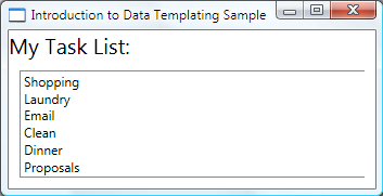
Without a DataTemplate, our ListBox currently looks like this:

What's happening is that without any specific instructions, the ListBox by default calls ToString when trying to display the objects in the collection. Therefore, if the Task object overrides the ToString method, then the ListBox displays the string representation of each source object in the underlying collection.
For example, if the Task class overrides the ToString method this way, where name is the field for the TaskName property:
public override string ToString()
{
    return name.ToString();
}
Public Overrides Function ToString() As String
    Return _name.ToString()
End Function
Then the ListBox looks like the following:

However, that is limiting and inflexible. Also, if you are binding to XML data, you wouldn't be able to override ToString.
Defining a Simple DataTemplate
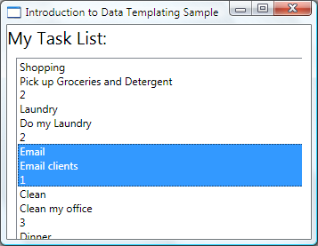
The solution is to define a DataTemplate. One way to do that is to set the ItemTemplate property of the ListBox to a DataTemplate. What you specify in your DataTemplate becomes the visual structure of your data object. The following DataTemplate is fairly simple. We are giving instructions that each item appears as three TextBlock elements within a StackPanel. Each TextBlock element is bound to a property of the Task class.
<ListBox Width="400" Margin="10"
         ItemsSource="{Binding Source={StaticResource myTodoList}}">
   <ListBox.ItemTemplate>
     <DataTemplate>
       <StackPanel>
         <TextBlock Text="{Binding Path=TaskName}" />
         <TextBlock Text="{Binding Path=Description}"/>
         <TextBlock Text="{Binding Path=Priority}"/>
       </StackPanel>
     </DataTemplate>
   </ListBox.ItemTemplate>
 </ListBox>
The underlying data for the examples in this topic is a collection of CLR objects. If you are binding to XML data, the fundamental concepts are the same, but there is a slight syntactic difference. For example, instead of having Path=TaskName, you would set XPath to @TaskName (if TaskName is an attribute of your XML node).
Now our ListBox looks like the following:

Creating the DataTemplate as a Resource
In the above example, we defined the DataTemplate inline. It is more common to define it in the resources section so it can be a reusable object, as in the following example:
<Window.Resources>
<DataTemplate x:Key="myTaskTemplate">
  <StackPanel>
    <TextBlock Text="{Binding Path=TaskName}" />
    <TextBlock Text="{Binding Path=Description}"/>
    <TextBlock Text="{Binding Path=Priority}"/>
  </StackPanel>
</DataTemplate>
</Window.Resources>
Now you can use myTaskTemplate as a resource, as in the following example:
<ListBox Width="400" Margin="10"
         ItemsSource="{Binding Source={StaticResource myTodoList}}"
         ItemTemplate="{StaticResource myTaskTemplate}"/>
Because myTaskTemplate is a resource, you can now use it on other controls that have a property that takes a DataTemplate type. As shown above, for ItemsControl objects, such as the ListBox, it is the ItemTemplate property. For ContentControl objects, it is the ContentTemplate property.
The DataType Property
The DataTemplate class has a DataType property that is very similar to the TargetType property of the Style class. Therefore, instead of specifying an x:Key for the DataTemplate in the above example, you can do the following:
<DataTemplate DataType="{x:Type local:Task}">
  <StackPanel>
    <TextBlock Text="{Binding Path=TaskName}" />
    <TextBlock Text="{Binding Path=Description}"/>
    <TextBlock Text="{Binding Path=Priority}"/>
  </StackPanel>
</DataTemplate>
This DataTemplate gets applied automatically to all Task objects. Note that in this case the x:Key is set implicitly. Therefore, if you assign this DataTemplate an x:Key value, you are overriding the implicit x:Key and the DataTemplate would not be applied automatically.
If you are binding a ContentControl to a collection of Task objects, the ContentControl does not use the above DataTemplate automatically. This is because the binding on a ContentControl needs more information to distinguish whether you want to bind to an entire collection or the individual objects. If your ContentControl is tracking the selection of an ItemsControl type, you can set the Path property of the ContentControl binding to "/" to indicate that you are interested in the current item. For an example, see Bind to a Collection and Display Information Based on Selection. Otherwise, you need to specify the DataTemplate explicitly by setting the ContentTemplate property.
The DataType property is particularly useful when you have a CompositeCollection of different types of data objects. For an example, see Implement a CompositeCollection.
Adding More to the DataTemplate
Currently the data appears with the necessary information, but there's definitely room for improvement. Let's improve on the presentation by adding a Border, a Grid, and some TextBlock elements that describe the data that is being displayed.
<DataTemplate x:Key="myTaskTemplate">
  <Border Name="border" BorderBrush="Aqua" BorderThickness="1"
          Padding="5" Margin="5">
    <Grid>
      <Grid.RowDefinitions>
        <RowDefinition/>
        <RowDefinition/>
        <RowDefinition/>
      </Grid.RowDefinitions>
      <Grid.ColumnDefinitions>
        <ColumnDefinition />
        <ColumnDefinition />
      </Grid.ColumnDefinitions>
      <TextBlock Grid.Row="0" Grid.Column="0" Text="Task Name:"/>
      <TextBlock Grid.Row="0" Grid.Column="1" Text="{Binding Path=TaskName}" />
      <TextBlock Grid.Row="1" Grid.Column="0" Text="Description:"/>
      <TextBlock Grid.Row="1" Grid.Column="1" Text="{Binding Path=Description}"/>
      <TextBlock Grid.Row="2" Grid.Column="0" Text="Priority:"/>
      <TextBlock Grid.Row="2" Grid.Column="1" Text="{Binding Path=Priority}"/>
    </Grid>
  </Border>
</DataTemplate>
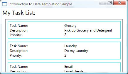
The following screenshot shows the ListBox with this modified DataTemplate:

We can set HorizontalContentAlignment to Stretch on the ListBox to make sure the width of the items takes up the entire space:
<ListBox Width="400" Margin="10"
     ItemsSource="{Binding Source={StaticResource myTodoList}}"
     ItemTemplate="{StaticResource myTaskTemplate}"
     HorizontalContentAlignment="Stretch"/>
With the HorizontalContentAlignment property set to Stretch, the ListBox now looks like this:

Use DataTriggers to Apply Property Values
The current presentation does not tell us whether a Task is a home task or an office task. Remember that the Task object has a TaskType property of type TaskType, which is an enumeration with values Home and Work.
In the following example, the DataTrigger sets the BorderBrush of the element named border to Yellow if the TaskType property is TaskType.Home.
<DataTemplate x:Key="myTaskTemplate">
<DataTemplate.Triggers>
  <DataTrigger Binding="{Binding Path=TaskType}">
    <DataTrigger.Value>
      <local:TaskType>Home</local:TaskType>
    </DataTrigger.Value>
    <Setter TargetName="border" Property="BorderBrush" Value="Yellow"/>
  </DataTrigger>
</DataTemplate.Triggers>
</DataTemplate>
Our application now looks like the following. Home tasks appear with a yellow border and office tasks appear with an aqua border:

In this example the DataTrigger uses a Setter to set a property value. The trigger classes also have the EnterActions and ExitActions properties that allow you to start a set of actions such as animations. In addition, there is also a MultiDataTrigger class that allows you to apply changes based on multiple data-bound property values.
An alternative way to achieve the same effect is to bind the BorderBrush property to the TaskType property and use a value converter to return the color based on the TaskType value. Creating the above effect using a converter is slightly more efficient in terms of performance. Additionally, creating your own converter gives you more flexibility because you are supplying your own logic. Ultimately, which technique you choose depends on your scenario and your preference. For information about how to write a converter, see IValueConverter.
What Belongs in a DataTemplate?
In the previous example, we placed the trigger within the DataTemplate using the DataTemplate.Triggers property. The Setter of the trigger sets the value of a property of an element (the Border element) that is within the DataTemplate. However, if the properties that your Setters are concerned with are not properties of elements that are within the current DataTemplate, it may be more suitable to set the properties using a Style that is for the ListBoxItem class (if the control you are binding is a ListBox). For example, if you want your Trigger to animate the Opacity value of the item when a mouse points to an item, you define triggers within a ListBoxItem style. For an example, see the Introduction to Styling and Templating Sample.
In general, keep in mind that the DataTemplate is being applied to each of the generated ListBoxItem (for more information about how and where it is actually applied, see the ItemTemplate page.). Your DataTemplate is concerned with only the presentation and appearance of the data objects. In most cases, all other aspects of presentation, such as what an item looks like when it is selected or how the ListBox lays out the items, do not belong in the definition of a DataTemplate. For an example, see the Styling and Templating an ItemsControl section.
Choosing a DataTemplate Based on Properties of the Data Object
In The DataType Property section, we discussed that you can define different data templates for different data objects. That is especially useful when you have a CompositeCollection of different types or collections with items of different types. In the Use DataTriggers to Apply Property Values section, we have shown that if you have a collection of the same type of data objects you can create a DataTemplate and then use triggers to apply changes based on the property values of each data object. However, triggers allow you to apply property values or start animations but they don't give you the flexibility to reconstruct the structure of your data objects. Some scenarios may require you to create a different DataTemplate for data objects that are of the same type but have different properties.
For example, when a Task object has a Priority value of 1, you may want to give it a completely different look to serve as an alert for yourself. In that case, you create a DataTemplate for the display of the high-priority Task objects. Let's add the following DataTemplate to the resources section:
<DataTemplate x:Key="importantTaskTemplate">
  <DataTemplate.Resources>
    <Style TargetType="TextBlock">
      <Setter Property="FontSize" Value="20"/>
    </Style>
  </DataTemplate.Resources>
  <Border Name="border" BorderBrush="Red" BorderThickness="1"
          Padding="5" Margin="5">
    <DockPanel HorizontalAlignment="Center">
      <TextBlock Text="{Binding Path=Description}" />
      <TextBlock>!</TextBlock>
    </DockPanel>
  </Border>
</DataTemplate>
This example uses the DataTemplate.Resources property. Resources defined in that section are shared by the elements within the DataTemplate.
To supply logic to choose which DataTemplate to use based on the Priority value of the data object, create a subclass of DataTemplateSelector and override the SelectTemplate method. In the following example, the SelectTemplate method provides logic to return the appropriate template based on the value of the Priority property. The template to return is found in the resources of the enveloping Window element.
using System.Windows;
using System.Windows.Controls;

namespace SDKSample
{
    public class TaskListDataTemplateSelector : DataTemplateSelector
    {
        public override DataTemplate
            SelectTemplate(object item, DependencyObject container)
        {
            FrameworkElement element = container as FrameworkElement;

            if (element != null && item != null && item is Task)
            {
                Task taskitem = item as Task;

                if (taskitem.Priority == 1)
                    return
                        element.FindResource("importantTaskTemplate") as DataTemplate;
                else
                    return
                        element.FindResource("myTaskTemplate") as DataTemplate;
            }

            return null;
        }
    }
}
Namespace SDKSample
    Public Class TaskListDataTemplateSelector
        Inherits DataTemplateSelector
        Public Overrides Function SelectTemplate(ByVal item As Object, ByVal container As DependencyObject) As DataTemplate

            Dim element As FrameworkElement
            element = TryCast(container, FrameworkElement)

            If element IsNot Nothing AndAlso item IsNot Nothing AndAlso TypeOf item Is Task Then

                Dim taskitem As Task = TryCast(item, Task)

                If taskitem.Priority = 1 Then
                    Return TryCast(element.FindResource("importantTaskTemplate"), DataTemplate)
                Else
                    Return TryCast(element.FindResource("myTaskTemplate"), DataTemplate)
                End If
            End If

            Return Nothing
        End Function
    End Class
End Namespace
We can then declare the TaskListDataTemplateSelector as a resource:
<Window.Resources>
<local:TaskListDataTemplateSelector x:Key="myDataTemplateSelector"/>
</Window.Resources>
To use the template selector resource, assign it to the ItemTemplateSelector property of the ListBox. The ListBox calls the SelectTemplate method of the TaskListDataTemplateSelector for each of the items in the underlying collection. The call passes the data object as the item parameter. The DataTemplate that is returned by the method is then applied to that data object.
<ListBox Width="400" Margin="10"
         ItemsSource="{Binding Source={StaticResource myTodoList}}"
         ItemTemplateSelector="{StaticResource myDataTemplateSelector}"
         HorizontalContentAlignment="Stretch"/>
With the template selector in place, the ListBox now appears as follows:

This concludes our discussion of this example. For the complete sample, see Introduction to Data Templating Sample.
Styling and Templating an ItemsControl
Even though the ItemsControl is not the only control type that you can use a DataTemplate with, it is a very common scenario to bind an ItemsControl to a collection. In the What Belongs in a DataTemplate section we discussed that the definition of your DataTemplate should only be concerned with the presentation of data. In order to know when it is not suitable to use a DataTemplate it is important to understand the different style and template properties provided by the ItemsControl. The following example is designed to illustrate the function of each of these properties. The ItemsControl in this example is bound to the same Tasks collection as in the previous example. For demonstration purposes, the styles and templates in this example are all declared inline.
<ItemsControl Margin="10"
              ItemsSource="{Binding Source={StaticResource myTodoList}}">
  <!--The ItemsControl has no default visual appearance.
      Use the Template property to specify a ControlTemplate to define
      the appearance of an ItemsControl. The ItemsPresenter uses the specified
      ItemsPanelTemplate (see below) to layout the items. If an
      ItemsPanelTemplate is not specified, the default is used. (For ItemsControl,
      the default is an ItemsPanelTemplate that specifies a StackPanel.-->
  <ItemsControl.Template>
    <ControlTemplate TargetType="ItemsControl">
      <Border BorderBrush="Aqua" BorderThickness="1" CornerRadius="15">
        <ItemsPresenter/>
      </Border>
    </ControlTemplate>
  </ItemsControl.Template>
  <!--Use the ItemsPanel property to specify an ItemsPanelTemplate
      that defines the panel that is used to hold the generated items.
      In other words, use this property if you want to affect
      how the items are laid out.-->
  <ItemsControl.ItemsPanel>
    <ItemsPanelTemplate>
      <WrapPanel />
    </ItemsPanelTemplate>
  </ItemsControl.ItemsPanel>
  <!--Use the ItemTemplate to set a DataTemplate to define
      the visualization of the data objects. This DataTemplate
      specifies that each data object appears with the Proriity
      and TaskName on top of a silver ellipse.-->
  <ItemsControl.ItemTemplate>
    <DataTemplate>
      <DataTemplate.Resources>
        <Style TargetType="TextBlock">
          <Setter Property="FontSize" Value="18"/>
          <Setter Property="HorizontalAlignment" Value="Center"/>
        </Style>
      </DataTemplate.Resources>
      <Grid>
        <Ellipse Fill="Silver"/>
        <StackPanel>
          <TextBlock Margin="3,3,3,0"
                     Text="{Binding Path=Priority}"/>
          <TextBlock Margin="3,0,3,7"
                     Text="{Binding Path=TaskName}"/>
        </StackPanel>
      </Grid>
    </DataTemplate>
  </ItemsControl.ItemTemplate>
  <!--Use the ItemContainerStyle property to specify the appearance
      of the element that contains the data. This ItemContainerStyle
      gives each item container a margin and a width. There is also
      a trigger that sets a tooltip that shows the description of
      the data object when the mouse hovers over the item container.-->
  <ItemsControl.ItemContainerStyle>
    <Style>
      <Setter Property="Control.Width" Value="100"/>
      <Setter Property="Control.Margin" Value="5"/>
      <Style.Triggers>
        <Trigger Property="Control.IsMouseOver" Value="True">
          <Setter Property="Control.ToolTip"
                  Value="{Binding RelativeSource={x:Static RelativeSource.Self},
                          Path=Content.Description}"/>
        </Trigger>
      </Style.Triggers>
    </Style>
  </ItemsControl.ItemContainerStyle>
</ItemsControl>
The following is a screenshot of the example when it is rendered:

Note that instead of using the ItemTemplate, you can use the ItemTemplateSelector. Refer to the previous section for an example. Similarly, instead of using the ItemContainerStyle, you have the option to use the ItemContainerStyleSelector.
Two other style-related properties of the ItemsControl that are not shown here are GroupStyle and GroupStyleSelector.
Support for Hierarchical Data
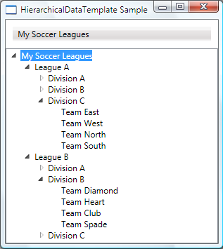
So far we have only looked at how to bind to and display a single collection. Sometimes you have a collection that contains other collections. The HierarchicalDataTemplate class is designed to be used with HeaderedItemsControl types to display such data. In the following example, ListLeagueList is a list of League objects. Each League object has a Name and a collection of Division objects. Each Division has a Name and a collection of Team objects, and each Team object has a Name.
<Window x:Class="SDKSample.Window1"
  xmlns="http://schemas.microsoft.com/winfx/2006/xaml/presentation"
  xmlns:x="http://schemas.microsoft.com/winfx/2006/xaml"
  Title="HierarchicalDataTemplate Sample"
  xmlns:src="clr-namespace:SDKSample">
  <DockPanel>
    <DockPanel.Resources>
      <src:ListLeagueList x:Key="MyList"/>

      <HierarchicalDataTemplate DataType    = "{x:Type src:League}"
                                ItemsSource = "{Binding Path=Divisions}">
        <TextBlock Text="{Binding Path=Name}"/>
      </HierarchicalDataTemplate>

      <HierarchicalDataTemplate DataType    = "{x:Type src:Division}"
                                ItemsSource = "{Binding Path=Teams}">
        <TextBlock Text="{Binding Path=Name}"/>
      </HierarchicalDataTemplate>

      <DataTemplate DataType="{x:Type src:Team}">
        <TextBlock Text="{Binding Path=Name}"/>
      </DataTemplate>
    </DockPanel.Resources>

    <Menu Name="menu1" DockPanel.Dock="Top" Margin="10,10,10,10">
        <MenuItem Header="My Soccer Leagues"
                  ItemsSource="{Binding Source={StaticResource MyList}}" />
    </Menu>

    <TreeView>
      <TreeViewItem ItemsSource="{Binding Source={StaticResource MyList}}" Header="My Soccer Leagues" />
    </TreeView>

  </DockPanel>
</Window>
The example shows that with the use of HierarchicalDataTemplate, you can easily display list data that contains other lists. The following is a screenshot of the example.

See also
.NET Desktop feedback
