Note
Access to this page requires authorization. You can try signing in or changing directories.
Access to this page requires authorization. You can try changing directories.
.NET Framework aims to make applications more accessible for your users. Accessibility features allow an application to provide an appropriate experience for users of Assistive Technology. Starting with .NET Framework 4.7.1, .NET Framework includes a large number of accessibility improvements that allow developers to create accessible applications.
Accessibility switches
You can configure your app to opt in to accessibility features if it targets .NET Framework 4.7 or an earlier version but is running on .NET Framework 4.7.1 or later. You can also configure your app to use legacy features (and not take advantage of accessibility features) if it targets .NET Framework 4.7.1 or later. Each .NET Framework version that includes accessibility features has a version-specific accessibility switch, which you add to the <AppContextSwitchOverrides> element in the <runtime> section of the application's configuration file. The following are the supported switches:
| Version | Switch |
|---|---|
| .NET Framework 4.7.1 | "Switch.UseLegacyAccessibilityFeatures" |
| .NET Framework 4.7.2 | "Switch.UseLegacyAccessibilityFeatures.2" |
| .NET Framework 4.8 | "Switch.UseLegacyAccessibilityFeatures.3" |
| August 11, 2020-KB4569746 Cumulative Update for .NET Framework 4.8 | "Switch.UseLegacyAccessibilityFeatures.4" |
| .NET Framework 4.8.1 | "Switch.UseLegacyAccessibilityFeatures.5" |
Taking advantage of accessibility enhancements
The new accessibility features are enabled by default for applications that target .NET Framework 4.7.1 or later. In addition, applications that target an earlier version of the .NET Framework but are running on .NET Framework 4.7.1 or later can opt out of legacy accessibility behaviors (and thereby take advantage of accessibility improvements) by adding switches to the <AppContextSwitchOverrides> element in the <runtime> section of the application's configuration file and setting their value to false. The following snippet shows how to opt in to the accessibility enhancements that were introduced in .NET Framework 4.7.1:
<runtime>
    <!-- AppContextSwitchOverrides value attribute is in the form of key1=true|false;key2=true|false  -->
    <AppContextSwitchOverrides value="Switch.UseLegacyAccessibilityFeatures=false" />
</runtime>
If you choose to opt in to accessibility features in a later .NET Framework version, you must also explicitly opt in to the features from earlier versions. To configure your app to take advantage of accessibility improvements in both .NET Framework 4.7.1 and 4.7.2, add the following <AppContextSwitchOverrides> element:
<runtime>
    <!-- AppContextSwitchOverrides value attribute is in the form of key1=true|false;key2=true|false  -->
    <AppContextSwitchOverrides value="Switch.UseLegacyAccessibilityFeatures=false;Switch.UseLegacyAccessibilityFeatures.2=false" />
</runtime>
To configure your app to take advantage of accessibility improvements in .NET Framework 4.7.1, 4.7.2, 4.8, and the August 2020 cumulative update for .NET Framework 4.8, add the following <AppContextSwitchOverrides> element:
<runtime>
    <!-- AppContextSwitchOverrides value attribute is in the form of key1=true|false;key2=true|false  -->
    <AppContextSwitchOverrides value="Switch.UseLegacyAccessibilityFeatures=false;Switch.UseLegacyAccessibilityFeatures.2=false;Switch.UseLegacyAccessibilityFeatures.3=false;Switch.UseLegacyAccessibilityFeatures.4=false"/>
</runtime>
Restoring legacy behavior
Applications that target versions of .NET Framework starting with 4.7.1 can disable accessibility features by adding switches to the <AppContextSwitchOverrides> element in the <runtime> section of the application's configuration file and setting their value to true. For example, the following configuration opts out of accessibility features introduced in .NET Framework 4.7.2:
<runtime>
    <!-- AppContextSwitchOverrides value attribute is in the form of key1=true|false;key2=true|false  -->
    <AppContextSwitchOverrides value="Switch.UseLegacyAccessibilityFeatures.2=true" />
</runtime>
What's new in accessibility in .NET Framework 4.8.1
.NET Framework 4.8.1 includes new accessibility features in the following areas:
Windows Forms
Added and improved UIA representations
Prior to .NET Framework 4.8.1, Windows Forms was missing support for a range of UIA patterns to support assistive technology to interact with applications. This deficiency could cause Narrator or other screen readers to report incomplete or incorrect information. It could also affect important functionality like moving a cursor through the text in a TextBox control. With .NET Framework 4.8.1, all of the required patterns for the common controls have been implemented. This new functionality gives users of assistive technology a much richer application interaction experience.
- Added support for the UIA expand/collapse pattern to the DateTimePicker control.
- Added UIA support to the MonthCalendar control. Now assistive technology tools such as Narrator can navigate through the individual dates in the control.
- Implemented text pattern support for all text-based controls, including the TextBox, MaskedTextBox, PropertyGrid edit control, DataGridViewTextBoxCell, ToolStripTextBox, and DomainUpDown controls.
- ToolTip now follows WCAG2.1 guidelines to be persistent, dismissable, and hoverable on Windows 11. Changes to tooltip behavior are limited to Windows 11 systems that have .NET Framework 4.8.1 installed, and only apply to applications where a timeout was not set for the tooltip. Tooltips that are persisting can be dismissed with either the Esc key or the Ctrl key or by navigating to a control with another tooltip set.
Various bug fixes for existing accessibility features
- Narrator can now focus on an empty DataGridView control.
- Addressed an issue that caused screen readers to count hidden columns when announcing the column count in a DataGridView control.
- Addressed an issue that caused the DataGridView to ignore the font settings set in the
DataGridviewCellStyleif the underlying form had aFontproperty that differed fromDefaultFont. - Updated the
AccessibleNameproperty of the DataGridView control's internal scroll bars to remove the text "ScrollBar". - Fixed the color of a
DataGridViewLinkCellwhen the cell is selected. - Fixed an issue with custom DataGridView controls where there was no
ControlTypeorLocalizedControlTypeprovided for custom DataGridViewCell elements. - Updated the luminosity ratio to 3.5:1 for ToolStripButton controls that have
ToolStripRenderModeset toSystem. - Improved keyboard navigation in a ToolStrip when the element is a
ToolStripComboBoxtype. - Updated the background color of the ToolStripButton in high contrast mode.
- Ensured that there is a bounding rectangle reported to assistive technology for the ToolStripSeparator.
- Fixed an issue that could cause the screen reader JAWS to crash when reading the PropertyGrid control.
- Ensured that the UIA hierarchy tree for a PropertyGrid control is updated when a complex entry like
Fontis expanded. Also ensured that the tree is updated properly when the entry is then collapsed and no longer visible. - PropertyGrid categories now have a localized control type of
PropertyGrid category. - Fixed an issue with the ComboBox that could cause the app to crash under Accessibility Insights for Windows.
- Updated the border color for the Button to have more contrast in the default colors.
- Enabled assistive technology tools to access the
ControlBoxbuttons of a maximized MDI child form. - The
AccessibleNameproperty of a DomainUpDown control has a new default value of an empty string. The empty string will encourage developers to create a meaningful name rather than accepting the previous non-empty default value. - Updated the
AccessibleNameproperty of the Print button in the PrintPreviewDialog from "Print Button" to "Print" to avoid redundancy when screen readers announce the control and its type. - Updated UIA list controls to remove an empty list element when a PropertyGrid cell of type
ComboBoxis closed and no longer visible.
Windows Presentation Foundation (WPF)
Accessible Tooltip handling improvements
In this release, WPF improved the experience by ensuring that a tooltip in the current window can easily be dismissed by using the Esc key, the Ctrl key (by itself), or by the combination Ctrl+Shift+F10. The scope of the Esc key was reduced in this release to apply only to the current window, when previously it would have applied to any open tooltip in the application. By default, WPF tooltips will follow WCAG2.1 guidelines to be persistent, dismissable, and hoverable.
What's new in accessibility in the August 11, 2020 Cumulative Update for .NET Framework 4.8
The August 11, 2020-KB4569746 Cumulative Update for .NET Framework 4.8 includes new accessibility features in Windows Forms:
Addresses an issue with announcing
PropertyGridcontrol items and a category's expanded/collapsed state by screen readers.Updates the accessible patterns of the
PropertyGridcontrol and its inner elements.Updates the accessible names of the
PropertyGridcontrol inner elements so they're correctly announced by screen readers.Addresses bounding rectangle accessible properties for the
PropertyGridViewcontrols.Enables screen readers to correctly announce the expanded/collapsed state of
DataGridViewcombo box cells.
What's new in accessibility in .NET Framework 4.8
.NET Framework 4.8 includes new accessibility features in the following areas:
Windows Forms
In .NET Framework 4.8, Windows Forms adds support for LiveRegions and Notification Events to many commonly used controls. It also adds support for ToolTips when a user navigates to a control by using the keyboard.
UIA LiveRegions Support in Labels and StatusStrips
UIA LiveRegions allow application developers to notify screen readers of a text change in a control that is located apart from the location where the user is working. This is useful, for example, for a StatusStrip control that shows a connection status. If the connection is dropped and the status changes, the developer might want to notify the screen reader.
Starting with .NET Framework 4.8, Windows Forms implements UIA LiveRegions for both the Label and StatusStrip controls. For example, the following code uses the LiveRegion in a Label control named label1:
public Form1()
{
   InitializeComponent();
   label1.AutomationLiveSetting = AutomationLiveSetting.Polite;
}

…
Label1.Text = "Ready!";
Narrator announces “Ready” regardless of where the user is interacting with the application.
You can also implement your UserControl as a LiveRegion:
using System;
using System.Windows.Forms;
using System.Windows.Forms.Automation;

namespace WindowsFormsApplication
{
   public partial class UserControl1 : UserControl, IAutomationLiveRegion
   {
      public UserControl1()
      {
         InitializeComponent();
      }

      public AutomationLiveSetting AutomationLiveSetting { get; set; }
      private AutomationLiveSetting IAutomationLiveRegion.GetLiveSetting()
      {
         return this.AutomationLiveSetting;
      }

      protected override void OnTextChanged(EventArgs e)
      {
         base.OnTextChanged(e);
         AutomationNotifications.UiaRaiseLiveRegionChangedEvent(this.AccessibilityObject);
      }
   }
}
UIA notification events
The UIA Notification event, introduced in Windows 10 Fall Creators Update, allows your app to raise a UIA event, which leads to Narrator simply making an announcement based on text you supply with the event, without the need to have a corresponding control in the UI. In some scenarios, this is a straightforward way to dramatically improve the accessibility of your app. In can also be useful to notify of the progress of some process that may take a long time. For more information about UIA Notification Events, see Can your desktop app leverage the new UI Notification event?.
The following example raises the Notification event:
MethodInfo raiseMethod = typeof(AccessibleObject).GetMethod("RaiseAutomationNotification");
if (raiseMethod != null) {
   raiseMethod.Invoke(progressBar1.AccessibilityObject, new object[3] {/*Other*/ 4, /*All*/ 2, "The progress is 50%." });
}
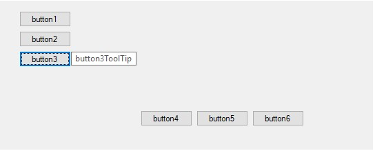
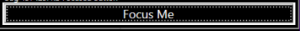
ToolTips on keyboard access
In applications that target .NET Framework 4.7.2 and earlier versions, a control tooltip can only be triggered to pop up by moving a mouse pointer into the control. Starting with .NET Framework 4.8, a keyboard user can trigger a control's tooltip by focusing the control using a Tab key or arrow keys with or without modifier keys. This particular accessibility enhancement requires an additional AppContext switch:
<?xml version="1.0" encoding="utf-8"?>
<configuration>
   <startup>
      <supportedRuntime version="v4.0" sku=".NETFramework,Version=v4.6.1"/>
   </startup>
   <runtime>
      <!-- AppContextSwitchOverrides values are in the form of key1=true|false;key2=true|false  -->
      <!-- Please note that disabling Switch.UseLegacyAccessibilityFeatures, Switch.UseLegacyAccessibilityFeatures.2 and Switch.UseLegacyAccessibilityFeatures.3 is required to disable Switch.System.Windows.Forms.UseLegacyToolTipDisplay -->
      <AppContextSwitchOverrides value="Switch.UseLegacyAccessibilityFeatures=false;Switch.UseLegacyAccessibilityFeatures.2=false;Switch.UseLegacyAccessibilityFeatures.3=false;Switch.System.Windows.Forms.UseLegacyToolTipDisplay=false"/>
   </runtime>
</configuration>
The following figure shows the tooltip when the user has selected a button with the keyboard.
Windows Presentation Foundation (WPF)
Starting with .NET Framework 4.8, WPF includes a number of accessibility improvements.
Screen narrators no longer announce elements with Collapsed or Hidden visibility
Elements with collapsed or hidden visibility are no longer announced by screen reader. User interfaces that contain elements with a Visibility of Visibility.Collapsed or Visibility.Hidden can be misrepresented by screen readers if they are announced to the user. Starting with .NET Framework 4.8, WPF no longer includes collapsed or hidden elements in the Control View of the UIAutomation tree, so the screen readers can no longer announce these elements.
SelectionTextBrush property for use with non-Adorner based text selection
In .NET Framework 4.7.2, WPF added the ability to draw TextBox and PasswordBox text selection without using the Adorner layer. The foreground color of the selected text in this scenario was dictated by SystemColors.HighlightTextBrush.
.NET Framework 4.8 adds a new property, SelectionTextBrush, that allows developers to select the specific brush for the selected text when using non-Adorner based text selection. This property works only on TextBoxBase-derived controls and the PasswordBox control in WPF applications with non-Adorner-based text selection enabled. It does not work on the RichTextBox control. If non-Adorner-based text selection is not enabled, this property is ignored.
To use this property, simply add it to your XAML code and use the appropriate brush or binding. The resulting text selection looks like this:
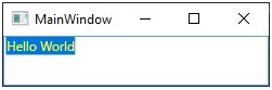
You can combine the use of the SelectionBrush and SelectionTextBrush properties to generate any background and foreground color combination that you deem appropriate.
Support for the UIAutomation ControllerFor property
UIAutomation’s ControllerFor property returns an array of automation elements that are manipulated by the automation element that supports this property. This property is commonly used for Auto-suggest accessibility. ControllerFor is used when an automation element affects one or more segments of the application UI or the desktop. Otherwise, it is hard to associate the impact of the control operation with UI elements. This feature adds the ability for controls to provide a value for the ControllerFor property.
.NET Framework 4.8 adds a new virtual method, GetControlledPeersCore(). To provide a value for the ControllerFor property, simply override this method and return a List<AutomationPeer> for the controls being manipulated by this AutomationPeer:
public class AutoSuggestTextBox: TextBox
{
   protected override AutomationPeer OnCreateAutomationPeer()
   {
      return new AutoSuggestTextBoxAutomationPeer(this);
   }

   public ListBox SuggestionListBox;
}

internal class AutoSuggestTextBoxAutomationPeer : TextBoxAutomationPeer
{
   public AutoSuggestTextBoxAutomationPeer(AutoSuggestTextBox owner) : base(owner)
   {
   }

   protected override List<AutomationPeer> GetControlledPeersCore()
   {
      List<AutomationPeer> controlledPeers = new List<AutomationPeer>();
      AutoSuggestTextBox owner = Owner as AutoSuggestTextBox;
      controlledPeers.Add(UIElementAutomationPeer.CreatePeerForElement(owner.SuggestionListBox));
      return controlledPeers;
   }
}
Tooltips on keyboard access
In .NET Framework 4.7.2 and earlier versions, tooltips display only when the user hovers the mouse cursor over a control. In .NET Framework 4.8, tooltips also display on keyboard focus, as well as via a keyboard shortcut.
To enable this feature, an application needs to target .NET Framework 4.8 or opt-in by using the Switch.UseLegacyAccessibilityFeatures.3 and Switch.UseLegacyToolTipDisplay AppContext switches. The following is a sample application configuration file:
<?xml version="1.0" encoding="utf-8" ?>
<configuration>
   <startup>
      <supportedRuntime version="v4.0" sku=".NETFramework,Version=v4.5" />
   </startup>
   <runtime>
      <AppContextSwitchOverrides value="Switch.UseLegacyAccessibilityFeatures=false;Switch.UseLegacyAccessibilityFeatures.2=false;Switch.UseLegacyAccessibilityFeatures.3=false;Switch.UseLegacyToolTipDisplay=false" />
   </runtime>
</configuration>
Once enabled, all controls that contain a tooltip display it once the control receives keyboard focus. The tooltip can be dismissed over time or when the keyboard focus changes. Users can also dismiss the tooltip manually by using a new keyboard shortcut, Ctrl+Shift+F10. Once the tooltip has been dismissed, it can be displayed again by using the same keyboard shortcut.
Note
Ribbon tooltips on Ribbon controls won’t show on keyboard focus; they only show via the keyboard shortcut.
Added Support for SizeOfSet and PositionInSet UIAutomation properties
Windows 10 introduced two new UIAutomation properties, SizeOfSet and PositionInSet, which are used by applications to describe the count of items in a set. UIAutomation client applications such as screen readers can then query an application for these properties and announce an accurate representation of the application’s UI.
Starting with .NET Framework 4.8, WPF exposes these two properties to UIAutomation in WPF applications. This can be accomplished in two ways:
By using dependency properties.
WPF adds two new dependency properties, AutomationProperties.SizeOfSet and AutomationProperties.PositionInSet. A developer can use XAML to set their values:
<Button AutomationProperties.SizeOfSet="3"
  AutomationProperties.PositionInSet="1">Button 1</Button>

<Button AutomationProperties.SizeOfSet="3"
  AutomationProperties.PositionInSet="2">Button 2</Button>

<Button AutomationProperties.SizeOfSet="3"
  AutomationProperties.PositionInSet="3">Button 3</Button>
By overriding AutomationPeer virtual methods.
The GetSizeOfSetCore() and GetPositionInSetCore() virtual methods were added to the
AutomationPeerclass. A developer can provide values forSizeOfSetandPositionInSetby overriding these methods, as shown in the following example:public class MyButtonAutomationPeer : ButtonAutomationPeer { protected override int GetSizeOfSetCore() { // Call into your own logic to provide a value for SizeOfSet return CalculateSizeOfSet(); } protected override int GetPositionInSetCore() { // Call into your own logic to provide a value for PositionInSet return CalculatePositionInSet(); } }
In addition, items in ItemsControl instances provide a value for these properties automatically without additional action from the developer. If an ItemsControl is grouped, the collection of groups is represented as a set, and each group is counted as a separate set, with each item inside that group providing its position inside that group as well as the size of the group. Automatic values are not affected by virtualization. Even if an item is not realized, it is still counted toward the total size of the set and affects the position in the set of its sibling items.
Automatic values are only provided if the application targets .NET Framework 4.8. For applications that target an earlier version of the .NET Framework, you can set the Switch.UseLegacyAccessibilityFeatures.3 AppContext switch, as shown in the following App.config file:
<?xml version="1.0" encoding="utf-8" ?>
<configuration>
   <startup>
      <supportedRuntime version="v4.0" sku=".NETFramework,Version=v4.5" />
   </startup>
   <runtime>
      <AppContextSwitchOverrides value="Switch.UseLegacyAccessibilityFeatures=false;Switch.UseLegacyAccessibilityFeatures.2=false;Switch.UseLegacyAccessibilityFeatures.3=false" />
   </runtime>
</configuration>
Windows Workflow Foundation (WF) workflow designer
The workflow designer includes the following changes in .NET Framework 4.8:
Users using Narrator will see improvements in FlowSwitch case labels.
Users using Narrator will see improvements in button descriptions.
Users who choose High Contrast themes will see improvements in the visibility of the Workflow Designer and its controls, like better contrast ratios between elements and more noticeable selection boxes used for focus elements.
If your application targets .NET Framework 4.7.2 or an earlier version, you can opt in to these changes by setting the Switch.UseLegacyAccessibilityFeatures.3 AppContext switch to false in your application configuration file. For more information, see the Taking advantage of accessibility enhancements section in this article.
What's new in accessibility in .NET Framework 4.7.2
.NET Framework 4.7.2 includes new accessibility features in the following areas:
Windows Forms
OS-defined colors in High Contrast themes
Starting with .NET Framework 4.7.2, Windows Forms uses colors defined by the operating system in High Contrast themes. This affects the following controls:
The drop-down arrow of the ToolStripDropDownButton control.
The Button, RadioButton and CheckBox controls with FlatStyle set to FlatStyle.Flat or FlatStyle.Popup. Previously, selected text and background colors were not contrasting and were hard to read.
Controls contained within a GroupBox that has its Enabled property set to
false.The ToolStripButton, ToolStripComboBox, and ToolStripDropDownButton controls, which have an increased luminosity contrast ratio in High Contrast Mode.
The LinkColor property of the DataGridViewLinkCell.
Narrator improvements
Starting with .NET Framework 4.7.2, Narrator support is enhanced as follows:
It announces the value of the ToolStripMenuItem.ShortcutKeys property when announcing the text of a ToolStripMenuItem.
It indicates when a ToolStripMenuItem has its Enabled property set to
false.It gives feedback on the state of a check box when the ListView.CheckBoxes property is set to
true.Narrator's Scan Mode focus order is consistent with the visual order of the controls on the ClickOnce download dialog window.
DataGridView improvements
Starting with .NET Framework 4.7.2, the DataGridView control has introduced the following accessibility improvements:
Rows can be sorted using the keyboard. A user can use the F3 key in order to sort by the current column.
The column width of the current cell can be increased or decreased with the Alt + Left/Right arrow keys.
When the DataGridView.SelectionMode is set to DataGridViewSelectionMode.FullRowSelect, the column header changes color to indicate the current column as the user tabs through the cells in the current row.
The AccessibleObject.Parent property of a System.Windows.Forms.DataGridViewLinkCell.DataGridViewLinkCellAccessibleObject returns the correct parent control.
Improved visual cues
- The RadioButton and CheckBox controls with an empty Text property display a focus indicator when they receive the focus.
Improved Property Grid Support
The PropertyGrid control child elements now return a
truefor the IsReadOnlyProperty property only when a PropertyGrid element is enabled.The PropertyGrid control child elements return a
falsefor the IsEnabledProperty property only when a PropertyGrid element can be changed by the user.
Improved keyboard navigation
- The ToolStripButton control allows focus when contained within a ToolStripPanel that has the TabStop property set to
true
Windows Presentation Foundation (WPF)
Changes to the CheckBox and RadioButton controls
In .NET Framework 4.7.1 and earlier versions, the WPF System.Windows.Controls.CheckBox and System.Windows.Controls.RadioButton controls have inconsistent and, in Classic and High Contrast themes, incorrect focus visuals. These issues occur in cases where the controls do not have any content set. This can make the transition between themes confusing and the focus visual hard to see.
In .NET Framework 4.7.2, these visuals are now more consistent across themes and more easily visible in Classic and High Contrast themes.
WinForms controls hosted in a WPF application
For WinForms control hosted in a WPF application in .NET Framework 4.7.1 and earlier versions, users couldn't tab out of the WinForms layer if the first or last control in that layer is the WPF ElementHost control. In .NET Framework 4.7.2, users are now able to tab out of the WinForms layer.
However, automated applications that rely on focus never escaping the WinForms layer may no longer work as expected.
What's new in accessibility in .NET Framework 4.7.1
.NET Framework 4.7.1 includes new accessibility features in the following areas:
Windows Presentation Foundation (WPF)
Screen reader improvements
If accessibility improvements are enabled, .NET Framework 4.7.1 includes the following enhancements that affect screen readers:
In .NET Framework 4.7 and earlier versions, Expander controls were announced by screen readers as buttons. Starting with .NET Framework 4.7.1, they are correctly announced as expandable/collapsible groups.
In .NET Framework 4.7 and earlier versions, DataGridCell controls were announced by screen readers as “custom.” Starting with .NET Framework 4.7.1, they are now correctly announced as data grid cell (localized).
Starting with .NET Framework 4.7.1, screen readers announce the name of an editable ComboBox.
In .NET Framework 4.7 and earlier versions, PasswordBox controls were announced as “no item in view” or had otherwise incorrect behavior. This issue is fixed starting with .NET Framework 4.7.1.
UIAutomation LiveRegion support
Screen readers such as Narrator help people read the UI contents of an application, usually by text-to-speech output of the UI content that has the focus. However, if a UI element changes and does not have the focus, the user may not be notified and may miss important information. Live regions aim at solving this problem. A developer can use them to inform the screen reader or any other UIAutomation client that an important change has been made to a UI element. The screen reader can then decide how and when to inform the user of this change.
To support live regions, the following APIs have been added to WPF:
The AutomationElementIdentifiers.LiveSettingProperty and AutomationElementIdentifiers.LiveRegionChangedEvent fields, which identify the LiveSetting property and the LiveRegionChanged event. They can be set by using XAML.
The AutomationProperties.LiveSetting attached property, which informs the screen reader of the importance of the UI change to the user.
The AutomationProperties.LiveSettingProperty property, which identifies the AutomationProperties.LiveSetting attached property.
The AutomationPeer.GetLiveSettingCore method, which can be overridden to provide a LiveSetting value.
The AutomationProperties.GetLiveSetting and AutomationProperties.SetLiveSetting methods, which get and set a LiveSetting value.
The System.Windows.Automation.AutomationLiveSetting enumeration, which defines the following possible LiveSetting values:
AutomationLiveSetting.Off. The element does not send notifications if the content of the live region has changed.
AutomationLiveSetting.Polite. The element sends non-interruptive notifications if the content of the live region has changed.
AutomationLiveSetting.Assertive. The element sends interruptive notifications if the content of the live region has changed.
You can create a LiveRegion by setting the AutomationProperties.LiveSetting property on the element of interest, as shown in the following example:
<TextBlock Name="myTextBlock" AutomationProperties.LiveSetting="Assertive">announcement</TextBlock>
When the data in the live region changes and you need to inform a screen reader, you explicitly raise an event, as shown in the following sample.
var peer = FrameworkElementAutomationPeer.FromElement(myTextBlock);

peer.RaiseAutomationEvent(AutomationEvents.LiveRegionChanged);
Dim peer = FrameworkElementAutomationPeer.FromElement(myTextBlock)
peer.RaiseAutomationEvent(AutomationEvents.LiveRegionChanged)
High contrast
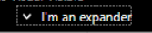
Starting with .NET Framework 4.7.1, improvements in high contrast have been made to various WPF controls. They are now visible when the HighContrast theme is set. These include:
Expander control
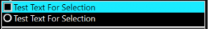
The focus visual for the Expander control is now visible. The keyboard visuals for ComboBox,ListBox, and RadioButton controls are visible as well. For example:
Before:

After:
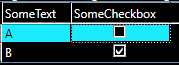
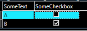
CheckBox and RadioButton controls
The text in the CheckBox and RadioButton controls is now easier to see when selected in high contrast themes. For example:
Before:
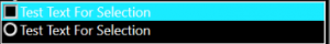
After:
ComboBox control
Starting with .NET Framework 4.7.1, the border of a disabled ComboBox control is the same color as disabled text. For example:
Before:

After:

In addition, disabled and focused buttons use the correct theme color.
Before:
After:

Finally, in .NET Framework 4.7 and earlier versions, setting a ComboBox control’s style to
Toolbar.ComboBoxStyleKeycaused the drop-down arrow to be invisible. This issue is fixed starting with .NET Framework 4.7.1. For example:Before:

After:

DataGrid control
Starting with .NET Framework 4.7.1, the sort indicator arrow in DataGrid controls now uses correct theme colors. For example:
Before:
After:
In addition, in .NET Framework 4.7 and earlier versions, the default link style changed to an incorrect color on mouse over in high contrast modes. This is resolved starting with .NET Framework 4.7.1. Similarly, DataGrid checkbox columns use the expected colors for keyboard focus feedback starting with .NET Framework 4.7.1.
Before:

After:

For more information on WPF accessibility improvements in .NET Framework 4.7.1, see Accessibility improvements in WPF.
Windows Forms accessibility improvements
In .NET Framework 4.7.1, Windows Forms (WinForms) includes accessibility changes in the following areas.
Improved display in High Contrast mode
Starting with .NET Framework 4.7.1, various WinForms controls offer improved rendering in the HighContrast modes available in the operating system. Windows 10 has changed the values for some high contrast system colors, and Windows Forms is based on the Windows 10 Win32 framework. For the best experience, run on the latest version of Windows and opt in to the latest OS changes by adding an app.manifest file in a test application and uncomment the Windows 10 supported OS line so that it looks the following:
<!-- Windows 10 -->
<supportedOS Id="{8e0f7a12-bfb3-4fe8-b9a5-48fd50a15a9a}" />
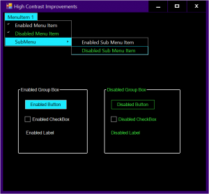
Some examples of high contrast changes include:
Checkmarks in MenuStrip items are easier to view.
When selected, disabled MenuStrip items are easier to view.
Text in a selected Button control contrasts with the selection color.
Disabled text is easier to read. For example:
Before:
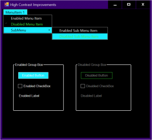
After:
High contrast improvements in the Thread Exception Dialog.
Improved Narrator support
Windows Forms in .NET Framework 4.7.1 includes the following accessibility improvements for the Narrator:
The MonthCalendar control can be accessed by the Narrator, as well as by other UI automation tools.
The CheckedListBox control notifies Narrator when an item's check state has changed so the user is notified that they’ve changed the value of a list item.
The DataGridViewCell control reports the correct read-only status to Narrator.
Narrator can now read disabled ToolStripMenuItem text, whereas previously it would skip over disabled menu items.
Enhanced support for UIAutomation accessibility patterns
Starting with .NET Framework 4.7.1, developers of accessibility technology tools can leverage common API accessibility patterns and properties for several WinForms controls. These accessibility improvements include:
The ComboBox and ToolStripSplitButton now support the expand/collapse pattern.
The DataGridViewCheckBoxCell now supports the toggle pattern.
The ToolStripItem control supports the Name property and the expand/collapse pattern.
The NumericUpDown and DomainUpDown controls support the Name property.
Improved property browser experience
Starting with .NET Framework 4.7.1, Windows Forms includes:
- Better keyboard navigation through the various drop-down selection windows.
- A reduction of unnecessary tab stops.
- Better reporting of control types.
- Improved narrator behavior.
ASP.NET web controls
Starting with .NET Framework 4.7.1 and Visual Studio 2017 version 15.3, ASP.NET improves how ASP.NET web controls work with accessibility technology in Visual Studio. Changes include the following:
Changes to implement missing UI accessibility patterns in controls, like the Add Field dialog in the Details View wizard, or the Configure ListView dialog of the ListView wizard.
Changes to improve the display in High Contrast mode, like the Data Pager Fields Editor.
Changes to improve the keyboard navigation experiences for controls, like the Fields dialog in the Edit Pager Fields wizard of the DataPager control, the Configure ObjectContext dialog, or the Configure Data Selection dialog of the Configure Data Source wizard.
.NET SDK Tools
The Configuration Editor Tool (SvcConfigEditor.exe) and Service Trace Viewer Tool (SvcTraceViewer.exe) have been improved by fixing varied accessibility issues. Most of these were small issues, like a name not being defined or certain UI automation patterns not being implemented correctly. While many users won’t be aware of these incorrect values, customers who use assistive technologies like screen readers will find these SDK tools more accessible.
These enhancements change some previous behaviors, such as keyboard focus order.
Windows Workflow Foundation (WF) Workflow Designer
Accessibility changes in the Workflow Designer include the following:
The tab order changes to left to right and top to bottom in some controls:
The initialize correlation window for setting correlation data for the InitializeCorrelation activity.
The content definition window for the Receive, Send, SendReply, and ReceiveReply activities.
More functions are available via the keyboard:
When editing the properties of an activity, property groups can be collapsed by keyboard the first time they are focused.
Warning icons are accessible by keyboard.
The More Properties button in the Properties window is accessible by keyboard.
Keyboard users can access the header items in the Arguments and Variables panes of the Workflow Designer.
Improved visibility of items with focus, such as when:
Adding rows to data grids used by the Workflow Designer and activity designers.
Tabbing through fields in the ReceiveReply and SendReply activities.
Setting default values for variables or arguments
Screen readers can now correctly recognize:
Breakpoints set in the workflow designer.
The FlowSwitch<T>, FlowDecision, and CorrelationScope activities.
The contents of the Receive activity.
The Target Type for the InvokeMethod activity.
The Exception combo box and the Finally section in the TryCatch activity.
The Message Type combo box, the splitter in the Add Correlation Initializers window, the Content Definition window, and the CorrelatesOn Definition window in the messaging activities (Receive, Send, SendReply, and ReceiveReply).
State machine transitions and transitions destinations.
Annotations and connectors on FlowDecision activities.
The context (right-click) menus for activities.
The property value editors, the Clear Search button, the By Category and Alphabetical sort buttons, and the Expression Editor dialog in the properties grid.
The zoom percentage in the Workflow Designer.
The InvokeDelegate activity.
The Select Types window for dictionary activities (
Microsoft.Activities.AddToDictionary<TKey,TValue>,Microsoft.Activities.RemoveFromDictionary<TKey,TValue>, etc.).The Browse and Select .NET Type window.
Breadcrumbs in the Workflow Designer.
Users who choose High Contrast themes will see many improvements in the visibility of the Workflow Designer and its controls, like better contrast ratios between elements and more noticeable selection boxes used for focus elements.
See also
Collaborate with us on GitHub
The source for this content can be found on GitHub, where you can also create and review issues and pull requests. For more information, see our contributor guide.