Basic bindings
A .NET Multi-platform App UI (.NET MAUI) data binding links a pair of properties between two objects, at least one of which is usually a user-interface object. These two objects are called the target and the source:
- The target is the object (and property) on which the data binding is set.
- The source is the object (and property) referenced by the data binding.
In the simplest case, data flows from the source to the target, which means that the value of the target property is set from the value of the source property. However, in some cases, data can alternatively flow from the target to the source, or in both directions.
Important
The target is always the object on which the data binding is set even if it's providing data rather than receiving data.
Bindings with a binding context
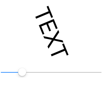
Consider the following XAML example, whose intent is to rotate a Label by manipulating a Slider:
<ContentPage xmlns="http://schemas.microsoft.com/dotnet/2021/maui"
             xmlns:x="http://schemas.microsoft.com/winfx/2009/xaml"
             x:Class="DataBindingDemos.BasicCodeBindingPage"
             Title="Basic Code Binding">
    <StackLayout Padding="10, 0">
        <Label x:Name="label"
               Text="TEXT"
               FontSize="48"
               HorizontalOptions="Center"
               VerticalOptions="Center" />

        <Slider x:Name="slider"
                Maximum="360"
                VerticalOptions="Center" />
    </StackLayout>
</ContentPage>
Without data bindings, you would set the ValueChanged event of the Slider to an event handler that accesses the Value property of the Slider and sets that value to the Rotation property of the Label. The data binding automates this task, and so the event handler and the code within it are no longer necessary.
You can set a binding on an instance of any class that derives from BindableObject, which includes Element, VisualElement, View, and View derivatives. The binding is always set on the target object. The binding references the source object. To set the data binding, use the following two members of the target class:
- The
BindingContextproperty specifies the source object. - The
SetBindingmethod specifies the target property and source property.
In this example, the Label is the binding target, and the Slider is the binding source. Changes in the Slider source affect the rotation of the Label target. Data flows from the source to the target.
The SetBinding method defined by BindableObject has an argument of type BindingBase from which the Binding class derives, but there are other SetBinding methods defined by the BindableObjectExtensions class. The code-behind for the XAML uses a simpler SetBinding extension method from the BindableObjectExtensions class:
public partial class BasicCodeBindingPage : ContentPage
{
    public BasicCodeBindingPage()
    {
        InitializeComponent();

        label.BindingContext = slider;
        label.SetBinding(Label.RotationProperty, "Value");
    }
}
The Label object is the binding target so that's the object on which this property is set and on which the method is called. The BindingContext property indicates the binding source, which is the Slider. The SetBinding method is called on the binding target but specifies both the target property and the source property. The target property is specified as a BindableProperty object: Label.RotationProperty. The source property is specified as a string and indicates the Value property of Slider.
Important
The target property must be backed by a bindable property. Therefore, the target object must be an instance of a class that derives from BindableObject. For more information, see Bindable properties.
The source property is specified as a string. Internally, reflection is used to access the actual property. In this particular case, however, the Value property is also backed by a bindable property.
As you manipulate the Slider, the Label rotates accordingly:

Alternatively, the data binding can be specified in XAML:
<ContentPage xmlns="http://schemas.microsoft.com/dotnet/2021/maui"
             xmlns:x="http://schemas.microsoft.com/winfx/2009/xaml"
             x:Class="DataBindingDemos.BasicXamlBindingPage"
             Title="Basic XAML Binding">
    <StackLayout Padding="10, 0">
        <Label Text="TEXT"
               FontSize="80"
               HorizontalOptions="Center"
               VerticalOptions="Center"
               BindingContext="{x:Reference Name=slider}"
               Rotation="{Binding Path=Value}" />

        <Slider x:Name="slider"
                Maximum="360"
                VerticalOptions="Center" />
    </StackLayout>
</ContentPage>
Just as in code, the data binding is set on the target object, which is the Label. Two XAML markup extensions are used to define the data binding:
- The
x:Referencemarkup extension is required to reference the source object, which is the Slider namedslider. - The
Bindingmarkup extension links theRotationproperty of the Label to theValueproperty of the Slider.
For more information about XAML markup extensions, see Consume XAML markup extensions.
Note
The source property is specified with the Path property of the Binding markup extension, which corresponds with the Path property of the Binding class.
XAML markup extensions such as x:Reference and Binding can have content property attributes defined, which for XAML markup extensions means that the property name doesn't need to appear. The Name property is the content property of x:Reference, and the Path property is the content property of Binding, which means that they can be eliminated from the expressions:
<Label Text="TEXT"
       FontSize="80"
       HorizontalOptions="Center"
       VerticalOptions="Center"
       BindingContext="{x:Reference slider}"
       Rotation="{Binding Value}" />
Important
Binding performance can be improved by using compiled bindings. For more information, see Compiled bindings.
Bindings without a binding context
The BindingContext property is an important component of data bindings, but it is not always necessary. The source object can instead be specified in the SetBinding call or the Binding markup extension:
<ContentPage xmlns="http://schemas.microsoft.com/dotnet/2021/maui"
             xmlns:x="http://schemas.microsoft.com/winfx/2009/xaml"
             x:Class="DataBindingDemos.AlternativeCodeBindingPage"
             Title="Alternative Code Binding">
    <StackLayout Padding="10, 0">
        <Label x:Name="label"
               Text="TEXT"
               FontSize="40"
               HorizontalOptions="Center"
               VerticalOptions="CenterAndExpand" />

        <Slider x:Name="slider"
                Minimum="-2"
                Maximum="2"
                VerticalOptions="CenterAndExpand" />
    </StackLayout>
</ContentPage>
In this example, the Slider is defined to control the Scale property of the Label. For that reason, the Slider is set for a range of -2 to 2.
The code-behind file sets the binding with the SetBinding method, with the second argument being a constructor for the Binding class:
public partial class AlternativeCodeBindingPage : ContentPage
{
    public AlternativeCodeBindingPage()
    {
        InitializeComponent();

        label.SetBinding(Label.ScaleProperty, new Binding("Value", source: slider));
    }
}
The Binding constructor has 6 parameters, so the source parameter is specified with a named argument. The argument is the slider object.
Note
The VisualElement class also defines ScaleX and ScaleY properties, which can scale the VisualElement differently in the horizontal and vertical directions.
Alternatively, the data binding can be specified in XAML:
<ContentPage xmlns="http://schemas.microsoft.com/dotnet/2021/maui"
             xmlns:x="http://schemas.microsoft.com/winfx/2009/xaml"
             x:Class="DataBindingDemos.AlternativeXamlBindingPage"
             Title="Alternative XAML Binding">
    <StackLayout Padding="10, 0">
        <Label Text="TEXT"
               FontSize="40"
               HorizontalOptions="Center"
               VerticalOptions="Center"
               Scale="{Binding Source={x:Reference slider},
                               Path=Value}" />

        <Slider x:Name="slider"
                Minimum="-2"
                Maximum="2"
                VerticalOptions="Center" />
    </StackLayout>
</ContentPage>
In this example, the Binding markup extension has two properties set, Source and Path, separated by a comma. The Source property is set to an embedded x:Reference markup extension that otherwise has the same syntax as setting the BindingContext.
The content property of the Binding markup extension is Path, but the Path= part of the markup extension can only be eliminated if it is the first property in the expression. To eliminate the Path= part, you need to swap the two properties:
Scale="{Binding Value, Source={x:Reference slider}}" />
Although XAML markup extensions are usually delimited by curly braces, they can also be expressed as object elements:
<Label Text="TEXT"
       FontSize="40"
       HorizontalOptions="Center"
       VerticalOptions="Center">
    <Label.Scale>
        <Binding Source="{x:Reference slider}"
                 Path="Value" />
    </Label.Scale>
</Label>
In this example, the Source and Path properties are regular XAML attributes. The values appear within quotation marks and the attributes are not separated by a comma. The x:Reference markup extension can also become an object element:
<Label Text="TEXT"
       FontSize="40"
       HorizontalOptions="Center"
       VerticalOptions="Center">
    <Label.Scale>
        <Binding Path="Value">
            <Binding.Source>
                <x:Reference Name="slider" />
            </Binding.Source>
        </Binding>
    </Label.Scale>
</Label>
This syntax isn't common, but sometimes it's necessary when complex objects are involved.
The examples shown so far set the BindingContext property and the Source property of Binding to an x:Reference markup extension to reference another view on the page. These two properties are of type Object, and they can be set to any object that includes properties that are suitable for binding sources. You can also set the BindingContext or Source property to an x:Static markup extension to reference the value of a static property or field, or a StaticResource markup extension to reference an object stored in a resource dictionary, or directly to an object, which is often an instance of a viewmodel.
Note
The BindingContext property can also be set to a Binding object so that the Source and Path properties of Binding define the binding context.
Binding context inheritance
You can specify the source object using the BindingContext property or the Source property of the Binding object. If both are set, the Source property of the Binding takes precedence over the BindingContext.
Important
The BindingContext property value is inherited through the visual tree.
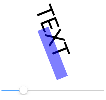
The following XAML example demonstrates binding context inheritance:
<ContentPage xmlns="http://schemas.microsoft.com/dotnet/2021/maui"
             xmlns:x="http://schemas.microsoft.com/winfx/2009/xaml"
             x:Class="DataBindingDemos.BindingContextInheritancePage"
             Title="BindingContext Inheritance">
    <StackLayout Padding="10">
        <StackLayout VerticalOptions="Fill"
                     BindingContext="{x:Reference slider}">

            <Label Text="TEXT"
                   FontSize="80"
                   HorizontalOptions="Center"
                   VerticalOptions="End"
                   Rotation="{Binding Value}" />

            <BoxView Color="#800000FF"
                     WidthRequest="180"
                     HeightRequest="40"
                     HorizontalOptions="Center"
                     VerticalOptions="Start"
                     Rotation="{Binding Value}" />
        </StackLayout>

        <Slider x:Name="slider"
                Maximum="360" />
    </StackLayout>
</ContentPage>
In this example, the BindingContext property of the StackLayout is set to the slider object. This binding context is inherited by both the Label and the BoxView, both of which have their Rotation properties set to the Value property of the Slider:

 Browse the sample