Note
Access to this page requires authorization. You can try signing in or changing directories.
Access to this page requires authorization. You can try changing directories.
 Browse the sample
The navigation experience provided by .NET Multi-platform App UI (.NET MAUI) Shell is based on flyouts and tabs. The top level of navigation in a Shell app is either a flyout or a bottom tab bar, depending on the navigation requirements of the app. When the navigation experience for an app begins with bottom tabs, the child of the subclassed Shell object should be a TabBar object, which represents the bottom tab bar.
A TabBar object can contain one or more Tab objects, with each Tab object representing a tab on the bottom tab bar. Each Tab object can contain one or more ShellContent objects, with each ShellContent object displaying a single ContentPage. When more than one ShellContent object is present in a Tab object, the ContentPage objects are navigable by top tabs. Within a tab, you can navigate to other ContentPage objects that are known as detail pages.
Important
The TabBar type disables the flyout.
Single page
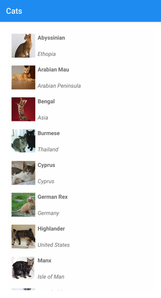
A single page Shell app can be created by adding a Tab object to a TabBar object. Within the Tab object, a ShellContent object should be set to a ContentPage object:
<Shell xmlns="http://schemas.microsoft.com/dotnet/2021/maui"
       xmlns:x="http://schemas.microsoft.com/winfx/2009/xaml"
       xmlns:views="clr-namespace:Xaminals.Views"
       x:Class="Xaminals.AppShell">
    <TabBar>
       <Tab>
           <ShellContent ContentTemplate="{DataTemplate views:CatsPage}" />
       </Tab>
    </TabBar>
</Shell>
This example results in the following single page app:
Shell has implicit-conversion operators that enable the Shell visual hierarchy to be simplified without introducing more views into the visual tree. This simplification is possible because a subclassed Shell object can only ever contain FlyoutItem objects or a TabBar object, which can only ever contain Tab objects, which can only ever contain ShellContent objects. These implicit-conversion operators can be used to remove the Tab objects from the previous example:
<Shell xmlns="http://schemas.microsoft.com/dotnet/2021/maui"
       xmlns:x="http://schemas.microsoft.com/winfx/2009/xaml"
       xmlns:views="clr-namespace:Xaminals.Views"
       x:Class="Xaminals.AppShell">
    <Tab>
        <ShellContent ContentTemplate="{DataTemplate views:CatsPage}" />
    </Tab>
</Shell>
This implicit conversion automatically wraps the ShellContent object in a Tab object, which is wrapped in a TabBar object.
Important
In a Shell app, pages are created on demand in response to navigation. This is accomplished by using the DataTemplate markup extension to set the ContentTemplate property of each ShellContent object to a ContentPage object.
Bottom tabs
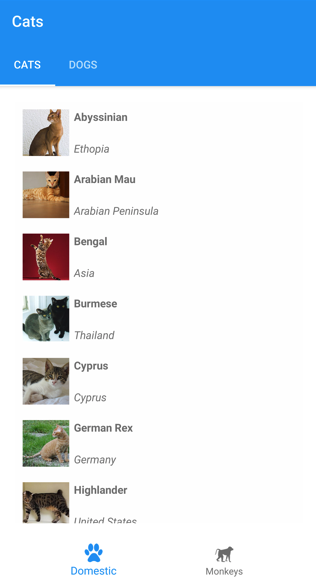
If there are multiple Tab objects in a single TabBar object, Tab objects are rendered as bottom tabs:
<Shell xmlns="http://schemas.microsoft.com/dotnet/2021/maui"
       xmlns:x="http://schemas.microsoft.com/winfx/2009/xaml"
       xmlns:views="clr-namespace:Xaminals.Views"
       x:Class="Xaminals.AppShell">
    <TabBar>
       <Tab Title="Cats"
            Icon="cat.png">
           <ShellContent ContentTemplate="{DataTemplate views:CatsPage}" />
       </Tab>
       <Tab Title="Dogs"
            Icon="dog.png">
           <ShellContent ContentTemplate="{DataTemplate views:DogsPage}" />
       </Tab>
    </TabBar>
</Shell>
The Title property, of type string, defines the tab title. The Icon property, of type ImageSource, defines the tab icon:

When there are more than five tabs on a TabBar, a More tab appears, which can be used to access the other tabs:

In addition, Shell's implicit conversion operators can be used to remove the ShellContent and Tab objects from the previous example:
<Shell xmlns="http://schemas.microsoft.com/dotnet/2021/maui"
       xmlns:x="http://schemas.microsoft.com/winfx/2009/xaml"
       xmlns:views="clr-namespace:Xaminals.Views"
       x:Class="Xaminals.AppShell">
    <TabBar>
       <ShellContent Title="Cats"
                     Icon="cat.png"
                     ContentTemplate="{DataTemplate views:CatsPage}" />
       <ShellContent Title="Dogs"
                     Icon="dog.png"
                     ContentTemplate="{DataTemplate views:DogsPage}" />
    </TabBar>
</Shell>
This implicit conversion automatically wraps each ShellContent object in a Tab object.
Important
In a Shell app, pages are created on demand in response to navigation. This is accomplished by using the DataTemplate markup extension to set the ContentTemplate property of each ShellContent object to a ContentPage object.
Bottom and top tabs
When more than one ShellContent object is present in a Tab object, a top tab bar is added to the bottom tab, through which the ContentPage objects are navigable:
<Shell xmlns="http://schemas.microsoft.com/dotnet/2021/maui"
       xmlns:x="http://schemas.microsoft.com/winfx/2009/xaml"
       xmlns:views="clr-namespace:Xaminals.Views"
       x:Class="Xaminals.AppShell">
    <TabBar>
       <Tab Title="Domestic"
            Icon="paw.png">
           <ShellContent Title="Cats"
                         ContentTemplate="{DataTemplate views:CatsPage}" />
           <ShellContent Title="Dogs"
                         ContentTemplate="{DataTemplate views:DogsPage}" />
       </Tab>
       <Tab Title="Monkeys"
            Icon="monkey.png">
           <ShellContent ContentTemplate="{DataTemplate views:MonkeysPage}" />
       </Tab>
    </TabBar>
</Shell>
This code results in the layout shown in the following screenshot:
In addition, Shell's implicit conversion operators can be used to remove the second Tab object from the previous example:
<Shell xmlns="http://schemas.microsoft.com/dotnet/2021/maui"
       xmlns:x="http://schemas.microsoft.com/winfx/2009/xaml"
       xmlns:views="clr-namespace:Xaminals.Views"
       x:Class="Xaminals.AppShell">
    <TabBar>
       <Tab Title="Domestic"
            Icon="paw.png">
           <ShellContent Title="Cats"
                         Icon="cat.png"
                         ContentTemplate="{DataTemplate views:CatsPage}" />
           <ShellContent Title="Dogs"
                         Icon="dog.png"
                         ContentTemplate="{DataTemplate views:DogsPage}" />
       </Tab>
       <ShellContent Title="Monkeys"
                     Icon="monkey.png"
                     ContentTemplate="{DataTemplate views:MonkeysPage}" />
    </TabBar>
</Shell>
This implicit conversion automatically wraps the third ShellContent object in a Tab object.
Tab appearance
The Shell class defines the following attached properties that control the appearance of tabs:
TabBarBackgroundColor, of type Color, that defines the background color for the tab bar. If the property is unset, theBackgroundColorproperty value is used.TabBarDisabledColor, of type Color, that defines the disabled color for the tab bar. If the property is unset, theDisabledColorproperty value is used.TabBarForegroundColor, of type Color, that defines the foreground color for the tab bar. If the property is unset, theForegroundColorproperty value is used.TabBarTitleColor, of type Color, that defines the title color for the tab bar. If the property is unset, theTitleColorproperty value is used.TabBarUnselectedColor, of type Color, that defines the unselected color for the tab bar. If the property is unset, theUnselectedColorproperty value is used.
All of these properties are backed by BindableProperty objects, which means that the properties can be targets of data bindings, and styled.
The three properties that most influence the color of a tab are TabBarForegroundColor, TabBarTitleColor, and TabBarUnselectedColor:
- If only the
TabBarTitleColorproperty is set then its value will be used to color the title and icon of the selected tab. IfTabBarTitleColorisn't set then the title color will match the value of theTabBarForegroundColorproperty. - If the
TabBarForegroundColorproperty is set and theTabBarUnselectedColorproperty isn't set then the value of theTabBarForegroundColorproperty will be used to color the title and icon of the selected tab. - If only the
TabBarUnselectedColorproperty is set then its value will be used to color the title and icon of the unselected tab.
For example:
- When the
TabBarTitleColorproperty is set toGreenthe title and icon for the selected tab is green, and unselected tabs match system colors. - When the
TabBarForegroundColorproperty is set toBluethe title and icon for the selected tab is blue, and unselected tabs match system colors. - When the
TabBarTitleColorproperty is set toGreenand theTabBarForegroundColorproperty is set toBluethe title is green and the icon is blue for the selected tab, and unselected tabs match system colors. - When the
TabBarTitleColorproperty is set toGreenand theShell.ForegroundColorproperty is set toBluethe title is green and the icon is blue for the selected tab, and unselected tabs match system colors. This occurs because theShell.ForegroundColorproperty value propagates to theTabBarForegroundColorproperty. - When the
TabBarTitleColorproperty is set toGreen, theTabBarForegroundColorproperty is set toBlue, and theTabBarUnselectedColorproperty is set toRed, the title is green and the icon is blue for the selected tab, and unselected tab titles and icons are red.
The following example shows a XAML style that sets different tab bar color properties:
<Style TargetType="TabBar">
    <Setter Property="Shell.TabBarBackgroundColor"
            Value="CornflowerBlue" />
    <Setter Property="Shell.TabBarTitleColor"
            Value="Black" />
    <Setter Property="Shell.TabBarUnselectedColor"
            Value="AntiqueWhite" />
</Style>
In addition, tabs can also be styled using Cascading Style Sheets (CSS). For more information, see .NET MAUI Shell specific properties.
Tab selection
When a Shell app that uses a tab bar is first run, the Shell.CurrentItem property is set to the first Tab object in the subclassed Shell object. However, the property can be set to another Tab, as shown in the following example:
<Shell ...
       CurrentItem="{x:Reference dogsItem}">
    <TabBar>
        <ShellContent Title="Cats"
                      Icon="cat.png"
                      ContentTemplate="{DataTemplate views:CatsPage}" />
        <ShellContent x:Name="dogsItem"
                      Title="Dogs"
                      Icon="dog.png"
                      ContentTemplate="{DataTemplate views:DogsPage}" />
    </TabBar>
</Shell>
This example sets the CurrentItem property to the ShellContent object named dogsItem, which results in it being selected and displayed. In this example, an implicit conversion is used to wrap each ShellContent object in a Tab object.
The equivalent C# code, given a ShellContent object named dogsItem, is:
CurrentItem = dogsItem;
In this example, the CurrentItem property is set in the subclassed Shell class. Alternatively, the CurrentItem property can be set in any class through the Shell.Current static property:
Shell.Current.CurrentItem = dogsItem;
TabBar and Tab visibility
The tab bar and tabs are visible in Shell apps by default. However, the tab bar can be hidden by setting the Shell.TabBarIsVisible attached property to false.
While this property can be set on a subclassed Shell object, it's typically set on any ShellContent or ContentPage objects that want to make the tab bar invisible:
<TabBar>
   <Tab Title="Domestic"
        Icon="paw.png">
       <ShellContent Title="Cats"
                     ContentTemplate="{DataTemplate views:CatsPage}" />
       <ShellContent Shell.TabBarIsVisible="false"
                     Title="Dogs"
                     ContentTemplate="{DataTemplate views:DogsPage}" />
   </Tab>
   <Tab Title="Monkeys"
        Icon="monkey.png">
       <ShellContent ContentTemplate="{DataTemplate views:MonkeysPage}" />
   </Tab>
</TabBar>
In this example, the tab bar is hidden when the upper Dogs tab is selected.
In addition, Tab objects can be hidden by setting the IsVisible bindable property to false:
<TabBar>
    <ShellContent Title="Cats"
                  Icon="cat.png"
                  ContentTemplate="{DataTemplate views:CatsPage}" />
    <ShellContent Title="Dogs"
                  Icon="dog.png"
                  ContentTemplate="{DataTemplate views:DogsPage}"
                  IsVisible="False" />
    <ShellContent Title="Monkeys"
                  Icon="monkey.png"
                  ContentTemplate="{DataTemplate views:MonkeysPage}" />
</TabBar>
In this example, the second tab is hidden.
Collaborate with us on GitHub
The source for this content can be found on GitHub, where you can also create and review issues and pull requests. For more information, see our contributor guide.