Button
The .NET Multi-platform App UI (.NET MAUI) Button displays text and responds to a tap or click that directs the app to carry out a task. A Button usually displays a short text string indicating a command, but it can also display a bitmap image, or a combination of text and an image. When the Button is pressed with a finger or clicked with a mouse it initiates that command.
Button defines the following properties:
BorderColor, of type Color, describes the border color of the button.BorderWidth, of typedouble, defines the width of the button's border.CharacterSpacing, of typedouble, defines the spacing between characters of the button's text.Command, of type ICommand, defines the command that's executed when the button is tapped.CommandParameter, of typeobject, is the parameter that's passed toCommand.ContentLayout, of typeButtonContentLayout, defines the object that controls the position of the button image and the spacing between the button's image and text.CornerRadius, of typeint, describes the corner radius of the button's border.FontAttributes, of typeFontAttributes, determines text style.FontAutoScalingEnabled, of typebool, defines whether the button text will reflect scaling preferences set in the operating system. The default value of this property istrue.FontFamily, of typestring, defines the font family.FontSize, of typedouble, defines the font size.- ImageSource, of type ImageSource, specifies a bitmap image to display as the content of the button.
LineBreakMode, of typeLineBreakMode, determines how text should be handled when it can't fit on one line.Padding, of typeThickness, determines the button's padding.Text, of typestring, defines the text displayed as the content of the button.TextColor, of type Color, describes the color of the button's text.TextTransform, of typeTextTransform, defines the casing of the button's text.
These properties are backed by BindableProperty objects, which means that they can be targets of data bindings, and styled.
Note
While Button defines an ImageSource property, that allows you to display a image on the Button, this property is intended to be used when displaying a small icon next to the Button text.
In addition, Button defines Clicked, Pressed, and Released events. The Clicked event is raised when a Button tap with a finger or mouse pointer is released from the button's surface. The Pressed event is raised when a finger presses on a Button, or a mouse button is pressed with the pointer positioned over the Button. The Released event is raised when the finger or mouse button is released. Generally, a Clicked event is also raised at the same time as the Released event, but if the finger or mouse pointer slides away from the surface of the Button before being released, the Clicked event might not occur.
Important
A Button must have its IsEnabled property set to true for it to respond to taps.
Create a Button
To create a button, create a Button object and handle its Clicked event.
The following XAML example show how to create a Button:
<ContentPage xmlns="http://schemas.microsoft.com/dotnet/2021/maui"
xmlns:x="http://schemas.microsoft.com/winfx/2009/xaml"
x:Class="ButtonDemos.BasicButtonClickPage"
Title="Basic Button Click">
<StackLayout>
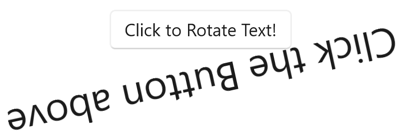
<Button Text="Click to Rotate Text!"
VerticalOptions="Center"
HorizontalOptions="Center"
Clicked="OnButtonClicked" />
<Label x:Name="label"
Text="Click the Button above"
FontSize="18"
VerticalOptions="Center"
HorizontalOptions="Center" />
</StackLayout>
</ContentPage>
The Text property specifies the text that appears in the Button. The Clicked event is set to an event handler named OnButtonClicked. This handler is located in the code-behind file:
public partial class BasicButtonClickPage : ContentPage
{
    public BasicButtonClickPage ()
    {
        InitializeComponent ();
    }

    async void OnButtonClicked(object sender, EventArgs args)
    {
        await label.RelRotateTo(360, 1000);
    }
}
In this example, when the Button is tapped, the OnButtonClicked method executes. The sender argument is the Button object responsible for this event. You can use this to access the Button object, or to distinguish between multiple Button objects sharing the same Clicked event. The Clicked handler calls an animation function that rotates the Label 360 degrees in 1000 milliseconds:
The equivalent C# code to create a Button is:
Button button = new Button
{
    Text = "Click to Rotate Text!",
    VerticalOptions = LayoutOptions.Center,
    HorizontalOptions = LayoutOptions.Center
};
button.Clicked += async (sender, args) => await label.RelRotateTo(360, 1000);
Use the command interface
An app can respond to Button taps without handling the Clicked event. The Button implements an alternative notification mechanism called the command or commanding interface. This consists of two properties:
Commandof type ICommand, an interface defined in theSystem.Windows.Inputnamespace.CommandParameterproperty of typeObject.
This approach is particularly suitable in connection with data-binding, and particularly when implementing the Model-View-ViewModel (MVVM) pattern. In an MVVM application, the viewmodel defines properties of type ICommand that are then connected to Button objects with data bindings. .NET MAUI also defines Command and Command<T> classes that implement the ICommand interface and assist the viewmodel in defining properties of type ICommand. For more information about commanding, see Commanding.
The following example shows a very simple viewmodel class that defines a property of type double named Number, and two properties of type ICommand named MultiplyBy2Command and DivideBy2Command:
public class CommandDemoViewModel : INotifyPropertyChanged
{
    double number = 1;

    public event PropertyChangedEventHandler PropertyChanged;

    public ICommand MultiplyBy2Command { get; private set; }
    public ICommand DivideBy2Command { get; private set; }

    public CommandDemoViewModel()
    {
        MultiplyBy2Command = new Command(() => Number *= 2);
        DivideBy2Command = new Command(() => Number /= 2);
    }

    public double Number
    {
        get
        {
            return number;
        }
        set
        {
            if (number != value)
            {
                number = value;
                PropertyChanged?.Invoke(this, new PropertyChangedEventArgs("Number"));
            }
        }
    }
}
In this example, the two ICommand properties are initialized in the class's constructor with two objects of type Command. The Command constructors include a little function (called the execute constructor argument) that either doubles or halves the value of the Number property.
The following XAML example consumes the CommandDemoViewModel class:
<ContentPage xmlns="http://schemas.microsoft.com/dotnet/2021/maui"
             xmlns:x="http://schemas.microsoft.com/winfx/2009/xaml"
             xmlns:local="clr-namespace:ButtonDemos"
             x:Class="ButtonDemos.BasicButtonCommandPage"
             Title="Basic Button Command">
    <ContentPage.BindingContext>
        <local:CommandDemoViewModel />
    </ContentPage.BindingContext>

    <StackLayout>
        <Label Text="{Binding Number, StringFormat='Value is now {0}'}"
               FontSize="18"
               VerticalOptions="Center"
               HorizontalOptions="Center" />
        <Button Text="Multiply by 2"
                VerticalOptions="Center"
                HorizontalOptions="Center"
                Command="{Binding MultiplyBy2Command}" />
        <Button Text="Divide by 2"
                VerticalOptions="Center"
                HorizontalOptions="Center"
                Command="{Binding DivideBy2Command}" />
    </StackLayout>
</ContentPage>
In this example, the Label element and two Button objects contain bindings to the three properties in the CommandDemoViewModel class. As the two Button objects are tapped, the commands are executed, and the number changes value. The advantage of this approach over Clicked handlers is that all the logic involving the functionality of this page is located in the viewmodel rather than the code-behind file, achieving a better separation of the user interface from the business logic.
It's also possible for the Command objects to control the enabling and disabling of the Button objects. For example, suppose you want to limit the range of number values between 210 and 2–10. You can add another function to the constructor (called the canExecute argument) that returns true if the Button should be enabled:
public class CommandDemoViewModel : INotifyPropertyChanged
{
    ···
    public CommandDemoViewModel()
    {
        MultiplyBy2Command = new Command(
            execute: () =>
            {
                Number *= 2;
                ((Command)MultiplyBy2Command).ChangeCanExecute();
                ((Command)DivideBy2Command).ChangeCanExecute();
            },
            canExecute: () => Number < Math.Pow(2, 10));

        DivideBy2Command = new Command(
            execute: () =>
            {
                Number /= 2;
                ((Command)MultiplyBy2Command).ChangeCanExecute();
                ((Command)DivideBy2Command).ChangeCanExecute();
            },
            canExecute: () => Number > Math.Pow(2, -10));
    }
    ···
}
In this example, the calls to the ChangeCanExecute method of Command are required so that the Command method can call the canExecute method and determine whether the Button should be disabled or not. With this code change, as the number reaches the limit, the Button is disabled.
It's also possible for two or more Button elements to be bound to the same ICommand property. The Button elements can be distinguished using the CommandParameter property of Button. In this case, you'll want to use the generic Command<T> class. The CommandParameter object is then passed as an argument to the execute and canExecute methods. For more information, see Commanding.
Press and release the button
The Pressed event is raised when a finger presses on a Button, or a mouse button is pressed with the pointer positioned over the Button. The Released event is raised when the finger or mouse button is released. Generally, a Clicked event is also raised at the same time as the Released event, but if the finger or mouse pointer slides away from the surface of the Button before being released, the Clicked event might not occur.
The following XAML example shows a Label and a Button with handlers attached for the Pressed and Released events:
<ContentPage xmlns="http://schemas.microsoft.com/dotnet/2021/maui"
             xmlns:x="http://schemas.microsoft.com/winfx/2009/xaml"
             x:Class="ButtonDemos.PressAndReleaseButtonPage"
             Title="Press and Release Button">
    <StackLayout>
        <Button Text="Press to Rotate Text!"
                VerticalOptions="Center"
                HorizontalOptions="Center"
                Pressed="OnButtonPressed"
                Released="OnButtonReleased" />
        <Label x:Name="label"
               Text="Press and hold the Button above"
               FontSize="18"
               VerticalOptions="Center"
               HorizontalOptions="Center" />
    </StackLayout>
</ContentPage>
The code-behind file animates the Label when a Pressed event occurs, but suspends the rotation when a Released event occurs:
public partial class PressAndReleaseButtonPage : ContentPage
{
    IDispatcherTimer timer;
    Stopwatch stopwatch = new Stopwatch();

    public PressAndReleaseButtonPage()
    {
        InitializeComponent();

        timer = Dispatcher.CreateTimer();
        timer.Interval = TimeSpan.FromMilliseconds(16);
        timer.Tick += (s, e) =>
        {
            label.Rotation = 360 * (stopwatch.Elapsed.TotalSeconds % 1);
        };
    }

    void OnButtonPressed(object sender, EventArgs args)
    {
        stopwatch.Start();
        timer.Start();
    }

    void OnButtonReleased(object sender, EventArgs args)
    {
        stopwatch.Stop();
        timer.Stop();
    }
}
The result is that the Label only rotates while a finger is in contact with the Button, and stops when the finger is released.
Button visual states
Button has a Pressed VisualState that can be used to initiate a visual change to the Button when pressed, provided that it's enabled.
The following XAML example shows how to define a visual state for the Pressed state:
<Button Text="Click me!"
        ...>
    <VisualStateManager.VisualStateGroups>
        <VisualStateGroupList>
            <VisualStateGroup x:Name="CommonStates">
                <VisualState x:Name="Normal">
                    <VisualState.Setters>
                        <Setter Property="Scale"
                                Value="1" />
                    </VisualState.Setters>
                </VisualState>
                <VisualState x:Name="Pressed">
                    <VisualState.Setters>
                        <Setter Property="Scale"
                                Value="0.8" />
                    </VisualState.Setters>
                </VisualState>
                <VisualState x:Name="PointerOver" />
            </VisualStateGroup>
        </VisualStateGroupList>
    </VisualStateManager.VisualStateGroups>
</Button>
In this example, the Pressed VisualState specifies that when the Button is pressed, its Scale property will be changed from its default value of 1 to 0.8. The Normal VisualState specifies that when the Button is in a normal state, its Scale property will be set to 1. Therefore, the overall effect is that when the Button is pressed, it's rescaled to be slightly smaller, and when the Button is released, it's rescaled to its default size.
Important
For a Button to return to its Normal state the VisualStateGroup must also define a PointerOver state. If you use the styles ResourceDictionary created by the .NET MAUI app project template, you'll already have an implicit Button style that defines the PointerOver state.
For more information about visual states, see Visual states.
Use bitmaps with buttons
The Button class defines an ImageSource property that allows you to display a small bitmap image on the Button, either alone or in combination with text. You can also specify how the text and image are arranged. The ImageSource property is of type ImageSource, which means that the bitmaps can be loaded from a file, embedded resource, URI, or stream.
Bitmaps aren't scaled to fit a Button. The best size is usually between 32 and 64 device-independent units, depending on how large you want the bitmap to be.
You can specify how the Text and ImageSource properties are arranged on the Button using the ContentLayout property of Button. This property is of type ButtonContentLayout, and its constructor has two arguments:
- A member of the
ImagePositionenumeration:Left,Top,Right, orBottomindicating how the bitmap appears relative to the text. - A
doublevalue for the spacing between the bitmap and the text.
In XAML, you can create a Button and set the ContentLayout property by specifying only the enumeration member, or the spacing, or both in any order separated by commas:
<Button Text="Button text"
        ImageSource="button.png"
        ContentLayout="Right, 20" />
The equivalent C# code is:
Button button = new Button
{
    Text = "Button text",
    ImageSource = new FileImageSource
    {
        File = "button.png"
    },
    ContentLayout = new Button.ButtonContentLayout(Button.ButtonContentLayout.ImagePosition.Right, 20)
};
Disable a Button
Sometimes an app enters a state where a Button click is not a valid operation. In such cases, the Button can be disabled by setting its IsEnabled property to false.