Note
Access to this page requires authorization. You can try signing in or changing directories.
Access to this page requires authorization. You can try changing directories.
 Browse the sample
The .NET Multi-platform App UI (.NET MAUI) CollectionView is a view for presenting lists of data using different layout specifications. It aims to provide a more flexible, and performant alternative to ListView.
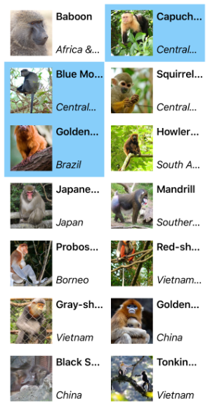
The following screenshot shows a CollectionView that uses a two-column vertical grid and allows multiple selections:
CollectionView should be used for presenting lists of data that require scrolling or selection. A bindable layout can be used when the data to be displayed doesn't require scrolling or selection. For more information, see BindableLayout.
CollectionView and ListView differences
While the CollectionView and ListView APIs are similar, there are some notable differences:
- CollectionView has a flexible layout model, which allows data to be presented vertically or horizontally, in a list or a grid.
- CollectionView supports single and multiple selection.
- CollectionView has no concept of cells. Instead, a data template is used to define the appearance of each item of data in the list.
- CollectionView automatically utilizes the virtualization provided by the underlying native controls.
- CollectionView reduces the API surface of ListView. Many properties and events from ListView are not present in CollectionView.
- CollectionView does not include built-in separators.
- CollectionView will throw an exception if its
ItemsSourceis updated off the UI thread.
Move from ListView to CollectionView
ListView implementations can be migrated to CollectionView implementations with the help of the following table:
| Concept | ListView API | CollectionView |
|---|---|---|
| Data | ItemsSource |
A CollectionView is populated with data by setting its ItemsSource property. For more information, see Populate a CollectionView with data. |
| Item appearance | ItemTemplate |
The appearance of each item in a CollectionView can be defined by setting the ItemTemplate property to a DataTemplate. For more information, see Define item appearance. |
| Cells | TextCell, ImageCell, ViewCell | CollectionView has no concept of cells, and therefore no concept of disclosure indicators. Instead, a data template is used to define the appearance of each item of data in the list. |
| Row separators | SeparatorColor, SeparatorVisibility |
CollectionView does not include built-in separators. These can be provided, if desired, in the item template. |
| Selection | SelectionMode, SelectedItem |
CollectionView supports single and multiple selection. For more information, see Configure CollectionView item selection. |
| Row height | HasUnevenRows, RowHeight |
In a CollectionView, the row height of each item is determined by the ItemSizingStrategy property. For more information, see Item sizing. |
| Caching | CachingStrategy |
CollectionView automatically uses the virtualization provided by the underlying native controls. |
| Headers and footers | Header, HeaderElement, HeaderTemplate, Footer, FooterElement, FooterTemplate |
CollectionView can present a header and footer that scroll with the items in the list, via the Header, Footer, HeaderTemplate, and FooterTemplate properties. For more information, see Headers and footers. |
| Grouping | GroupDisplayBinding, GroupHeaderTemplate, GroupShortNameBinding, IsGroupingEnabled |
CollectionView displays correctly grouped data by setting its IsGrouped property to true. Group headers and group footers can be customized by setting the GroupHeaderTemplate and GroupFooterTemplate properties to DataTemplate objects. For more information, see Display grouped data in a CollectionView. |
| Pull to refresh | IsPullToRefreshEnabled, IsRefreshing, RefreshAllowed, RefreshCommand, RefreshControlColor, BeginRefresh(), EndRefresh() |
Pull to refresh functionality is supported by setting a CollectionView as the child of a RefreshView. For more information, see Pull to refresh. |
| Context menu items | ContextActions |
Context menu items are supported by setting a SwipeView as the root view in the DataTemplate that defines the appearance of each item of data in the CollectionView. For more information, see Context menus. |
| Scrolling | ScrollTo() |
CollectionView defines ScrollTo methods, which scroll items into view. For more information, see Control scrolling in a CollectionView. |
Collaborate with us on GitHub
The source for this content can be found on GitHub, where you can also create and review issues and pull requests. For more information, see our contributor guide.