Picker
The .NET Multi-platform App UI (.NET MAUI) Picker displays a short list of items, from which the user can select an item.
Picker defines the following properties:
CharacterSpacing, of typedouble, is the spacing between characters of the item displayed by the Picker.FontAttributesof typeFontAttributes, which defaults toFontAtributes.None.FontAutoScalingEnabled, of typebool, which determines whether the text respects scaling preferences set in the operating system. The default value of this property istrue.FontFamilyof typestring, which defaults tonull.FontSizeof typedouble, which defaults to -1.0.HorizontalTextAlignment, of typeTextAlignment, is the horizontal alignment of the text displayed by the Picker.ItemsSourceof typeIList, the source list of items to display, which defaults tonull.SelectedIndexof typeint, the index of the selected item, which defaults to -1.SelectedItemof typeobject, the selected item, which defaults tonull.ItemDisplayBinding, of type BindingBase, selects the property that will be displayed for each object in the list of items, if theItemSourceis a complex object. For more information, see Populate a Picker with data using data binding.TextColorof type Color, the color used to display the text.TextTransform, of typeTextTransform, which defines whether to transform the casing of text.Titleof typestring, which defaults tonull.TitleColorof type Color, the color used to display theTitletext.VerticalTextAlignment, of typeTextAlignment, is the vertical alignment of the text displayed by the Picker.
All of the properties, with the exception of ItemDisplayBinding, are backed by BindableProperty objects, which means that they can be styled, and the properties can be targets of data bindings. The SelectedIndex and SelectedItem properties have a default binding mode of BindingMode.TwoWay, which means that they can be targets of data bindings in an application that uses the Model-View-ViewModel (MVVM) pattern. For information about setting font properties, see Fonts.
A Picker doesn't show any data when it's first displayed. Instead, the value of its Title property is shown as a placeholder, as shown in the following iOS screenshot:

When the Picker gains focus, its data is displayed and the user can select an item:
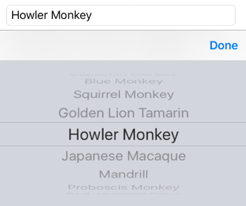
The Picker fires a SelectedIndexChanged event when the user selects an item. Following selection, the selected item is displayed by the Picker:

There are two techniques for populating a Picker with data:
- Setting the
ItemsSourceproperty to the data to be displayed. This is the recommended technique for adding data to a Picker. For more information, see Set the ItemsSource property. - Adding the data to be displayed to the
Itemscollection. For more information, see Add data to the Items collection.
Set the ItemsSource property
A Picker can be populated with data by setting its ItemsSource property to an IList collection. Each item in the collection must be of, or derived from, type object. Items can be added in XAML by initializing the ItemsSource property from an array of items:
<Picker x:Name="picker"
        Title="Select a monkey">
  <Picker.ItemsSource>
    <x:Array Type="{x:Type x:String}">
      <x:String>Baboon</x:String>
      <x:String>Capuchin Monkey</x:String>
      <x:String>Blue Monkey</x:String>
      <x:String>Squirrel Monkey</x:String>
      <x:String>Golden Lion Tamarin</x:String>
      <x:String>Howler Monkey</x:String>
      <x:String>Japanese Macaque</x:String>
    </x:Array>
  </Picker.ItemsSource>
</Picker>
Note
The x:Array element requires a Type attribute indicating the type of the items in the array.
The equivalent C# code is:
var monkeyList = new List<string>();
monkeyList.Add("Baboon");
monkeyList.Add("Capuchin Monkey");
monkeyList.Add("Blue Monkey");
monkeyList.Add("Squirrel Monkey");
monkeyList.Add("Golden Lion Tamarin");
monkeyList.Add("Howler Monkey");
monkeyList.Add("Japanese Macaque");

Picker picker = new Picker { Title = "Select a monkey" };
picker.ItemsSource = monkeyList;
Respond to item selection
A Picker supports selection of one item at a time. When a user selects an item, the SelectedIndexChanged event fires, the SelectedIndex property is updated to an integer representing the index of the selected item in the list, and the SelectedItem property is updated to the object representing the selected item. The SelectedIndex property is a zero-based number indicating the item the user selected. If no item is selected, which is the case when the Picker is first created and initialized, SelectedIndex will be -1.
Note
Item selection behavior in a Picker can be customized on iOS with a platform-specific. For more information, see Picker item selection on iOS.
The following XAML example shows how to retrieve the SelectedItem property value from the Picker:
<Label Text="{Binding Source={x:Reference picker}, Path=SelectedItem}" />
The equivalent C# code is:
Label monkeyNameLabel = new Label();
monkeyNameLabel.SetBinding(Label.TextProperty, new Binding("SelectedItem", source: picker));
In addition, an event handler can be executed when the SelectedIndexChanged event fires:
void OnPickerSelectedIndexChanged(object sender, EventArgs e)
{
  var picker = (Picker)sender;
  int selectedIndex = picker.SelectedIndex;

  if (selectedIndex != -1)
  {
    monkeyNameLabel.Text = (string)picker.ItemsSource[selectedIndex];
  }
}
In this example, the event handler obtains the SelectedIndex property value, and uses the value to retrieve the selected item from the ItemsSource collection. This is functionally equivalent to retrieving the selected item from the SelectedItem property. Each item in the ItemsSource collection is of type object, and so must be cast to a string for display.
Note
A Picker can be initialized to display a specific item by setting the SelectedIndex or SelectedItem properties. However, these properties must be set after initializing the ItemsSource collection.
Populate a Picker with data using data binding
A Picker can be also populated with data by using data binding to bind its ItemsSource property to an IList collection. In XAML this is achieved with the Binding markup extension:
<Picker Title="Select a monkey"
        ItemsSource="{Binding Monkeys}"
        ItemDisplayBinding="{Binding Name}" />
The equivalent C# code is shown below:
Picker picker = new Picker { Title = "Select a monkey" };
picker.SetBinding(Picker.ItemsSourceProperty, "Monkeys");
picker.ItemDisplayBinding = new Binding("Name");
In this example, the ItemsSource property data binds to the Monkeys property of the binding context, which returns an IList<Monkey> collection. The following code example shows the Monkey class, which contains four properties:
public class Monkey
{
  public string Name { get; set; }
  public string Location { get; set; }
  public string Details { get; set; }
  public string ImageUrl { get; set; }
}
When binding to a list of objects, the Picker must be told which property to display from each object. This is achieved by setting the ItemDisplayBinding property to the required property from each object. In the code examples above, the Picker is set to display each Monkey.Name property value.
Respond to item selection
Data binding can be used to set an object to the SelectedItem property value when it changes:
<Picker Title="Select a monkey"
        ItemsSource="{Binding Monkeys}"
        ItemDisplayBinding="{Binding Name}"
        SelectedItem="{Binding SelectedMonkey}" />
<Label Text="{Binding SelectedMonkey.Name}" ... />
<Label Text="{Binding SelectedMonkey.Location}" ... />
<Image Source="{Binding SelectedMonkey.ImageUrl}" ... />
<Label Text="{Binding SelectedMonkey.Details}" ... />
The equivalent C# code is:
Picker picker = new Picker { Title = "Select a monkey" };
picker.SetBinding(Picker.ItemsSourceProperty, "Monkeys");
picker.SetBinding(Picker.SelectedItemProperty, "SelectedMonkey");
picker.ItemDisplayBinding = new Binding("Name");

Label nameLabel = new Label { ... };
nameLabel.SetBinding(Label.TextProperty, "SelectedMonkey.Name");

Label locationLabel = new Label { ... };
locationLabel.SetBinding(Label.TextProperty, "SelectedMonkey.Location");

Image image = new Image { ... };
image.SetBinding(Image.SourceProperty, "SelectedMonkey.ImageUrl");

Label detailsLabel = new Label();
detailsLabel.SetBinding(Label.TextProperty, "SelectedMonkey.Details");
The SelectedItem property data binds to the SelectedMonkey property of the binding context, which is of type Monkey. Therefore, when the user selects an item in the Picker, the SelectedMonkey property will be set to the selected Monkey object. The SelectedMonkey object data is displayed in the user interface by Label and Image views.
Note
The SelectedItem and SelectedIndex properties both support two-way bindings by default.
Add data to the Items collection
An alternative process for populating a Picker with data is to add the data to be displayed to the read-only Items collection, which is of type IList<string>. Each item in the collection must be of type string. Items can be added in XAML by initializing the Items property with a list of x:String items:
<Picker Title="Select a monkey">
  <Picker.Items>
    <x:String>Baboon</x:String>
    <x:String>Capuchin Monkey</x:String>
    <x:String>Blue Monkey</x:String>
    <x:String>Squirrel Monkey</x:String>
    <x:String>Golden Lion Tamarin</x:String>
    <x:String>Howler Monkey</x:String>
    <x:String>Japanese Macaque</x:String>
  </Picker.Items>
</Picker>
The equivalent C# code is:
Picker picker = new Picker { Title = "Select a monkey" };
picker.Items.Add("Baboon");
picker.Items.Add("Capuchin Monkey");
picker.Items.Add("Blue Monkey");
picker.Items.Add("Squirrel Monkey");
picker.Items.Add("Golden Lion Tamarin");
picker.Items.Add("Howler Monkey");
picker.Items.Add("Japanese Macaque");
In addition to adding data using the Items.Add method, data can also be inserted into the collection by using the Items.Insert method.
Respond to item selection
A Picker supports selection of one item at a time. When a user selects an item, the SelectedIndexChanged event fires, and the SelectedIndex property is updated to an integer representing the index of the selected item in the list. The SelectedIndex property is a zero-based number indicating the item that the user selected. If no item is selected, which is the case when the Picker is first created and initialized, SelectedIndex will be -1.
Note
Item selection behavior in a Picker can be customized on iOS with a platform-specific. For more information, see Picker item selection on iOS.
The following code example shows the OnPickerSelectedIndexChanged event handler method, which is executed when the SelectedIndexChanged event fires:
void OnPickerSelectedIndexChanged(object sender, EventArgs e)
{
  var picker = (Picker)sender;
  int selectedIndex = picker.SelectedIndex;

  if (selectedIndex != -1)
  {
    monkeyNameLabel.Text = picker.Items[selectedIndex];
  }
}
This method obtains the SelectedIndex property value, and uses the value to retrieve the selected item from the Items collection. Because each item in the Items collection is a string, they can be displayed by a Label without requiring a cast.
Note
A Picker can be initialized to display a specific item by setting the SelectedIndex property. However, the SelectedIndex property must be set after initializing the Items collection.
Feedback
Coming soon: Throughout 2024 we will be phasing out GitHub Issues as the feedback mechanism for content and replacing it with a new feedback system. For more information see: https://aka.ms/ContentUserFeedback.
Submit and view feedback for