Note
Access to this page requires authorization. You can try signing in or changing directories.
Access to this page requires authorization. You can try changing directories.
 Browse the sample
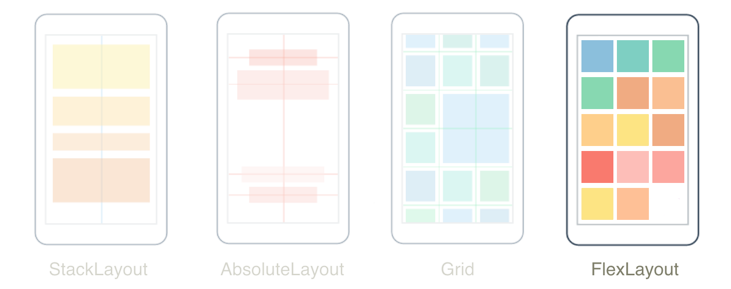
The .NET Multi-platform App UI (.NET MAUI) FlexLayout is a layout that can arrange its children horizontally and vertically in a stack, and can also wrap its children if there are too many to fit in a single row or column. In addition, FlexLayout can control orientation and alignment, and adapt to different screen sizes. FlexLayout is based on the Cascading Style Sheets (CSS) Flexible Box Layout Module.
The FlexLayout class defines the following properties:
AlignContent, of typeFlexAlignContent, which determines how the layout engine will distribute space between and around children that have been laid out on multiple lines. The default value of this property isStretch. For more information, see AlignContent.AlignItems, of typeFlexAlignItems, which indicates how the layout engine will distribute space between and around children along the cross axis. The default value of this property isStretch. For more information, see AlignItems.Direction, of typeFlexDirection, which defines the direction and main axis of children. The default value of this property isRow. For more information, see Direction.JustifyContent, of typeFlexJustify, which specifies how space is distributed between and around children along the main axis. The default value of this property isStart. For more information, see JustifyContent.Position, of typeFlexPosition, which determines whether the position of children are relative to each other, or by using fixed values. The default value of this property isRelative.Wrap, of typeFlexWrap, which controls whether children are laid out in a single line or in multiple lines. The default value of this property isNoWrap. For more information, see Wrap.AlignSelf, of typeFlexAlignSelf, which is an attached property that indicates how the layout engine will distribute space between and around children for a specific child along the cross axis. The default value of this property isAuto. For more information, see AlignSelf.Basis, of typeFlexBasis, which is an attached property that defines the initial main size of the child before free space is distributed according to other property values. The default value of this property isAuto. For more information, see Basis.Grow, of typefloat, which is an attached property that specifies the amount of available space the child should use on the main axis. The default value of this property is 0.0. A validation callback ensures that when the property is set, its value is greater than or equal to 0. For more information, see Grow.Order, of typeint, which is an attached property that determines whether the child should be laid out before or after other children in the container. The default value of this property is 0. For more information, see Order.Shrink, of typefloat, which is an attached property that controls how a child should shrink so that all children can fit inside the container. The default value of this property is 1.0. A validation callback ensures that when the property is set, its value is greater than or equal to 0. For more information, see Shrink.
These properties are backed by BindableProperty objects, which means that the properties can be targets of data bindings and styled.
Important
When items in a FlexLayout are arranged in a column, the FlexLayout has a vertical main axis and a horizontal cross axis. When items in a FlexLayout are arranged in a row, the FlexLayout has a horizontal main axis and a vertical cross axis.
FlexLayout and its children can be partially styled using Cascading Style Sheets (CSS). For more information, see Styling apps using Cascading Style Sheets (CSS).
Orientation and alignment
The Direction, Wrap, JustifyContent, AlignItems, AlignContent, and Position bindable properties can be set on a FlexLayout to control orientation and alignment of all children.
Direction
The Direction property, of type FlexDirection, defines the direction and main axis of children. The FlexDirection enumeration defines the following members:
Column, which indicates that children should be stacked vertically.ColumnReverse(or "column-reverse" in XAML), which indicates that children should be stacked vertically in reverse order.Row, which indicates that children should be stacked horizontally. This is the default value of theDirectionproperty.RowReverse(or "row-reverse" in XAML), which indicates that children should be stacked horizontally in reverse order.
When the Direction property is set to Column, or ColumnReverse, the main-axis will be the y-axis and items will be stacked vertically. When the Direction property is set to Row, or RowReverse, the main-axis will be the x-axis and children will be stacked horizontally.
Note
In XAML, you can specify the value of this property using the enumeration member names in lowercase, uppercase, or mixed case, or you can use the two additional strings shown in parentheses.
Wrap
The Wrap property, of type FlexWrap, controls whether children are laid out in a single line or in multiple lines. The FlexWrap enumeration defines the following members:
NoWrap, which indicates that children are laid out in a single line. This is the default value of theWrapproperty.Wrap, which indicates that items are laid out in multiple lines if needed.Reverse(or "wrap-reverse" in XAML), which indicates that items are laid out in multiple lines if needed, in reverse order.
When the Wrap property is set to NoWrap and the main axis is constrained, and the main axis is not wide or tall enough to fit all the children, the FlexLayout attempts to make the items smaller. You can control the shrink factor of children with the Shrink attached bindable property.
When the Wrap property is set to Wrap or WrapReverse, the AlignContent property can be used to specify how the lines should be distributed.
JustifyContent
The JustifyContent property, of type FlexJustify, specifies how space is distributed between and around children along the main axis. The FlexJustify enumeration defines the following members:
Start(or "flex-start" in XAML), which indicates that children should be aligned at the start. This is the default value of theJustifyContentproperty.Center, which indicates that children should be aligned around the center.End(or "flex-end" in XAML), which indicates that children should be aligned at the end.SpaceBetween(or "space-between" in XAML), which indicates that children should be evenly distributed, with the first child being at the start and the last child being at the end.SpaceAround(or "space-around" in XAML), which indicates that children should be evenly distributed, with the first and last children having a half-size space.SpaceEvenly, which indicates that children should be evenly distributed, with all children having equal space around them.
AlignItems
The AlignItems property, of type FlexAlignItems, indicates how the layout engine will distribute space between and around children along the cross axis. The FlexAlignItems enumeration defines the following members:
Stretch, which indicates that children should be stretched out. This is the default value of theAlignItemsproperty.Center, which indicates that children should be aligned around the center.Start(or "flex-start" in XAML), which indicates that children should be aligned at the start.End(or "flex-end" in XAML), which indicates that children should be aligned at the end.
This is one of two properties that indicates how children are aligned on the cross axis. Within each row, children are stretched or aligned on the start, center, or end of each item.
For any individual child, the AlignItems setting can be overridden with the AlignSelf attached bindable property.
AlignContent
The AlignContent property, of type FlexAlignContent, determines how the layout engine will distribute space between and around children that have been laid out on multiple lines. The FlexAlignContent enumeration defines the following members:
Stretch, which indicates that children should be stretched out. This is the default value of theAlignContentproperty.Center, which indicates that children should be aligned around the center.Start(or "flex-start" in XAML), which indicates that children should be aligned at the start.End(or "flex-end" in XAML), which indicates that children should be aligned at the end.SpaceBetween(or "space-between" in XAML), which indicates that children should be evenly distributed, with the first child being at the start and the last child being at the end.SpaceAround(or "space-around" in XAML), which indicates that children should be evenly distributed, with the first and last children having a half-size space.SpaceEvenly, which indicates that children should be evenly distributed, with all children having equal space around them.
The AlignContent property has no effect when there is only one row or column.
Child alignment and sizing
The AlignSelf, Order, Basis, Grow, and Shrink attached bindable properties can be set on children of the FlexLayout to control child orientation, alignment, and sizing.
AlignSelf
The AlignSelf property, of type FlexAlignSelf, indicates how the layout engine will distribute space between and around children for a specific child along the cross axis. The FlexAlignSelf enumeration defines the following members:
Auto, which indicates that a child should be aligned according to the alignment value of its parent. This is the default value of theAlignSelfproperty.Stretch, which indicates that a child should be stretched out.Center, which indicates that a child should be aligned around the center.Start(or "flex-start" in XAML), which indicates that a child should be aligned at the start.End(or "flex-end" in XAML), which indicates that a child should be aligned at the end.
For any individual child of the FlexLayout, this property overrides the AlignItems property set on the FlexLayout. The default setting of Auto means to use the AlignItems setting.
In XAML, this property is set on a child without any reference to its FlexLayout parent:
<Label FlexLayout.AlignSelf="Center"
       ... />
The equivalent C# code is:
Label label = new Label();
FlexLayout.SetAlignSelf(label, FlexAlignSelf.Center);
Order
The Order property, of type int, enables you to change the order that children of the FlexLayout are arranged. The default value of this property is 0.
Usually, children are arranged in the order in which they are added to the FlexLayout. However, this order can be overridden by setting this property to a non-zero integer value on one or more children. The FlexLayout then arranges its children based on their Order property values. Children with the same Order property values are arranged in the order in which they are added to the FlexLayout.
Basis
The Basis property, of type FlexBasis, defines the initial size of the child on the main axis before free space is distributed according to other property values. The value specified by this property is the size along the main axis of the parent FlexLayout. Therefore, this property indicates the width of a child when children are arranged in rows, or the height of a child when children are arranged in columns. This property is called basis because it specifies a size that is the basis of all subsequent layout.
The FlexBasis type is a structure that enables size to be specified in device-independent units, or as a percentage of the size of the FlexLayout. The default value of the Basis property is Auto, which means that the child's requested width or height is used.
In XAML, you can use a number for a size in device-independent units:
<Label FlexLayout.Basis="40"
       ... />
The equivalent C# code is:
FlexLayout.SetBasis(label, 40);
In XAML, a percentage can be specified as follows:
<Label FlexLayout.Basis="25%"
       ... />
The equivalent C# code is:
FlexLayout.SetBasis(label, new FlexBasis(0.25f, true));
The first argument to the FlexBasis constructor is a fractional float value that must be in the range of 0 to 1. The second argument indicates that the size is relative, rather than absolute.
Grow
The Grow property, of type float, specifies the amount of available space the child should use on the main axis. The default value of this property is 0.0, and its value must be greater than or equal to 0.
The Grow property is used when the Wrap property is set to NoWrap and a row of children has a total width less than the width of the FlexLayout, or a column of children has a shorter height than the FlexLayout. The Grow property indicates how to apportion the leftover space among the children. If a single child is given a positive Grow value, then that child takes up all the remaining space. Alternatively, the remaining space can also be allocated among two or more children.
Shrink
The Shrink property, of type float, controls how a child should shrink so that all children can fit inside the container. The default value of this property is 1.0, and its value must be greater than or equal to 0.
The Shrink property is used when the Wrap property is set to NoWrap and the aggregate width of a row of children is greater than the width of the FlexLayout, or the aggregate height of a single column of children is greater than the height of the FlexLayout. Normally the FlexLayout will display these children by constricting their sizes. The Shrink property can indicate which children are given priority in being displayed at their full sizes.
Tip
The Grow and Shrink values can both be set to accommodate situations where the aggregate child sizes might sometimes be less than or sometimes greater than the size of the FlexLayout.
Examples
The following examples demonstrate common uses of FlexLayout.
Stack
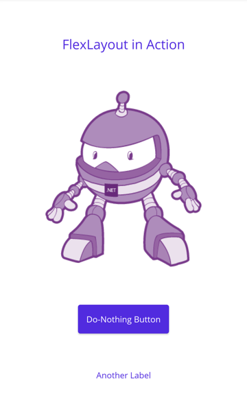
A FlexLayout can substitute for a StackLayout:
<ContentPage xmlns="http://schemas.microsoft.com/dotnet/2021/maui"
             xmlns:x="http://schemas.microsoft.com/winfx/2009/xaml"
             x:Class="FlexLayoutDemos.Views.SimpleStackPage"
             Title="Simple Stack">
    <FlexLayout Direction="Column"
                AlignItems="Center"
                JustifyContent="SpaceEvenly">
        <Label Text="FlexLayout in Action"
               FontSize="18" />
        <Image Source="dotnet_bot_branded.png"
               HeightRequest="300" />
        <Button Text="Do-Nothing Button" />
        <Label Text="Another Label" />
    </FlexLayout>
</ContentPage>
In this example, the Direction property is set to Column, which causes the children of the FlexLayout to be arranged in a single column. The AlignItems property is set to Center, which causes each child to be horizontally centered. The JustifyContent property is set to SpaceEvenly which allocates all leftover vertical space equally between all the children, above the first child and below the last child:
Note
The AlignSelf attached property can be used to override the AlignItems property for a specific child.
Wrap items
A FlexLayout can wrap its children to additional rows or columns:
<ContentPage xmlns="http://schemas.microsoft.com/dotnet/2021/maui"
             xmlns:x="http://schemas.microsoft.com/winfx/2009/xaml"
             x:Class="FlexLayoutDemos.Views.PhotoWrappingPage"
             Title="Photo Wrapping">
    <Grid>
        <ScrollView>
            <FlexLayout x:Name="flexLayout"
                        Wrap="Wrap"
                        JustifyContent="SpaceAround" />
        </ScrollView>
        ...
    </Grid>
</ContentPage>
In this example, the Direction property of the FlexLayout is not set, so it has the default setting of Row, meaning that the children are arranged in rows and the main axis is horizontal. The Wrap property is set to Wrap, which causes children to wrap to the next row if there are too many children to fit on a row. The JustifyContent property is set to SpaceAround which allocates all leftover space on the main axis so that each child is surrounded by the same amount of space:

The code-behind file for this example retrieves a collection of photos and adds them to the FlexLayout.
In addition, the FlexLayout is a child of a ScrollView. Therefore, if there are too many rows to fit on the page, then the ScrollView has a default Orientation property of Vertical and allows vertical scrolling.
Page layout
There is a standard layout in web design called the holy grail because it's a layout format that is very desirable, but often hard to realize with perfection. The layout consists of a header at the top of the page and a footer at the bottom, both extending to the full width of the page. Occupying the center of the page is the main content, but often with a columnar menu to the left of the content and supplementary information (sometimes called an aside area) at the right. This layout can be realized with a FlexLayout.
The following example shows an implementation of this layout using a FlexLayout nested in another:
<ContentPage xmlns="http://schemas.microsoft.com/dotnet/2021/maui"
             xmlns:x="http://schemas.microsoft.com/winfx/2009/xaml"
             x:Class="FlexLayoutDemos.Views.HolyGrailLayoutPage"
             Title="Holy Grail Layout">

    <FlexLayout Direction="Column">

        <!-- Header -->
        <Label Text="HEADER"
               FontSize="18"
               BackgroundColor="Aqua"
               HorizontalTextAlignment="Center" />

        <!-- Body -->
        <FlexLayout FlexLayout.Grow="1">

            <!-- Content -->
            <Label Text="CONTENT"
                   FontSize="18"
                   BackgroundColor="Gray"
                   HorizontalTextAlignment="Center"
                   VerticalTextAlignment="Center"
                   FlexLayout.Grow="1" />

            <!-- Navigation items-->
            <BoxView FlexLayout.Basis="50"
                     FlexLayout.Order="-1"
                     Color="Blue" />

            <!-- Aside items -->
            <BoxView FlexLayout.Basis="50"
                     Color="Green" />

        </FlexLayout>

        <!-- Footer -->
        <Label Text="FOOTER"
               FontSize="18"
               BackgroundColor="Pink"
               HorizontalTextAlignment="Center" />
    </FlexLayout>
</ContentPage>
The navigation and aside areas are rendered with a BoxView on the left and right. The first FlexLayout has a vertical main axis and contains three children arranged in a column. These are the header, the body of the page, and the footer. The nested FlexLayout has a horizontal main axis with three children arranged in a row:
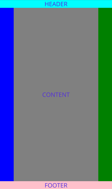
In this example, the Order property is set on the first BoxView to a value less than its siblings to cause it to appear as the first item in the row. The Basis property is set on both BoxView objects to give them a width of 50 device-independent units. The Grow property is set on the nested FlexLayout to indicate that this FlexLayout should occupy all of the unused vertical space within the outer FlexLayout. In addition, the Grow property is set on the Label representing the content, to indicate that this content is to occupy all of the unused horizontal space within the nested FlexLayout.
Note
There's also a Shrink property that you can use when the size of children exceeds the size of the FlexLayout but wrapping is not desired.
Collaborate with us on GitHub
The source for this content can be found on GitHub, where you can also create and review issues and pull requests. For more information, see our contributor guide.