Note
Access to this page requires authorization. You can try signing in or changing directories.
Access to this page requires authorization. You can try changing directories.
Safe areas prevent your content from being hidden under the app header, navigation bar, tabs, and hinge. It's important to know and respect the safe areas for each device posture and orientation.
Dual portrait
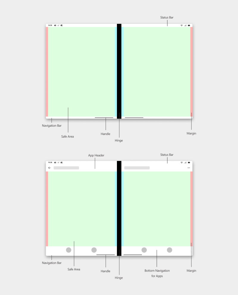
Dual screens held in landscape orientation act as double portrait screens. The GREEN area denotes the safe area where content for the app can be laid out. To provide the best experience, make sure the content doesn't enter the RED margin area.
Dual screens give you more opportunity to display content in several different patterns. Depending on the pattern you choose, the BLUE margins near the hinge are meant to be optional. For example, if you follow the List-Detail pattern, you might have to keep in mind the BLUE margins. However, if you follow the Extended Canvas pattern, then your content can flow across the hinge without having to worry about the BLUE margins near the hinge.

Single portrait and single landscape
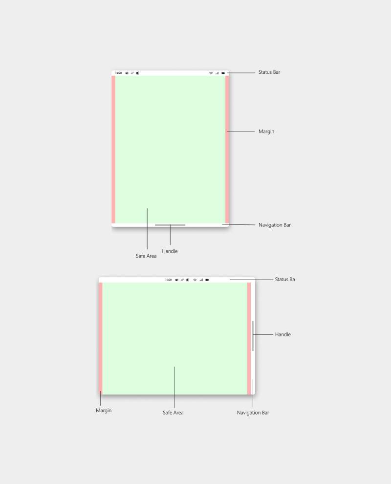
Dual screens folded 360 degrees like a notebook act as a single portrait screen just like a regular smartphone. The GREEN area denotes the safe area where content for the app can be laid out. To provide the best experience, make sure the content doesn't enter the RED margin area.

Single portrait and single landscape with app headers and navigation
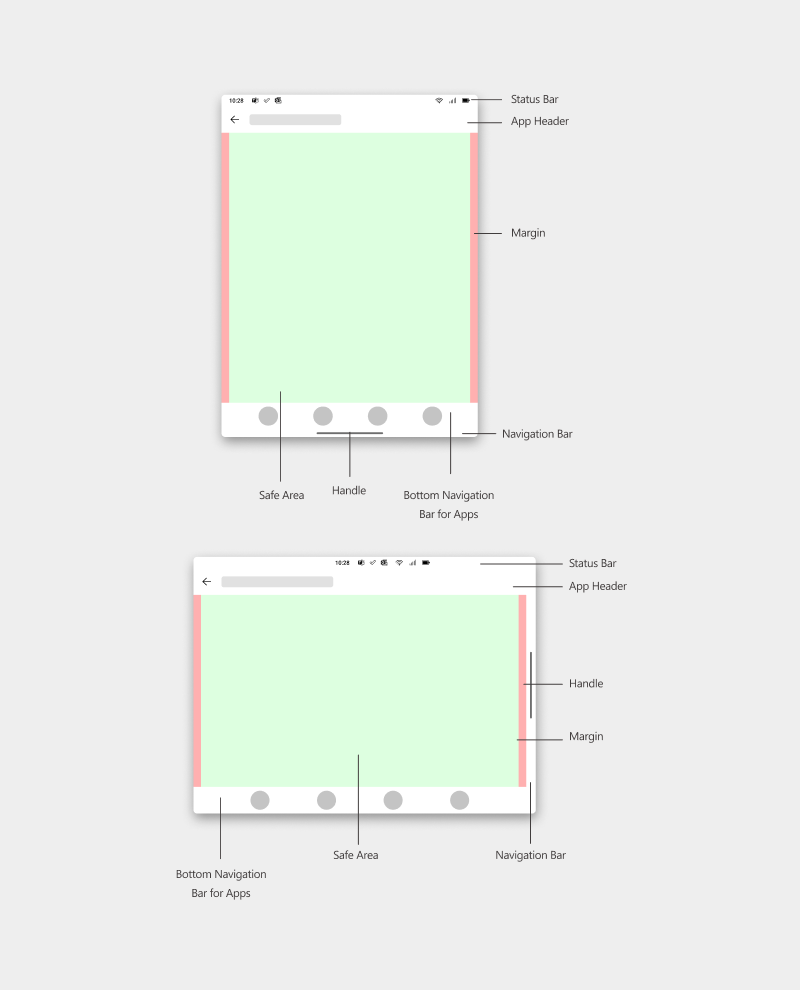
Dual screens folded 360 degrees like a notebook act as a single portrait screen just like a regular smartphone. The GREEN area denotes the safe area where content for the app can be laid out. To provide the best experience, make sure the content doesn't enter the RED margin area.

Dual landscape
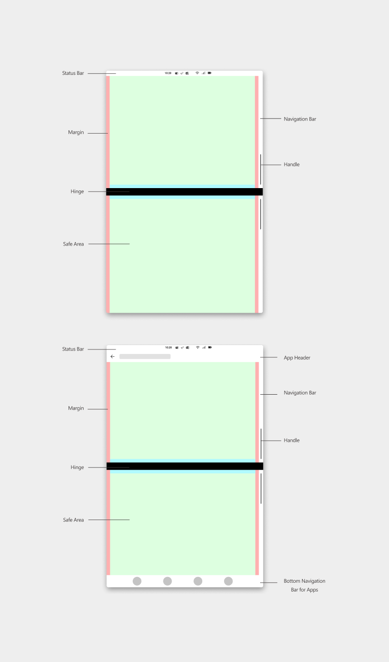
Dual screens held in portrait orientation act as double landscape screens. The GREEN area denotes the safe area where content for the app can be laid out. To provide the best experience, make sure the content doesn't enter the RED margin area.
Dual screens give you more opportunity to display content in several different patterns. Depending on the pattern you choose, the BLUE margins near the hinge are meant to be optional. For example, if you follow the List-Detail pattern, you might have to keep in mind the BLUE margins. However, if you follow the Extended Canvas pattern, then your content can flow across the hinge without having to worry about the BLUE margins near the Hinge.
