.NET MAUI TwoPaneView layout
The TwoPaneLayout control provides an adaptive layout container with two children: Pane1 and Pane2. On dual-screen and foldable devices, the control will position the panes on either side of the hinge or fold. On all other device types the layout behavior is configurable, and can show either one or both panes according to properties set on the control.
Get started
Instructions to add the TwoPaneView control to your project are available in the .NET MAUI documentation, by adding the Microsoft.Maui.Controls.Foldable NuGet.
The following code is a simple XAML example of the TwoPaneView, which shows:
foldablenamespace required in the root element- Properties set on the TwoPaneView element (can also using binding or be set programmatically)
Pane1andPane2containers where you add your layouts
<ContentPage xmlns:foldable="clr-namespace:Microsoft.Maui.Controls.Foldable;assembly=Microsoft.Maui.Controls.Foldable">
    <foldable:TwoPaneView
            TallModeConfiguration="SinglePane"
            WideModeConfiguration="LeftRight"
            PanePriority="Pane1">
        <foldable:TwoPaneView.Pane1>
            <StackLayout>
                <Label Text="Pane1 Content" />
            </StackLayout>
        </foldable:TwoPaneView.Pane1>
        <foldable:TwoPaneView.Pane2>
            <StackLayout>
                <Label Text="Pane2 Content" />
            </StackLayout>
        </foldable:TwoPaneView.Pane2>
    </foldable:TwoPaneView>
</ContentPage>
By default, the TwoPaneView will attempt to always render both panes, which means that when the app is running on a single-screen, the view will be split between the two panes. The following properties can be used to affect the layout when it's only rendering on one screen:
- MinTallModeHeight – indicates the minimum height the control must be to enter Tall mode.
- MinWideModeWidth – indicates the minimum width the control must be to enter Wide mode.
- Pane1Length – sets the width of
Pane1in Wide mode, the height ofPane1in Tall mode, and has no effect in SinglePane mode. - Pane2Length – sets the width of
Pane2in Wide mode, the height ofPane2in Tall mode, and has no effect in SinglePane mode.
On the Surface Duo (and other foldable devices), applications can be spanned across a hinge or fold. The TwoPaneView control has additional properties that determine where the two panes are rendered in relation to each other (in both single- or dual-screen):
- TallModeConfiguration – when in tall mode, the panes can be Top/Bottom, Bottom/Top, or a single pane only can be shown.
- WideModeConfiguration – when in wide mode, the panes can be Left/Right, Right/Left, or a single pane only.
- PanePriority – whether to show
Pane1orPane2if in SinglePane mode is chosen for tall or wide mode.
There are three display modes:
- SinglePane – only one pane is currently visible.
- Wide – the two panes are laid out horizontally. One pane is on the left and the other is on the right. On the Surface Duo the two screens are in portrait mode.
- Tall – the two panes are laid out vertically. One pane is on top and the other is on bottom. On the Surface Duo the two screens are in landscape mode.
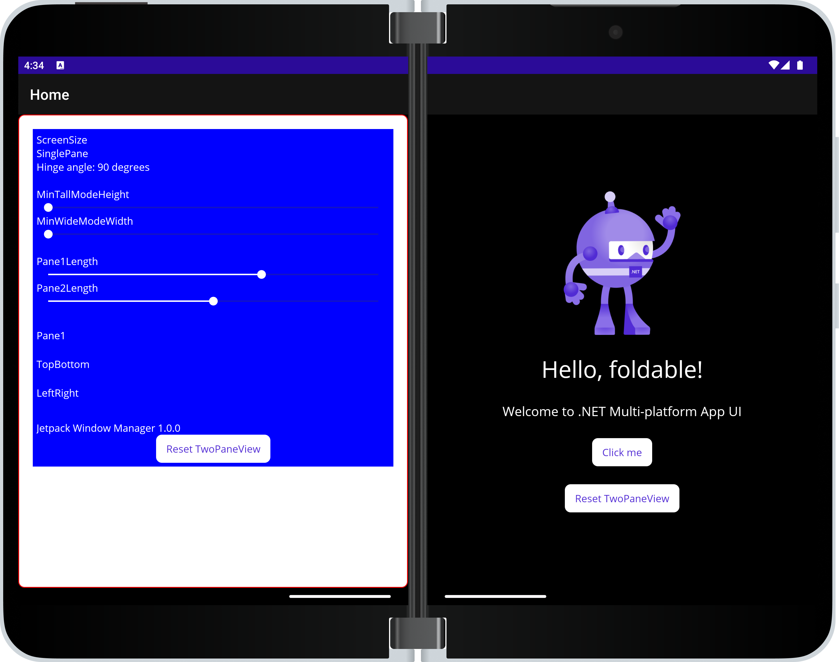
Sample
Download and run the TwoPaneView playground sample from GitHub. This screenshot shows how the sample exposes the various properties of the TwoPaneView control for experimentation:
Troubleshooting
If you observe unexpected behavior or layout from TwoPaneView, check the set-up instructions, including the UseFoldable() builder method and ConfigurationChanges attribute.