Note
Access to this page requires authorization. You can try signing in or changing directories.
Access to this page requires authorization. You can try changing directories.
This article explains how you can enhance the information that appears in Microsoft Dynamics 365 Commerce POS views by adding custom controls.
To enhance the information that appears in the views in Microsoft Dynamics 365 Commerce POS, add custom controls. A custom control lets you add your own custom information to the existing POS views. Use the POS extension framework to implement custom controls.
In Cart view, add custom controls by using the POS screen layout designer. Drag a custom control to a location of your choice, and set the height and width of the control. Then, write the extension logic in the extension project.
For example, in the following illustration, three custom controls were added by using the screen layout designer.
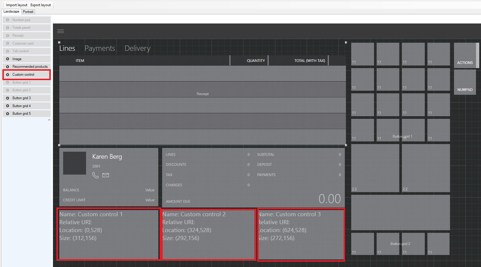
Currently, only Cart view lets you use the screen layout designer to add custom controls. For all other screens, do the layout in the extension project. One advantage of using the screen layout designer is that you can drag the custom control wherever you want on the screen. On other screens, the position is fixed, but you can modify the position by specifying the height and width.
Custom control matrix
The following table shows the views that support custom controls in POS.
| POS view | Supports custom controls | Supports screen layout designer |
|---|---|---|
| Cart view/Transaction page | Yes | Yes |
| Customer details view | Yes | No |
| Product details view | Yes | No |
| Customer Add/Edit view | Yes | No |
| Address Add/Edit view | Yes | No |
Note
Custom controls are supported only in the following product versions:
- For views that aren't based on the screen layout designer: Microsoft Dynamics 365 Finance App update 3 and Microsoft Dynamics 365 Retail App update 3
- For views that are based on the screen layout designer: Microsoft Dynamics 365 Finance App update 4 and Microsoft Dynamics 365 Retail App update 4
Create a custom control
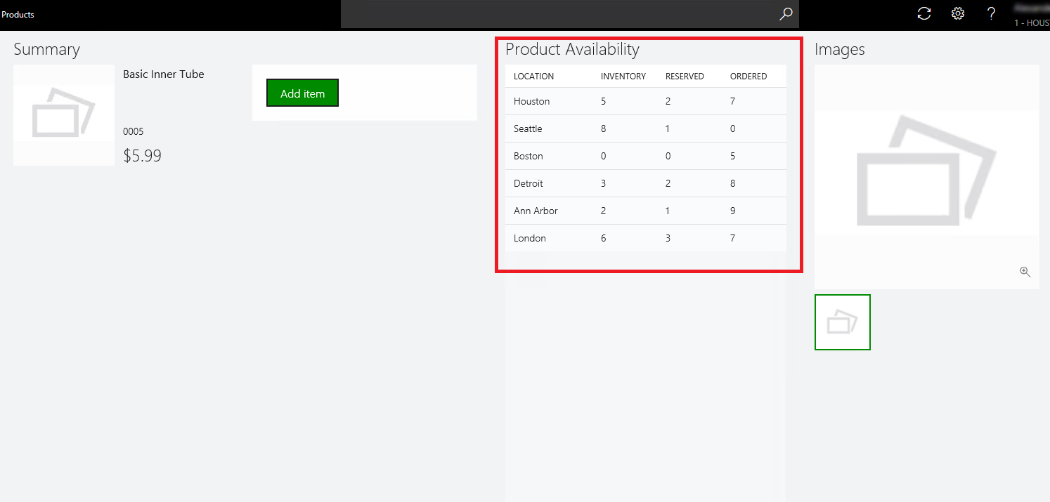
The following example shows how you can use extension to add custom controls to one of the existing POS views. For this example, you want information about product availability to appear in the product details view. To show this information, add a custom data list that has four columns: Location, Inventory, Reserved, and Ordered. You can use the same procedure to show other custom information in the POS views.
To create a custom control, follow these steps:
On the developer virtual machine (VM), start Microsoft Visual Studio 2015.
Open the ModernPos.sln file from RetailSDK\POS.
In the POS.Extensions project, add a new folder, and name it SampleExtensions.
In the new SampleExtensions folder, add another folder, and name it ViewExtensions.
In the ViewExtensions folder, add another folder, and name it SimpleProductDetails.
Note
If you're extending a view, give the folder the same name as the view. This naming convention makes navigation and code maintenance easier.
In the SimpleProductDetails folder, add a new .html file, and name it ProductAvailabilityPanel.html. Also add a new .ts file, and name it ProductAvailabilityPanel.ts. In the .html file, add whatever information you want the custom control to show. In the .ts file, add the corresponding logic.
A custom control is a simple HTML page that has your custom information.
Open the ProductAvailabilityPanel.html file, and paste the following code into it.
<!DOCTYPE html>
<html lang="en" xmlns="http://www.w3.org/1999/xhtml">
    <head>
        <meta charset="utf-8" />
        <title></title>
    </head>
    <body>
        <!-- Note: The element ID differs from the ID that is generated by the POS extensibility framework. This 'template' ID isn't used by the POS extensibility framework. -->
        <script id="Microsot\_Pos\_Extensibility\_Samples\_ProductAvailabilityPanel" type="text/html">
            <h2 class="marginTop8 marginBottom8" data-bind="text: title"></h2>
            <div class="width400 grow col">
                <div id="Microsot\_Pos\_Extensibility\_Samples\_ProductAvailabilityPanel\_DataList" data-bind="msPosDataList: dataList"></div>
            </div>
        </script>
    </body>
</html>
In the file, add the POS data list control to show the product availability information. You also specify the width of the control.
You can copy the full code from RetailSDK\Code\POS\Extensions\SampleExtensions\ViewExtensions\SimpleProductDetails\ProductAvailabilityPanel.html.
Open the ProductAvailabilityPanel.ts file, and paste the following code into it.
import {
    SimpleProductDetailsCustomControlBase,
    ISimpleProductDetailsCustomControlState,
    ISimpleProductDetailsCustomControlContext
} from "PosApi/Extend/Views/SimpleProductDetailsView";
import { ProxyEntities } from "PosApi/Entities";
import { ArrayExtensions } from "PosApi/TypeExtensions";
import { DataList, SelectionMode } from "PosUISdk/Controls/DataList";
To write your custom logic, import the list of controls and other data objects from the POS application programming interface (API).
Add constructor and initialize data list
Next, you add the constructor and initialize the data list with the product availability information. When you navigate to the page, the product availability information loads.
Note
The following steps don't include the source code, but you can copy the full code from RetailSDK\Code\POS\Extensions\SampleExtensions\ViewExtensions\SimpleProductDetails\ProductAvailabilityPanel.ts.
To a add constructor and initialize data list, follow these steps:
In your SampleExtensions folder, add a new .json file, name it manifest.json, and paste the following code into it.
{
    "$schema": "../manifestSchema.json",
    "name": "Pos_Extensibility_Samples",
    "publisher": "Microsoft",
    "version": "7.2.0",
    "minimumPosVersion": "7.2.0.0",
    "components": {
        "resources": {
            "supportedUICultures": [ "en-US" ],
            "fallbackUICulture": "en-US",
            "culturesDirectoryPath": "Resources/Strings",
            "stringResourcesFileName": "resources.resjson",
            "cultureInfoOverridesFilePath": "Resources/cultureInfoOverrides.json"
        },
        "extend": {
            "views": {
                "SimpleProductDetailsView": {
                    "controlsConfig": {
                        "customControls": [
                            {
                                "controlName": "productAvailabilityPanel",
                                "htmlPath": "ViewExtensions/SimpleProductDetails/ProductAvailabilityPanel.html",
                                "modulePath": "ViewExtensions/SimpleProductDetails/ProductAvailabilityPanel"
                            }
                        ]
                    }
                }
            }
        }
    }
}
During runtime, the manifest informs the POS that a custom control is added in SimpleProductDetailsView. In the preceding code example, it includes all the required metadata that the POS requires in order to load the control.
- Extend – Inform the POS that there's an extension for an existing POS feature.
- Views – Specify that an existing POS view is being extended.
- View Name – Specify the view that's being extended.
- Controls config – Specify the control that you're adding, such as Custom control.
- Control metadata – Specify the name, the path of the .html file path, and the path of the TypeScript module (that is, the .ts file).
Open the extensions.json file, and paste the following code into it.
{
    "extensionPackages": [
        {
            "baseUrl": "SampleExtensions"
        }
    ]
}
In the extensions.json file, you specify the various extensions that you have. In this case, you added a new extension folder. Therefore, you must specify that folder.
Note
Each extension folder or package that you specify here should have a manifest.
Open the tsconfig.json file, and include your extension. Paste the following code into the file.
"extends": "../tsconfigs/tsmodulesconfig",
"exclude": [
    // "SampleExtensions"
],
Test the extension
To test the extension, follow these steps:
Press F5, and deploy the POS to test your customization.
After the POS starts, sign in. Then search for any product, and open the product details view. You should now see the custom control that you added. Here's an example.
You can copy the full code for this sample from RetailSDK\Code\POS\Extensions\SampleExtensions\ViewExtensions\SimpleProductDetail.